Devilish designs for olive oil brand Diacolicchio
Toward the end of last year, we chatted with, founder and chief creative officer of San Francisco branding firm Noise 13 about many things, one of which was the portfolio projects that make designers proud.

She reckoned it's often the "boring" ones that are the most satisfying, but that’s not to say many of their projects look dry. Take its latest work for Diacolicchio—olive oil with an intensely spicy flavour thanks to the fact it’s made with ground chilli peppers.
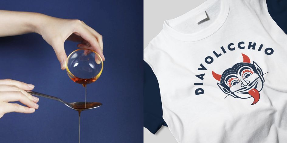
It's that fiery hot taste that informed the design direction for the branding and packaging, which has something rather devilish at its core. A devil, to be exact.
"When your client walks into the room, asks if you can make a logo look like 'this,' and then proceeds to bug out his eyes, stick out his tongue and pull back his ears, you know you are in for some fun," says Noise 13. It's often used in Italy as a finishing oil in place of actual chilli flakes.
Sounds like an interesting client, and one that a few designers would perhaps find slightly frustrating: after all, surely no one really wants a logomark foisted on them by a man who's clearly quite good at playing Charades?
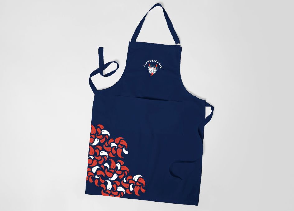
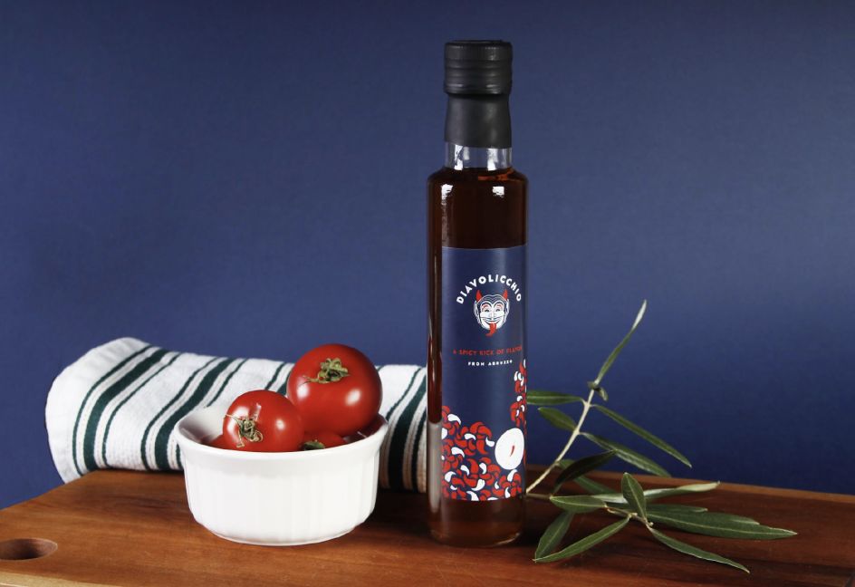
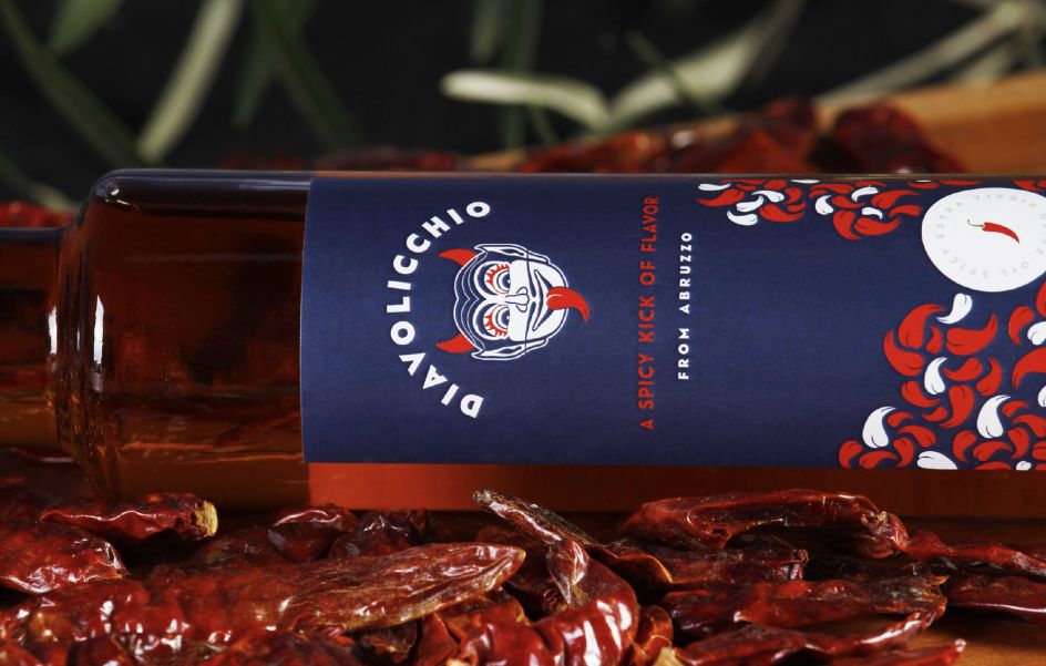
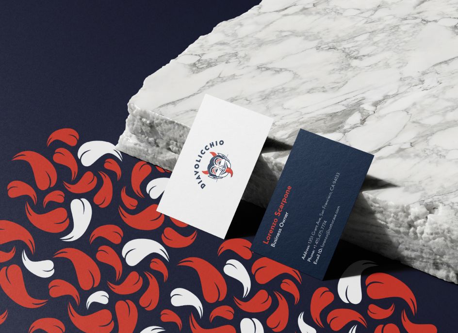
Noise 13's designers honed in on the similarities between the shape of chilli pepper, a devil's tongue and a devil's horns. Naturally, the devil face logo, which has something of a theatrical mask vibe, uses these chilli pepper shapes for its tongue and horns. Still, the simplified shape is also used across the visual system. The lower half of the bottle label, for instance, features a pattern of peppers cascading down as a reference to the oil’s chilli sediment.
"There are an endless variety of Italian olive oils in the market and most stick to a more dated, classic Italian aesthetic," says the agency. "We wanted this brand and package design to buck that trend completely. We also wanted to ensure that, at one glance, you knew this olive oil was going to be quite the spicy treat."
Aside from the wee devil, which Noise 13 "affectionately named" Lorenzo, after its client, the branding is pretty simple, with a red, which and dark blue colour palette and all-caps, modern sans serif type.
Editor's Picks


Trending


Podcasts


Editor's Picks
Further Reading