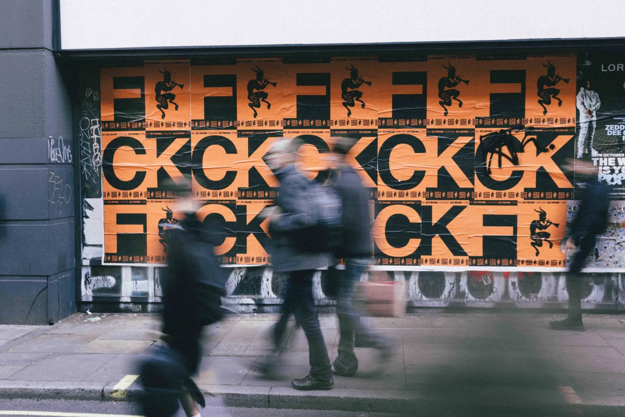
ABD's identity for Goodparts, a men's wellness brand selling lubes and balms for sex
New York creative collective ABD (short for Associates By Design) is behind this identity for Goodparts, a new men's wellness brand that's taking a revolutionary approach to sex and intimacy.
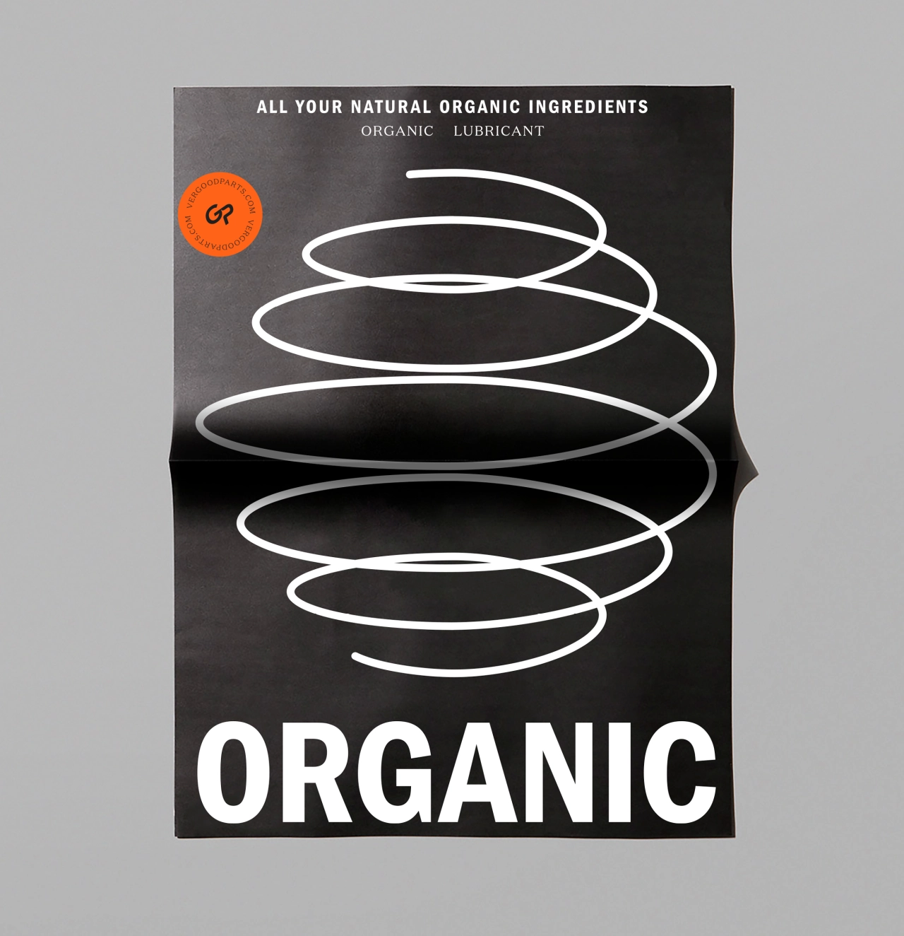
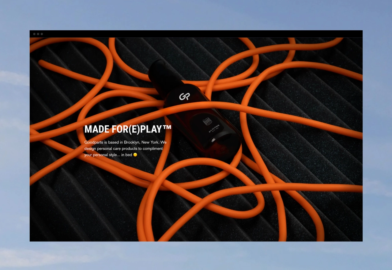
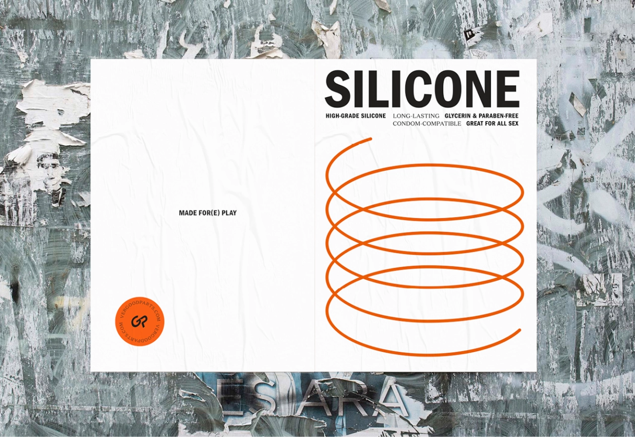
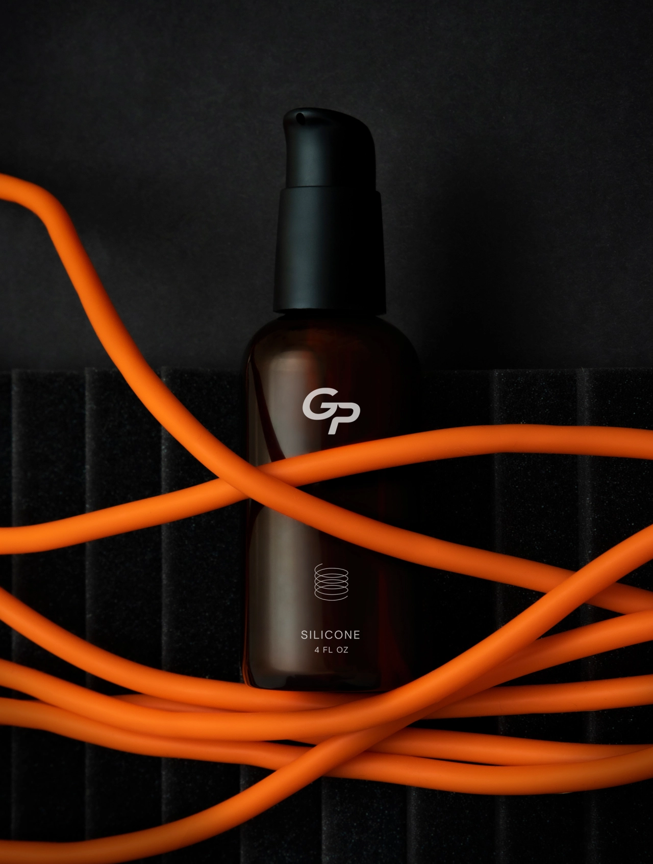
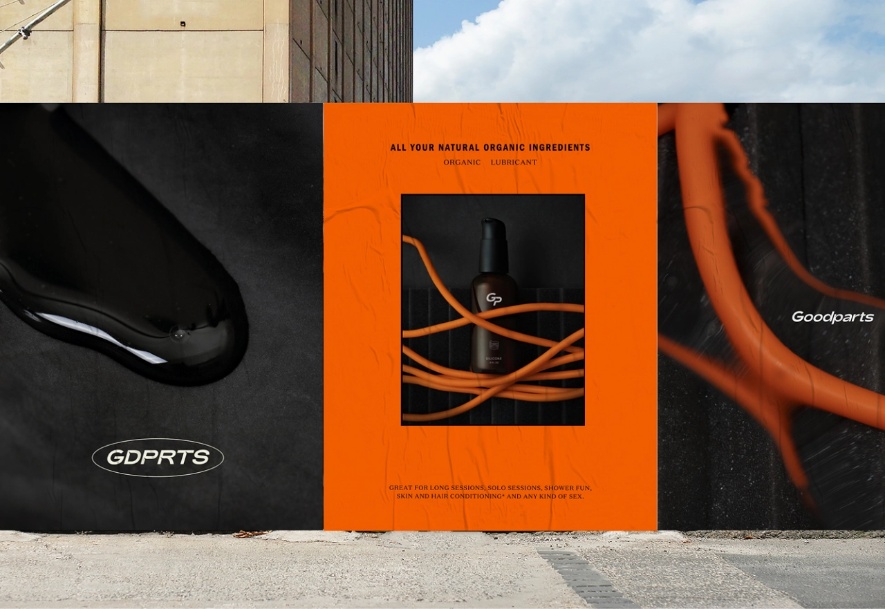
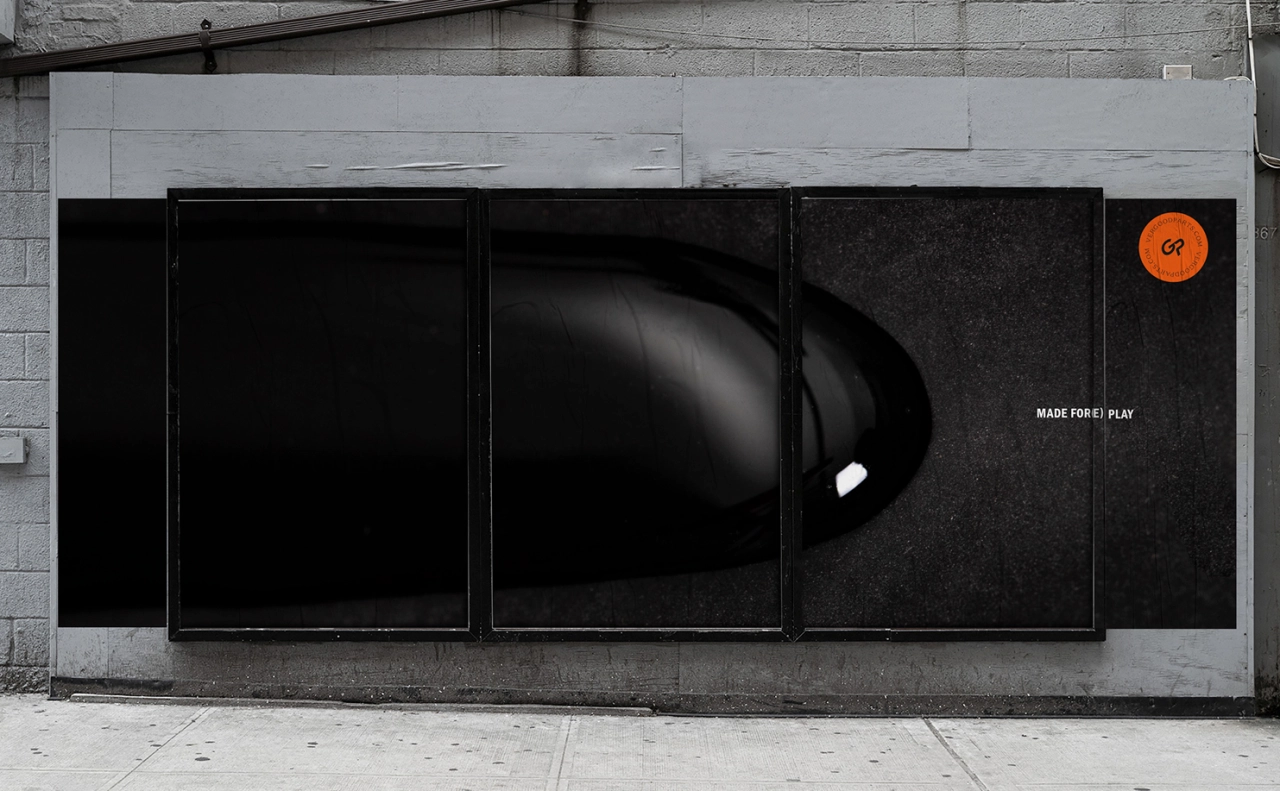
Based in Brooklyn, the luxury personal care product – designed to bridge the gap between our sex lives and our personal care routines – not only complements a "personal style in life" but also a "personal style in bed". Through nuance, tone, strong narrative, and tongue-in-cheek visuals, ABD has created an identity that hopes to "speak to our inner-most desires".
"It's an incredible form of human connection, evolution, and pleasure," explains Creative Partner Simon Mortimer. "But the way the world talks about sex is clinical, dated, and taboo. These sociocultural norms reinforce the idea that sex isn't something we should be talking about – and so we don't. When we don't talk, we don't learn, we don't explore, we don't adapt, and we don't improve. Goodparts is for anyone but was designed with the modern man in mind: gay, straight, and in-between."
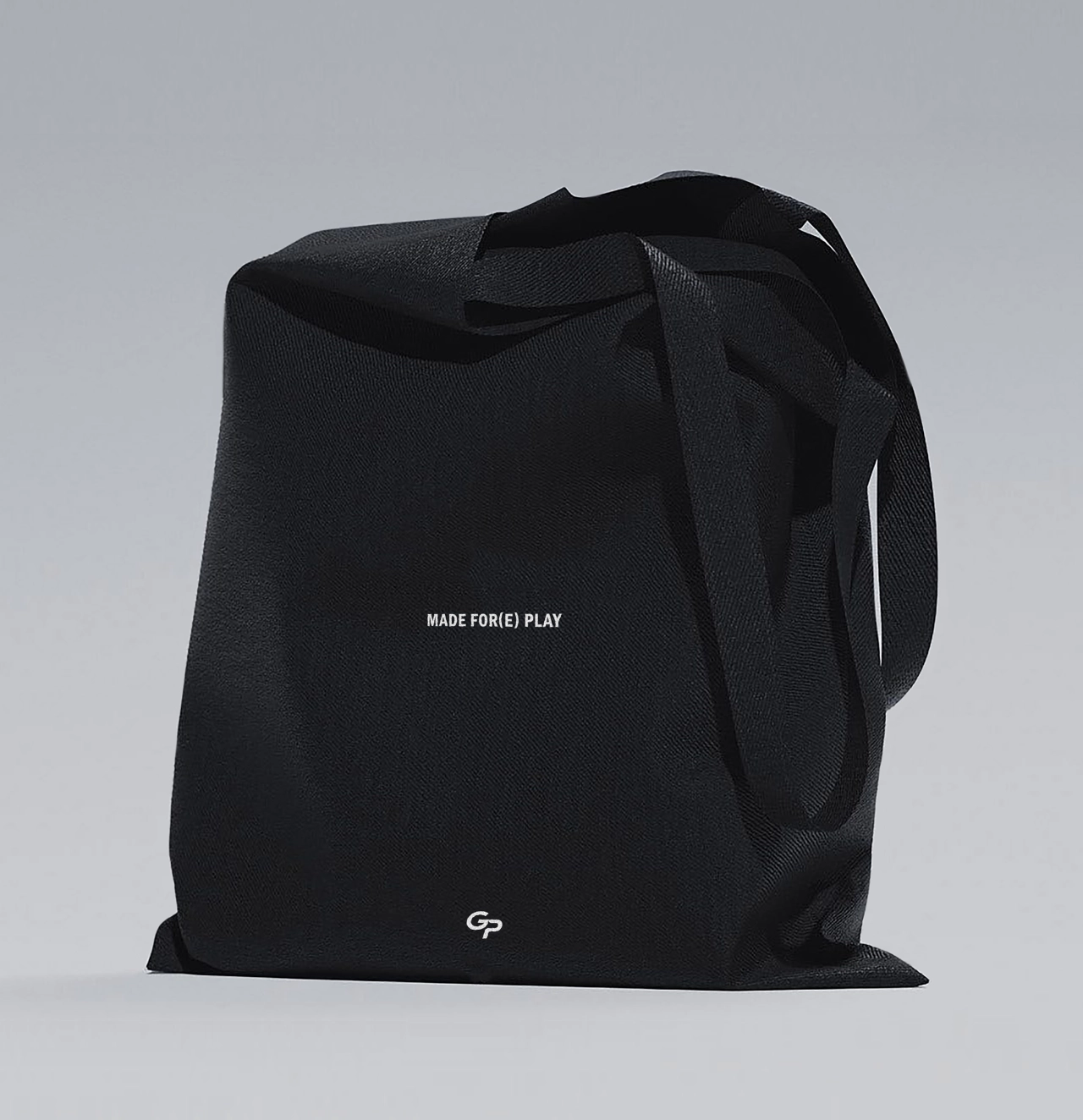
Simon adds: "A good sex life doesn't start and end in the bedroom. We wanted to develop a brand that you could take with you, be proud to have on your bedside table, and one you didn't have to hide when your friends came over. Sex is fun, playful, beautiful, and kind of athletic. It's also different for everyone."
ABD wanted to create an identity that could be "true to that personal experience", and not just "sugar-coat" sex with whimsical, airy imagery and subtle innuendo. "We wanted a brand that felt confident, active and energized that all men – gay, straight, or bi – desired," Simon continues. "In our research, it became clear to us that in most straight relationships, the woman purchases the lube, and it's viewed as a product 'for her'. We wanted to shift the paradigm, and portray lube as a symbol of self-care and sexual health."
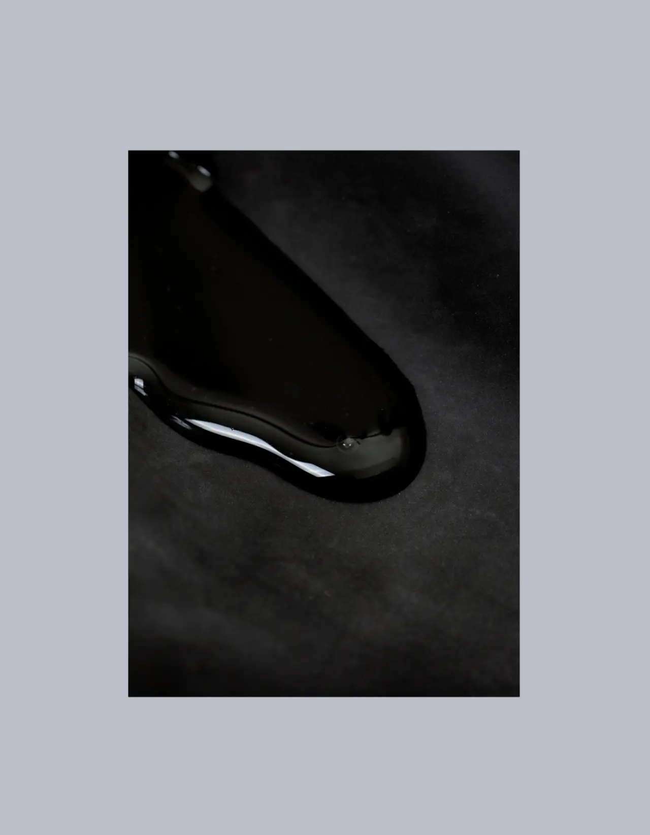
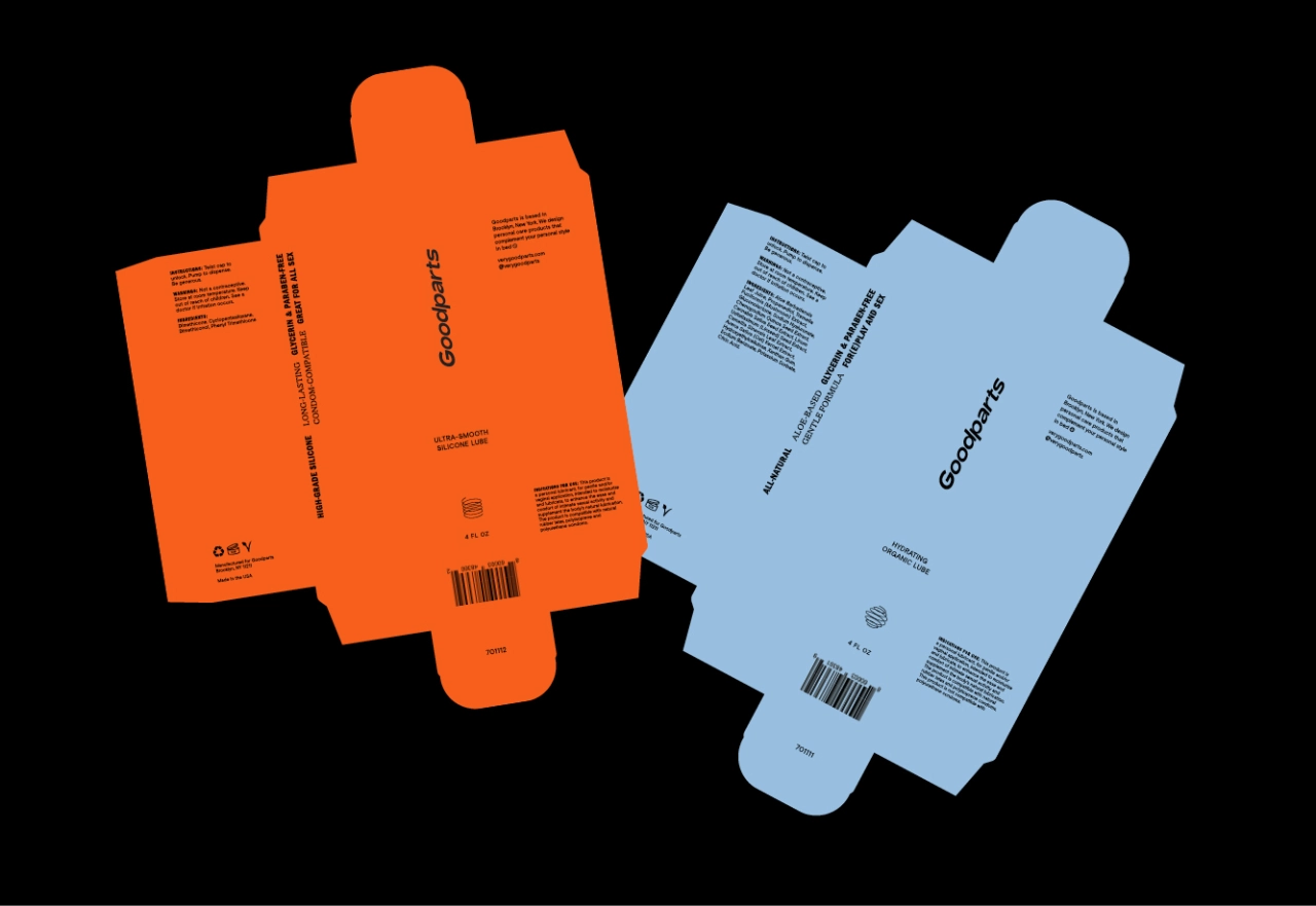
The colour palette plays an important part in the identity, as different tones represent different styles we all have in bed and the unique dynamics with various partners. "Some like it moody with lights off," adds Simon. "Some are energetic and filled with passion, and some like it slow, with lots of romance (and foreplay). We wanted to complement these different styles within our colour choices."
![Stack of cardboard boxes displaying Goodparts branding and "Made For[e] Play" text against a metal shutter background](https://media.creativeboom.com/036a6397-65a1-4596-a66a-263495fc9ce6/conversions/454af28e7ad2e72b83896c54c9e4e4e6a47669b3-medium.webp)
Editor's Picks





Trending






Latest Jobs
Senior Graphic Designer at MoMA Retail
Full-time·New York·$72k-$80k
Senior Designer at Definition
Contract·London·£45k–£50k
Midweight Full Stack Developer at Bureau for Visual Affairs
Full-time·London (Open to remote)·£35k–£50k
Mid-Senior Designer at Something Familiar
Full-time·Bristol·£32k–£40k
Account Manager at BUILDHOLLYWOOD
Full-time·London·£34k–£38k
Account Director at How&How
Full-time·London·£73k-£79k