A simple, playful identity for a school for visually impaired children
Graphic designers and art directors Simon Langlois and Raphaëlle Brillant have worked together on a charming project for La Fondation de l'école Jacques-Ouellette (the Jacques-Ouellette School Foundation).
The school is entirely devoted to pre-school, elementary and secondary education for blind and visually impaired students aged between 4 and 21, and its mission is to “bring together the financial, human and material resources to support the school's projects."
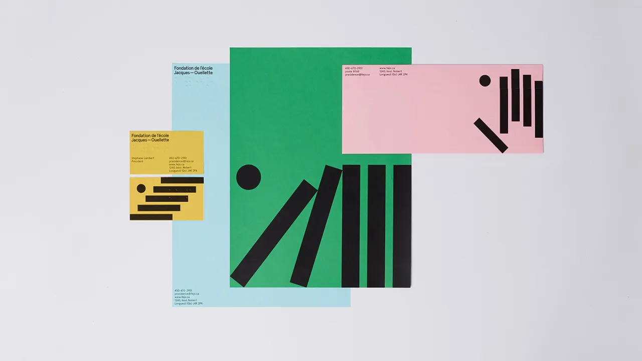
The designers were briefed to create new positioning for the brand and to redesign its visual identity. “This foundation is positioning itself as an agent of change giving its students the opportunity to fulfil their potential and evolve despite their handicap,” say the designers.
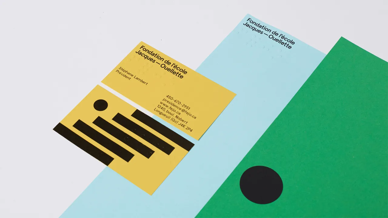
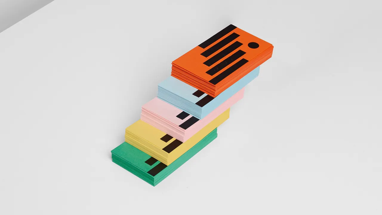
Their approach was to use a range of bold colours, ranging from a striking bright orange to baby pink and a dusty blue. These work alongside a simple graphic logo device built around five thick, black lines and a dot. These can be used in static forms across printed matter and taken apart and reassembled for various applications.

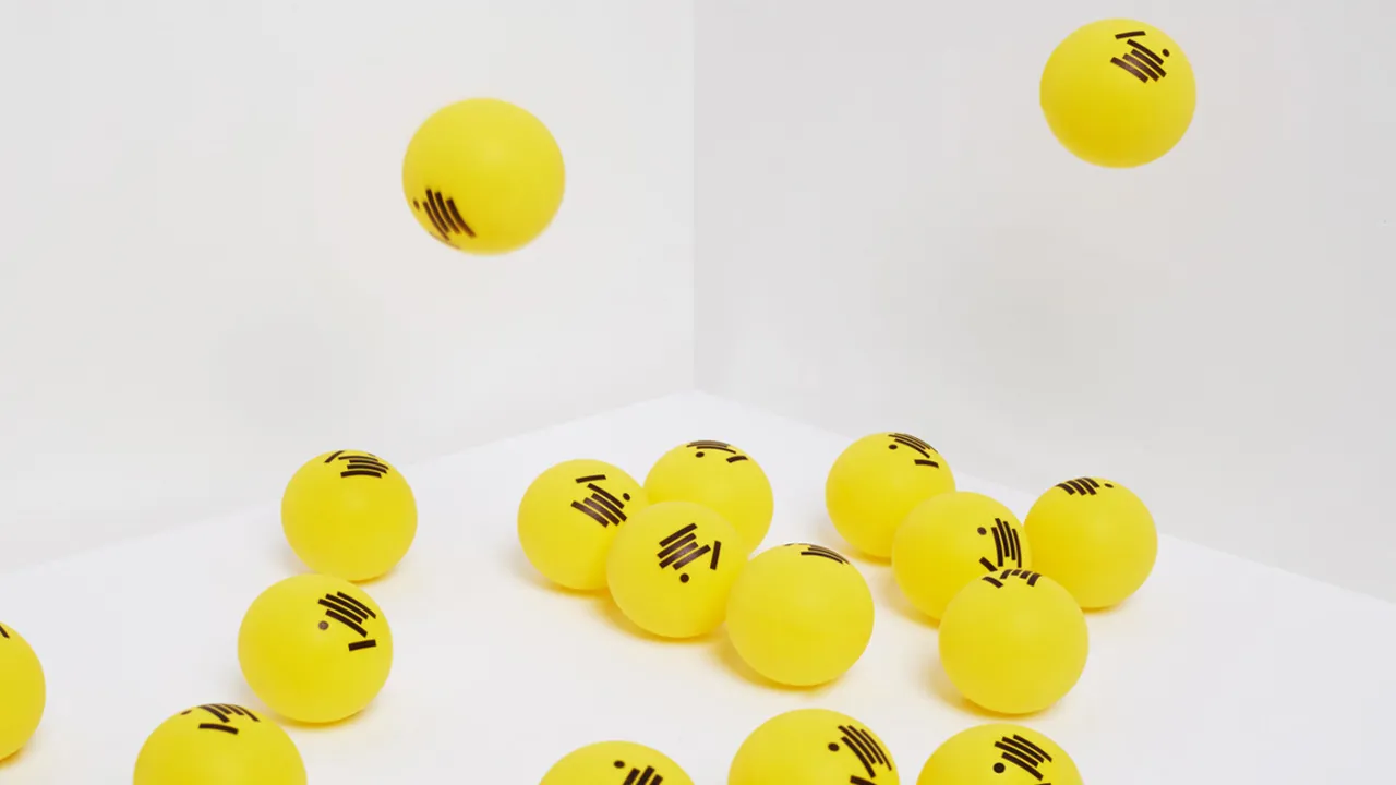
The simple, eye-catching approach works beautifully across everything from business cards to bookmarks, the website design and even ping pong balls, which dance across the cute new website design.
They have also been animated to bring the identity to life online, with Brillant-Marquis taking care of the motion side of things.
The photography is by Vincent Castonguay, who is also based in Montreal.
Editor's Picks





Trending






Latest Jobs
Design Director at Human After All
Full-time·London·£66k–£88k
Paid Media Executive at Munro Agency
Full-time·Glasgow·From £27,000
Senior Brand Designer at Analogue
Full-time·Leeds·£38k-£45k
Senior 2D Motion Designer at Art&Graft
Full-time·London·£50k-£65k
Midweight Full Stack Developer at Bureau for Visual Affairs
Full-time·London (Open to remote)·£35k–£50k
Creative Director at Koto
Full-time·London·£95k-£130k