Brand Brothers reimagine Glénat's visual identity with a dynamic system rooted in heritage
French publisher Glénat's new identity, created by Brand Brothers, demonstrates how studios can approach the challenge of building on an existing logo while bringing something fresh and unexpected.
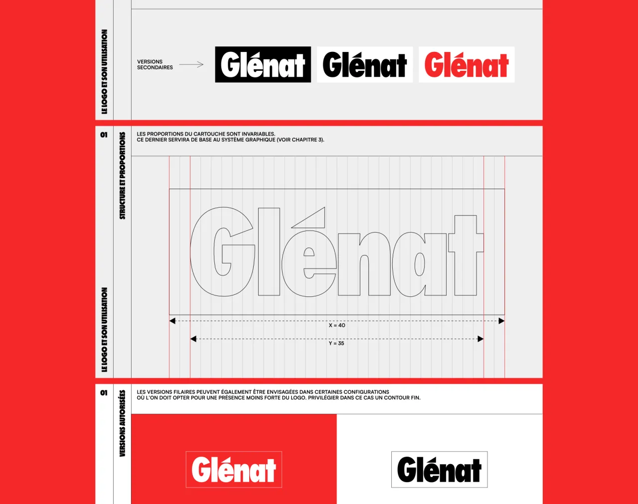
When Brand Brothers were asked to redesign Glénat's identity, the brief came with a restraint that most designers will have had themselves at least once. They couldn't touch the logo, which came with its own set of challenges, but for Johan Debit, cofounder of the Paris-based studio, it presented an opportunity too.
"It was a real constraint at first, in the sense that we almost never work this way," Johan says. "We are always the authors of the logos for the brands we work with, and given the importance of typographic work in our working method, starting from an existing logo can be perceived as a real limitation, because we don't control the initial graphic parameters.
"But it's always essential to adapt to the context, and by immersing ourselves in Glénat's immense heritage, we were able to tame this logo and consider it as part of the publisher's heritage. From there, it became an ally to our creativity."
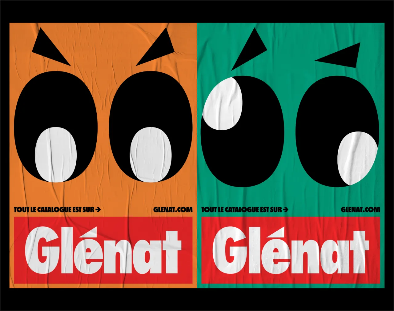
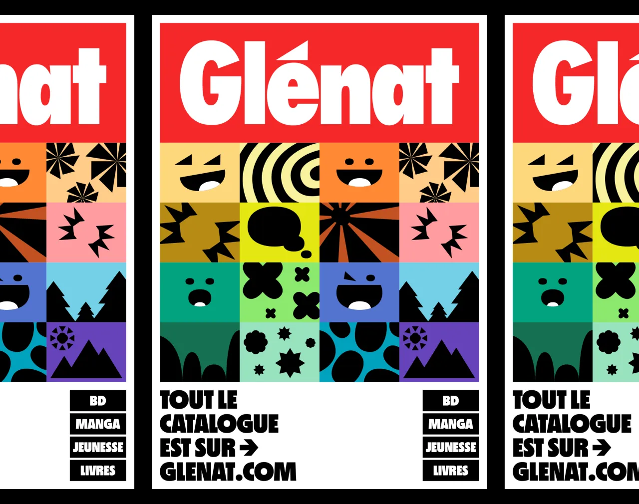
Founded in 1969 in Grenoble, Glénat has grown into one of France's largest independent publishers, spanning manga, comics, children's literature, illustrated guides and graphic novels. With such an eclectic output, the new identity needed to provide consistency without flattening the diversity that defines the publishing house, which Johan describes as "the second crucial element of the brief".
He adds: "We had to succeed in unifying the entire catalogue behind the same voice, the same temperament. In short, what makes Glénat just as legitimate in publishing documentary books as manga, comics, graphic novels or children's books.
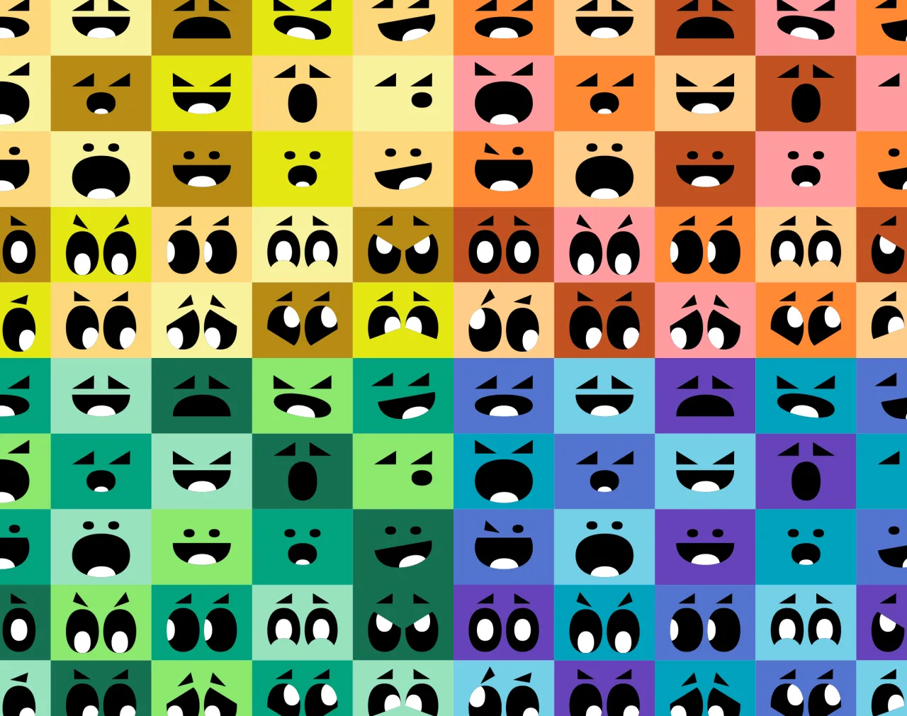
"We had to go beyond this notion of catalogue, and make this generalist positioning a strength. It was from this observation that we decided to visually represent this richness, through the varied emotions and reading atmospheres."
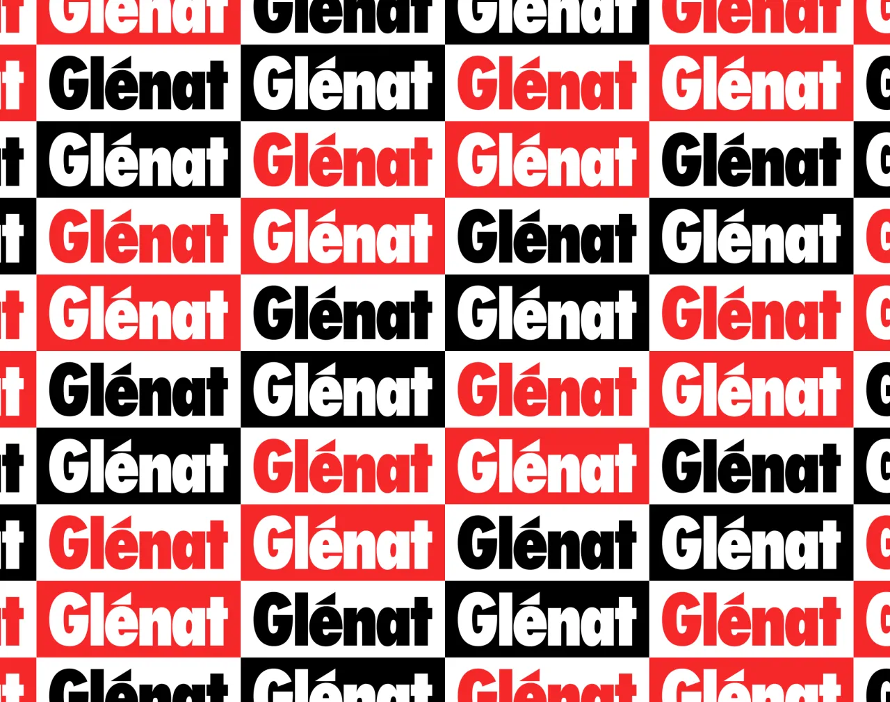
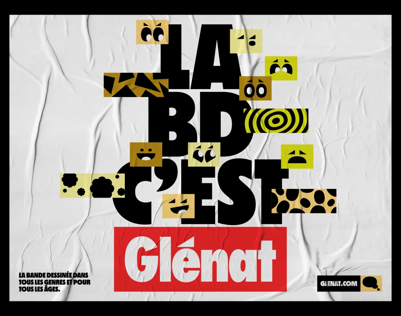
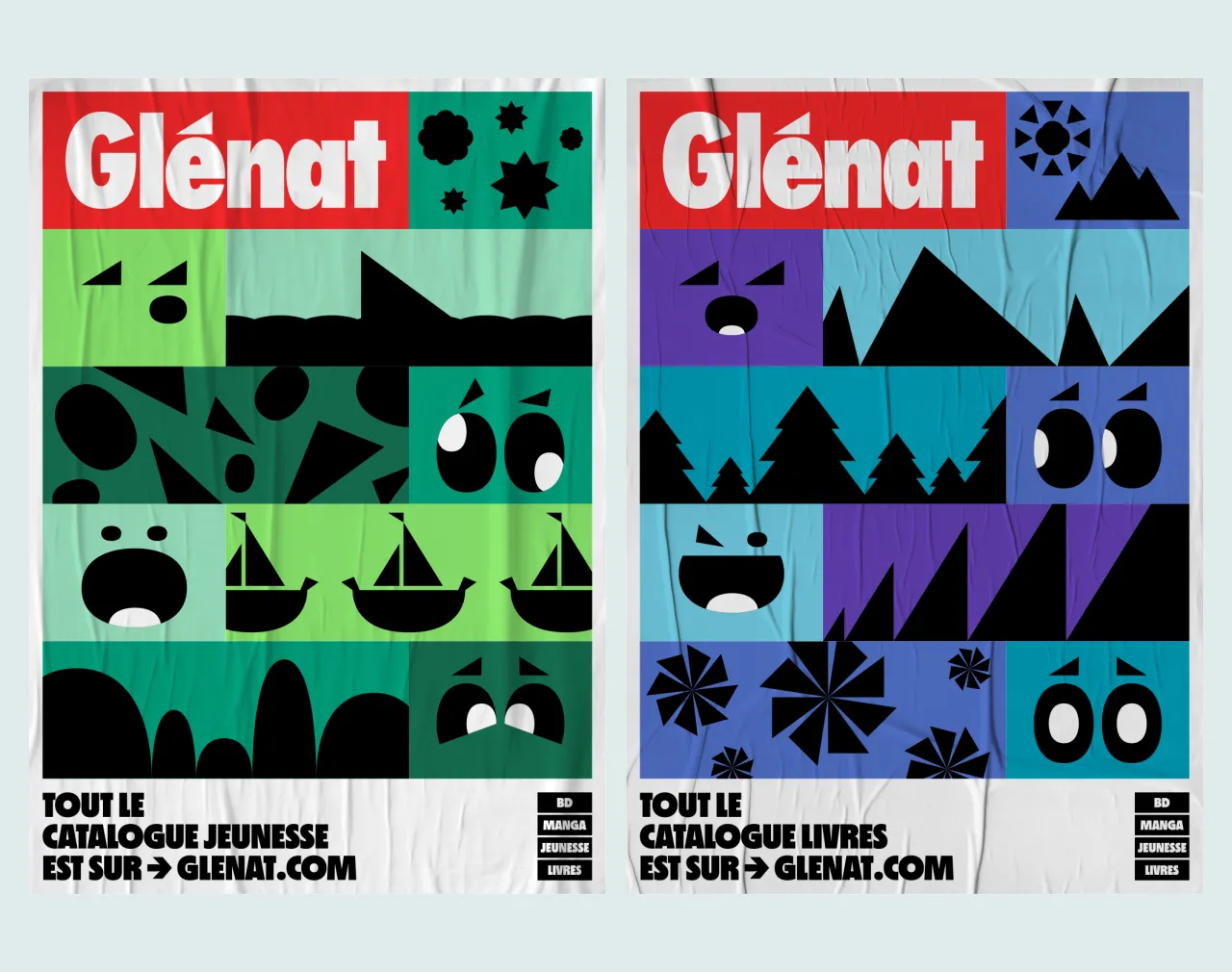
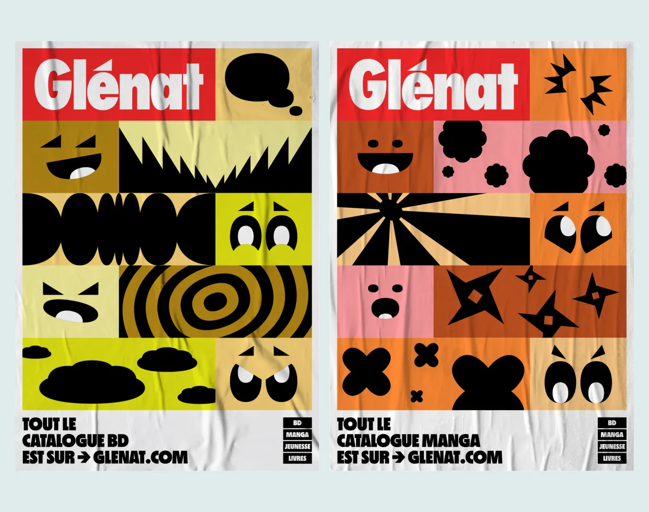
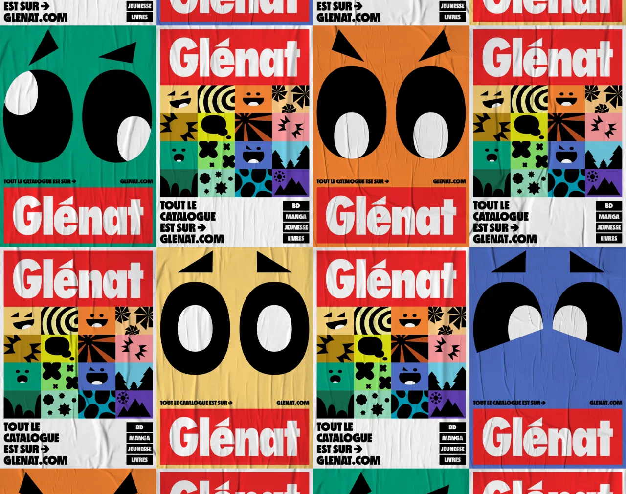
Since the logo was untouchable, Brand Brothers needed to find a way to expand its vocabulary. The breakthrough came in focusing on two features – the oval of the "G" and the small accent triangle – that were almost hidden in plain sight.
Glénat was also open to having a large modular graphic system, which Brand Brothers considers one of their signature methods, evident in several of their projects. Johan explains: "This method allows us to offer brands an abundance of graphic elements to play with, and to renew them over time – this creates branding in perpetual motion. However, in this specific case, the logo had to remain fixed.
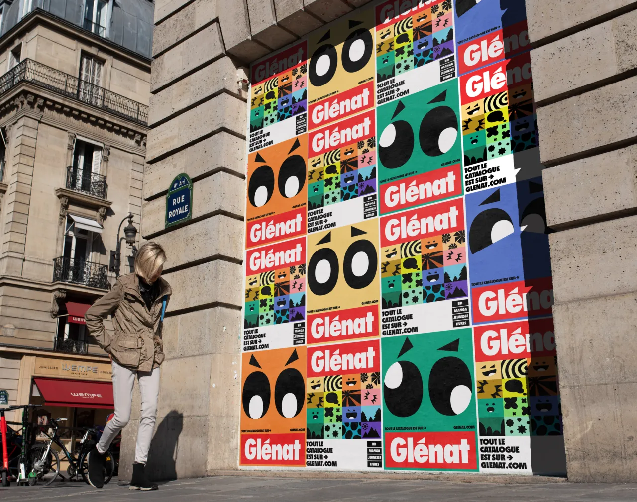
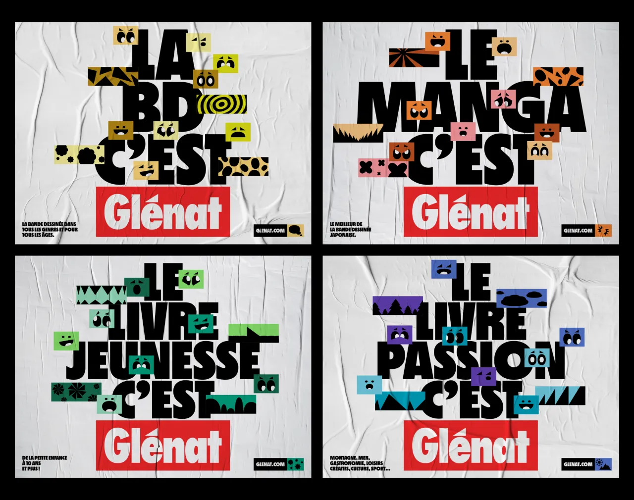
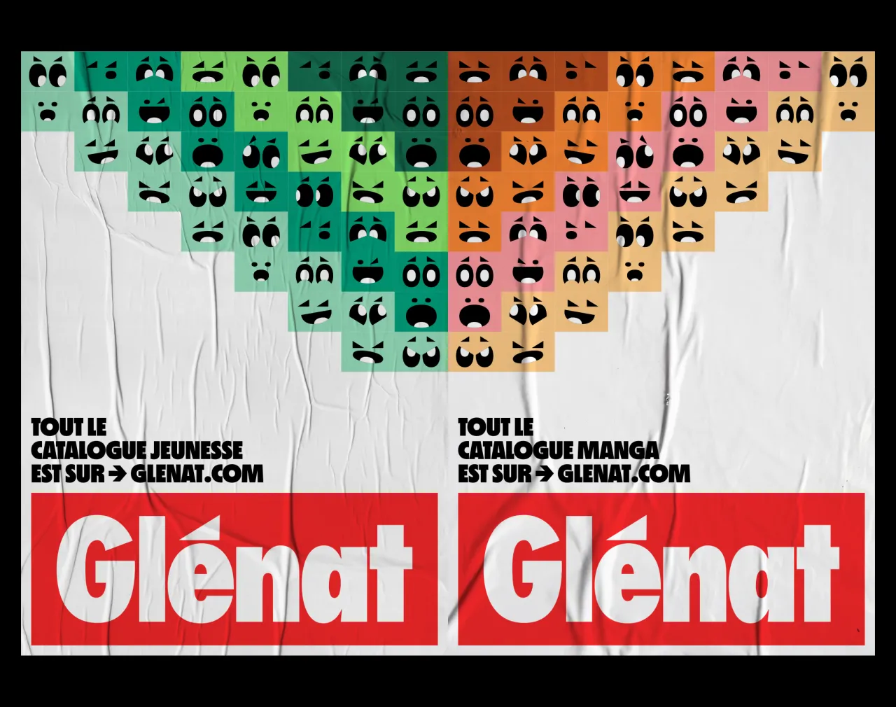
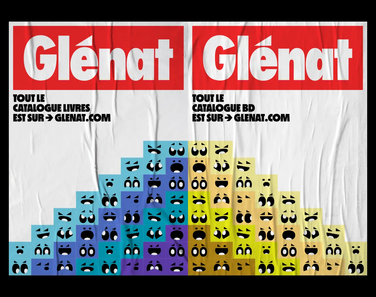
"The latter has, in our eyes, two iconic shapes, which form the backbone of this identity: the G's oval and the accent. By capitalising on these for the visual system, we ensured we created a natural link between this well-established logo and this new language we were putting in place for the future, all while maintaining enough abstraction to be able to create without constraint."
The result is a flexible toolkit of patterns, icons, and typographic treatments that radiate out from those two graphic forms. While the logo remains constant, the system surrounding it is designed to be in a state of constant flux.
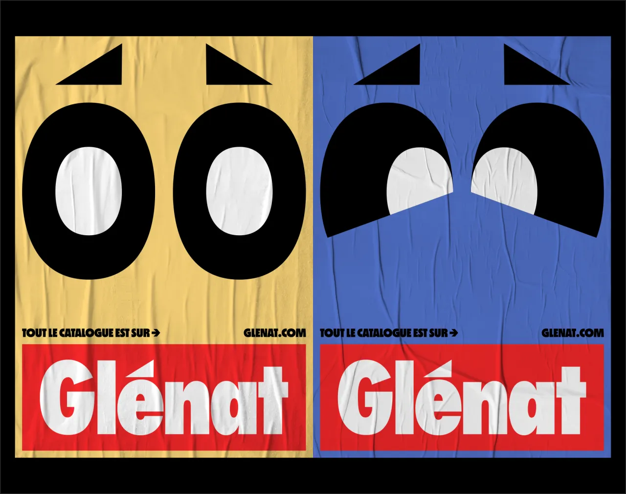
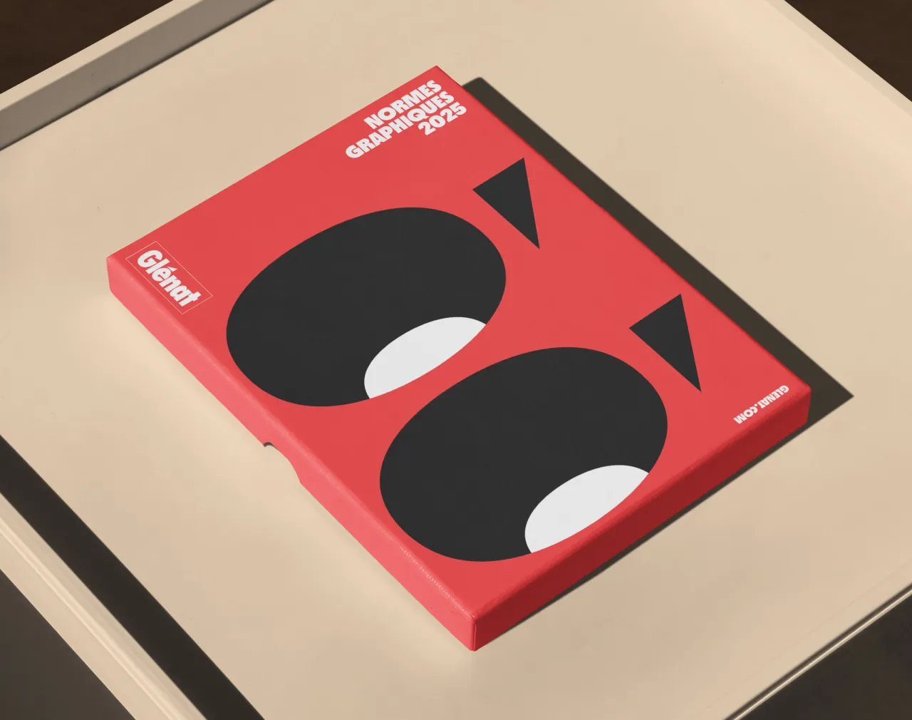
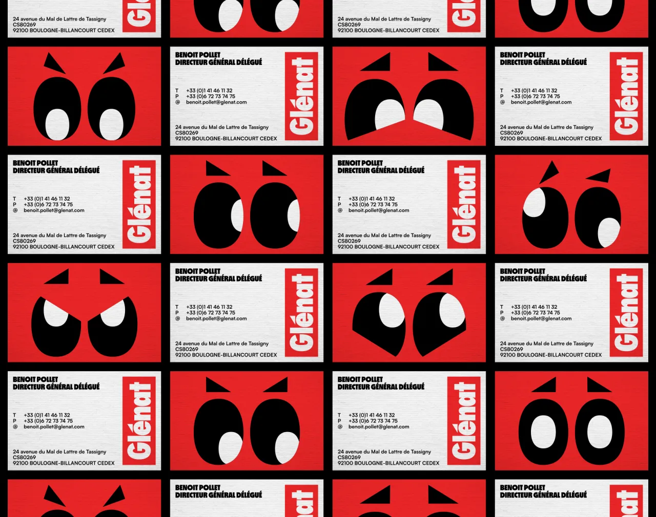
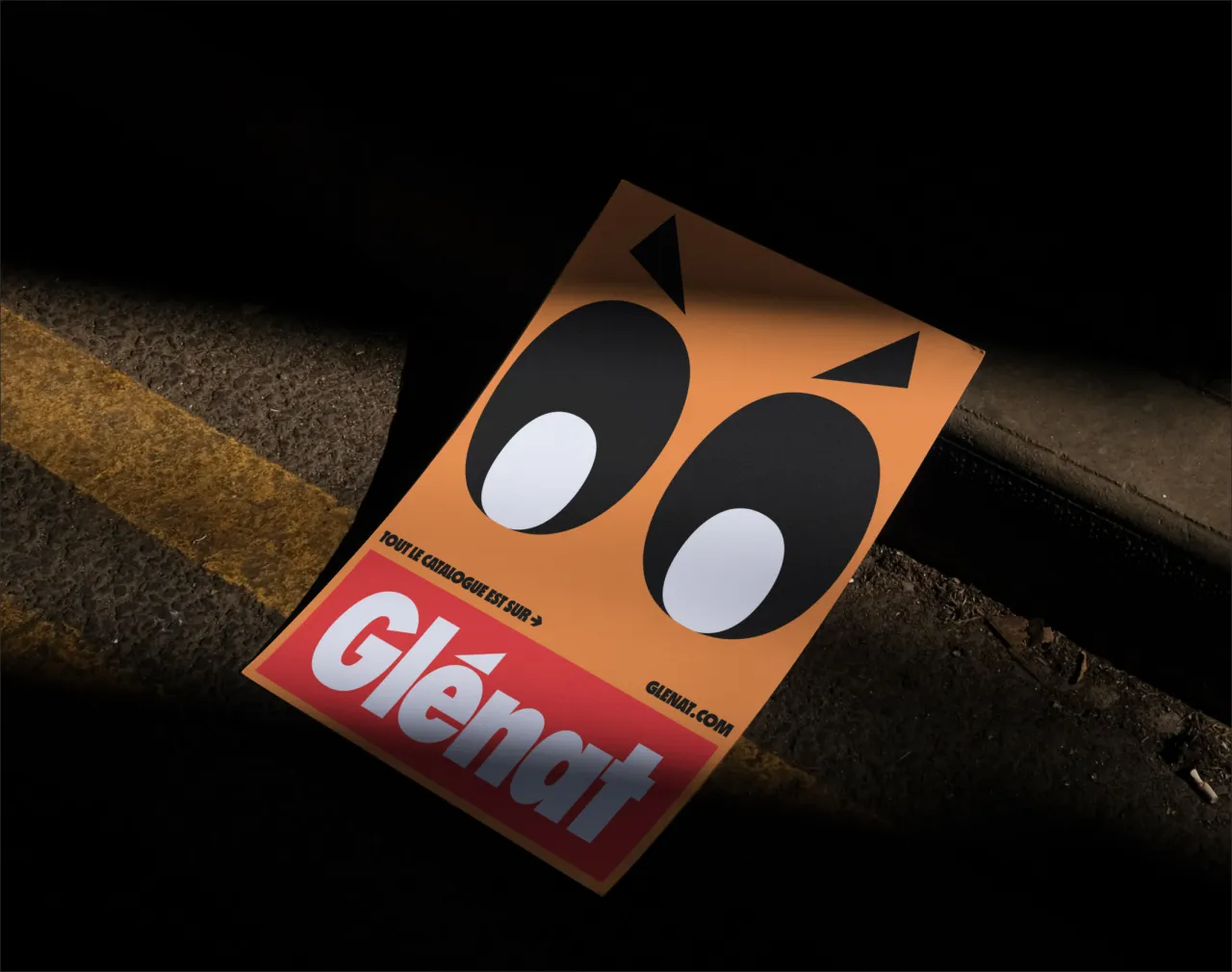
One of the most striking elements of the identity is a set of "emotion" and "ambience" icons. Essentially, they're visual devices that range from playful squiggles to geometric forms. They might sound niche, but in practice, they give Glénat the ability to flex across the full emotional spectrum of its catalogue.
"Glénat remains a publisher whose mission is to spread joy and passion, and it's this variety of pleasures that we wanted to convey through this system," says Johan. He describes the brand as being "unpretentious, accessible but demanding, with a twist that makes it unique and recognisable in the publishing world".
That sense of versatility is what allows the system to stretch from an atmospheric hiking manual to a brightly illustrated manga. "The richness of the system, through exaggeratedly varied forms, illustrations and colours, allowed us to cover the entire spectrum of the Glénat catalogue, from the most serious or committed readings to the lightest ones," Johan adds.
With an identity this expressive, there's always a risk of alienating long-time fans. For Glénat, a publisher with decades of cultural weight, striking the right balance was crucial.
Johan says: "The graphic simplicity of the new identity allows it to transcend time and move away from ephemeral trend effects, which could have been criticised. Moreover, this identity is consistent with the Glénat logo, positioning itself as a true extension of it.
"Then, we gave ourselves time with the Glénat teams to test it, tame it, and know if all stakeholders felt comfortable with it. Jacques Glénat, the founder, finally gave us his full approval; this constituted the ultimate proof that we were consistent with the spirit of this publisher and its readers."
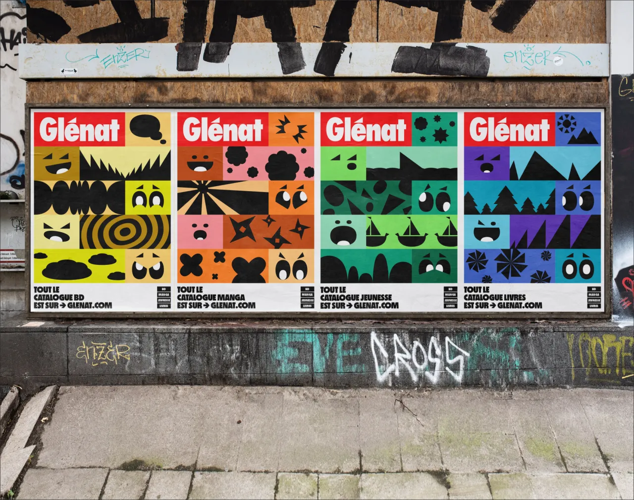
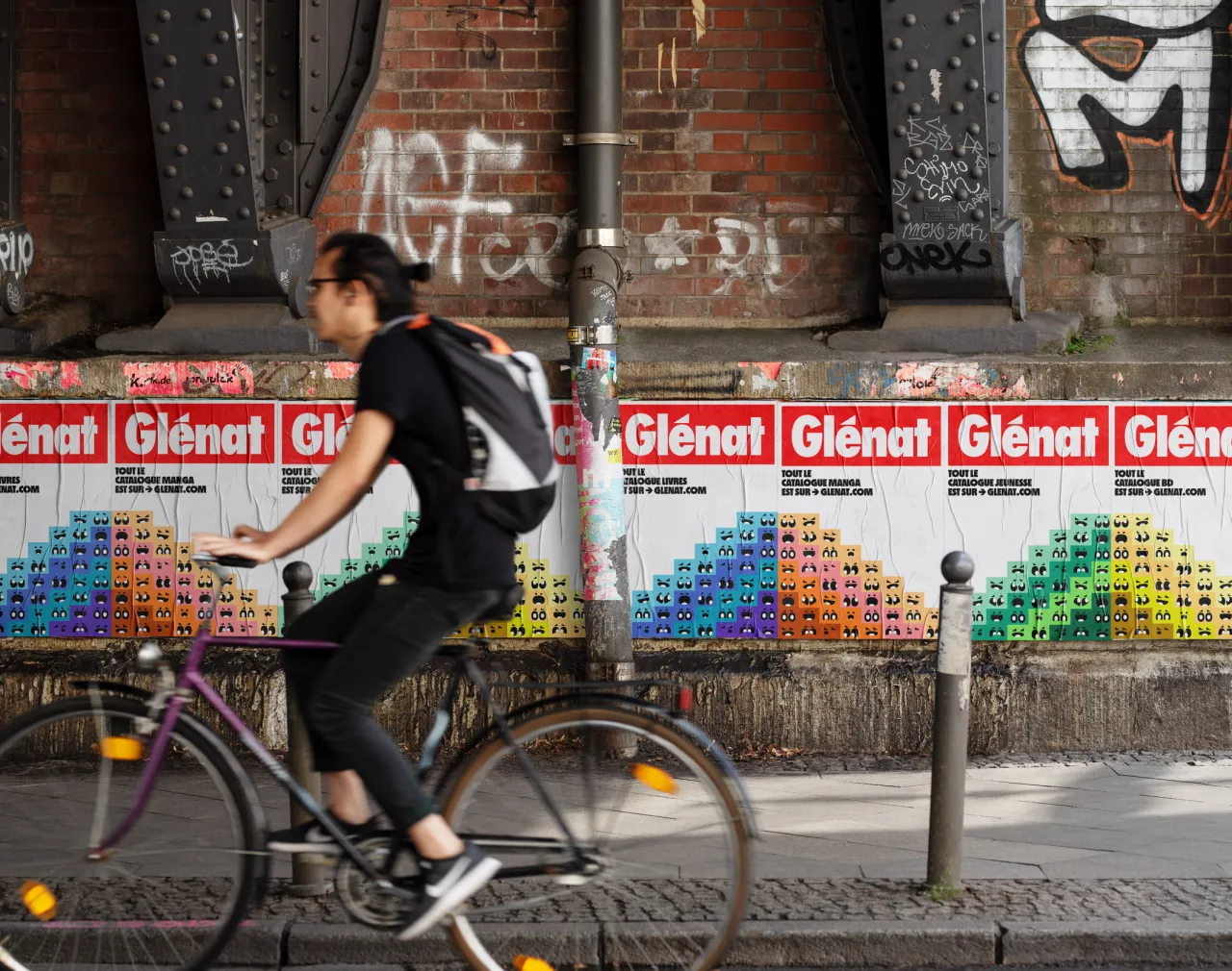
Although the system has only just started rolling out, it's already being applied across catalogues, campaigns, and events. Book covers remain the territory of individual authors and illustrators, but everything else is fair game, ranging from literary salons and festivals to social networks, including catalogues and campaigns.
"Glénat has a very good internal graphic studio, which takes over the work and will be responsible for bringing the identity to life," says Johan.
The rebrand took shape over the course of a year, with countless iterations and tests, but Johan recalls a pivotal moment when the direction clicked. "The idea for this system came very early in the process, from the first presentation actually, so when all the teams gave us their approval and felt comfortable with this very particular graphic language, we felt liberated," he says.
As Glénat continues to publish a wide range of content, from adventurous manga series to reflective non-fiction, the new identity provides a visual world that matches its literary one.
Editor's Picks





Trending






Latest Jobs
Senior Graphic Designer at MoMA Retail
Full-time·New York·$72k-$80k
Marketing Copywriter at ustwo
Full-time·London·£40k-£50k
Project Manager at A Practice for Everyday Life
Full-time·London·£37k-£46k
Head of Technical & Facilities at Midlands Arts Centre
Full-time·Birmingham·£40,210
Midweight Graphic Designer at We Are Your Friends
Full-time·London·£36k–£44k
Senior Creative Lead at Random Studio
Full-time·Amsterdam / Paris·€90k-€110k