The complete retrospective of Japan's ingenious master of three-dimensional typography
If, like John Maeda, many of you see Takenobu Igarashi as a creative legend who taught you the "ABCs of form (and life)", then prepare yourselves for the complete retrospective of the ingenious master of three-dimensional typography.
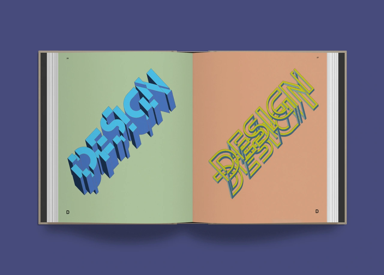
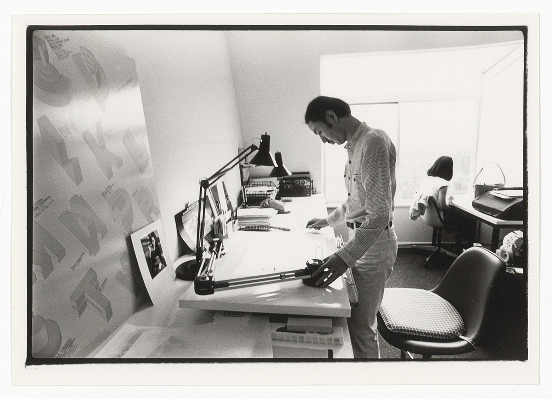
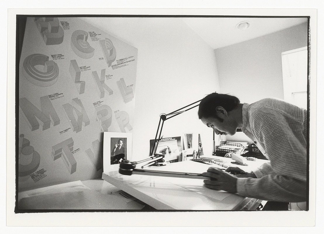
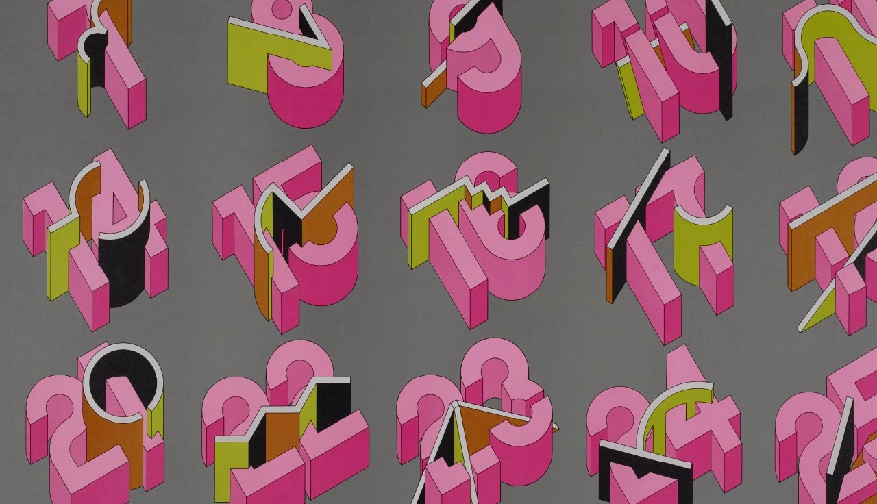
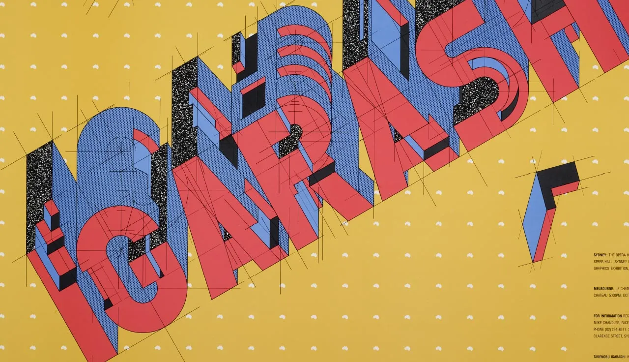
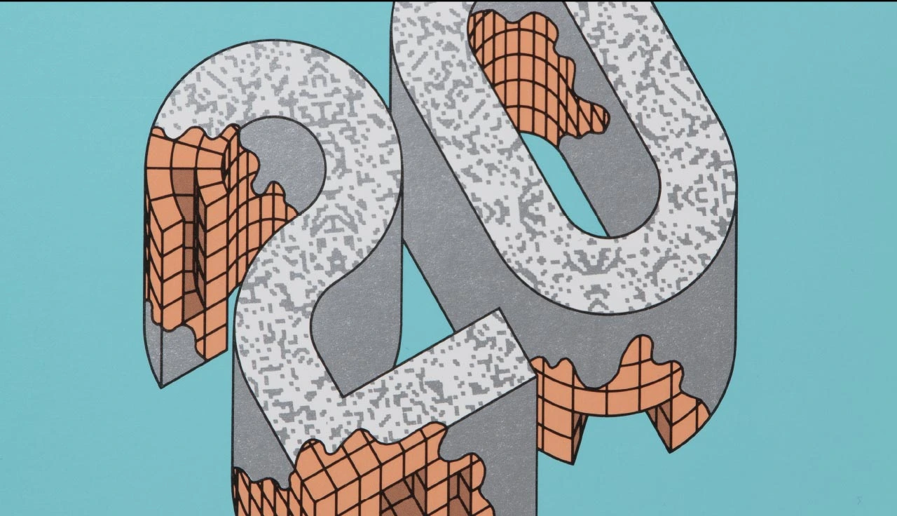
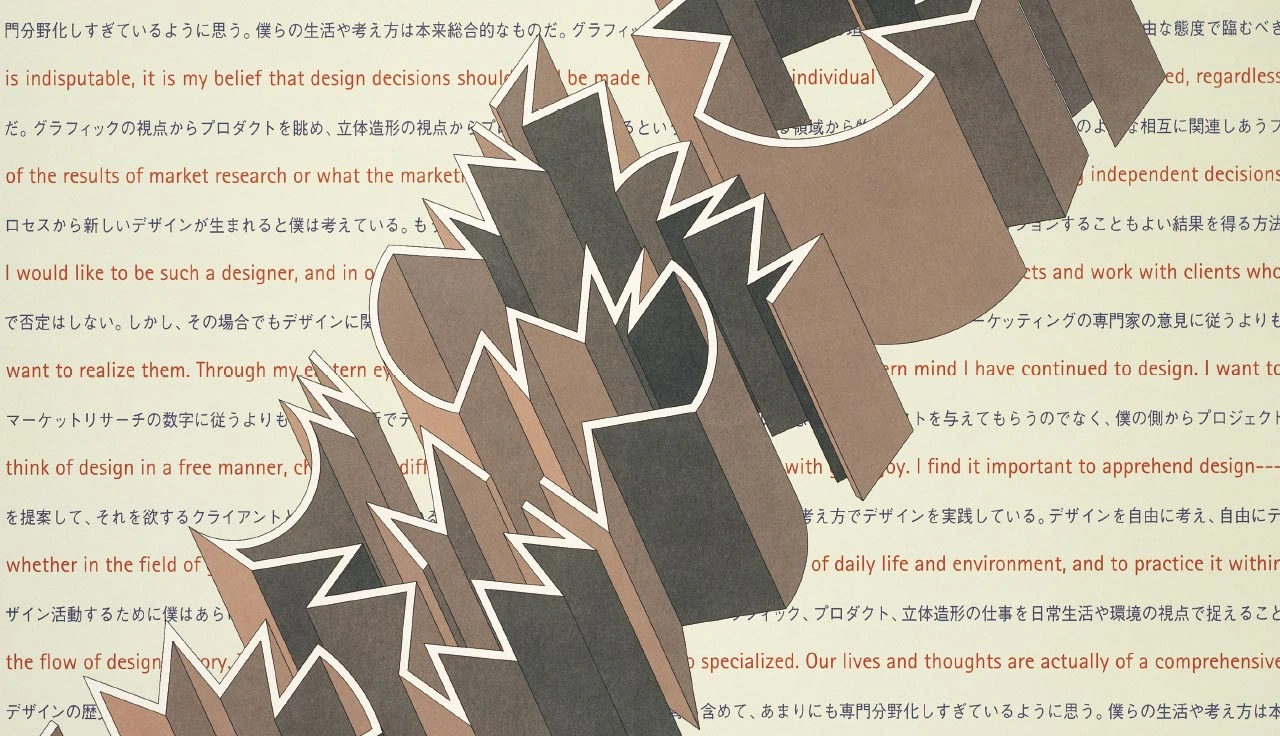
In the mid-1970s, the designer began a prolific, decade-long exploration into possibilities of 3D type with his first experiments with axonometric lettering appearing on magazine covers, posters, and record sleeves – taking influence from the avant-garde typography of the 1920s but rendered afresh as bold sculptural letterforms. It was, in fact, Graphis, the leading Swiss design magazine, that first featured his work in 1979, bringing his name to the attention of the creative community.
Timeless, arresting, and technically dazzling, Igarashi's signature style demonstrates a mastery of this field, refined long before the introduction of computers into the design industry – which makes his legacy all the more special.
"Takenobu Igarashi monumentalised type and typography when most of us were still living in Gutenberg's shadow," says graphic design historian, Steve Heller. "With his unprecedented 3D type, Igarashi created an even larger shadow that brought the old world together with the future one."
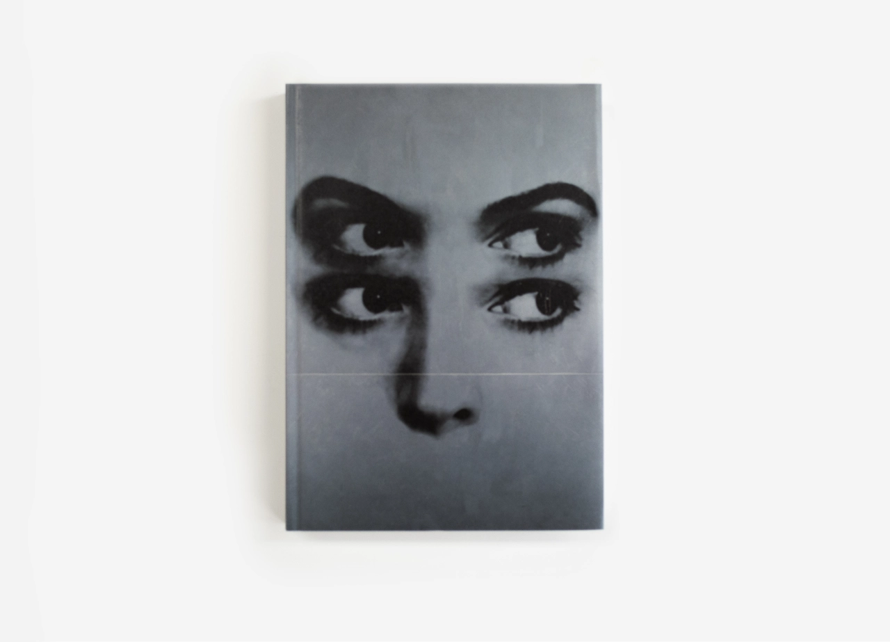
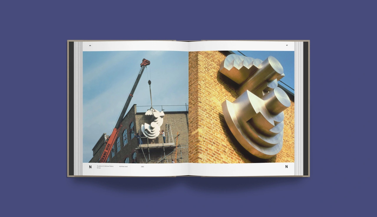
Published by Thames & Hudson, Takenobu Igarashi: A to Z offers an exhaustive guide to the man's experiments with typography, featuring not only his celebrated print and physical works – many photographed specially for this publication – but also a first look, using never before seen archival work, at the plans, drawings and production drafts behind his iconic works.
Edited by Sakura Nomiyama, a design historian for the Cooper Hewitt, Smithsonian Design Museum, the book spans early print works, hand-drawn experiments, self-initiated sculptural pieces, and high-profile 3D identities for a range of international clients – making it a long-overdue overview of one of the most revered graphic designers of the 20th century.
Beloved by designers across the planet, it was in 1994 that Takenobu Igarashi ended his 25 years in design and moved to Los Angeles to become a sculptor. He returned to Japan in June 2004 where he still produces various sculptures and reliefs for public spaces all over his home country, as well as graphic artworks.
Takenobu Igarashi: A to Z is published by Thames & Hudson and will be available from 24 September 2020. Meanwhile, find out more about Igarashi at takenobuigarashi.jp.

Editor's Picks





Trending






Latest Jobs
Account Manager at BUILDHOLLYWOOD
Full-time·London·£34k–£38k
Senior Copywriter at Human After All
Full-time·London·£48k–£66k
Senior 3D Motion Designer at Art&Graft
Full-time·London·£50k-£65k
Brand Designer, Product Launches at Figma
Full-time·New York·$127k–$269k
Account Manager at Moxie and Mettle
Full-time·Cheltenham·Up to £35k
Senior Creative Lead at Random Studio
Full-time·Amsterdam / Paris·€90k-€110k