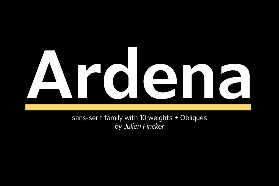
Julien Fincker releases 'pleasant and confident' modern sans-serif, Ardena
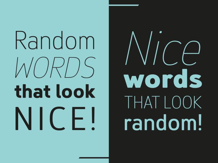
A new and modern sans-serif typeface, Ardena is the latest creation by German graphic designer Julien Fincker. Although it seems a little natural at first glance, it's a family that can be characterised as both pleasant and confident thanks to its open, rounded forms and vertical terminals.
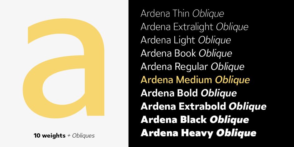
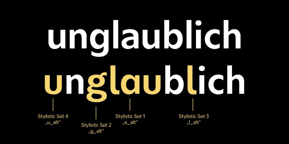
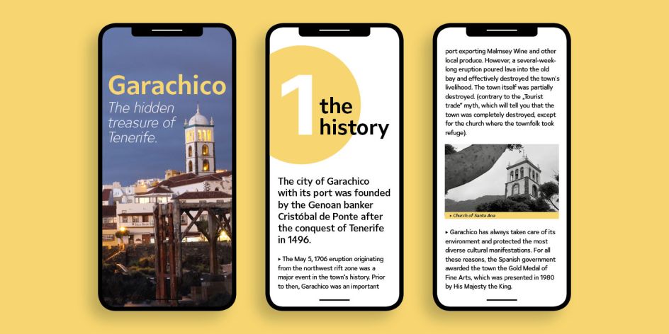
It's incredibly versatile, too. There are 20 styles overall – its thinner and thicker weights are suitable for strong headlines, while the middleweights can be used for "typographic challenges" and body text. Ardena comes complete with an extensive character collection, covering over 200 Latin-based languages. It also has an extended set of currency symbols and a range of Open Type features. Plus there are alternative characters as stylistic sets, small caps, and automatic fractions.
Ardena follows Julien's "high-contrast" serif Spitzkant, which he wanted to move away from and creating instead a "low-contrast sans serif" – one that is neutral yet flexible. "It's one of which there are already thousands, but I simply wanted to draw my own interpretation," says Julien. "One that can be used for all purposes and is well constructed. That was my primary motivation for Ardena."
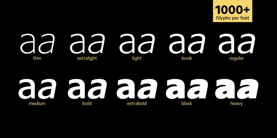
"Even neutral sans serifs can differ significantly in character. How to finish the terminals – vertically, diagonally or horizontally? Geometric or humanistic proportions, stroke width contrast, soft or tapered curves – all characteristics that can develop their very own dynamics," he adds. "Thus, not every sans serif is the same as another, as is generally claimed."
Aiming for clear legibility, Julien says that he intended to supply designers with "something more than just the classic numbers and arrows". So he drew circled and squared numbers and arrows, positive and negative. "Since these should not have to be searched for in glyph palettes, I developed a system of how these characters can be easily 'written' thanks to Open Type. A helpful tool and an easy way for users to find the appropriate characters. Only the standard ligatures have to be activated, which is the default in the most common graphics programs, such as Adobe Cloud, anyway."
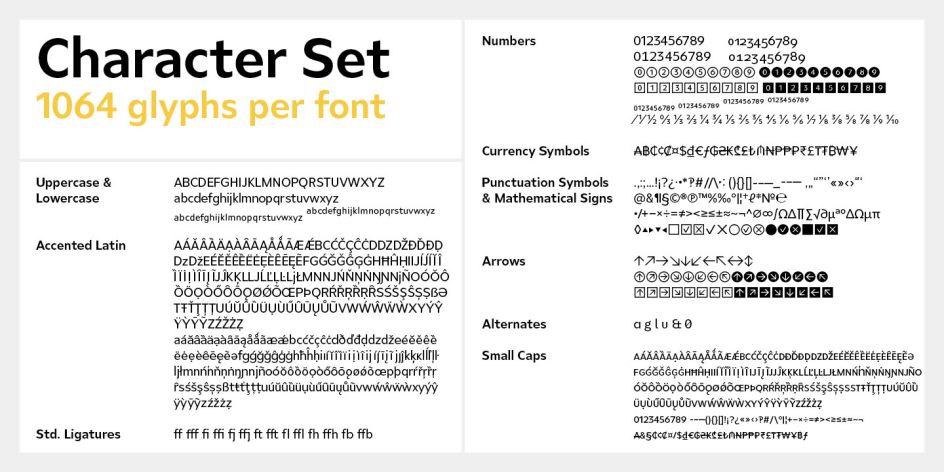
For the extensive language support – with its many currency characters, alternative characters, small caps and other features – even the much underrated Interrobang found its place. Julien's efforts resulted in over a thousand characters.
Ardena can be tested with the free Medium style and is available at a 60% reduced price at MyFonts and Fontspring until 19 March 2021.
Based in Stuttgart, Germany, Julien Fincker is a graduate of Communications and Graphic Design and has since worked for several influential agencies and companies, such as Grafisches Atelier Stankowski + Duschek. Today he's an art director at Sieber & Wolf Werbeagentur.


](https://www.creativeboom.com/upload/articles/90/908fdb6378db1e95d12595416f54e6336d5e80b8_732.jpg)


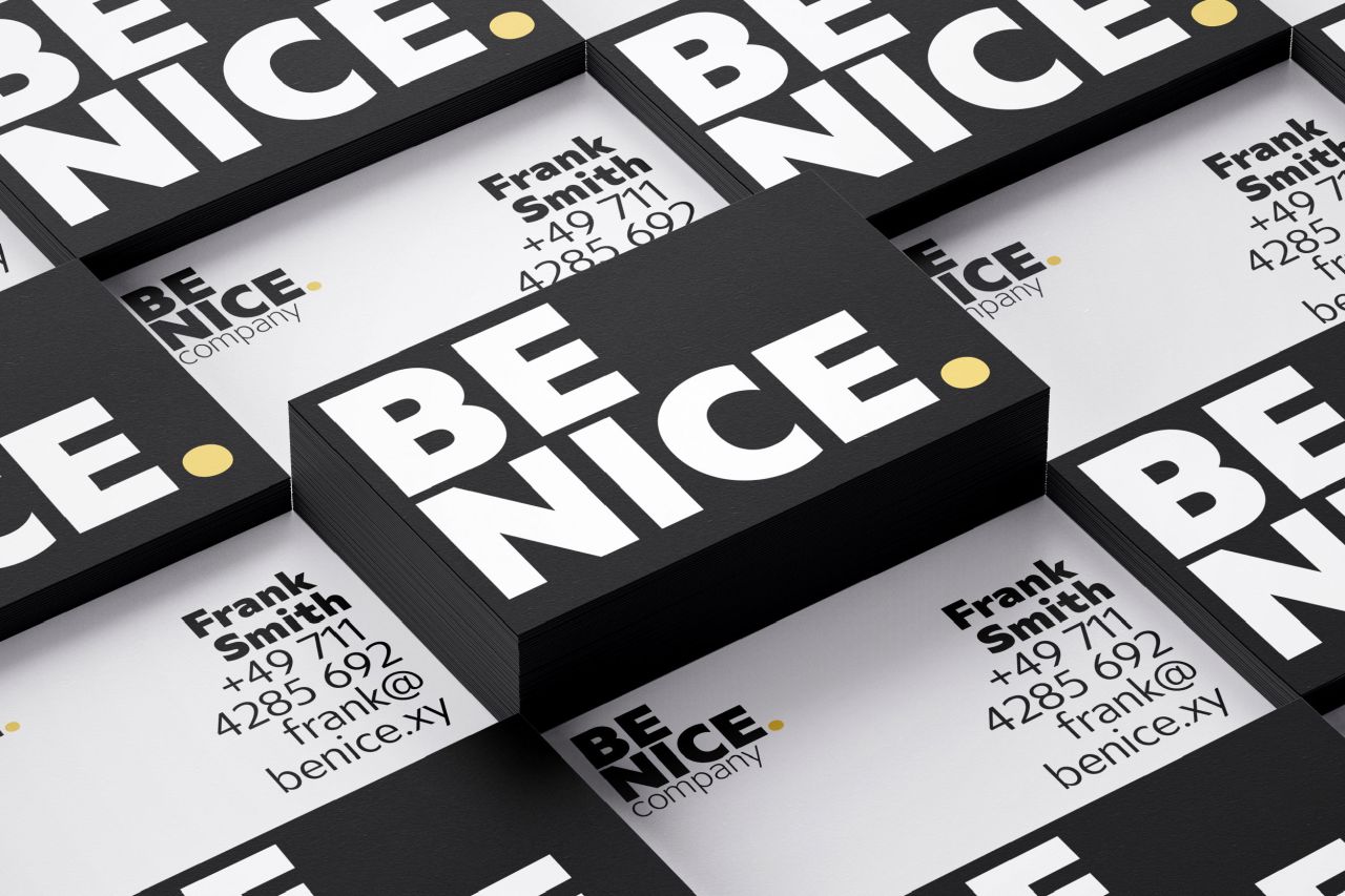
. In use by [Garbett](https://garbett.com.au/) for Career Trackers](https://www.creativeboom.com/upload/articles/0f/0f4e193ba9164073646e67421eb37b4b26986c67_732.png)