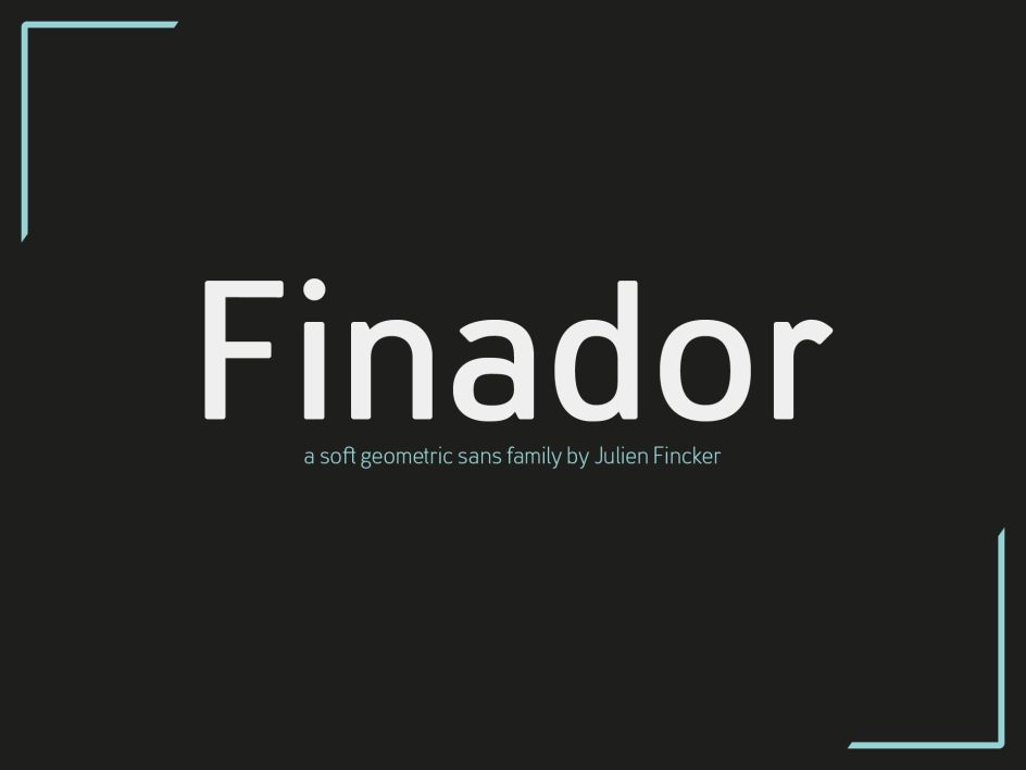
Finador: Julien Fincker's latest font family is modern, soft and geometric
Finador is a new modern, soft geometric sans font family, created by French designer Julien Fincker.
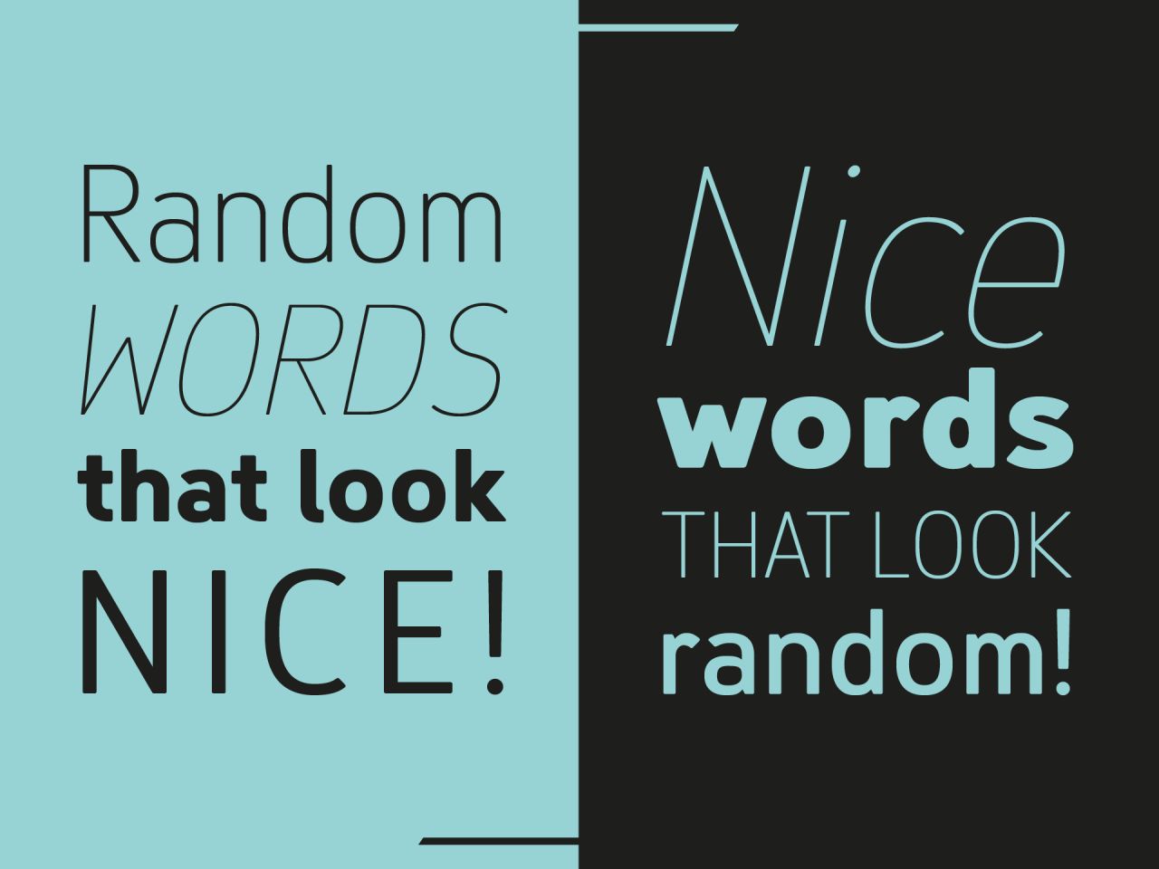
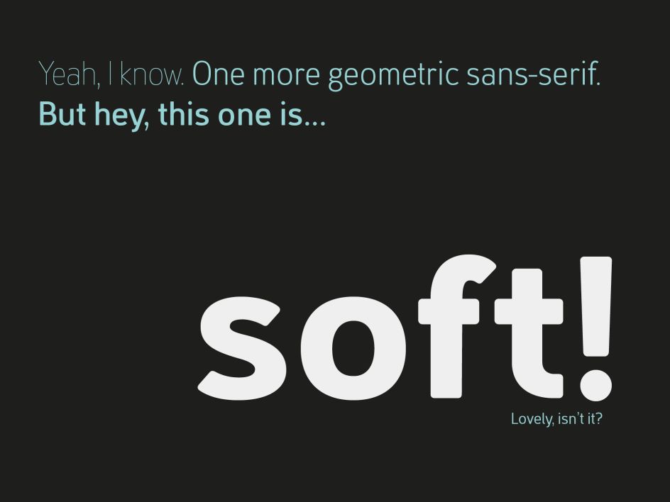
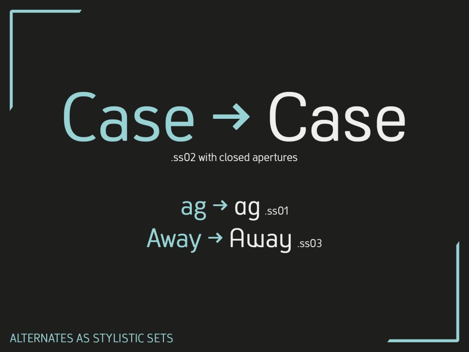
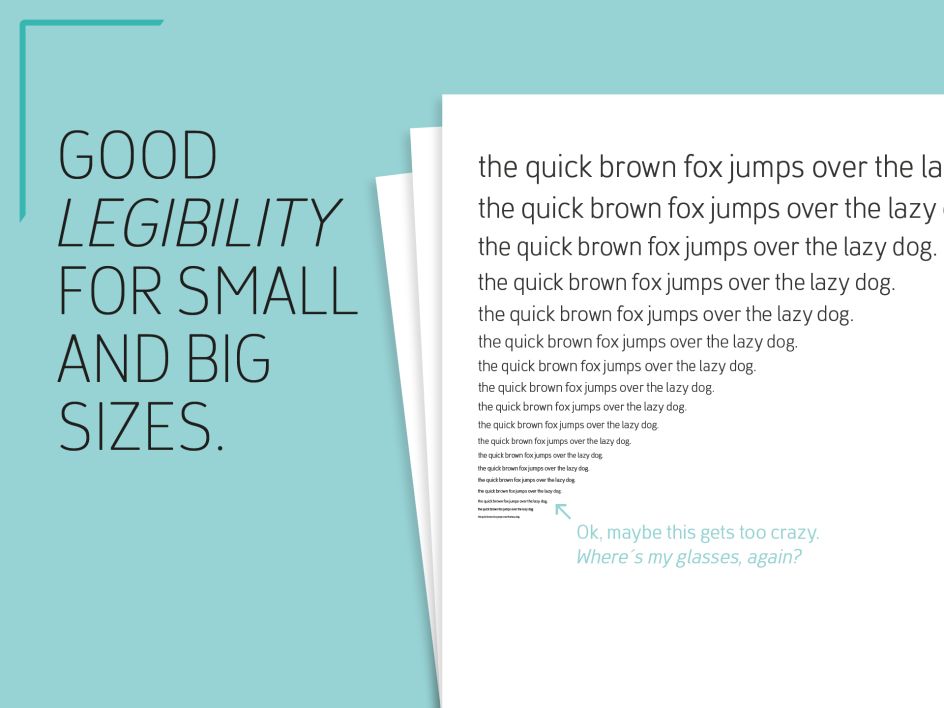
The functional style of the geometric sans has been softened by open apertures and rounded corners, making it functional and friendly.
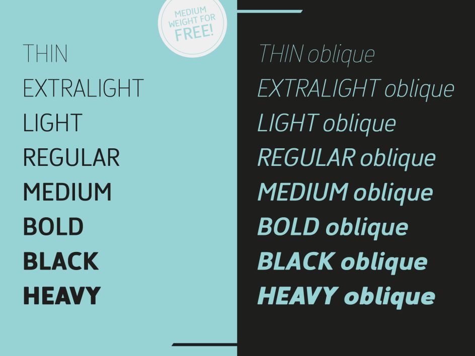
While the default version has open, modern apertures, Stylistic Set 2 includes the whole set of letters with closed, classic apertures, offering a slightly different look. "It's like having a second font in just one font," explains Julien, "so it's up to you to choose the right look for your projects."
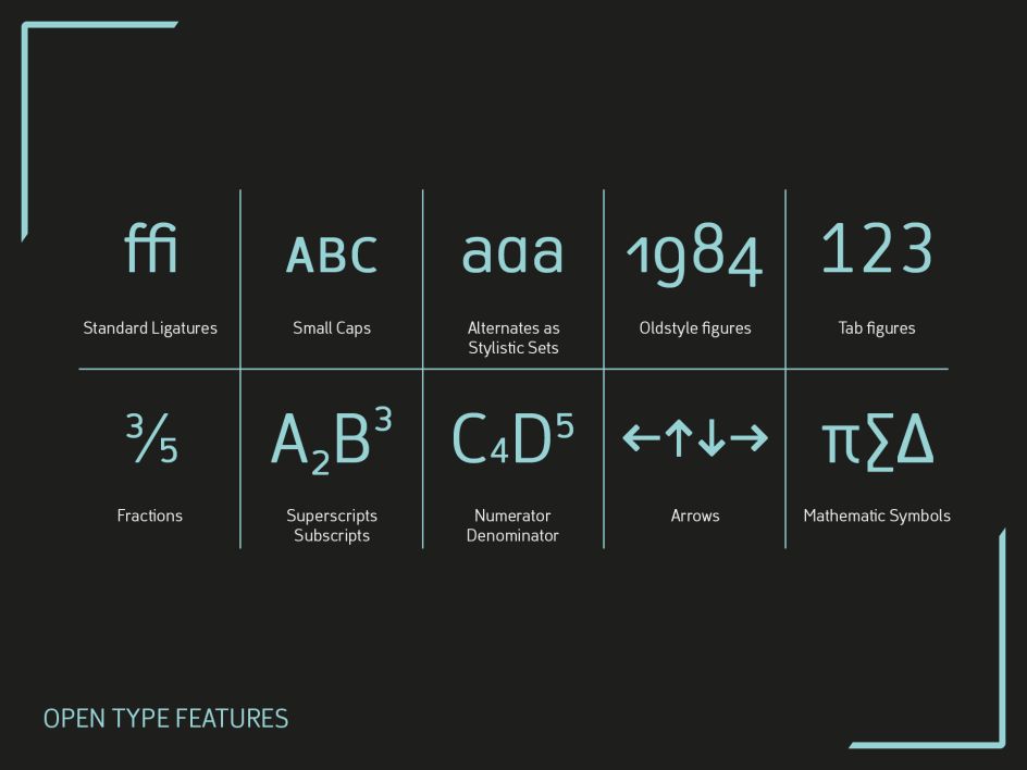
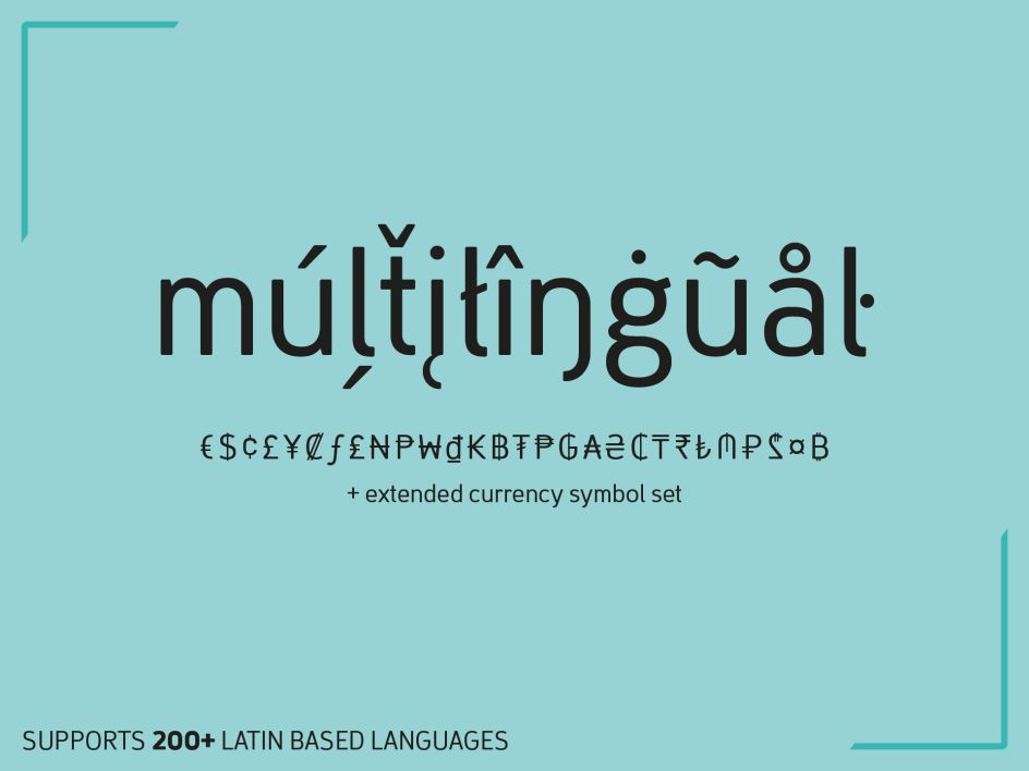
The Finador family includes 8 weights, from thin to heavy and their matching italics. With 900+ glyphs per style it supports over 200+ Latin-based languages, includes an extended currency symbol set and a lot of Open Type Features like small caps, ligatures, fractions, alternates and many more. The lightest and boldest weights are good for display usage, while the middleweights can also be used for body text.
As a versatile allrounder, Finador supports almost every one of your needs. It has the ability to become your next favourite workhorse family. Just give it a try. The Medium weight is free. Finador is available at MyFonts and Fontspring.


](https://www.creativeboom.com/upload/articles/90/908fdb6378db1e95d12595416f54e6336d5e80b8_732.jpg)