18 highly respected type foundries that remain fiercely independent
Smaller and leaner typeface companies sometimes fly under the radar but often have the best fonts, so they're well worth checking out. We list 18 amazing indies every designer should know.
Image courtesy of Order
In a digital world, where thousands of amazing fonts are at our fingertips, it's often easy to take for granted what we have. And yet any type designer knows a good typeface takes great talent and hard work to create and can sometimes require years of inspiration and perspiration to take form.
If the type industry was simply dominated by a few massive players, we'd worry that things would get stale, and those corporations would merely focus on wringing extra profit out of existing typefaces. Thankfully, that's not the world we live in. Instead, an army of fiercely independent type foundries is constantly innovating and developing new fonts, meaning that even the largest players have to compete in kind.
Happily, this means designers have an impossible range of options, allowing them to bring their visions to life in the most original and imaginative ways. But that wouldn't be possible without the indies, so in this article, we pay tribute to some of the best standard-bearers for inventiveness and excellence in type design from around the world.
Before we get started, though, please note that this is not a ranking: we list these font foundries – some big, some small – in no particular order. All of the inspirational indies we've featured below are worth supporting, and all could potentially provide the killer font you need to bring your design projects to the next level.
1. Just Another Foundry, Garching, Germany
Founded in 2004 by type designer Tim Ahrens and typographer Shoko Mugikura, Just Another Foundry is a German type design studio based in the Bavarian town of Garching. Their notable work to date has included JAF Herb, a new take on the German blackletter tradition, and the sans-serif superfamily JAF Bernini Sans, a 2012 TDC2 winner. They're also known for their work on custom and customised type design projects for Crown Equipment Corporation, OECD and Seiko Watch Corporation.
Our font of choice: JAF Cupidus
JAF Cupidus is notable for its extremely high x-height. It's an evolution of the foundry's earlier rounded sans, JAF Domus, in which they made the counter spaces as even as possible to give the typeface a sense of calm and space. In Cupidus, they've extended this concept to vertical directions, which reduces the hierarchy between upper and lowercase letters. While originally designed as a display face, Cupidus also can work well in text sizes.
JAF Cupidus by Just Another Foundry, Garching, Germany
2. Village, New York, USA
Village is a type co-op: a union of type foundries, scattered around the world, who've decided to go it alone, together. Its members include Blackletra, Constellation, Feliciano Type Foundry, Incubator, Klim, LuxTypo, MCKL, Schwartzco, Sharp Type, Type Supply and Urtd. Registered in New York, www.vllg.com is the information channel and boutique storefront for this group of equals.
Our font of choice: Ofelia
Ofelia is a versatile family of geometric sans fonts available in two optical sizes, Text and Display, and boasting just the right amount of personality. The Text family contains five weights ranging from Light through Bold. The overall geometric character speaks in a contemporary neutral voice while earmark glyphs ('a', 'f', ',') provide a gestural touch. The fonts are equipped with small caps, old style and tabular figures, as well as alternate versions of 'a' and 'l'.
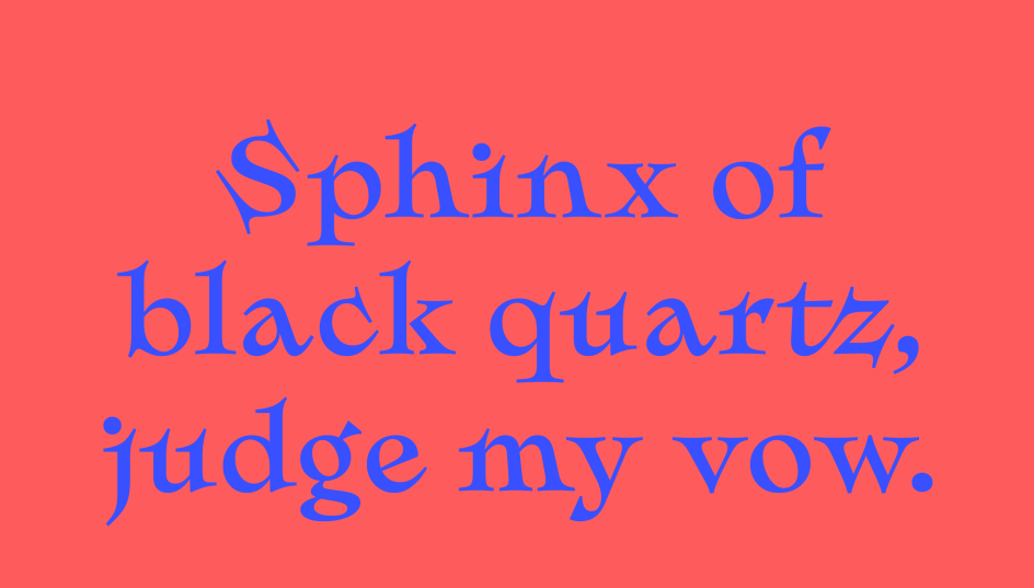
3. Order Type Foundry, Brooklyn, NYC, USA
Founded in 2017, Order is a New York-based design office by Hamish Smyth and Jesse Reed (read our interview with Jesse to learn more). Last December, it launched its own eponymous type foundry, which serves as a distributor for new type designers. It is focused on presenting experimental, practical, research-based families such as Pastiche Grotesque and Plebeian, created by Benjamin Tuttle.
Our font of choice: Etude
Etude is a stencil typeface inspired by the study of type design and experimental music techniques. The name comes from the French verb 'étudier' (to study). The design evokes a broad nib pen, the history of handwritten music notation, and the influence of Jean-Pierre Rousselet's constructed stencil forms. You can learn more about the font in this news article.
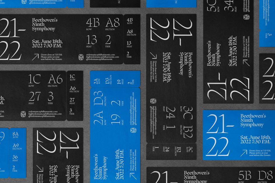
Etude by Order
4. Dalton Maag, London, UK
Dalton Maag is an independent type design studio based in London and comprises a global team of 40 type designers, font developers, creative directors, software engineers and support staff. They're best known for their headline-grabbing type creations for Rio 2016, Google, Amazon, Intel, and Nokia. But they also partner with smaller clients on a range of services, including logo refinements and font modifications, as well as small, medium, and large bespoke custom fonts.
Our font of choice: Jazzier
Jazzier is a contemporary take on the decorative metal display type of the late 19th century. These traditional features have been exaggerated and embellished, and the inclusion of multiple alternate glyphs provides creative breadth. The result is a typographic tone that feels highly familiar but elegantly irreverent. With over 850 glyphs, Jazzier is a good choice for book design, contemporary art exhibitions, music artwork and merchandise, and a wide range of packaging applications.
Jazzier by Dalton Maag, London, UK
5. Commercial Type, New York, USA and London, UK
Based in New York and London, Commercial Type is a digital type foundry producing original typefaces for commission and retail. It's a joint venture between Paul Barnes and Christian Schwartz, who've collaborated since 2004 on various typeface projects, most notably the award-winning Guardian Egyptian. They've also been honoured by D&AD and the Design Museum's 'Designer of the Year' prize.
Our font of choice: Orleans Bold
Designed in 2016 by Paul Barnes, Orleans is a crisp sans-serif display face that explores the handmade traditions in letterforms created with broad nibs, such as Blackletter, but also draws upon the rich tradition of calligraphic sans. It was originally drawn for the German edition of frieze, although the magazine closed before the redesign was implemented. The typeface was further developed with the help of Tim Ripper into seven weights with accompanying italics and received its full release in 2021.
6. Klim Type Foundry, Wellington, New Zealand
Klim Type Foundry was founded by Kris Sowersby in 2005 and is based in Wellington, New Zealand. Their typefaces combine historical knowledge with rigorous craft, and they've designed custom fonts for The FT, PayPal and National Geographic. Their work has also appeared in Apple's operating system, from macOS Catalina 10.15.4, and they've won awards from many organisations, including the ADC and TDC.
Our font of choice: Domaine
Domaine is a sharp, elegant serif that blends traditional French and British genres into a contemporary aesthetic. Its curvaceous Latin detailing centres upon gently bracketed triangular serifs, complemented by distinctive hooked terminals. Horizontal head serifs provide a calm, stable ground for the figurative detailing to shine, and the italics are inspired by Deberny & Peignot's Labeurs Ordinaires Série.
Domaine by Klim Type Foundry, Wellington, New Zealand
7. Grilli Type, Lucerne, Switzerland & New York, USA
Graphic designers by training, Noël Leu and Thierry Blancpain founded Grilli Type in Switzerland in late 2009 as a collaborative avenue for working with other designers. But while they're Swiss, they're not neutral. In contrast, they make type with a point of view, type that conveys meaning beyond the words it spells out. The studio now numbers seven, with colleagues dispersed across the globe.
Our font of choice: GT Pressura
Drawing inspiration from conceptual art and Constructivist aesthetics, GT Pressura uses the visual gesture of ink spreading under pressure as a stylistic device, bringing the warmth of analogue print into the digital space. Marc Kappeler and Dominik Huber originally designed it for a book about conceptual art in the former Soviet Union. The font was first released in 2012, followed by Cyrillic language support in 2017. This 2022 update is a Swiss Style take on the typeface: grid-driven, polished, and charismatic.
GT Pressura by Grilli Type
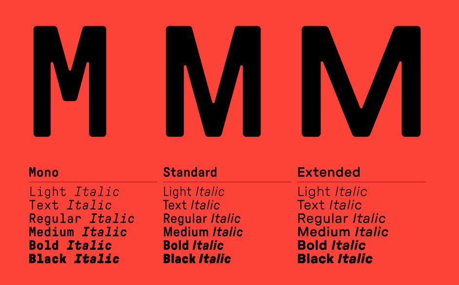
8. Mark Simonson, Saint Paul, MN, USA
American type designer and font developer Mark Simonson has been thinking about and drawing letters for as long as he can remember. But he didn't make fonts full-time until he was well into his forties, so he's something of a late bloomer. Importantly, he sees fonts as tools for making things rather than ends in themselves. "My attitude about licensing reflects this," he notes. "So you won't find restrictions in my licence about using my fonts in logos or on t-shirts."
Our font of choice: Proxima Vara
Proxima Vara (2021) is a variable version of Mark Simonson's popular Proxima Nova type family – a hybrid that combines modern proportions with a geometric appearance and bridges the gap between typefaces like Futura and Akzidenz Grotesk. In a single font file, it contains all the weights and styles of Proxima Nova, plus any style between them, along any of three dimensions (weight, width, and slant), without the distortion that comes with artificial manipulation such as squeezing, stretching, or slanting.
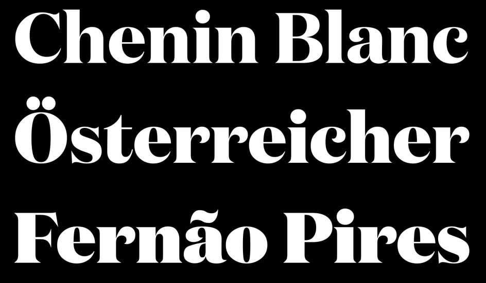
9. Colophon, London, UK and Los Angeles, USA
Founded in 2009, Colophon is an international, award-winning type foundry based in London and LA that creates, publishes, and distributes high-quality retail and custom typefaces for analogue and digital media. In tandem with its own designs, the foundry hosts original typefaces drawn by influential practitioners from varied design disciplines.
Our font of choice: Brick
Brick's foundations lie in the signage of three prominent pubs in London's East End: The Jolly Butchers (Brick Lane; now closed), The Royal Oak (Columbia Road), and The Prince Albert (Acton Street). Referencing their Art Deco traits, with a trace of Art Nouveau heritage, Brick is Fermín Guerrero's re-interpretation and continuation of the vernacular's elegant gestures brought into the 21st century. Available in five weights across two optical sizes, this font is available in both Standard and Professional versions.
10. Okay Type, Chicago, Illinois, USA
Jackson Showalter-Cavanaugh was working as a graphic designer with great clients and diverse projects but eventually realised he was only really interested in letterform-related assignments. So he started Okay Type in 2009 as a small typeface design studio. His debut font, Alright Sans, was named one of the best typefaces of 2011 by Communication Arts, and he hasn't looked back since.
Our font of choice: Okay
Drawn by Eric Gill in 1932, Gill Kayo was different enough from the rest of the Gill Sans family to deserve its own family entry. Okay began as an attempt to answer the question: "What if Gill Kayo didn't look so dumb?" This extra-bold, kind-of-humanist display sans has a dry, sarcastic wit, has multiple widths and boasts an alternate set of shorter extenders. A versatile family that's good for setting punchy and warm headlines.
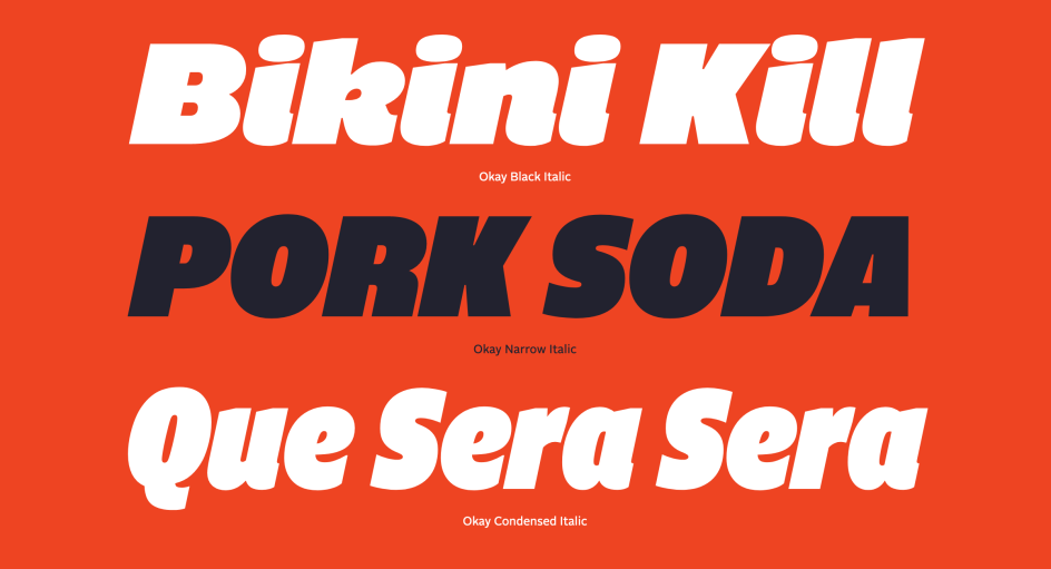
Okay by Okay Type, Chicago, Illinois, USA
11. HVD, Berlin, Germany
Founded in 2002 by Hannes von Döhren, a young graphic designer with a passion for letters, HvD is known for a balanced array of playful and professional typefaces, including FF Mark, Pluto, Reklame Script and Brandon Grotesque, as well as bespoke type design projects for Lufthansa, Volkswagen, Hyundai and Wal-Mart. They've received several design awards, including the iF Award, the Red Dot Award and the Certificate of Excellence in Type Design from the Type Directors Club NY.
Our font of choice: Match
Starting with initial sketches in 2017, Hannes von Döhren wanted to create a typeface based on a simple idea: standing compact with self-confidence. Consequently, the Match family was developed on a grid, and the constructed design has a reduced and precise appearance. The shapes are optically corrected and follow micro-typographic rules; the stroke endings are all either vertical or horizontal (letting the typeface appear organised); and the curves are drawn with a higher curve tension than other geometric typefaces (to achieve a super compact look, making words look like logos). These tricks lead to the appearance of smaller white spaces and more compact words.
12. Type Together, Prague, Czech Republic
Established in 2006 by Veronika Burian and José Scaglione, TypeTogether is an independent, cosmopolitan type foundry based in Prague that creates text typography for intensive digital and print editorial use. They're known for creating cross-platform, OpenType fonts of recognised aesthetic and technical excellence, which perform well in continuous reading and span many languages and scripts.
Our font of choice: Atlante Font
Atlante is that rare thing: a typeface that's both emotional and a 'serious serif'. Conventional but excessive (in all the best ways), it includes display and text versions, a tenacious italic, and more swashes, alternates, and ligatures than the average font family can muster.
13. Lineto, Zürich, Switzerland
With its name borrowed from Adobe's PostScript page description language, Lineto is a Swiss type foundry founded by Cornel Windlin and Stephan Müller in 1993. First and foremost, they see type design as an artistic domain, albeit one exposed to the many challenges of ever-changing technology. Their long list of clients includes Spotify, Airbnb, Google, Logitech, HP, Dell, Toyota, Nike, Adidas, the BBC, Eurosport, and Playboy Magazine, to name but a few.
Our font of choice: Ruder Plakat
Ruder Plakat is the latest version of a classic font originally designed by Emil Ruder (1914-70), an iconic typographer of the Swiss Style, with the help of students at Allgemeine Gewerbeschule Basel (AGS) in the early 1950s. In the 21st century, typography teacher Hans-Christian Pulver pulled the designs from the archive and began to develop them digitally. At Lineto, Pulver's drawings were further reworked and expanded by Arve Båtevik, adhering to contemporary principles of type design.
Ruder Plakat by Lineto
14. A2-Type, London, UK
A2-TYPE is a type foundry set up by London-based design studio A2/SW/HK. The foundry launched in 2010 with a selection of 15 fonts specially created for print, screen and environmental use. It's headed up by Scott Williams and Henrik Kubel, both members of Alliance Graphique Internationale (AGI), and has been recognised with type design awards from TDC in New York, D&AD and Tokyo Directors Club.
Our font of choice: Popular
Popular is a modern sans with contrast. The design was inspired by a printed specimen page from the Barnhart Bros. & Spindler Type Founders specimen No. 9, published in 1907. Formerly known as 'Lining Gothic Number 111', the revised version was created in a single weight with no italic style, and its subtly contrasted letters combined with condensed appearance make for a contemporary look. It's well suited to setting headlines and also a contender for sophisticated text settings where space is important.
15. F37, Manchester, UK
F37 Foundry is an award-winning type foundry based in Manchester that understands the minutiae of letterform aesthetics and creates fonts and logotypes to help businesses stand apart. They're well known for fonts such as Bella and Ginger, which are infused with an aesthetic twist that sets them apart from the crowd and have been licensed by the likes of Selfridges, Moonpig and PepsiCo.
Our font of choice: Pythia
F37 Pythia is undeniably a grotesque sans font, but some of its quirky, mannered component parts seem to be from another place altogether, adding a healthy sense of liveliness and unpredictability. There are, for instance, extravagant flourishes on the 'a', 'g', 'k' and 'y', where the terminal arches close in on themselves, creating intriguing, characterful handwriting-like forms. Also, check out the 'c', 'e', 'f', 's' and 't', where the arches are longer than usual, many with a distinctive overbite.
Pythia by F37, Manchester, UK
16. Process Type Foundry, Minneapolis/St. Paul, Minnesota, USA
Established in 2002, the Process Type Foundry is a partnership between type designers Nicole Dotin and founder Eric Olson. Located in Minnesota, they publish original typefaces for retail sale, as well as create custom fonts for clients of all sizes.
Our font of choice: Maple
A grotesque sans serif available for desktop, web, and mobile apps, Maple is an evolution of Process Grotesque, the foundry's retired interpretation of the Stephenson Blake grotesques, originally released in 2002. It's characterised by exaggerated lowercase incisions, irregular stroke terminations, and an overflowing black weight.
17. Typotheque, The Hague, Netherlands
Launched in 1999, Netherlands-based type design company Typotheque is a world languages expert, developing modern and authentic fonts for the majority of languages. In October 2009, they became the first type foundry to introduce the concept of web fonts. Their typefaces are mostly designed by founder Peter Bil'ak, including the popular Fedra Sans and Fedra Serif families, and notable clients include the Mozilla Foundation.
Our font of choice: Bara Grande
Inspired by the carved, incised metal types of the Dutch Golden Age, Bara is narrow and elegant and defines a new all-purpose text family while preserving some particularities of the original metal type. At text sizes, Bara provides a pleasant, slightly darker texture, while at larger sizes, it draws attention to warm, unorthodox details, such as the abruptly ended strokes of 'e' and 'c'.
18. DSType Foundry, Porto, Portugal
Founded in 1994, independent type foundry DSType has worked with some of the world's leading companies and publications to create high-quality typefaces. They've received numerous awards, including the Type Directors Club's Certificate of Excellence in Type Design. And you'll be able to see their work on newsstands, packaging, brands and events across the globe.
Our font of choice: Breve News
Breve is an editorial font that's simple, forceful and contemporary. All the fonts in this superfamily share the same structure, both in terms of anatomy and functionality. The text versions provide a soft and warm feel, while the Title versions are distinguished by non-descending letterforms, making the headlines much more uniform and interesting. The News version is more classic, with ball terminals and classic proportions, while the Display consists of extra-black, ultra-contrasted fonts.
Breve News by DSType Foundry, Porto, Portugal