
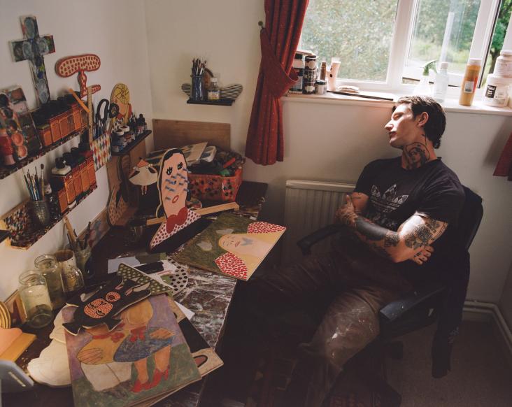
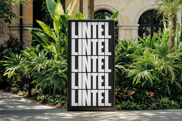
Port Magazine 2018 by Lena Karoline Weber & Tamara Knapp. Demonstrating Maelstrom by Klim
No Halloween-themed project is complete without some scary, spooky lettering to bring your designs to life (or should that be death?). And there are plenty of fonts out there on a horror theme.
But you don't want to go too cheesy, lest you reduce your creative work to the level of Microsoft clip art. Instead, you want sophisticated, high-quality typefaces that nonetheless convey the right level of dark drama and supernatural sensation.
To help you out, we've unearthed some earth-shattering fonts from various first-class foundries. All of these typefaces have the chops to summon the spirit of 31 October but also have the flexibility and broad appeal that can be used through the rest of the year too.
1. JAF Herb by Just Another Foundry
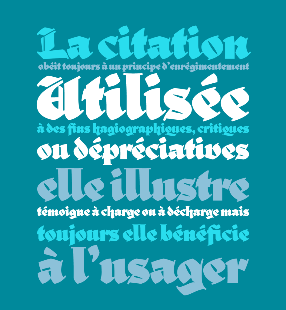
Perfect for spooky ghost stories, JAF Herb is based on 16th-century cursive broken scripts and printing types. Originally designed by Tim Ahrens, it features connecting letterforms that are rather tightly spaced. The idea was to develop a typeface with the properties of Blackletter without evoking any negative connotations. The design retains the complex, humane character of fraktur without appearing conservative, aggressive or intolerant.
AF Herb by Just Another Foundry
2. Specter by MCKL
On its homepage, Specter uses the story of Hamlet as its sample text. And this constructed geometric sans, whose letterforms seem to resemble cut paper laying on top of each other, seems perfect for typesetting murderous tales of times gone by. Originally developed as a custom typeface for design firm Knock, Inc and inspired by Granby, Metro, and Tempo, its 90° sheared terminals allow for tight typesetting.
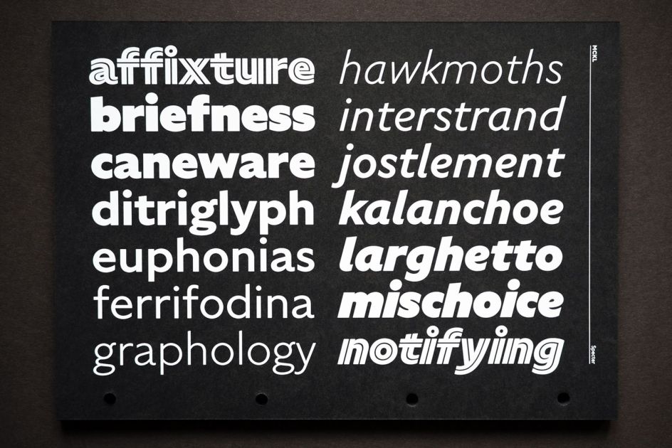
Specter by MCKL
3. Lucifer by Nguyen Gobber
Lucifer has a menacing appearance with sharp, expressive serifs and an overall organic look. It was inspired by the hand-lettering of Swiss designer Robert Stöcklin in his poster for the Schweizer Mustermesse Basel in 1924. Its expressive aesthetic excels in wordmarks, headlines, and poster designs. It works well in running text, too, making it a great workhorse for all occasions.
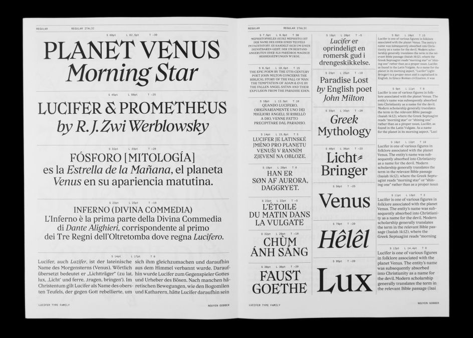
Lucifer by Nguyen Gobber
4. Widescreen by Dalton Maag
Widescreen was originally designed for a fictional company that, in the words of creators Dalton Maag, "outwardly looks benevolent but ultimately has a dark side". At first glance, it's a traditional sans serif with an Art Deco feel. Yet below the surface, it has an alter ego; an ultra-wide, almost Brutalist design hidden at the other end of its variable font width axis.
Widescreen by Dalton Maag
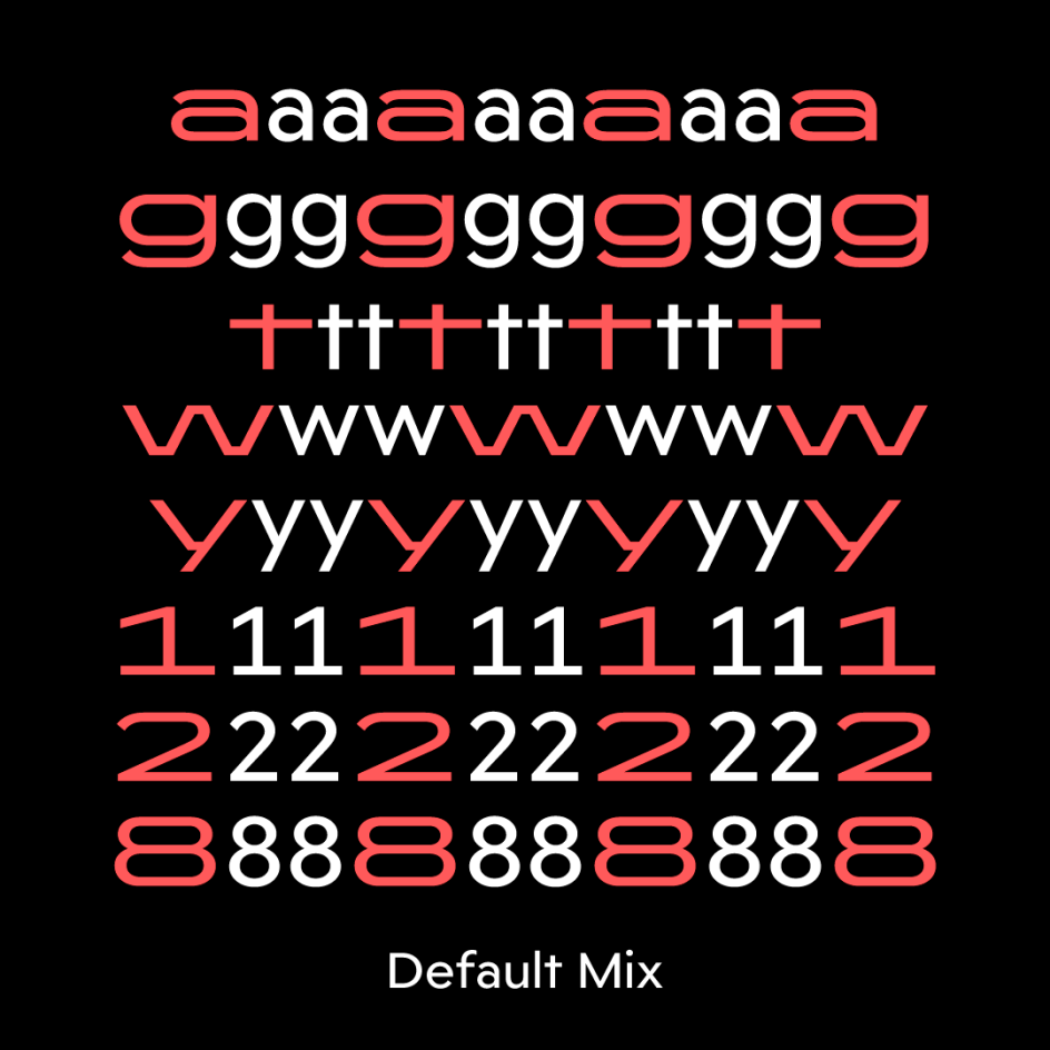
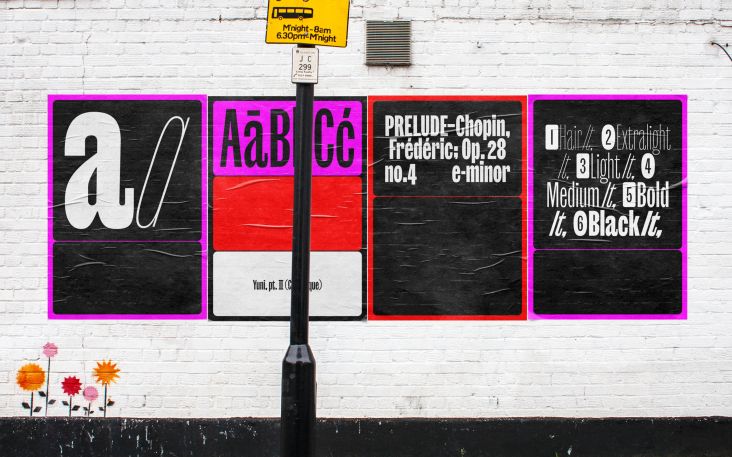
5. Maelstrom by Klim
There's a perverse charm to Maelstrom that makes it perfect for any Halloween project. This reversed-stress typeface's razor-thin spacing is striking, forming narrow strips of light sparkling through the black mass. Meanwhile, its companion font, Maelstrom Sans, offers a similarly uneasy mix of heavy horizontals and spindly diagonals that make it feel fragile like it could splinter at any moment.
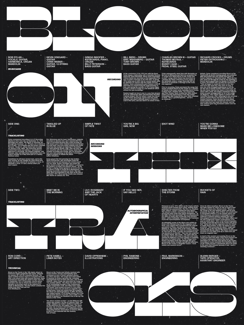
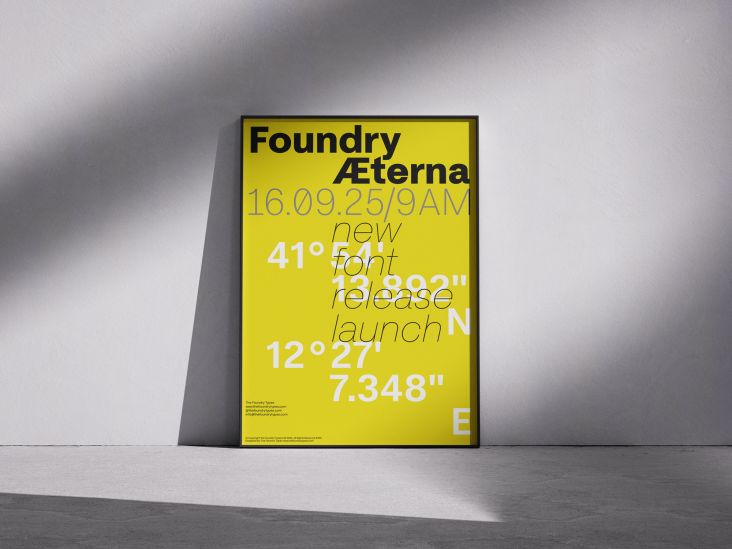
Blood On The Tracks by J. Rieger, using Maelstrom by Klim
6. Hades by DSType
Hades is a dark, contemporary blackletter for short, eye-catching headlines. Designed by Dino dos Santos and released in 2012, its incised forms and dynamic angles make for the kind of dramatic impact that instantly summons the spirit of the underworld. Open type features include fractions, standard ligatures and discretionary ligatures.
Hades by DSType
7. CWM by A2-TYPE
Infused with the spirit of totalitarian terror, CWM by A2-TYPE was inspired by the typography, poster design and printed ephemera from the Cold War era. It was created in 2008 as the principal typeface for 'Cold War Modern: Design 1945–1970', a catalogue published by the V&A Museum in London. The font has since been updated with the addition of two contrasting weights.
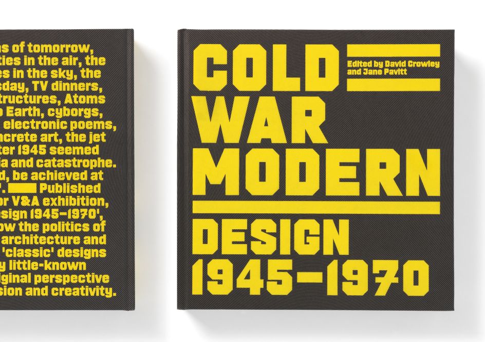
CWM by A2-TYPE


 using <a href="https://www.ohnotype.co/fonts/obviously" target="_blank">Obviously</a> by Oh No Type Co., Art Director, Brand & Creative—Spotify](https://www.creativeboom.com/upload/articles/6e/6ed31eddc26fa563f213fc76d6993dab9231ffe4_732.jpg)