Top 10 Helvetica alternatives for graphic designers
Looking for a clean and neutral font that isn't Helvetica? We've scoured the foundries and type shops to find some top contenders for your design projects.
](https://www.creativeboom.com/upload/articles/1b/1bafd6401df7c7b55c0632369cb360a7832e3014_1280.jpg)
Univers type poster by designer Rokaya Shenasa
Helvetica is one of the best-known and most-used fonts in the history of modern typography. Originally called Neue Haas Grotesk, the sans-serif, neo-grotesque typeface was designed by Swiss designers Max Miedinger and Eduard Hoffmann in 1957. And it quickly became one of the most popular typefaces of the mid-20th century.
Like the Swiss nation itself, designers loved its neutrality, making it almost infinitely adaptable for all kinds of projects. Some of the most recognisable uses of Helvetica have been on US tax forms, EU warnings on tobacco products, and in wordmarks, including American Airlines, BMW, Sears, Microsoft, Panasonic, Target and Verizon.
Helvetica has also been widely used in road and railway signage, from the UK and USA to Japan and South Korea. There's even been a popular film about it. And since the dawning of the digital age, it's been ubiquitous on software, apps and websites everywhere.
But given this widespread use – which has been criticised as overuse by leading typographers such as Erik Spiekermann – designers will often seek an alternative to Helvetica to avoid their work looking too samey and predictable.
In the list below, we've brought together ten such alternatives. All of these provide the same clear, unfussy neutrality of Helvetica but with a different visual twist to help give your designs a more distinctive look.
1. Open Sans by Steve Matteson
Open Sans is a free, open-source, humanist sans serif, designed with an upright stress, open forms and a neutral yet friendly appearance. Created by Steve Matteson of Ascender Corp, it's been optimised for print, web, and mobile and has excellent legibility (it's especially wonderful in smaller sizes). The complete 897 character set includes Latin, Greek and Cyrillic character sets, and since 2021 it's been available as a variable font family.
](https://www.creativeboom.com/upload/articles/73/73d2f678fd6898a84a8117c5f79082d2f056a27e_944.png)
By Wikipedia User:Sbp - Own work, CC BY 3.0
2. Inter by Rasmus Andersson
Another free and open-source typeface, Inter, is a variable font designed for screens, featuring a tall x-height to aid in the readability of mixed-case and lower-case text. It also includes several OpenType features, including tabular numbers, contextual alternates that adjust punctuation depending on the shape of surrounding glyphs, and a slashed zero for when you need to distinguish zero from the letter O.
3. Stag Sans by Panos Haratzopoulos, Ilya Ruderman, Christian Schwartz
Published by Commercial Type, Stag is a super-family that originated as a slab serif commissioned by Esquire magazine for headlines. The sans-serif is eye-catching in headlines but not distracting at text sizes. By hitting the right balance between rounded and blunt terminals, it complements its serif sibling perfectly, giving the family as a whole a no-nonsense muscularity.
4. Work Sans by Wei Huang
Work Sans is an open-source typeface loosely on early Grotesques and is simplified and optimised for screen resolutions. For example, diacritic marks are larger than how they'd be in print. The regular weights are optimised for on-screen text usage at medium sizes (14-48px), while those closer to the extreme weights are more suitable for display use. A version optimised for desktop applications is available from the Github project page.
5. Akzidenz-Grotesk by H. Berthold
Akzidenz-Grotesk translates into English as "working sans-serif", and it has a long pedigree. First published in 1898, the design originated from Royal Grotesk light by royal type-cutter Ferdinand Theinhardt. Its effortless simplicity led to its popularity taking hold in what became known as the post-war Swiss International Style, and Pentagram partner Domenic Lippa has described it as "probably the best typeface ever designed...it doesn't dominate when used, allowing the designer more freedom and versatility".
](https://www.creativeboom.com/upload/articles/2d/2def910ef65d8a276cd4cf9fa73a47d905467de2_944.png)
Akzidenz-Grotesk by H. Berthold. Image courtesy of Monotype
6. Avenir by Adrian Frutiger
Avenir is a geometric sans-serif typeface designed by iconic Swiss designer Adrian Frutiger in 1987. He designed it to be a more organic interpretation of the geometric style, more even in colour and suitable for extended text and later described it as his finest work. It translates from French as 'Future', suggesting that Futura was an influence. But unlike the latter, Avenir is not purely geometric; it has vertical strokes that are thicker than the horizontals, an 'o' that is not a perfect circle and shortened ascenders.
7. Arimo by Steve Matteson
Arimo is a TrueType font family that looks surprisingly good in all sizes. It was designed by Steve Matteson as an innovative, refreshing sans-serif design that's metrically compatible with Arial. It offers great on-screen readability characteristics and the pan-European WGL character set and solves the needs of developers looking for width-compatible fonts to address document portability across platforms.
8. Univers by Adrian Frutiger
Univers is a neo-grotesque sans-serif designed by Adrian Frutiger in 1957. This supremely legible family comes in various weights and styles, even when combined, giving an impression of steadiness and homogeneity. With its sturdy, clean forms, Univers can facilitate an expression of cool elegance and rationality. It has an uncanny ability to combine well with fonts of many different styles and origins.
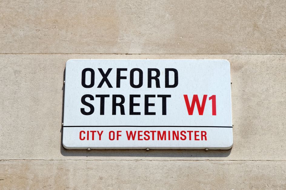
Univers Bold Condensed by Adrian Frutiger used on London street signs
9. Proxima Nova by Mark Simonson
Proxima Nova combines modern proportions with a geometric appearance, bridging the gap between typefaces like Futura and Akzidenz Grotesk. Since the mid-2010s, it's become the most popular paid-for font on the web and is used on thousands of websites around the world. Proxima Nova is available in seven weights, each with matching italics as well as small caps styles and condensed and extra condensed widths. It goes well with many fonts, including Helvetica Neue, Adobe Garamond and Lucida Grande.
10. FF Bau by Christian Schwartz
FF Bau is a large workhorse family of sans-serif Grotesk typefaces. They were designed by Christian Schwartz in 2002 as a revival of the Grotesk types cast by the Schelter & Giesecke foundry in Leipzig in the 19th century, which were popular at the Bauhaus in the mid-1920s. This latest version updates the family without rationalising away the spirit and warmth of the original. FF Bau is available in eight weights with matching italics and supports 83 languages.


](https://www.creativeboom.com/upload/articles/7a/7a527d53fefe4f354e8489365e89db422567f281_732.jpg)
 using <a href="https://www.ohnotype.co/fonts/obviously" target="_blank">Obviously</a> by Oh No Type Co., Art Director, Brand & Creative—Spotify](https://www.creativeboom.com/upload/articles/6e/6ed31eddc26fa563f213fc76d6993dab9231ffe4_732.jpg)
. In use by [Garbett](https://garbett.com.au/) for Career Trackers](https://www.creativeboom.com/upload/articles/0f/0f4e193ba9164073646e67421eb37b4b26986c67_732.png)