London Fire Brigade gets a new typeface that nods to the lettering of vintage fire engines
The London Fire Brigade has enjoyed a brand refresh by Studio Sutherl& this month with a typeface designed in collaboration with The Foundry Types, inspired by vintage hand-painted lettering of a bygone era. We find out more.
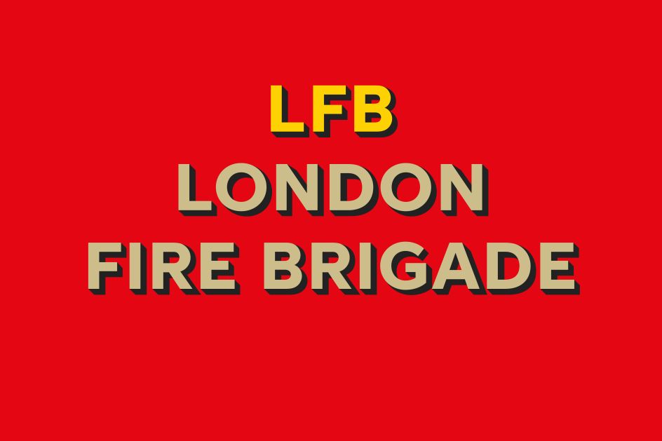
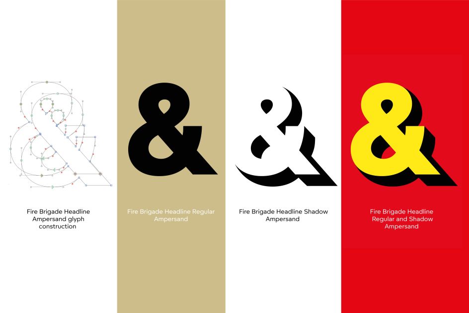
Aptly named Fire Brigade Headline, the new display typeface is a modern but classic drop shadow geometric and grotesque font that pays homage to the robust lettering of Victorian fire engines. It combines two fonts – Regular and Shadow – layered together to form a gorgeous 3D drop shadow effect.
The London Fire Brigade commissioned The Foundry Types to create a bespoke typeface that is "historic, relatable, and dynamic". It sits alongside the current primary typeface, Fire Brigade Sans, which integrates with the wider new identity. Inspired by the fire station architecture, façade signage, hand-painted lettering on the sides of horse-drawn Victorian water pumps, and London's vintage fire engines, the grotesque style also embodies all the Brigade's desired characteristics: "uniquely modern but classic, human and approachable, robust, bold, and strong". It's "also informed by the idea of being in the shadow of the flames and flashing sirens," says Jim Sutherland of Studio Sutherl&.
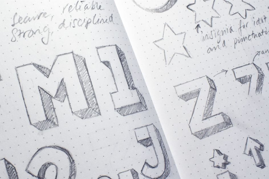
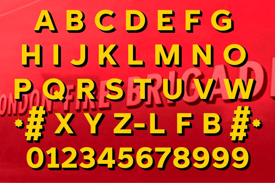
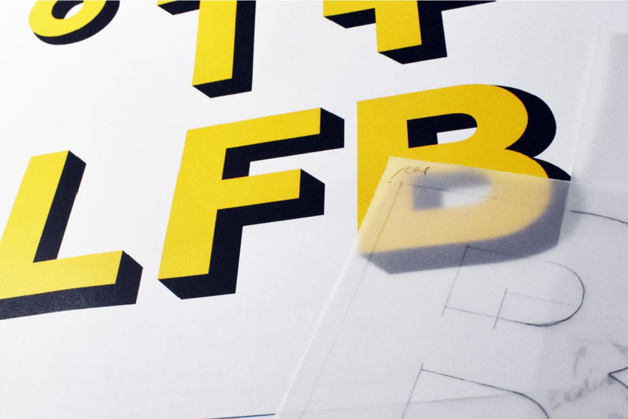
Looking a little closer, there's a purity to the display font, one that's purposeful and powerful, yet its humanistic forms suggest warmth and friendliness. It's all in the smallest of design details, such as the indented middle 'E' ba, which is reminiscent of many 18th-century sans serifs. Or perhaps the low-legged 'K', 'Q' with a through bar and distinctive figure '1' and '7' gives the font its unique character. What's more, the shadow of the font angle is set at 45 degrees, giving it a pleasing three-dimensional quality.
But when combining the two fonts together to create a 3D drop shadow effect, many technical problems had to be resolved. "Each glyph had to be crafted accurately to align perfectly when layered, promoting the appearance of a single 3D font," according to Stuart de Rozario, director and designer at The Foundry Types. He points to the rounder letters to highlight this: 'B, C, D, G, O, P, R, and S' apparently needed fuller curved shapes that "enhance the depth of the shadow in keeping visually with the other letters". But despite these challenges, the Regular or Shadow fonts can be used independently or alongside its counterpart.
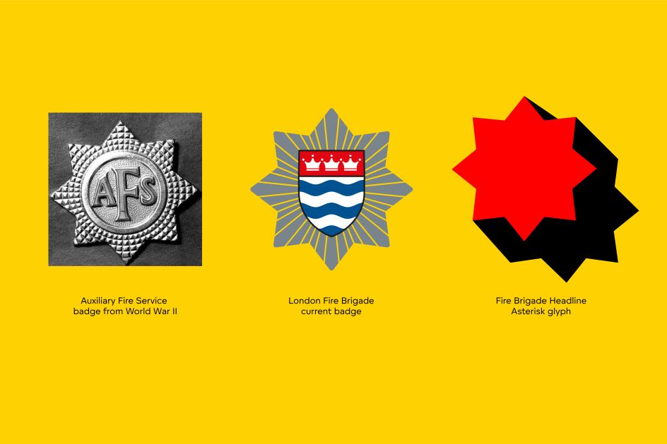
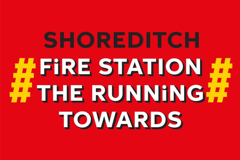
The character set contains capitals, figures, a set of eight arrows, punctuation, and a range of alternative glyphs, as well as an extra 'M' and punctuation with the LFB Insignia Star Badge emblem. There's even a quirky double hashtag, echoing a fireman's ladder – adding a dash of humour.
The Fire Brigade Headline Regular and Shadow typeface has been developed exclusively for the London Fire Brigade and will not be available for retail, sadly. It's currently being rolled out across the entire London Fire Brigade community. "Our aim was to design a typeface that captured the spirit and rich heritage of the London Fire Brigade – a caring, human, and incredibly brave institution that has spanned many centuries through wars, disasters, and technological advancements in firefighting," says Stuart.
Editor's Picks


Trending


Podcasts


Editor's Picks
Further Reading


 and [Fontsmith](http://www.fontsmith.com)](https://www.creativeboom.com/upload/articles/b9/b9516cdb3e33a14c0cb652316e1ca8737044453f_732.png)