WeWantMore brands 'the smallest grand luxury hotel'
The new brand world for Brussels' Faubourg 21 – a 19th-century townhouse turned luxury retreat – feels both intimate and grand thanks to a design language that doesn't shout luxury, but whispers it with every detail.
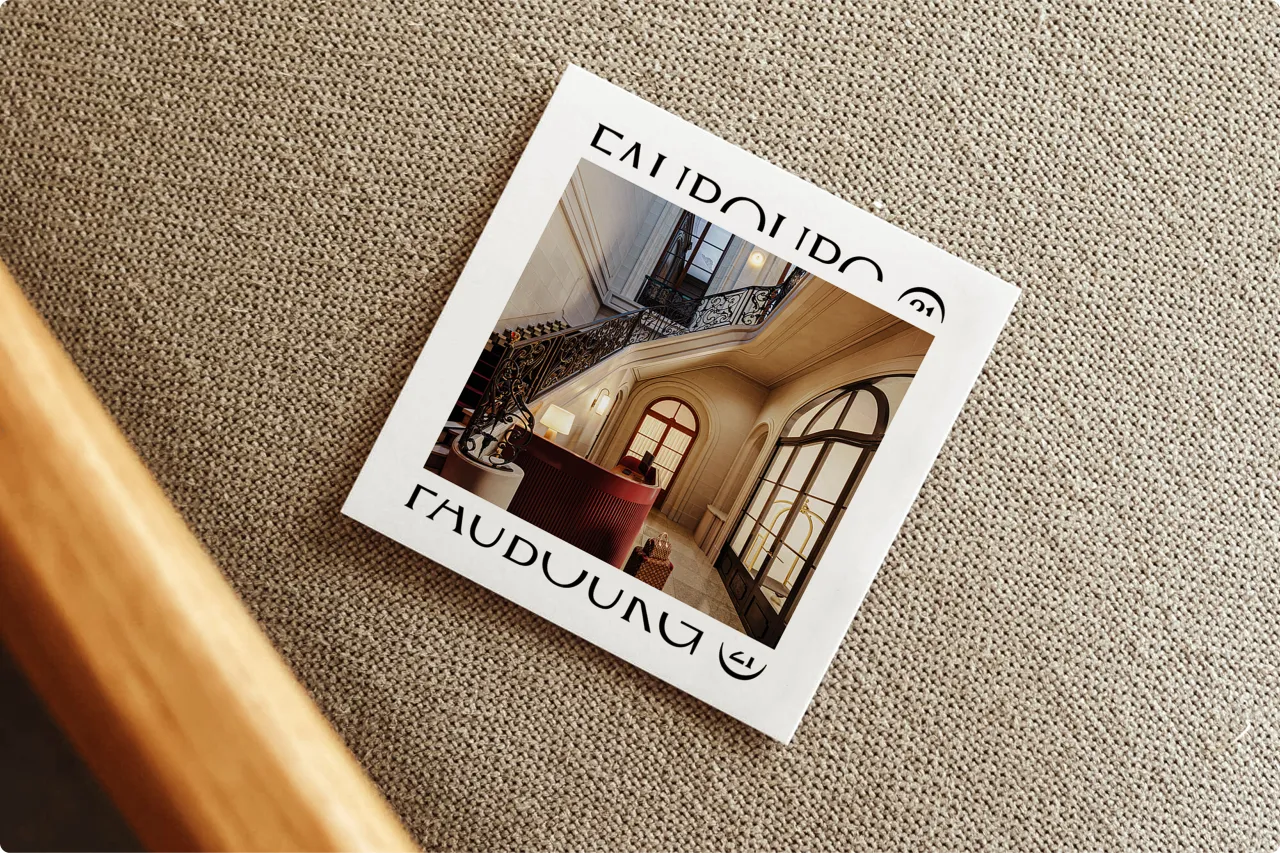
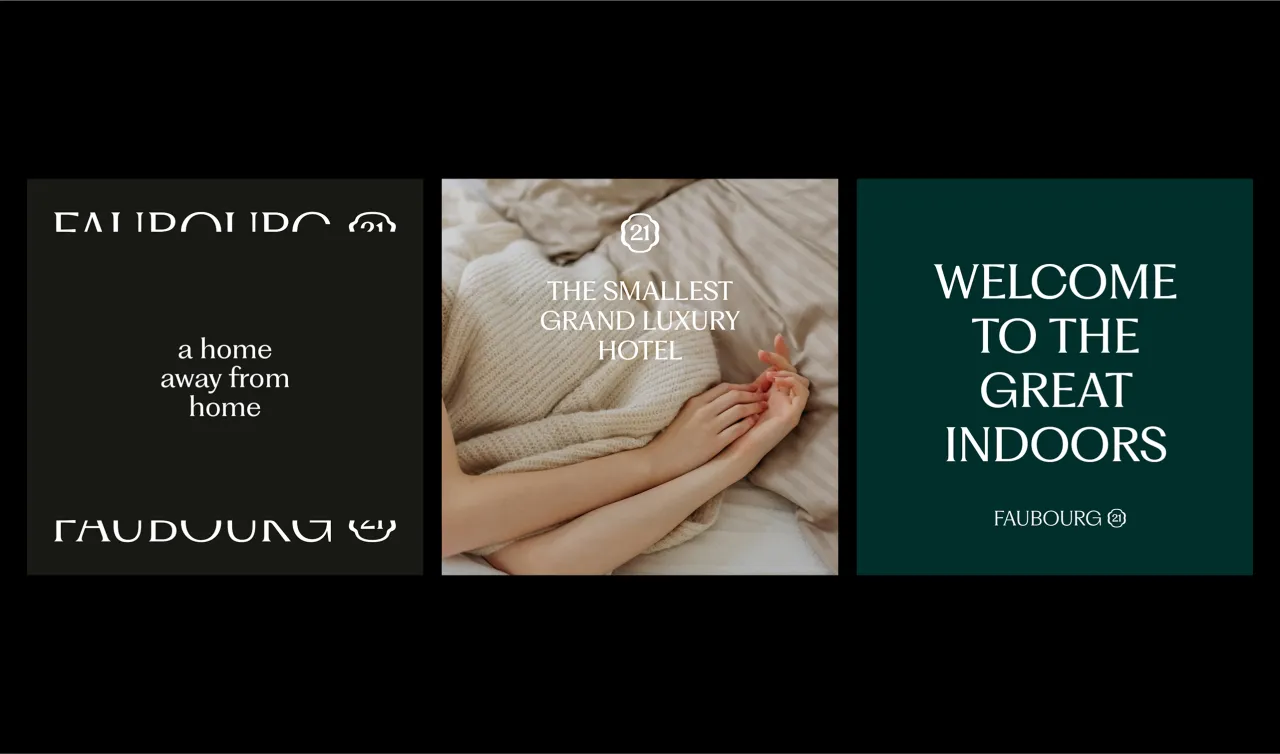
Faubourg 21 isn't the kind of hotel that flaunts its grandeur. Tucked inside a 19th-century Brussels townhouse, it describes itself as "the smallest grand luxury hotel", which became the north star for Belgian studio WeWantMore as they built its brand identity.
"That phrase really set the tone for everything," says Kenny Smet, brand designer at WeWantMore. "It's intimate yet grand, luxurious but never showy. Faubourg 21 isn't your typical hotel; it feels more like a private home.
"From the start, we wanted the identity to capture that sense of exclusivity – something refined and understated that doesn't need to shout."
It's a fitting approach for a place that trades in atmosphere rather than opulence. The brand is not designed to dazzle on first glance, but to reveal itself slowly, enhancing the sense of discovery for guests.
The art of ever-blooming discovery
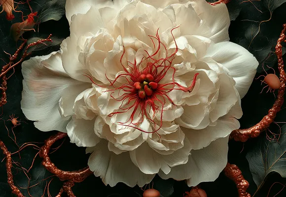
At the heart of the identity is the poetic concept of "ever-blooming discovery." It's a phrase that captures the experience of stepping inside Faubourg 21, from the unassuming street view to the layered, intimate spaces within.
"Faubourg 21 reveals itself in layers, just like the townhouse itself," Kenny explains. "The 'ever-blooming' idea came from that feeling of discovery, where each space and every detail offers something new."
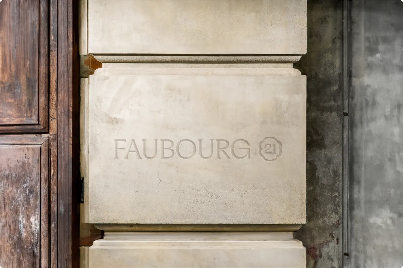
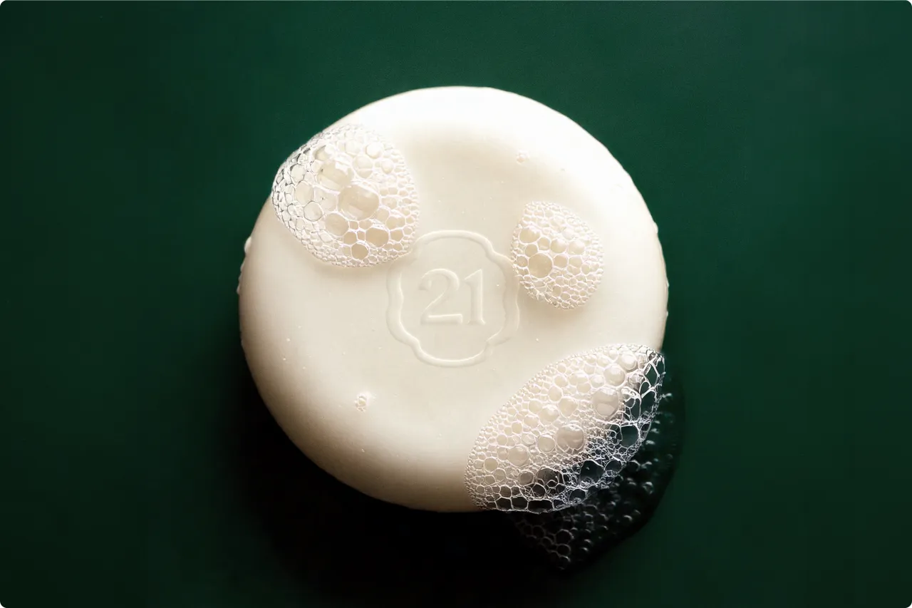
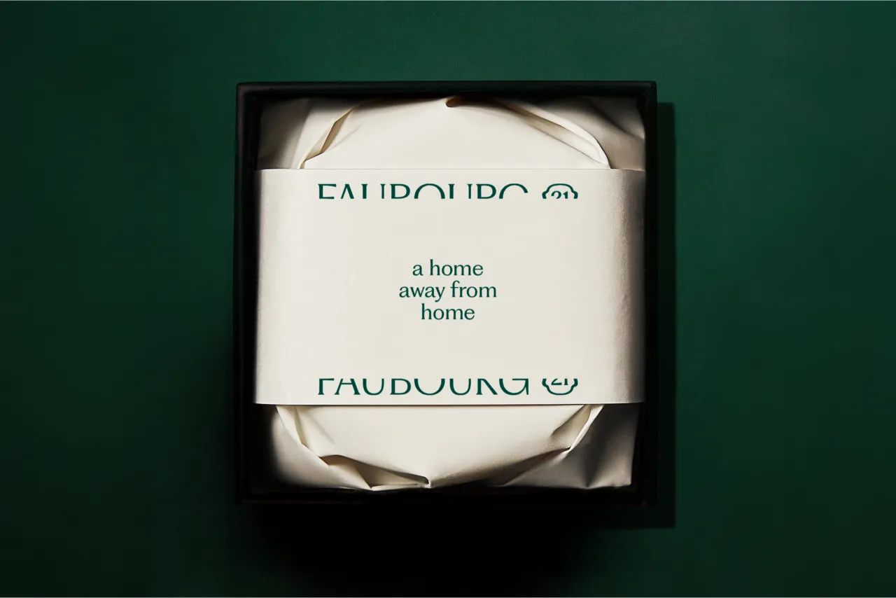
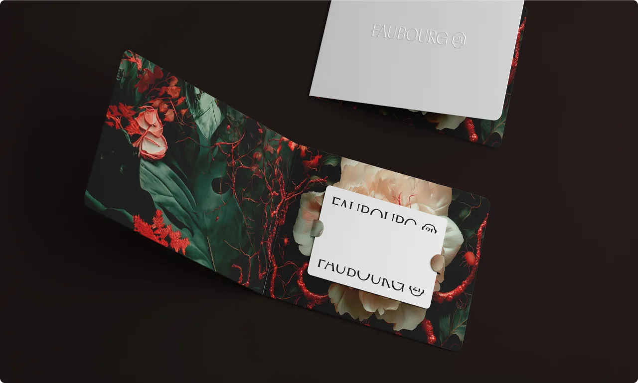
Hints of gradual revelation play out across the visual system, including through a delicate flower motif that evolves across applications, subtly changing form. The wordmark itself mirrors the opening of the townhouse doors, "inviting you in," as the team puts it. The brand was designed to reward attention through quiet, crafted details rather than obvious gestures.
A house of many worlds
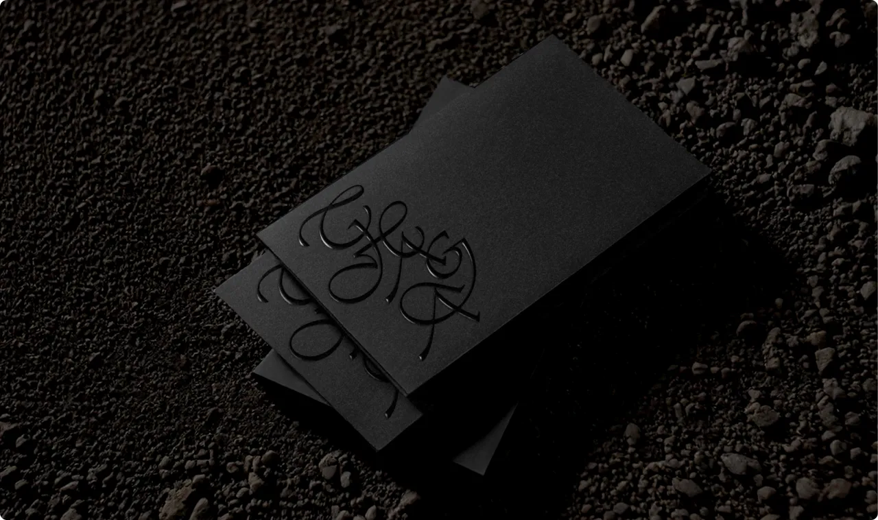
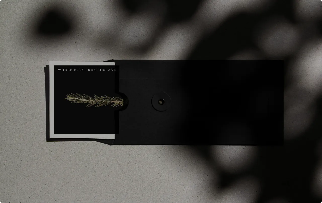
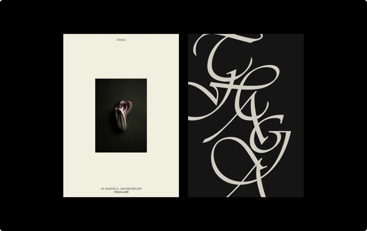
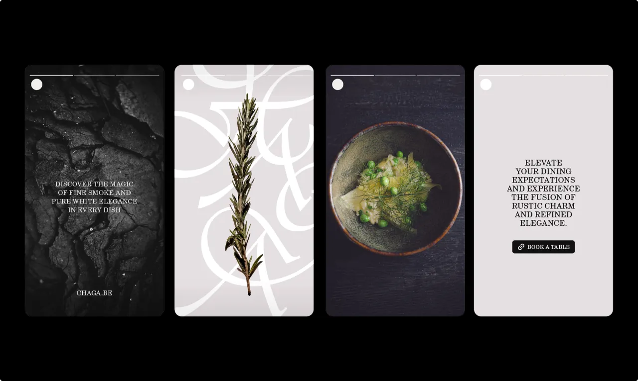
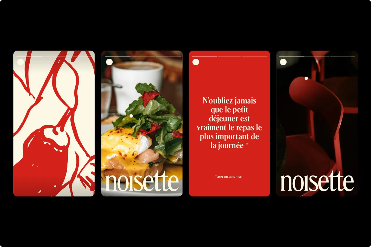
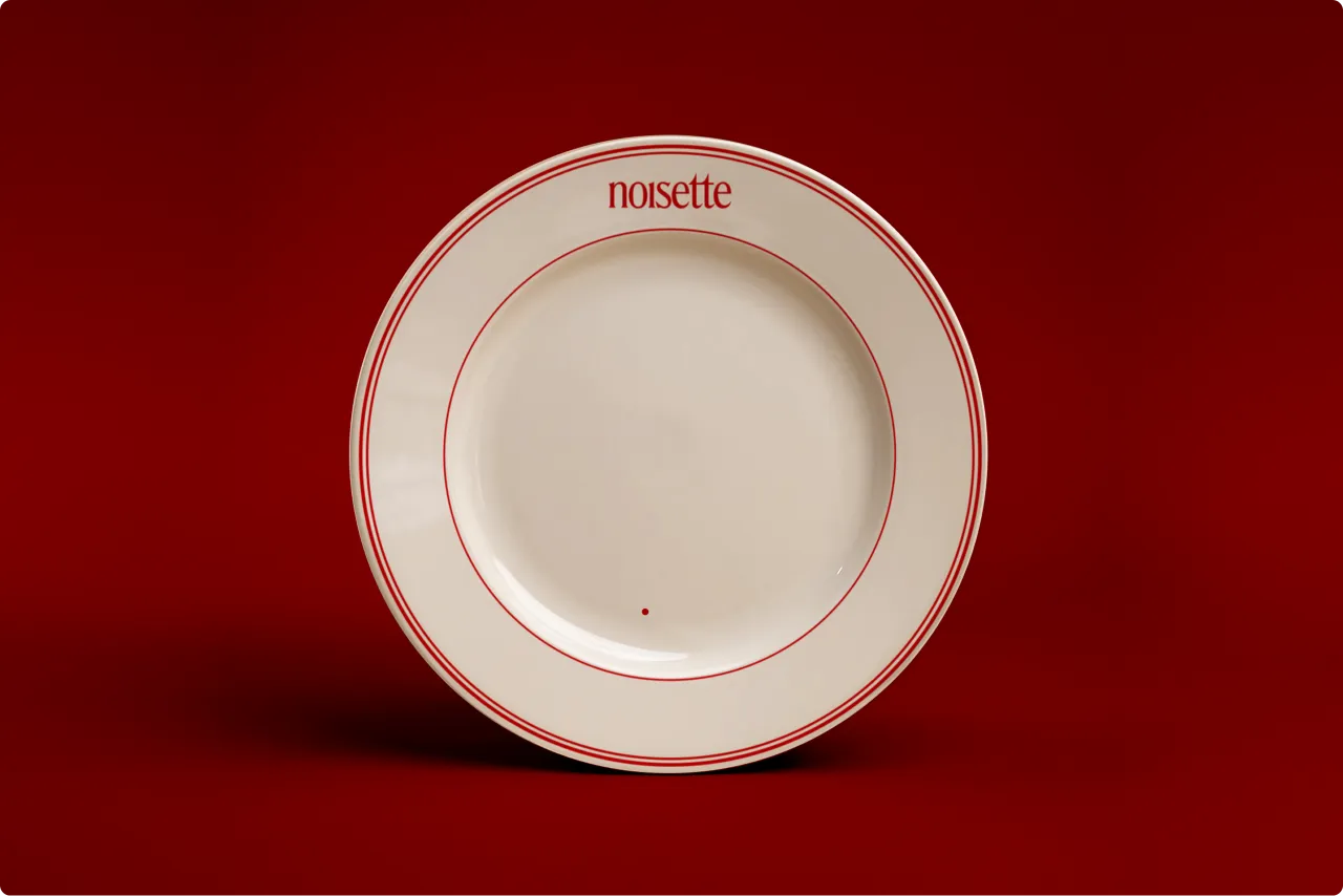
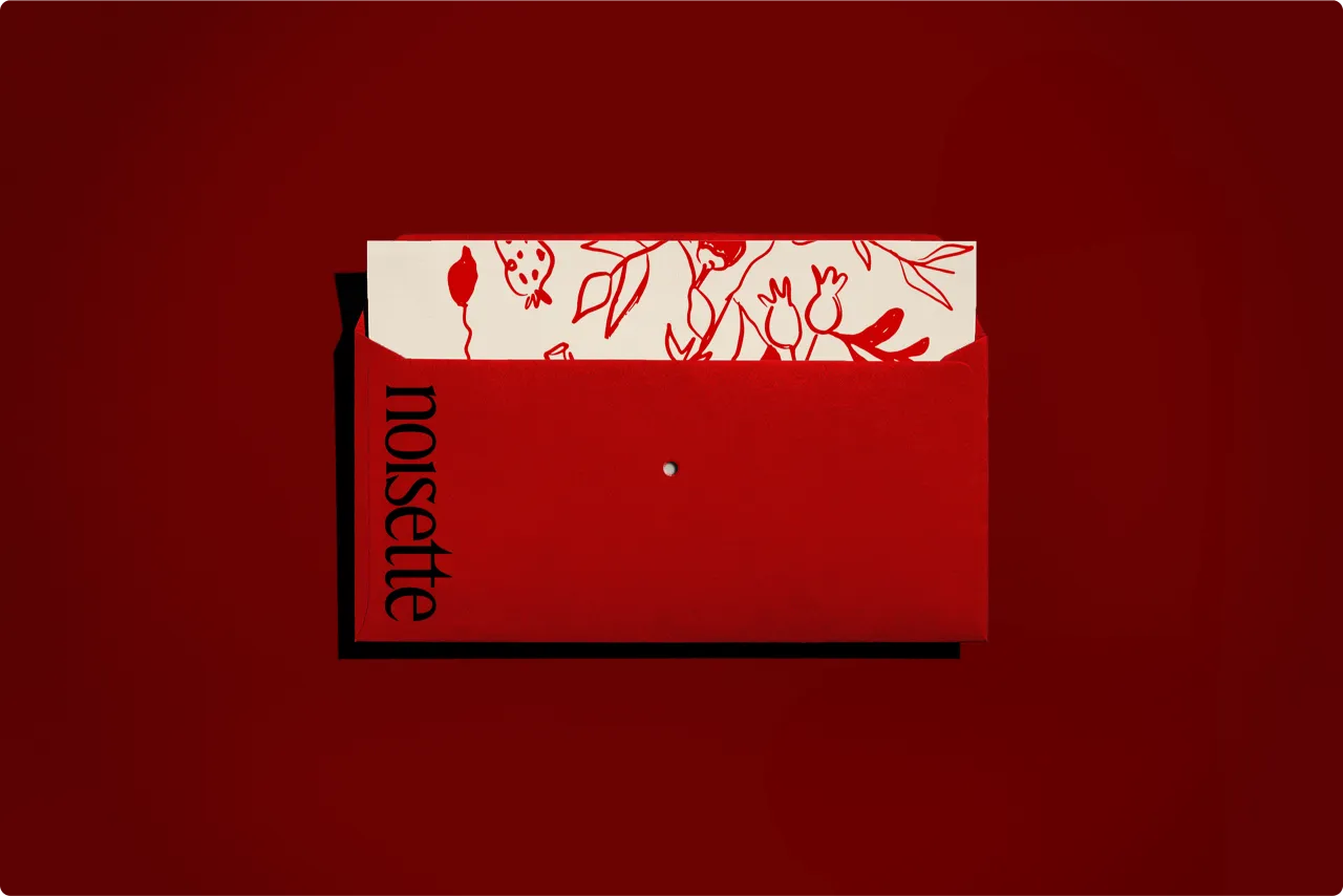
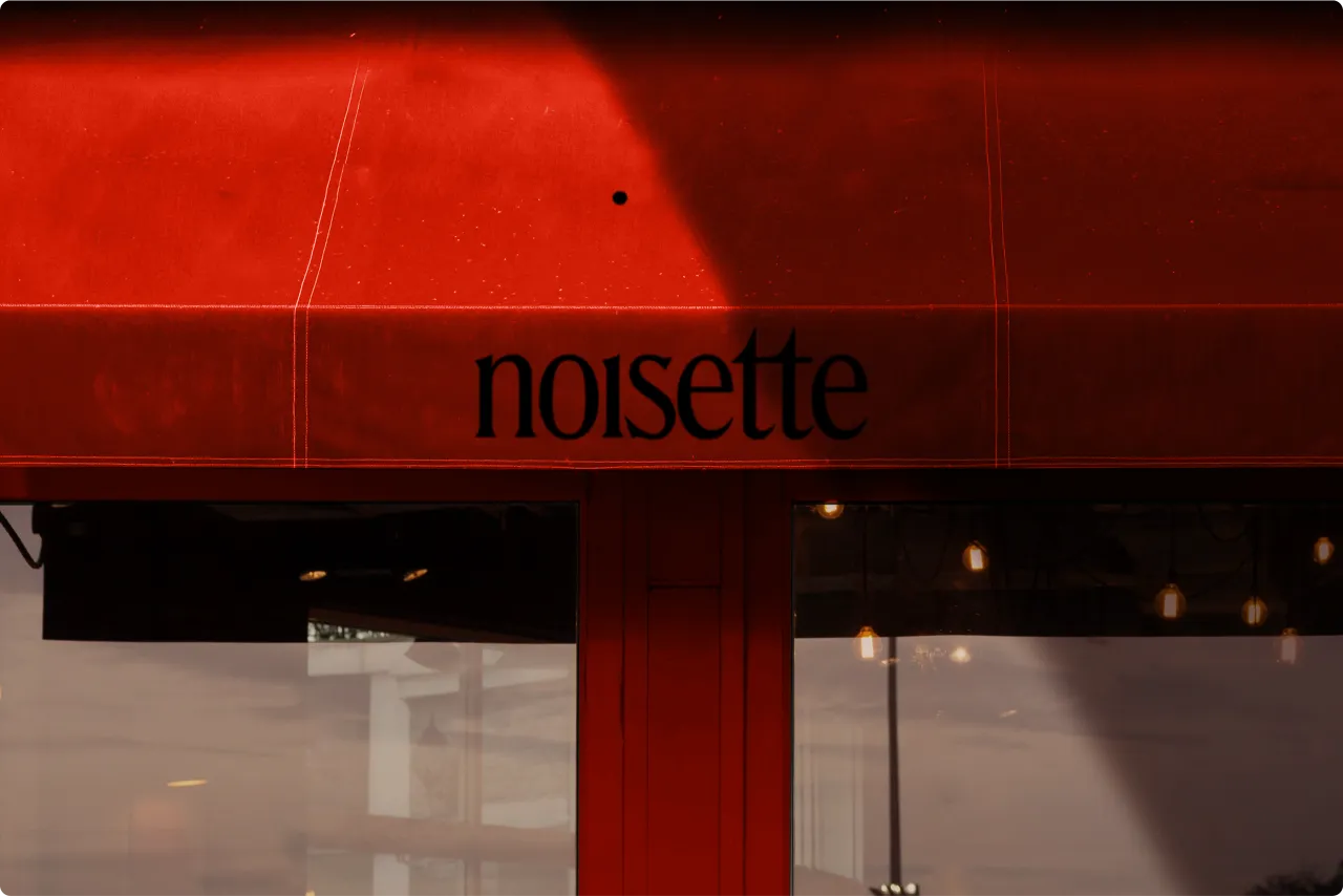
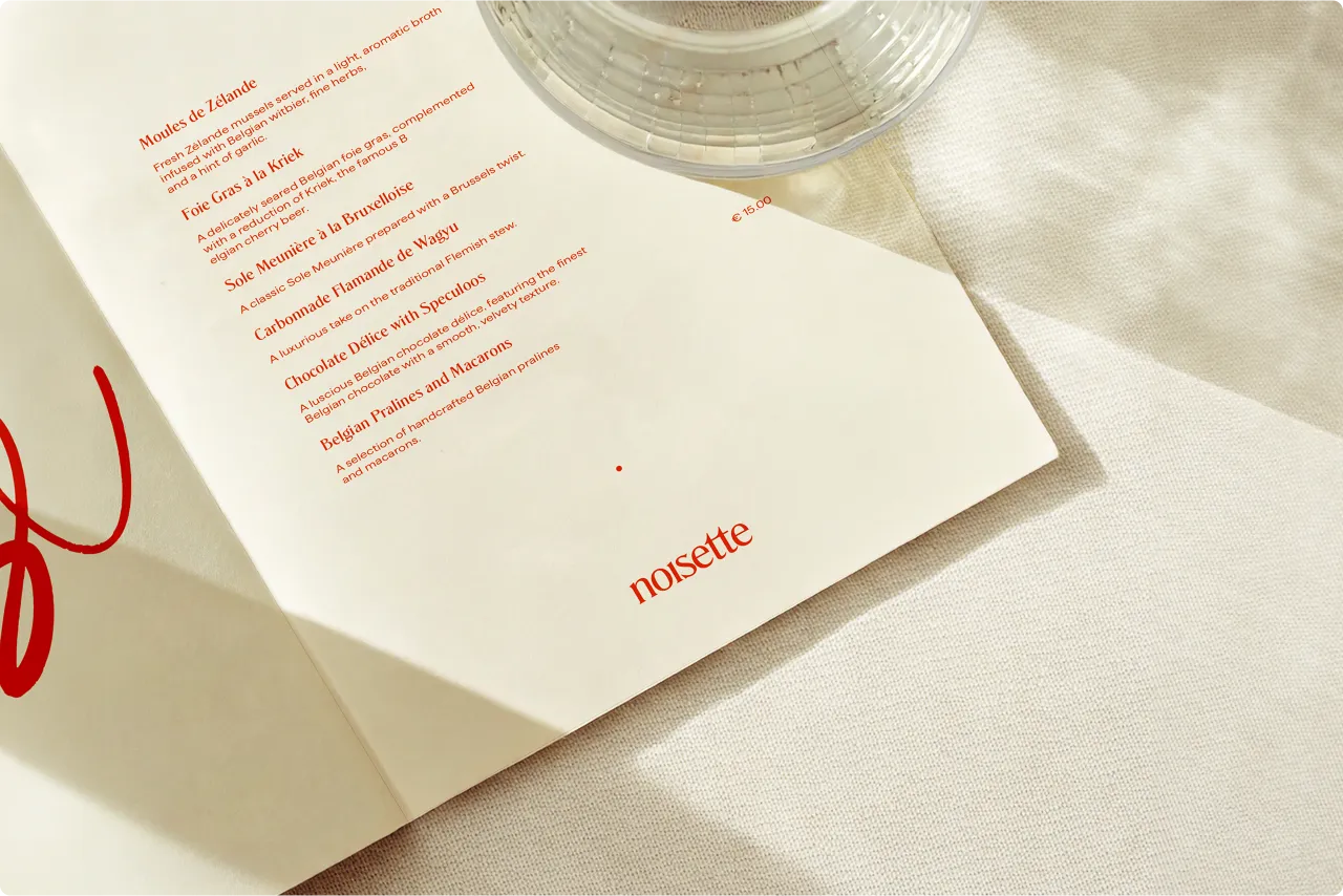
Beyond the hotel, WeWantMore also created the identities for its two restaurants: Noisette, a playful brasserie, and Chaga, a refined fine-dining space. Each has its own distinct character, yet all three share the same spirit of intimacy and care.
"We treated Faubourg 21 as a collection of micro-worlds," says Kenny. "Each space has its own personality and atmosphere, so each identity has to stand on its own, but at the same time, they all need to feel like part of the same family." Rather than relying on repetition, the studio drew on shared principles — materiality, typography, and tone — to weave a thread of cohesion through every experience.
Though invisible, that thread is unmistakable. Noisette bursts with warmth and whimsy, using bright reds and light-hearted illustrations to express the convivial energy of a European brasserie. Chaga, meanwhile, takes a quieter route characterised by deep tones, minimal typography, and a tactile sense of calm that encourages guests to slow down.
"They're two sides of the same coin," Kenny adds. "Noisette is lively and social. Chaga is calm, sensory, and serious. What brings them together is the same sense of intimacy and care."
The great indoors
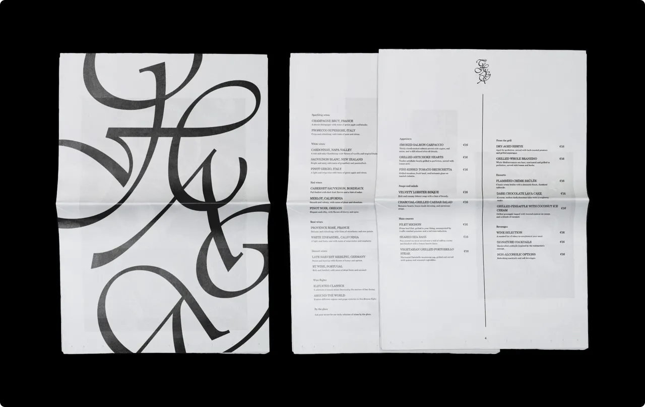
One of the challenges for WeWantMore was shaping the atmosphere of "the great indoors." The brand extends to every touchpoint, from menus to signage to the feel of the materials.
"Brand design isn't just about how things look," they explain. "At Faubourg 21, it's about how guests feel and move through the space. The brand acts as a quiet guide, helping guests make sense of the space and feel at home."
The approach recognises design as a sensory experience that can't be separated from the physical world it inhabits. "In a boutique hotel like this, design can turn a stay into more than just a visit," they add. "Hopefully, it becomes a story that stays with you long after you leave."
Bridging heritage and modernity
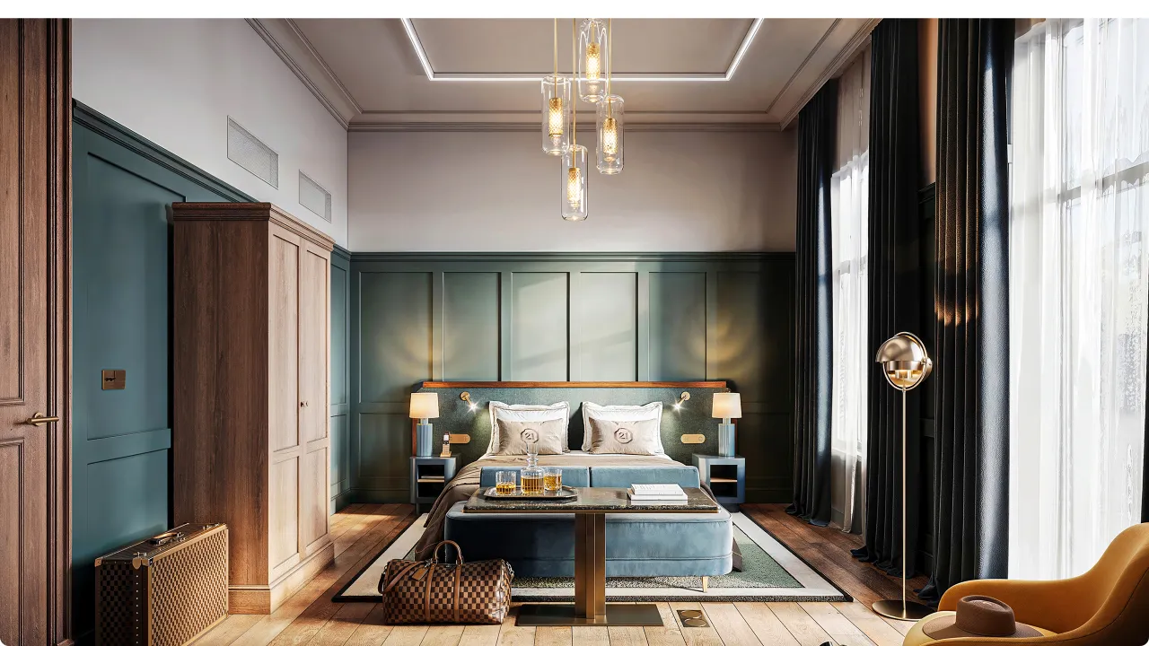
There was also the balancing act of old-world architecture with contemporary design. Faubourg 21's interiors celebrate the townhouse's history with features such as carved wood, grand staircases, and decorative mouldings, while still allowing for modern expression. The same philosophy guided the brand.
"We wanted to respect the building's history without letting nostalgia take over," Kenny explains. "The challenge was finding that balance, combining classical assets in a contemporary way. The brand reflects that same approach, creating something classical and refined but still fresh and current."
The result is a timeless sensibility that is both elegant and contemporary without feeling too ornate or cold.
Beyond the surface
Faubourg 21 is no doubt tapping into a broader trend in hospitality brand design where luxury is becoming both invisible and indispensable. Kenny reflects: "What we're most proud of is how the brand extends beyond a logo or colour palette to create a lived experience.
"Design isn't decoration; it's storytelling, mood, and emotion. When guests can feel the brand without seeing it, that's when design has truly done its job."
Editor's Picks





Trending





Latest Jobs
Junior Project Coordinator at Colorido Studios
Full-time·Twickenham·£28k–£32k
Graphic Designer at Crux Product Design
Full-time·Bristol·Up to £36k
Account Manager at Moxie and Mettle
Full-time·Cheltenham·Up to £35k
eCommerce Web Designer at on/Sight
Full-time·$75k–$95k
Brand Designer at Adfin
Full-time·London·£30k–£50k
Client Partner at Halo
Full-time·Bristol·£30k–£36k