Saint-Urbain bakes mid-century kitchen nostalgia into Novak Djokovic–backed snack brand
The new sorghum-based snack brand, created by Saint-Urbain with entrepreneur Jessica Davidoff and investor Novak Djokovic, reimagines 1970s kitchen culture for a new generation of gluten-free, corn-free eaters.
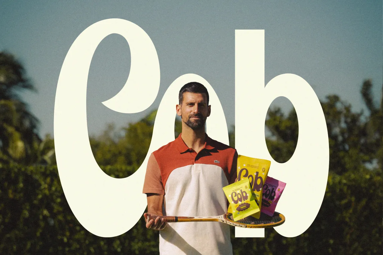
Clean eating has had plenty of visual tropes over the years – some repetitive and some a little tired – but Cob has arrived in the health-conscious foodie scene with something quite different. Created by Saint-Urbain for Cob Foods, the brand is backed by entrepreneur Jessica Davidoff and tennis legend Novak Djokovic and puts a warm, mid-century spin on the modern snack aisle.
Together they're taking on the dominance of industrial corn with a snack made from sorghum, a nutrient-rich grain grown in the United States. The idea started in a very personal place: Jessica's son has a corn allergy, which prompted her to imagine a food brand that didn't make dietary restrictions feel limiting.
She wanted something joyful, and that ambition quickly resonated with Alex Ostroff, founder and creative director of Saint-Urbain, who had collaborated with her before. Their shared goal was to build a world where clean eating doesn't trade fun for functionality.
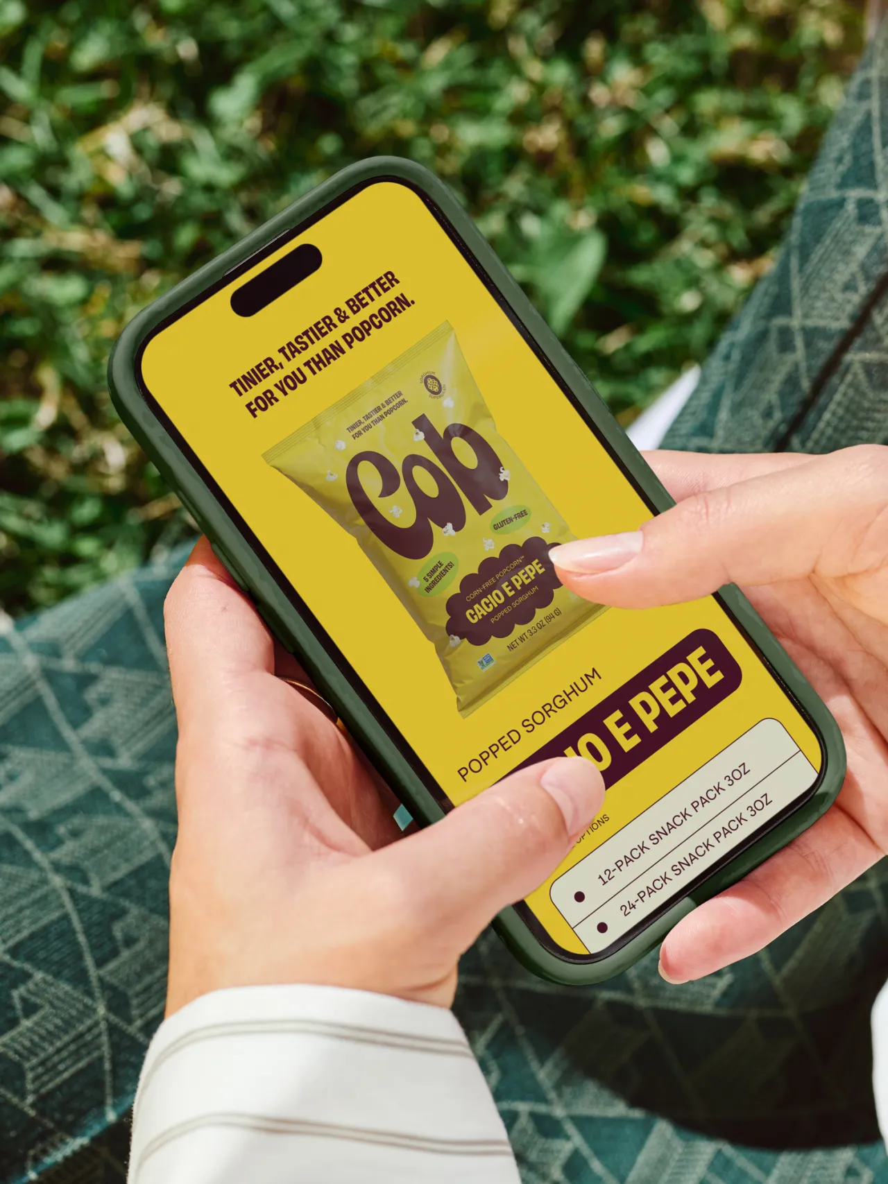
Saint-Urbain's role stretched from naming and strategy to visual identity, copywriting, and packaging. The name "Cob," which comes from the image of an empty corn cob, set the tone straight away.
It carries a wink of humour, but also signals the brand's stripped-back confidence. The studio used that as the foundation for a design language that blends familiarity with freshness without leaning too heavily on nostalgia for its own sake.
A big part of that world is rooted in 1970s snack packaging and the charm of retro kitchen graphics.
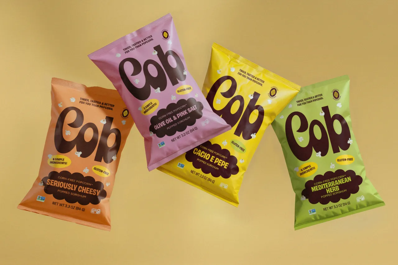
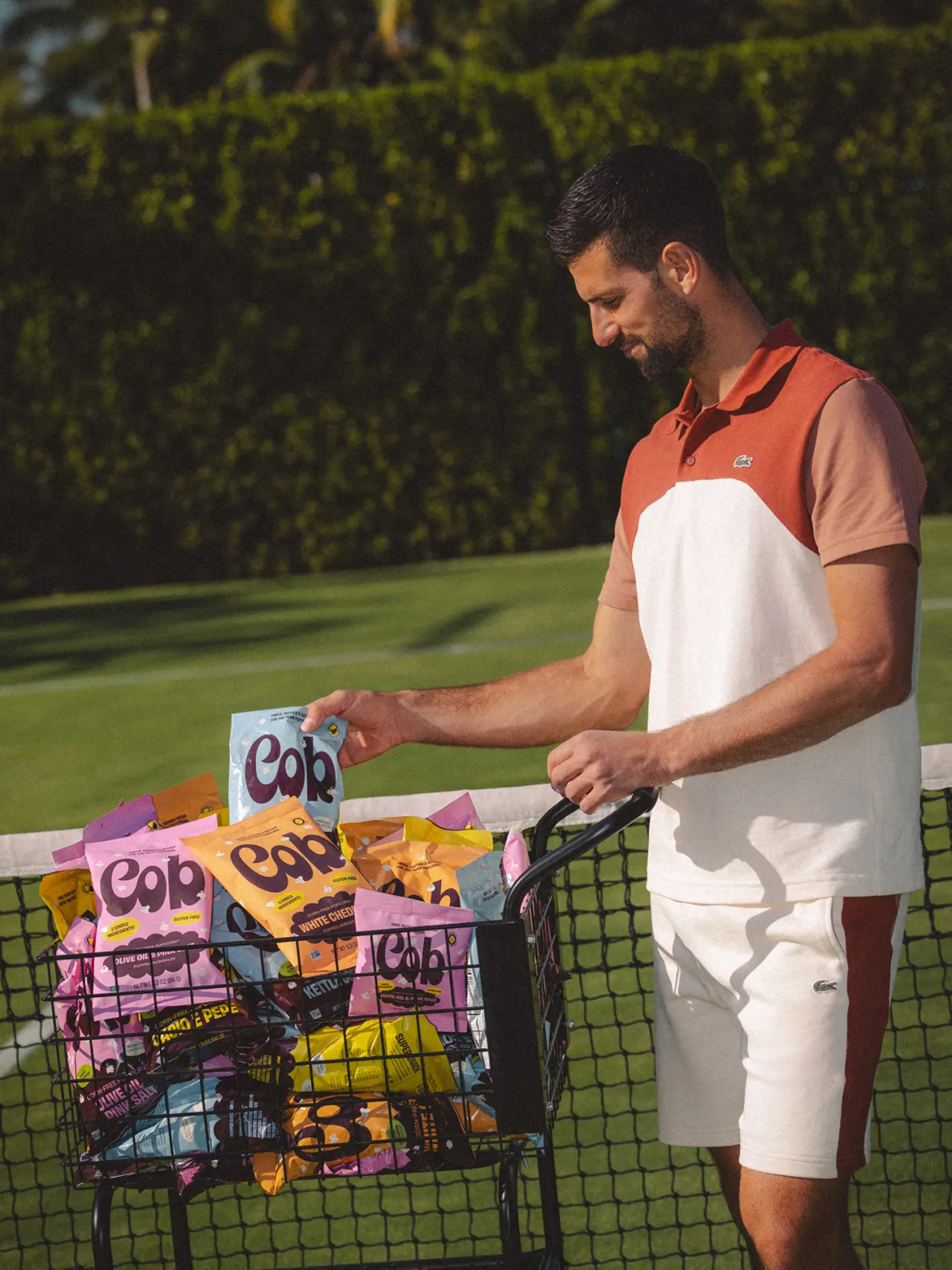
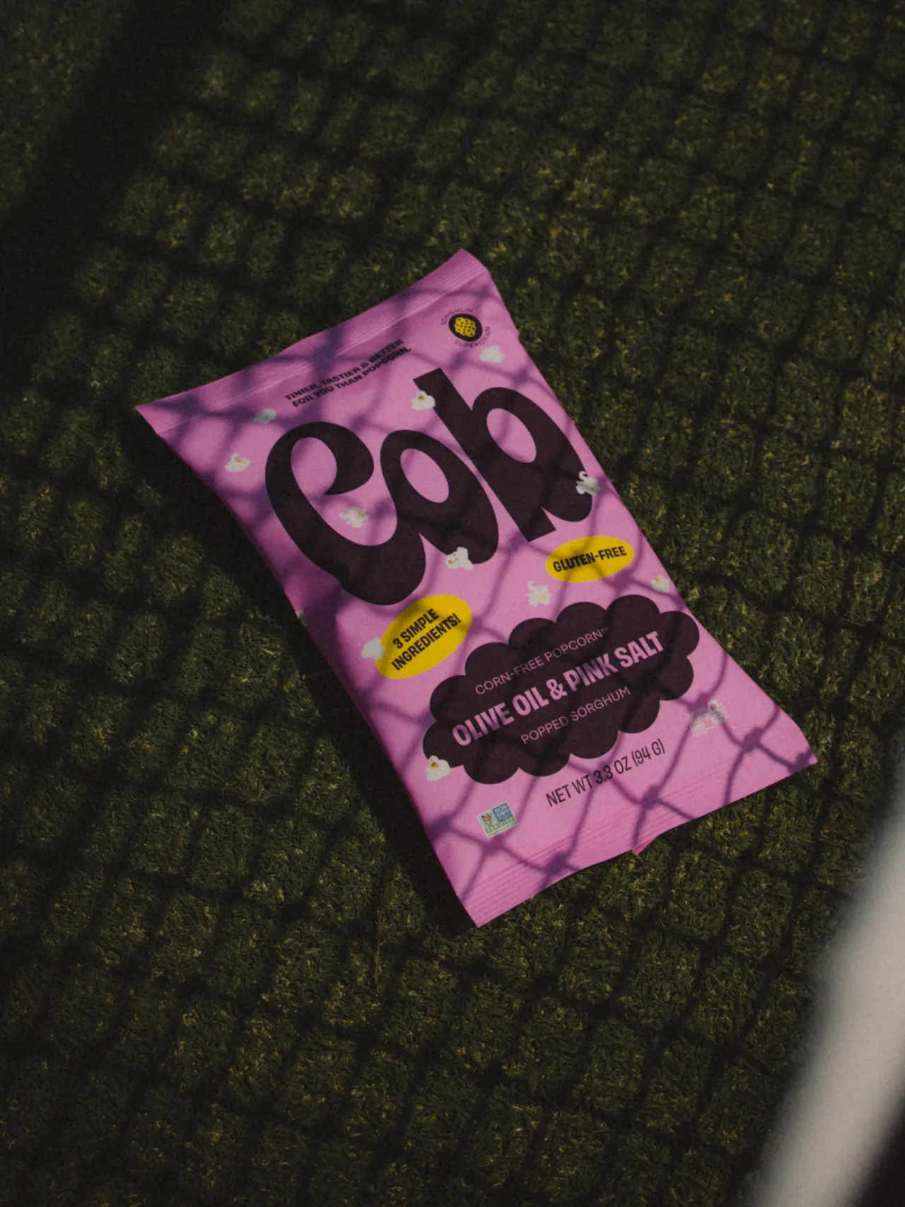
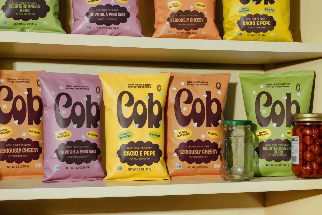
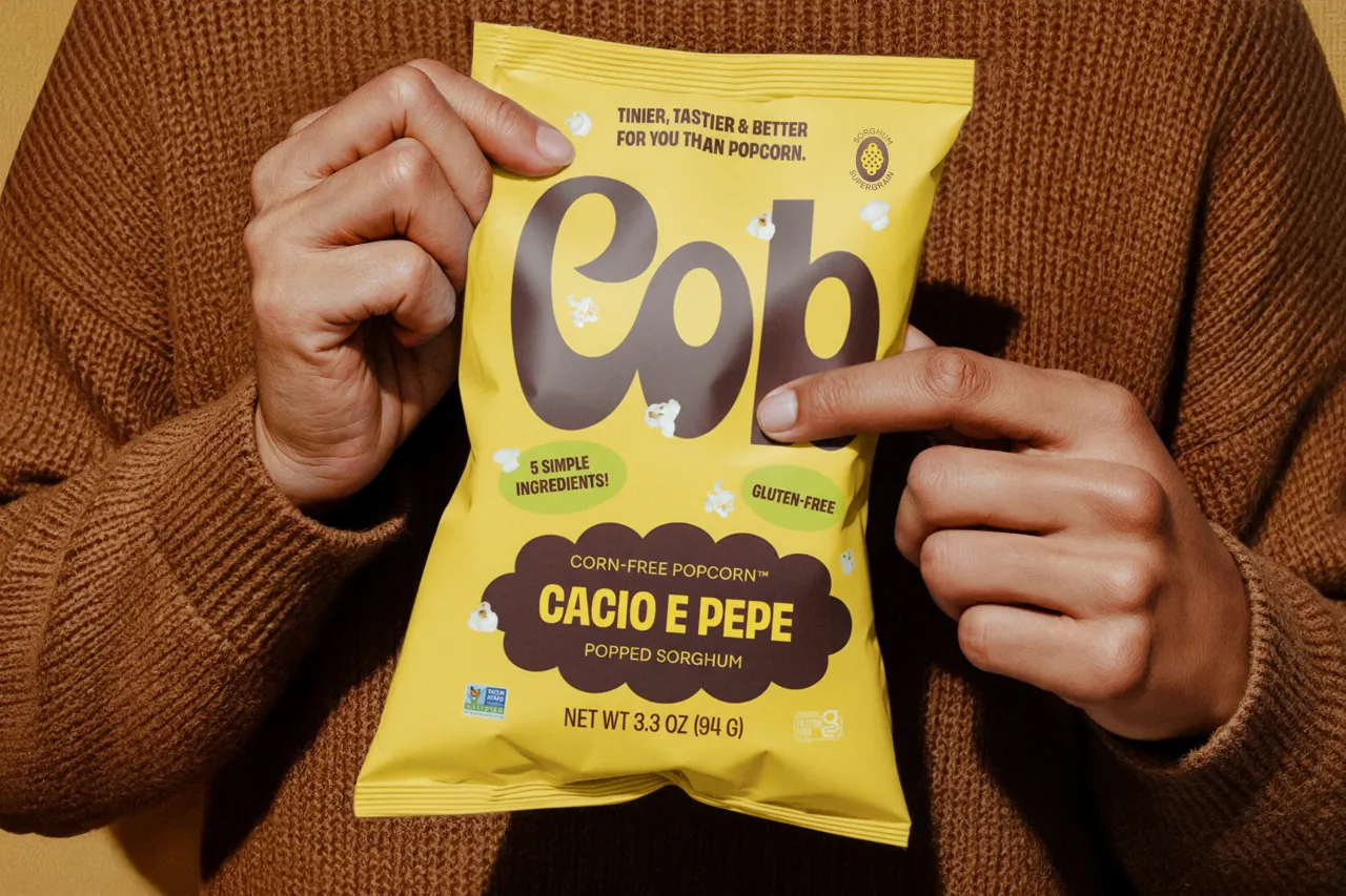
Rather than mimic old cereal boxes outright, the team studied their proportions and quirks, then rebuilt them thoughtfully. The custom condensed wordmark was drawn entirely by hand, balancing the chunky friendliness of early snack typography with a cleaner, modern finish.
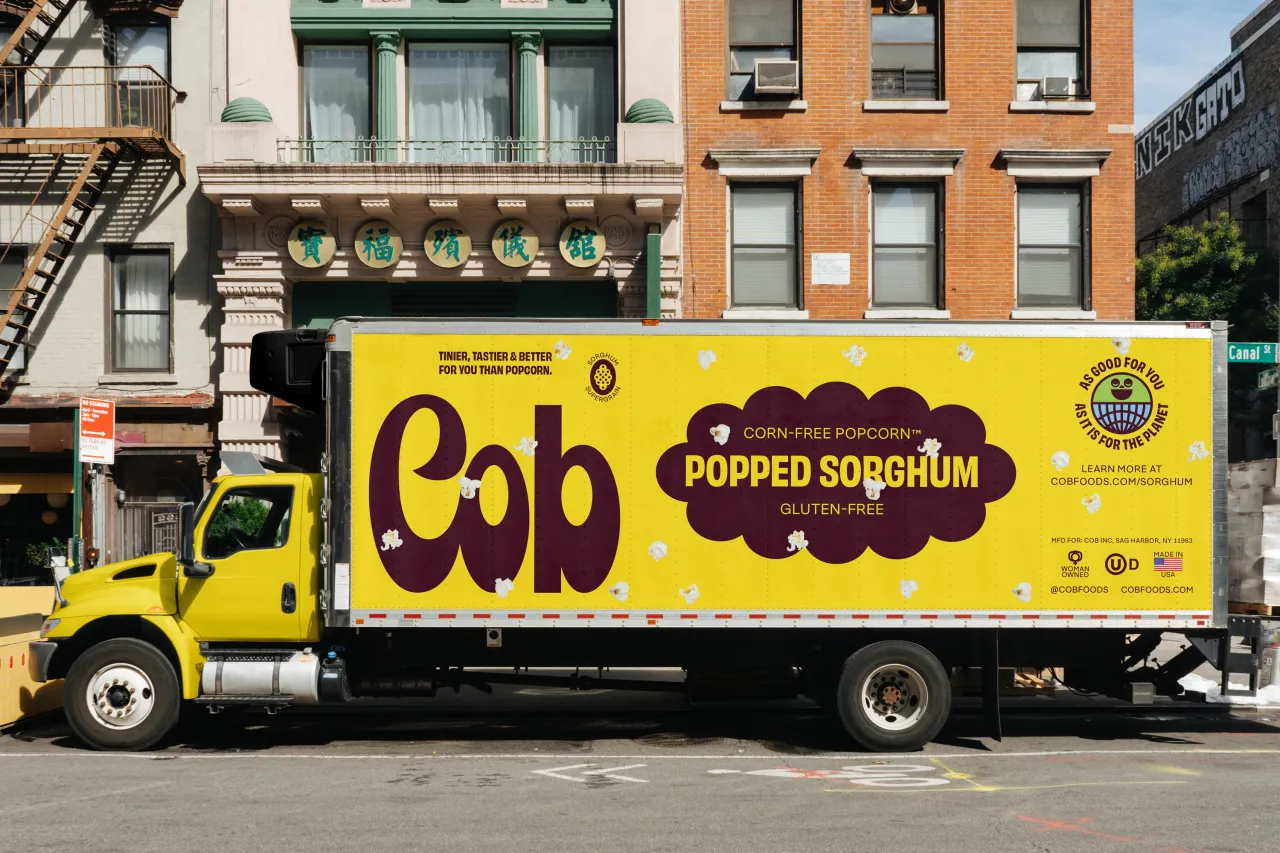
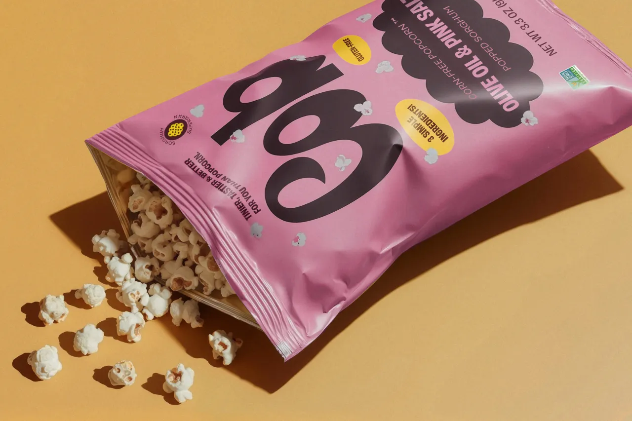
Colour plays a starring role, with sunny yellows and vintage creams nodding to childhood breakfasts, while chocolate browns and soft pastels bring warmth and approachability. It's deliberately broad in its appeal, avoiding the usual pink-for-girls, blue-for-boys divide, and instead inviting anyone to pick it up. This palette is reinforced by vectorised stars, bowls, scalloped edges, and other tiny visual cues that make the brand feel lived-in rather than stylised.
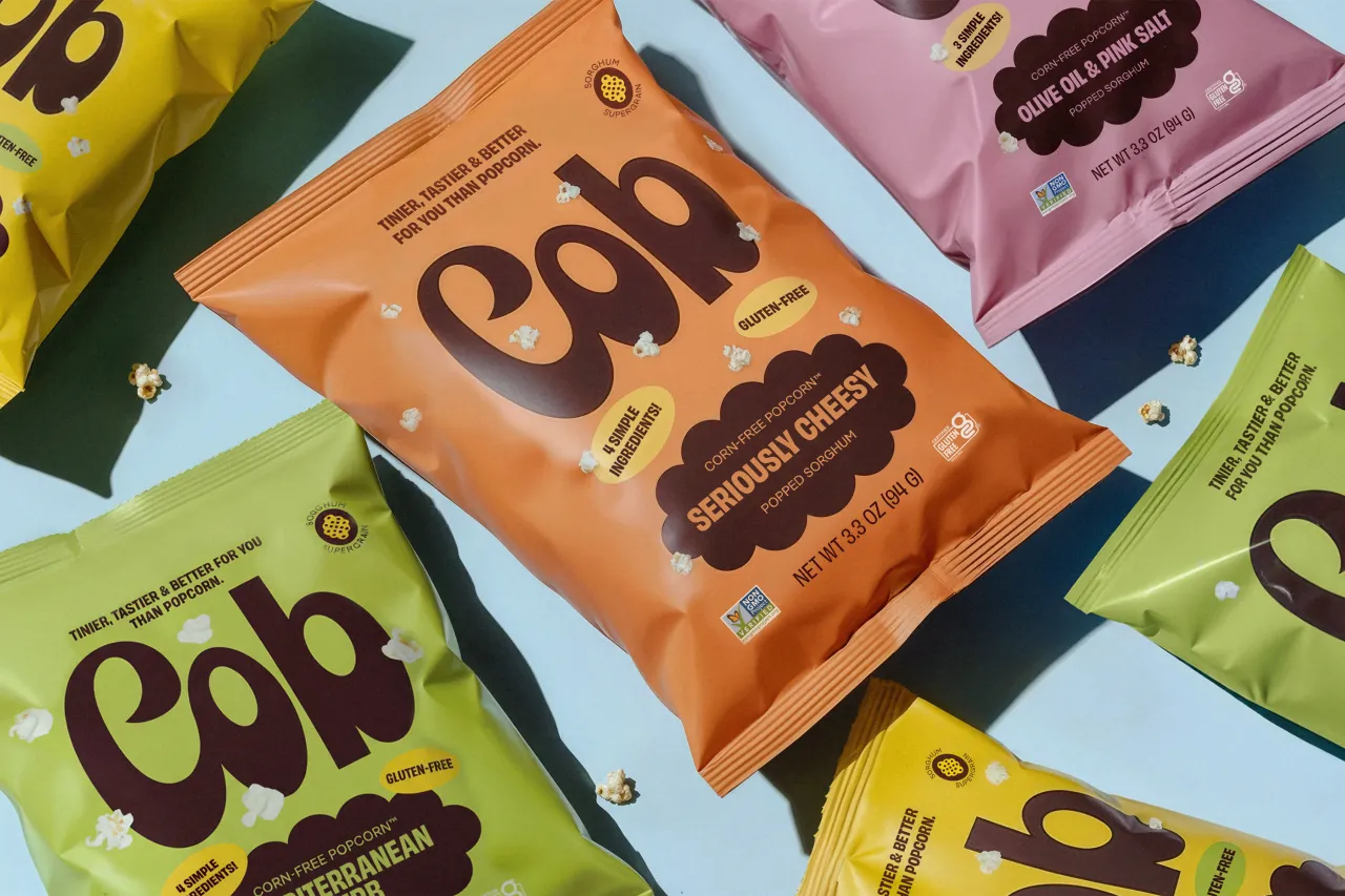
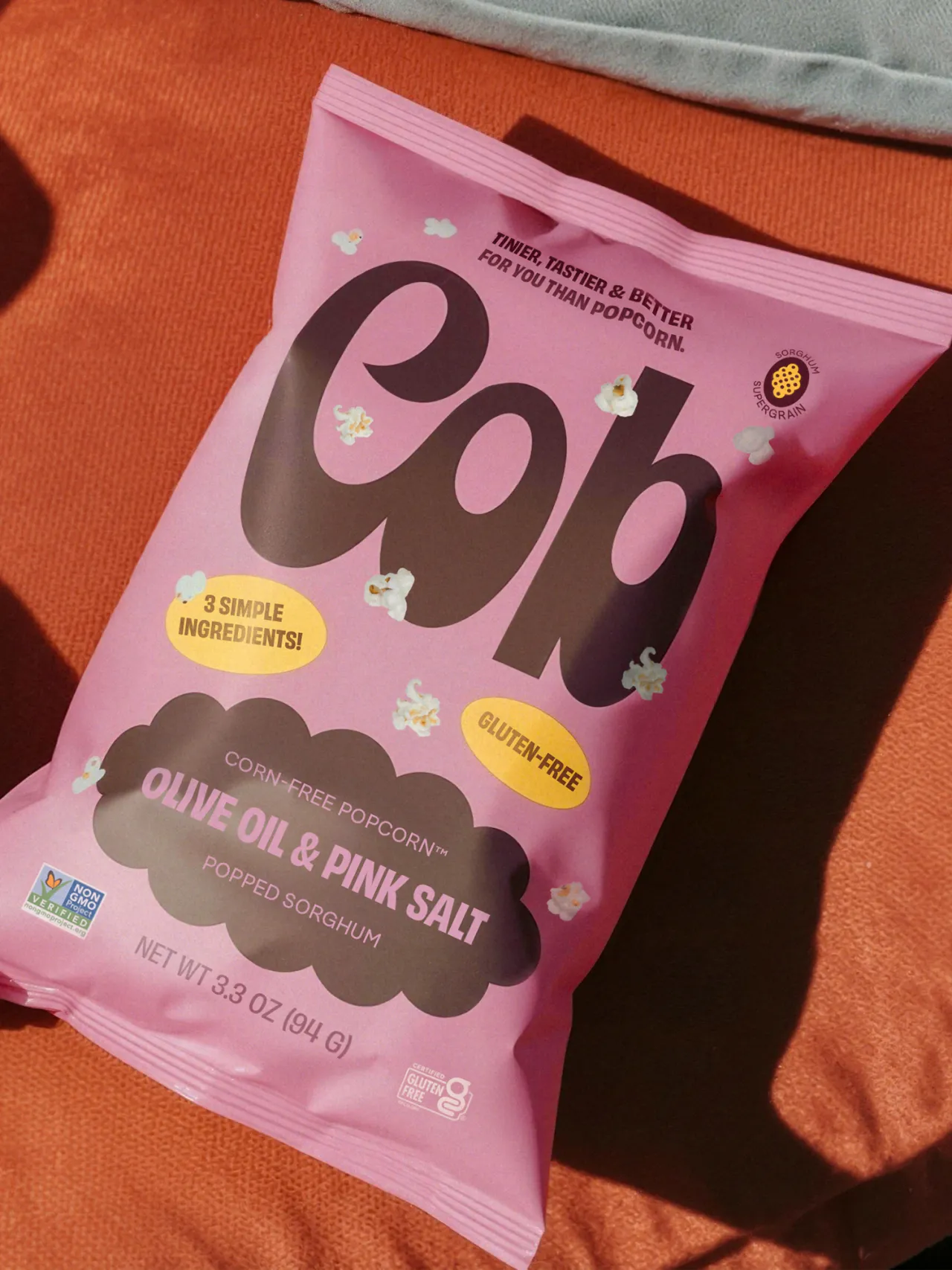
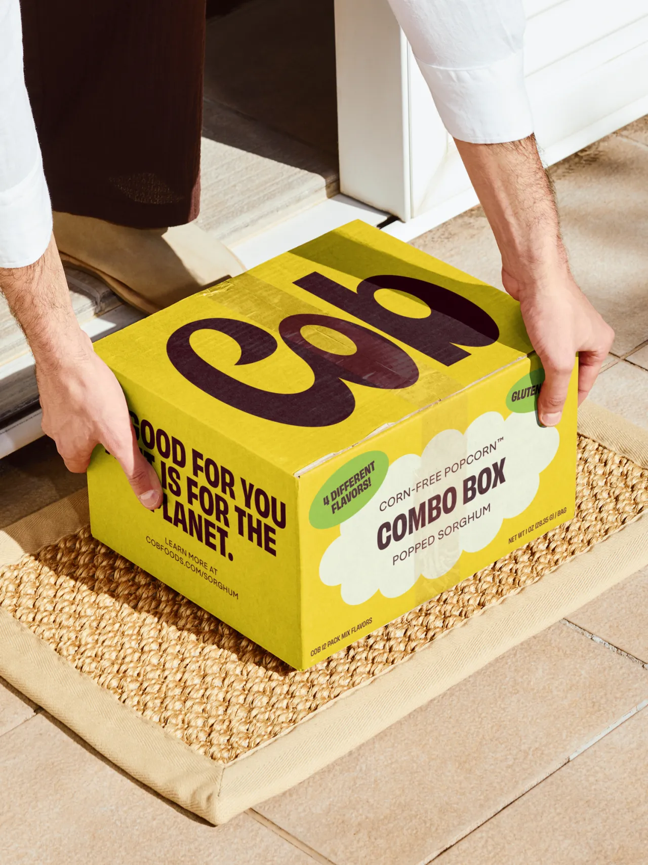
One of the more playful touches is the "floating popped sorghum" pattern. The real product is small – surprisingly small – which allowed Saint-Urbain to work at actual scale without overwhelming the packaging.
"They're tiny – like M&M Minis compared to regular M&Ms – so we could float them around at actual size without cluttering the design," says Ostroff. "It ended up being one of those rare design moments where the product's scale worked in our favour."
You really pick up that sense of optimism running through the whole system, which is sometimes missing from 'better-for-you' brands. More often than not, you see brands in this category default to clinical whites or muted, earthy minimalism, whereas Cob leans into joy and flavour.
It's comfortable being bright and fun. Crucially, it embraces what it is rather than fixating on what it avoids.
Djokovic, Davidoff, and Saint-Urbain set out to create a food brand that feels good in every sense, and what they've achieved is something natural, indulgent, nostalgic, and contemporary all at once. Thoughtful design really can be the key to reframing clean eating as something people genuinely look forward to rather than something they're forced to do.

Editor's Picks





Trending





Latest Jobs
Senior Designer at BKC
Full-time·£50k-£60k
Paid Media Executive at Munro Agency
Full-time·Glasgow·From £27,000
Account Manager at BUILDHOLLYWOOD
Full-time·London·£34k–£38k
Senior 3D Motion Designer at Art&Graft
Full-time·London·£50k-£65k
Senior Front End Developer at Crown Creative
Full-time·Belfast·£50k–£60k
Senior Operations Manager at BIG Partnership
Full-time·Glasgow·£45k–£50k