Chris Wilson's expressive identity for a healthy food startup has a cute mascot that urges us to 'swap for good'
Working with the founders of a food startup on a mission to help us live healthier, happier lives, Glasgow designer Chris Wilson of studio Sckmn helped define and create all aspects of their brand, from identity and tone of voice to packaging, visuals and surrounding campaign and social creative.
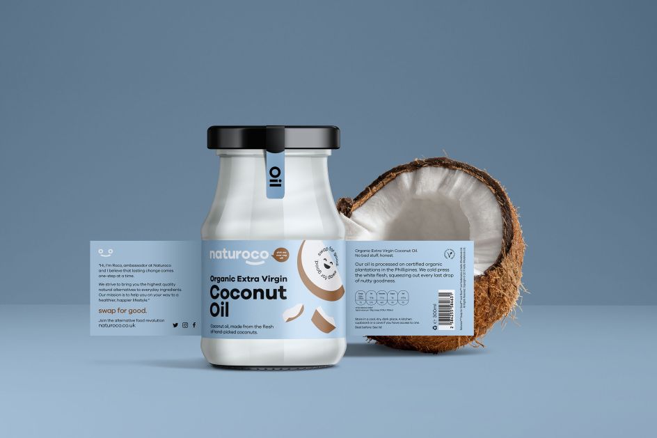
By offering healthy alternatives to everyday food ingredients and educating customers on the benefits of small changes to their diets, Naturoco hopes to encourage sustainable change in the way we all consume food. Its founders, Josh Robertson and Jordan Cumberton, approached Chris last year with a brief that would reflect its core mission.
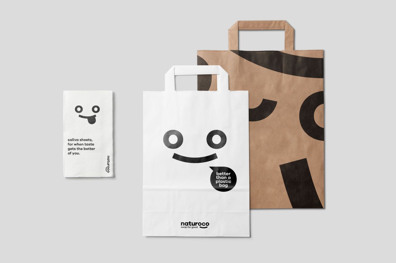
Working together to highlight food education as the core part of the brand, they came up with a brand mascot called Roco, which is featured as a cheerful and simple icon as part of the Naturoco logo, taking advantage of the double 'O' in the name. Coupled with the icon is humourous, friendly copy and call-to-actions, making Roco the engaging face and voice behind the brand.
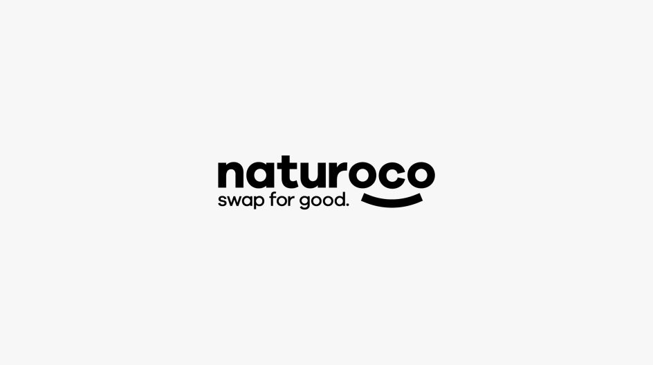
A tagline of 'Swap for Good' was also created, which centres around the theme of choice. 'Swap' reflects the company's offering of alternative ingredients while 'For Good' represents "forever or indefinitely sustaining change", conveying a positive benefit.
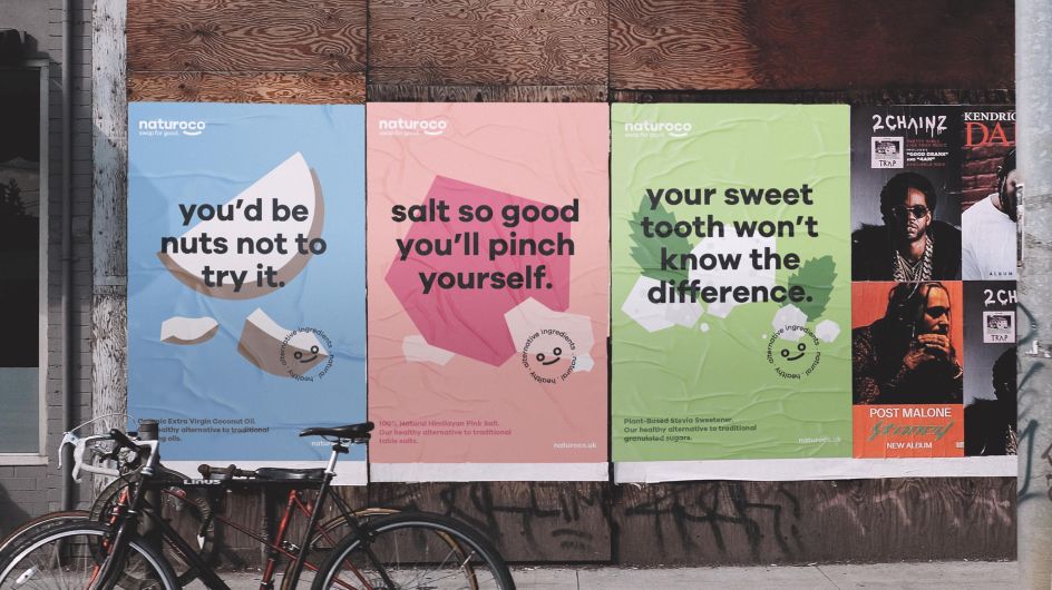
For the packaging design, Chris chose a bold circular san-serif typeface to stand out against the muted palette with a hint of accent colours to give a sense of play and simplicity. Each ingredient is represented visually on the pack with a simplified, flat style illustration, free from detailed elements helping mirror the purity of the product.
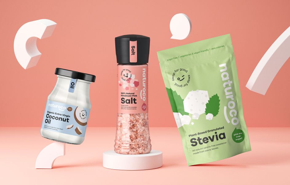
Elsewhere, visual cues were created from the circular characteristics found in the logo. A collection of geometric shapes, for example, can be used as information points – like bullet points – points of interest, such as pullouts for product features and patterns and housings for imagery or type.
Bold colour, clean layouts and conversational copy were then applied to various ads, promotional materials and social updates to explore how the brand and assets could be used for the launch or future campaigns.
"It was fun coming up with the idea of a friendly mascot to help communicate Naturoco's mission," Chris tells Creative Boom. "It's such a simple concept but is expressive and charming, perfectly fulfilling its purpose to get across complex ideas without overcomplicating things. I loved exploring the simplest way to convey emotion using a limited set of geometric shapes."
Editor's Picks


Trending


Podcasts


Editor's Picks
Further Reading