Regular Practice gives whole-food brand Frood an identity built for joy, not worthiness
The London studio has shaped the look and feel of Frida Redknapp's new range of cooking blends, now on shelves in M&S and Ocado.
There is a certain trap waiting for any "healthy" food brand. It's that whole worthy, slightly joyless aesthetic that signals goodness but risks forgetting the pleasure of actually eating. Frood, a brand-new range of whole-food cooking blends, has sidestepped the usual virtue signalling, thanks to London studio Regular Practice.
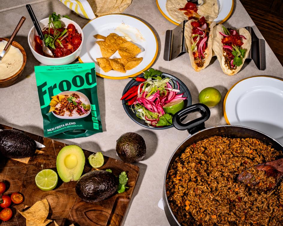
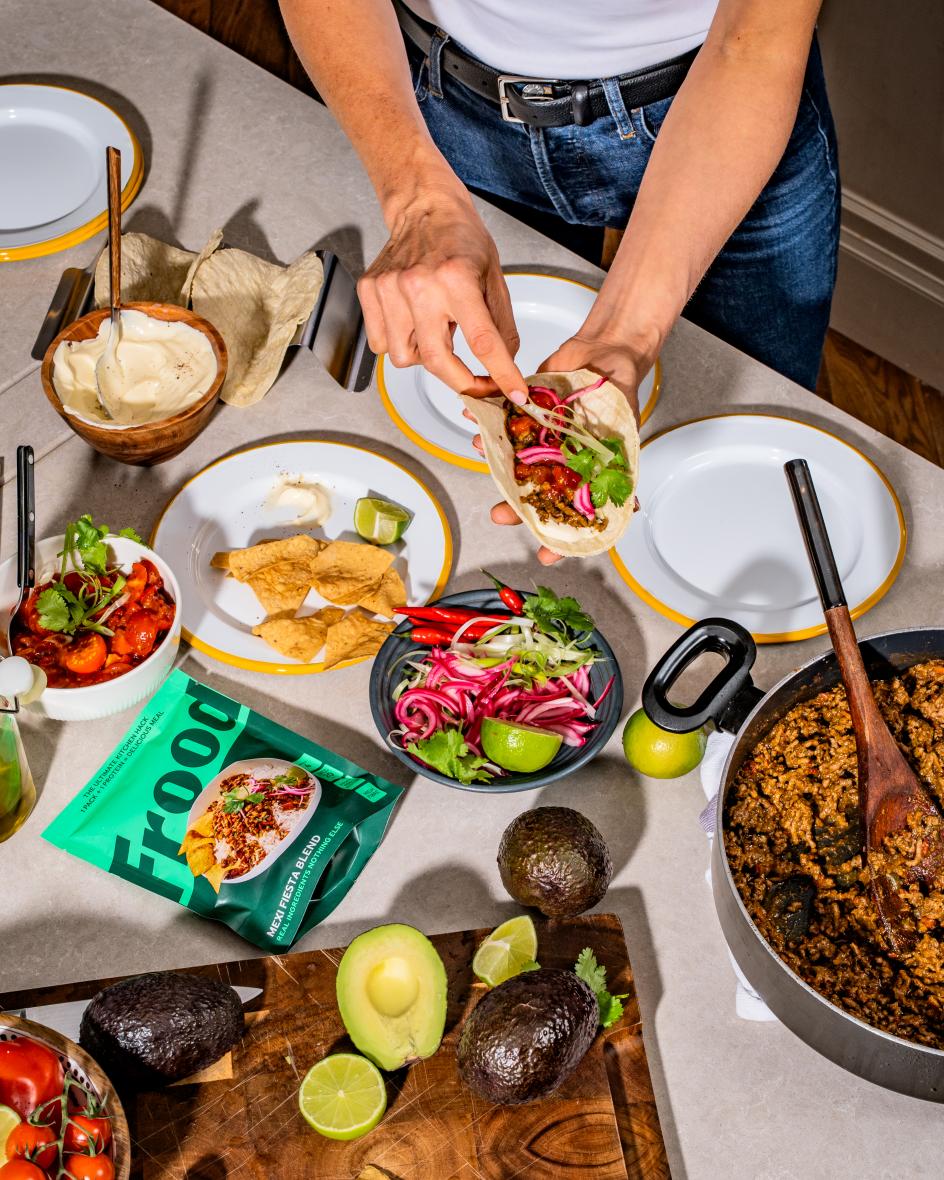
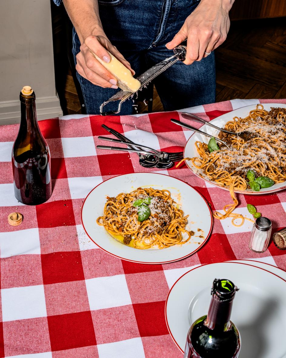
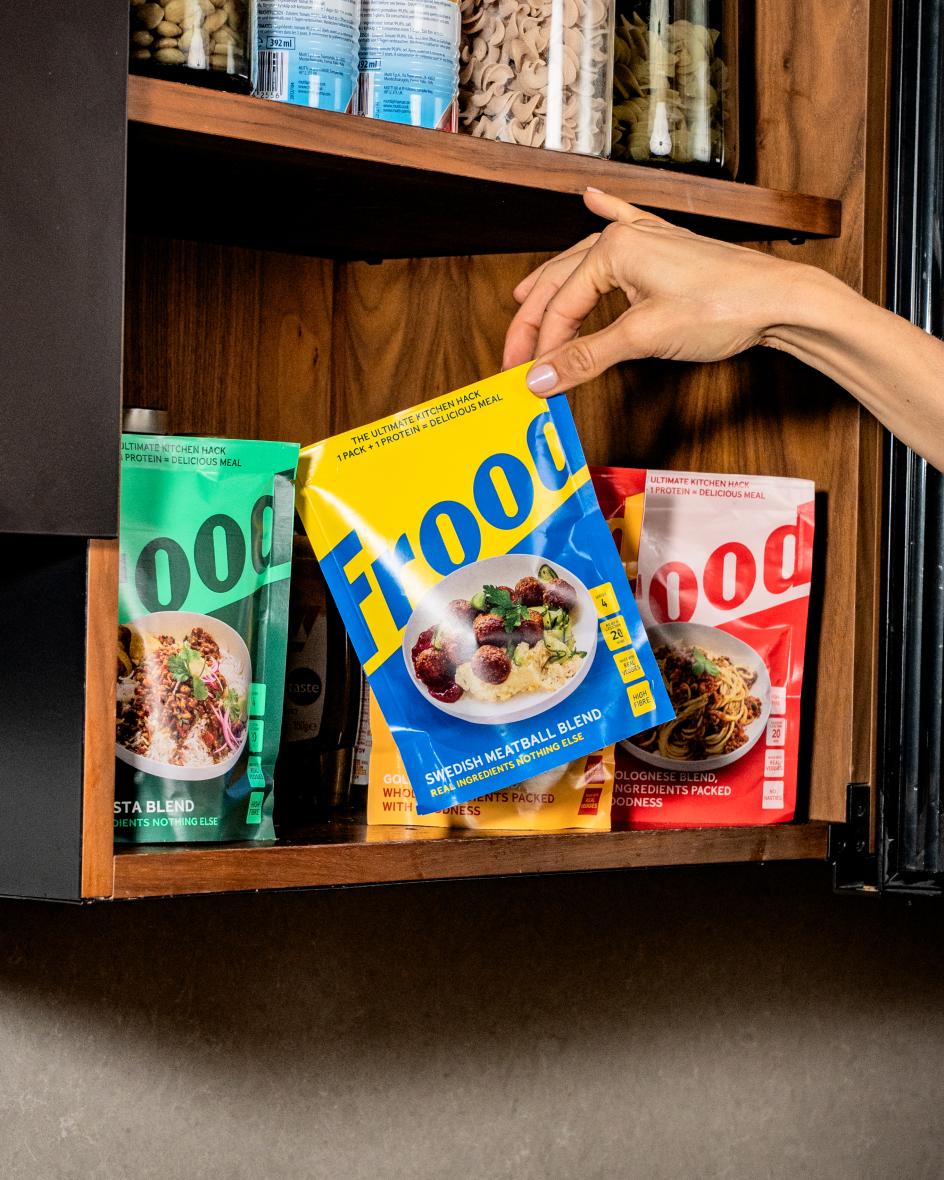
Frood is the brainchild of Frida Redknapp, a Swedish-born mother of five and a trusted voice in family, food and wellbeing. Inspired by her own kitchen hacks and family favourites, she set out to make healthy home cooking effortless without sacrificing flavour. The result is four cooking blends: Swedish Meatballs, Bella Bolognese, Golden Curry and Mexi Fiesta. Each combines dried fruits and vegetables, grains, seeds, plant proteins and other wholesome ingredients. You add your own choice of protein, a little water and oil, then mix and cook a complete meal in 20 minutes. Every blend is fibre-rich, a natural source of protein, packed with real veg, and notably free from ultra-processed ingredients. Nice. I'm sold.
But how does it look... Given that's a lot for a brand to carry? How do you convey convenience and nutrition, speed and care, modern shortcuts and real food – all at once? Hold too tightly to the health story, and it reads as a supplement; lean too far into convenience, and it loses the warmth. Not an easy thing to design. The job for Regular Practice, therefore, was to make all of it feel like one joyful, coherent idea on a supermarket shelf.
Regular Practice is a London branding studio that crafts visual identities, creative direction and brand strategy for ambitious brands. The name itself does a lot of work here. 'Frood' is playful, warm and memorable – a small, confident piece of language that captures the brand's belief that "real food can be quick and that everyday cooking should feel like a pleasure rather than a chore". It's also a nice foundation for everything that follows.
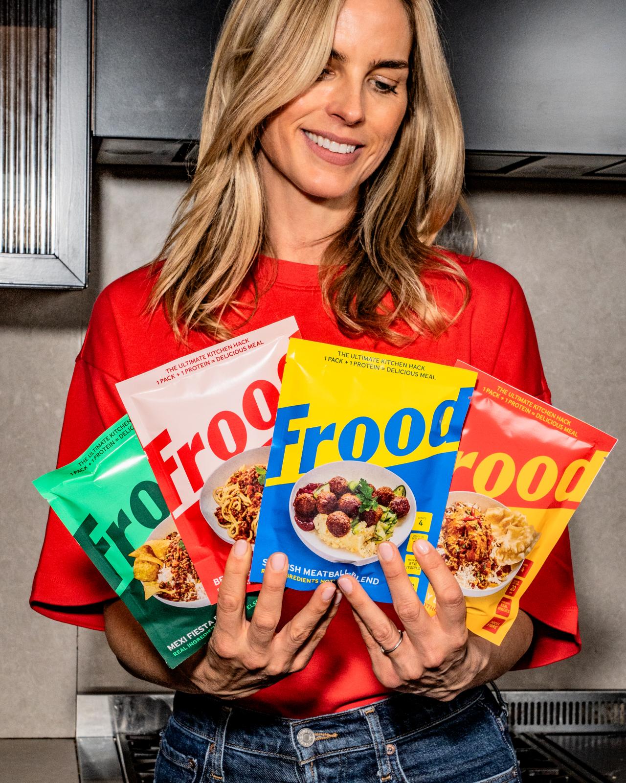
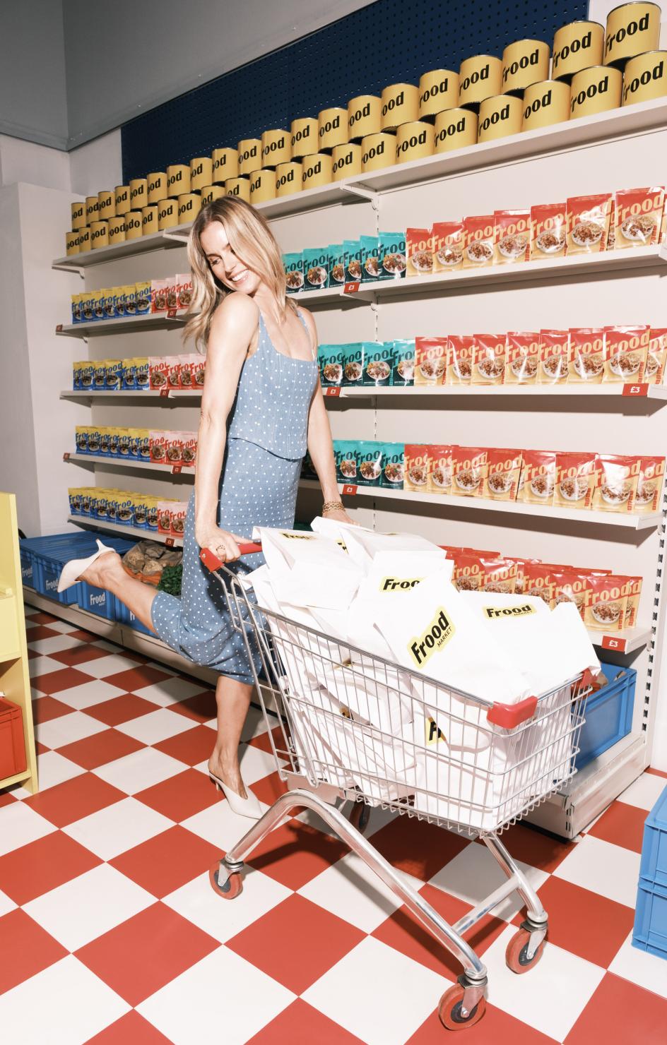
On the shelf, it looks loud. The 'Frood' wordmark is the hero: an oversized, chunky sans-serif that runs almost the full width of each pack. On an aisle full of soft, soothing wellness cues, that takes some nerve. And it does the one thing a challenger brand needs most: make you read it and, more importantly, remember it.
Underneath the bold opener, though, there's some further logic. Each blend gets its own colourway, so the range reads instantly as a family while every flavour is easy to tell apart: green for Mexi Fiesta, a warm red for Bella Bolognese, a sunny red-and-yellow for Golden Curry and – my favourite touch – blue and yellow for the Swedish Meatball blend, a cheeky nod to both the dish and Frida's own heritage. The wordmark flips colour against each background, so the logo stays constant while the palette shifts.
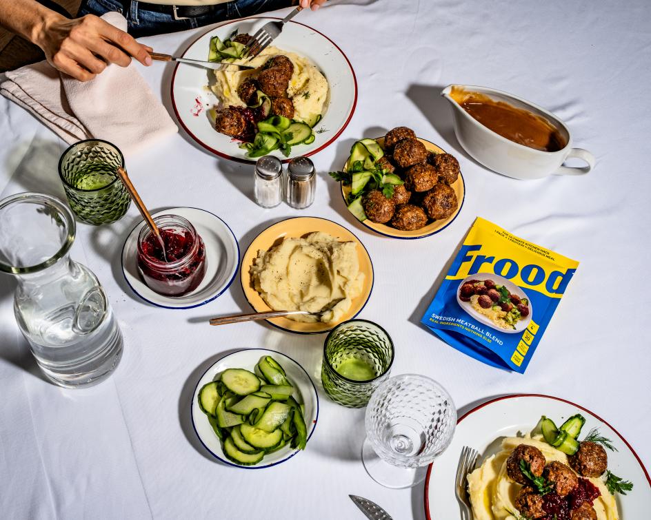

Accompanying photography by James Moyle shows the finished dish, so the promise never feels abstract. The set design feels aspirational and appeals to the target audience. And Redknapp is the star, which helps add credibility. A short stack of plain-spoken lines does the reassuring: "the ultimate kitchen hack", "1 pack + 1 protein = delicious meal", "real ingredients, nothing else", alongside neat flashes for high fibre, real veg and ready in under 20 minutes. It's the part of the design that carries the nutrition story without ever turning preachy.
The brand follows Redknapp's conviction that food is about connection, joy and everyday wellbeing. Frood is pitched squarely at busy people who want real nourishment without the faff. We all know it's a crowded, fast-moving corner of the market, which makes the clarity of the branding all the more important. Shoppers have seconds to understand what a product is and why it is different. Regular Practice smashed it.
Editor's Picks


Trending


Podcasts


Editor's Picks
Further Reading