Reddit gets a new identity featuring a refined 3D Snoo that celebrates conversation
It's the social community where you often find the funniest cat videos or epic fails. This week, Reddit saw the launch of its new visual identity courtesy of Pentagram. Still featuring its "loveable, genderless" mascot, Snoo, it shows how the platform has grown up since 2005.

Reddit is an American social news aggregation, content rating, and discussion website (just in case you need the Wikipedia description). And it's been around for a very long time. The 18th most-visited website in the world, it's expanding globally. But like many big brands of this nature, it had accumulated way too many branding materials, going off on various confusing and complex tangents, and so needed something more unified, contemporary and intuitive.
Cue its approach to Pentagram in 2022, working with partner Natasha Jen and team to look at its brand positioning with fresh eyes and create a cohesive identity system for the modern day while preserving its signature sense of friendliness and joy that we all know and love.
A creative spirit
At the heart of the work, Pentagram knew that retaining Reddit's creative spirit was key, so the first roll-up-sleeves challenge was to refine the company's positioning. "Reddit has a distinctly genuine sensibility to it, expressed in the forms of unique features on the platform and an alien mascot," explains Pentagram. "It also boasts an unusually curious, informed, and active community base." With this in mind, Pentagram agreed that Reddit's fresh identity would point back to four traits: "inherently eclectic, positively different, delightfully absurd, and genuinely candid".
It was these traits, along with Reddit's reputation as being a great place to discover and participate through conversation, that Pentagram created a new, strategic description for the website as "the heart of the internet".
Embracing a lovable mascot
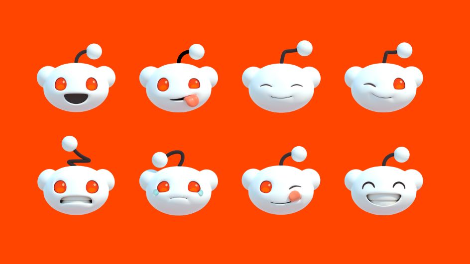
On refining Reddit's identity, Pentagram realised its mascot, Snoo, should be transformed into a character as iconic as Super Mario, so it formalised its shape and details. The New York studio took the existing 2D Snoo icon and rendered it in 3D, putting it through the kind of character development we'd expect at Pixar.
Snoo's new three-dimensional form has been introduced alongside a suite of emoji-like versions, setting the stage for its next act. It also lays the foundation for a new core illustration style, transitioning from spot illustrations that lack a common thread to heroic 3D icons, all unified in form.
You can see Reddit's joyful persona shines through the new Snoo, but Pentagram also wanted to highlight the role that comments play in the Reddit universe, which is mainly centred around discussion threads. Therefore, Pentagram introduced a conversation bubble as the new cornerstone of the brand's visual identity.
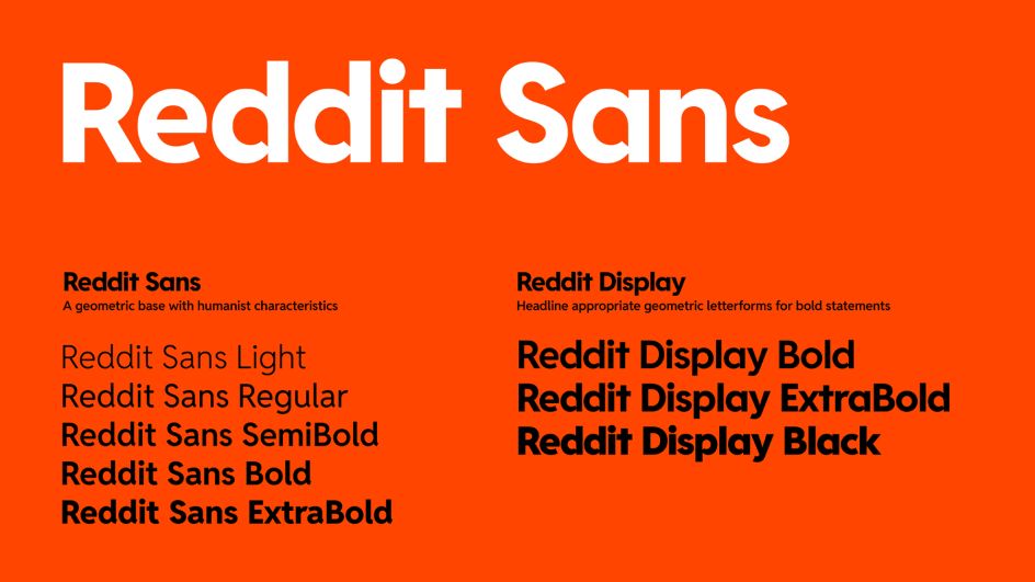
Just our type
On the typography, Pentagram began with the Reddit wordmark, customising Reddit Sans, one of the company's proprietary typefaces, turning the rounded counter forms of lowercase letters into bubbles as a nod to Reddit's interface. This led to the creation of Reddit Display, a unique custom typeface that brings the distinctive bubble motif to headlines and large-scale typography. "This ensures that the iconic shape becomes a recurring and memorable feature in Reddit's visual communication," explains Pentagram.
Beyond the typography, the conversation bubble becomes a key element, as it helps frame both text and images, acting as a foundational graphic element. "Its ability to adapt and shape-shift underscores and celebrates the essence of Reddit's communities, content, and unique vernacular, making it an integral part of Reddit's distinctive visual language," Pentagram adds.
Making things move
Once the speech bubble was established as the anchor point for the identity, Pentagram added some motion to allow the element to stretch or expand to accommodate different types of content, from photography to display copy. The motion behaviours mimic sliding drawers and doors and give the impression that Reddit is organising and revealing content logically. The aim is to create clarity, helping the Reddit community find their way through the wealth of information.
Vibrant and signature
And now for the colour palette. That distinctive OrangeRed remains Reddit's signature hue, but it's now complemented by a newly refined secondary palette, one that's been simplified from a diverse library of over 100 colours to a total of 15, with five primary hues, each with three shades.
"This approach strikes a balance between allowing community expression and maintaining brand coherence," says Pentagram. "The new secondary palette provides moderators with a curated spectrum for customisation, offering a range of choices within a thoughtfully limited range."
A new era
With these key refinements – the evolved form and expression of Snoo, the introduction of the bubble, the creation of Reddit Display, codified motion behaviours, and a streamlined colour palette – Pentagram believes they collectively reflect Reddit's unique brand attributes and give everything the company needs to boldly navigate its next chapter.
Editor's Picks


Trending


Podcasts


Editor's Picks
Further Reading