Porto Rocha celebrates gay culture with boldly explicit new mag, Brazilian Homo
The New York-based agency unveils a bold new NSFW publication celebrating the LGBTQIA+ community through innovative visual storytelling.
You don't see a lot of new print magazines released these days. Gone are the times when publishers could launch 20 new titles a week, hoping that at least one of them would find a mass audience. Now that everyone has a world of free information at their fingertips through their phones and tablets, a print magazine has to be pretty special to persuade them to part with hard-earned cash.
Well, here comes something pretty special. In a powerful testament to creative expression and cultural representation, New York-based design agency Porto Rocha has launched Brazilian Homo, a groundbreaking magazine that pushes the boundaries of both design and queer narratives.
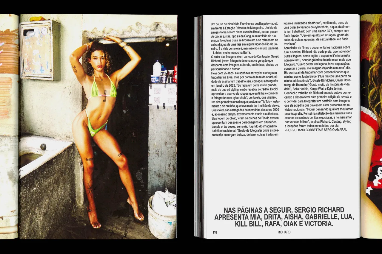
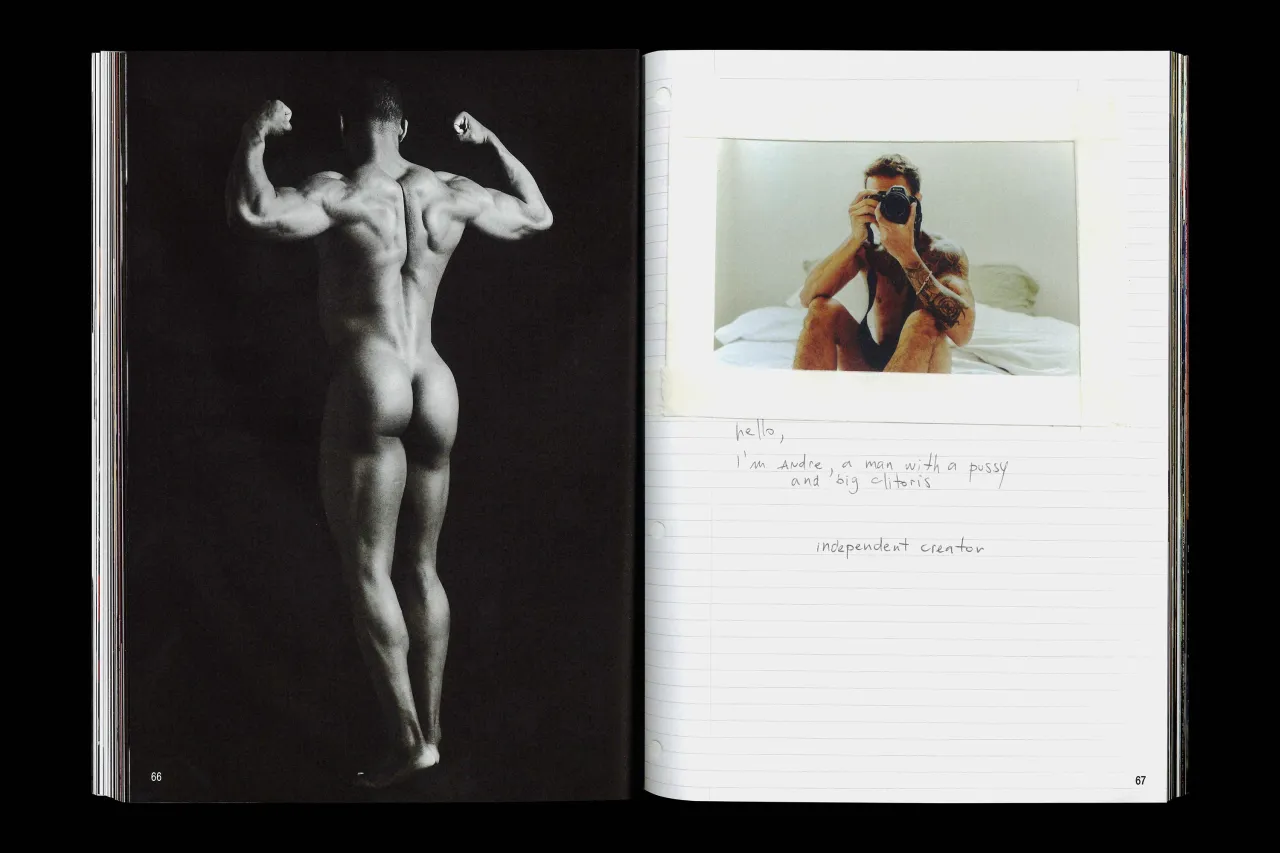
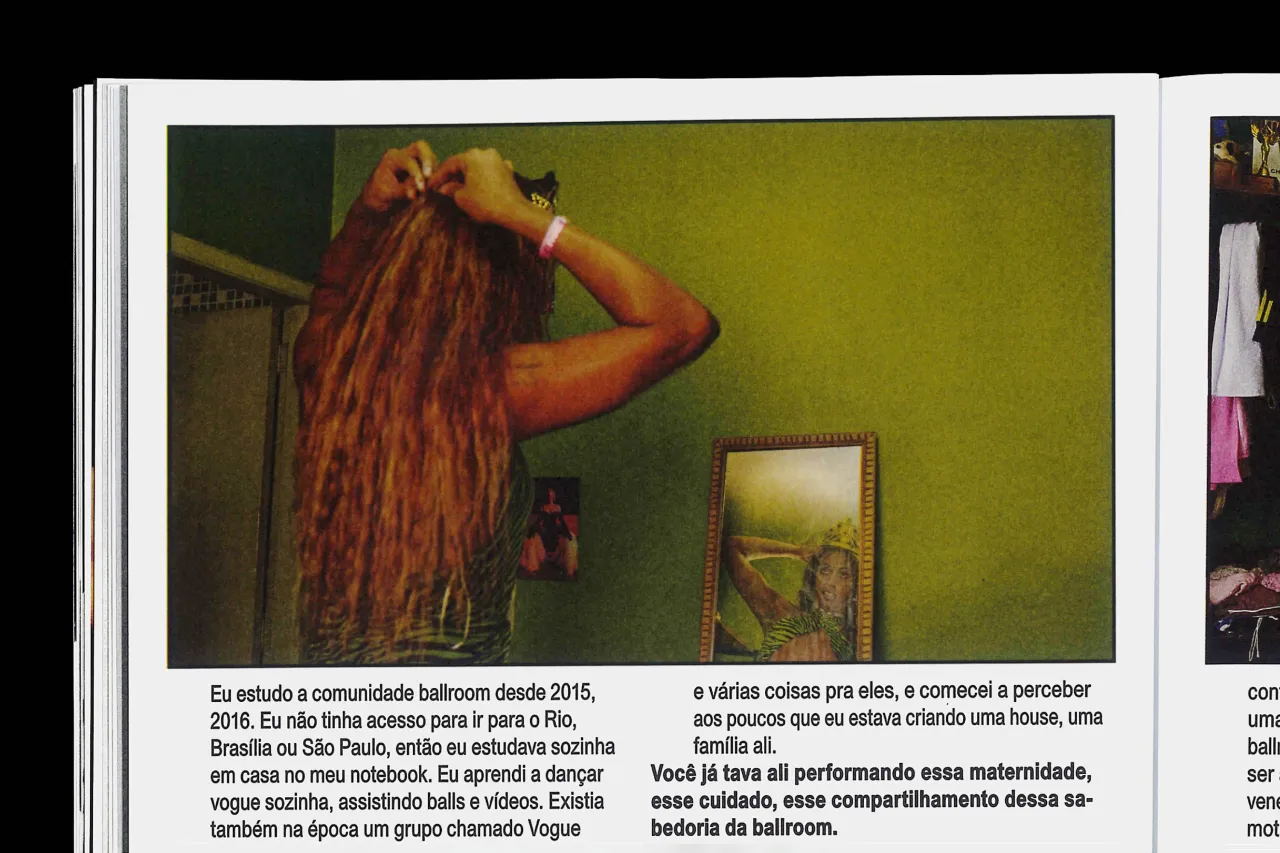
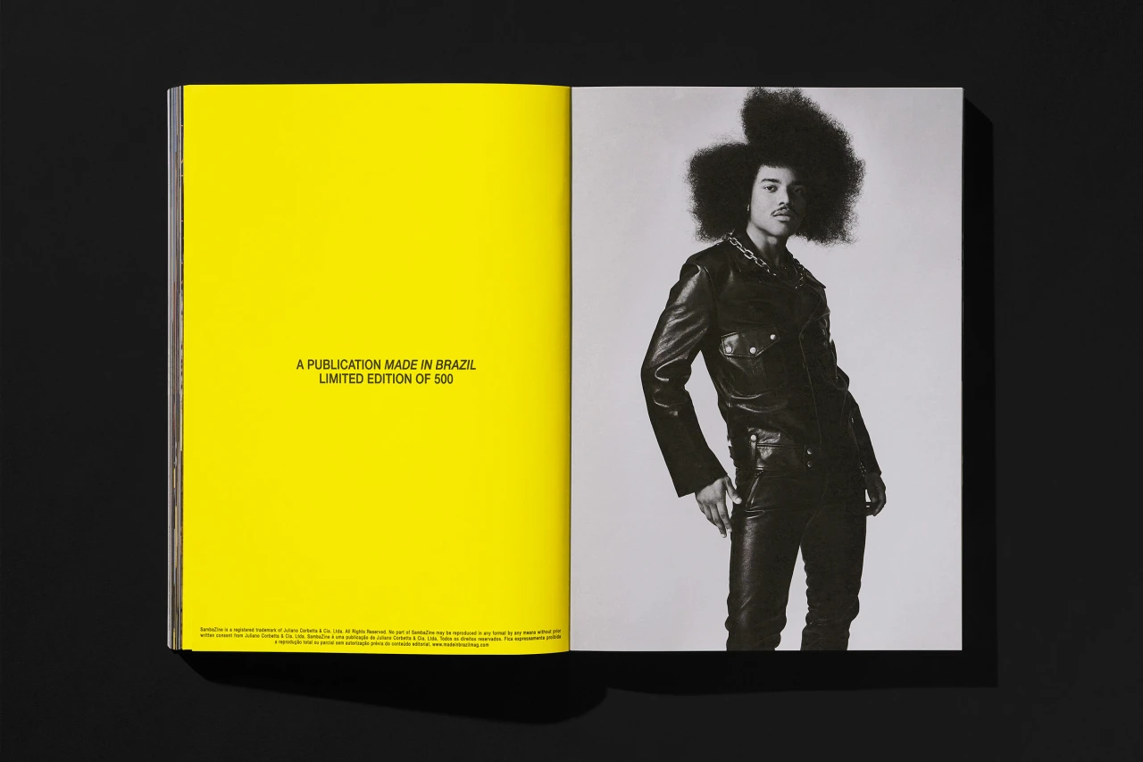
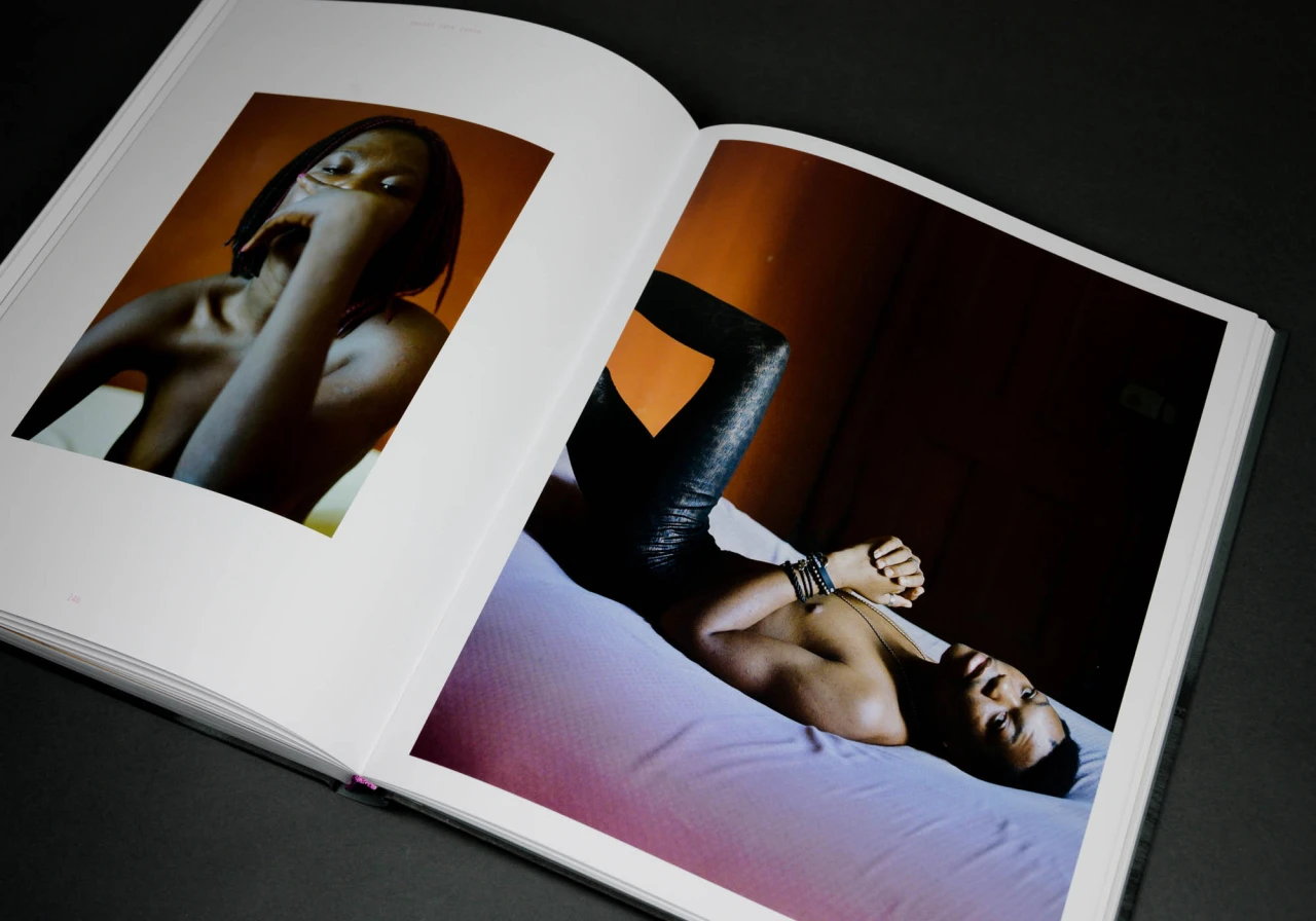
The publication, the agency's second collaboration with editor Juliano Corbetta, offers an unfiltered glimpse into Brazil's LGBTQIA+ community. Far from a conventional magazine, it's a vibrant celebration of identity, featuring striking photo editorials and intimate personal interviews that challenge traditional media representations of marginalised communities.
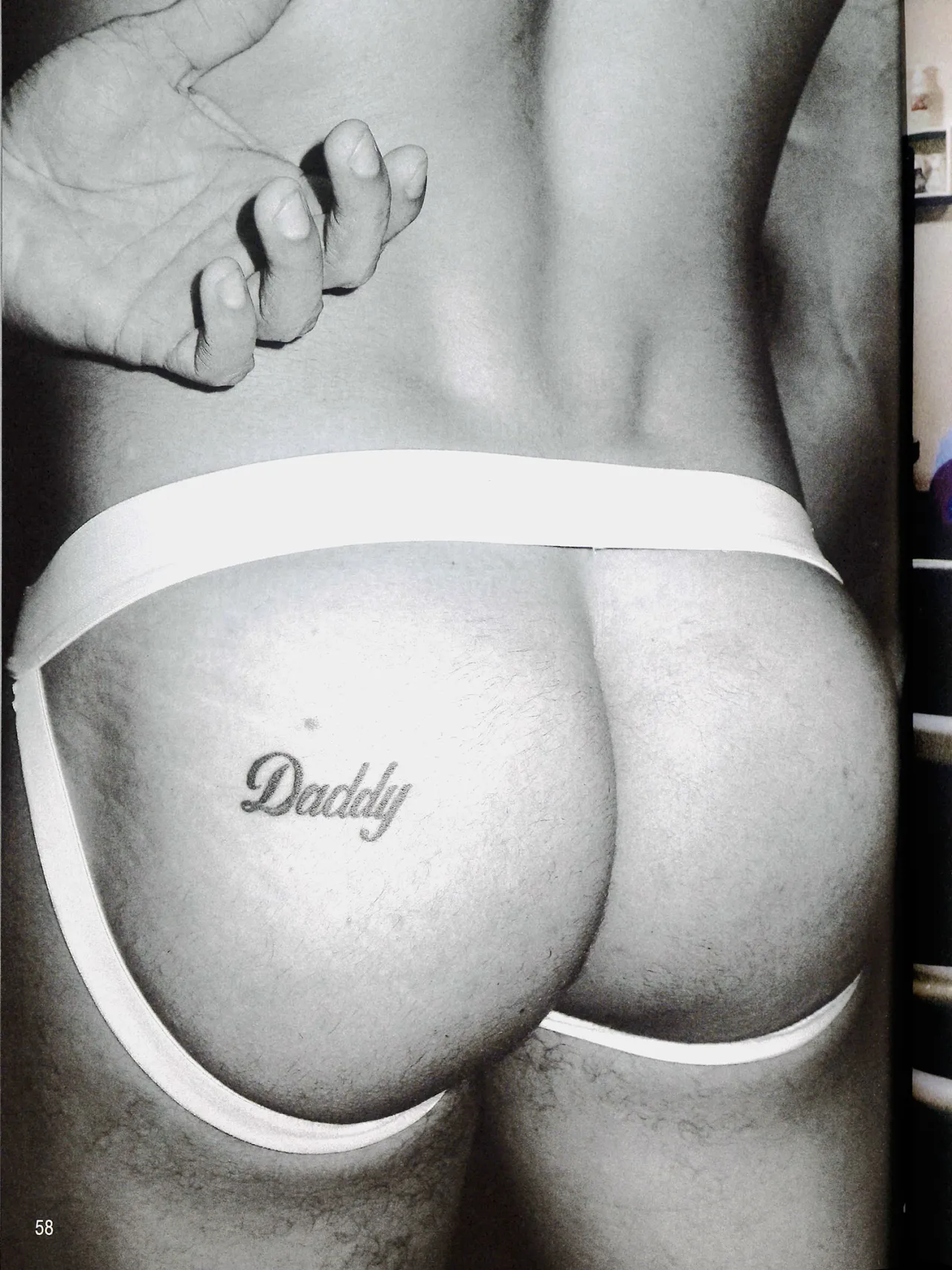
Featuring vibrant design, eclectic layouts and diverse voices, Brazilian Homo celebrates queer identity while supporting LGBTQIA+ causes. Porto Rocha describes it as their "first NSFW design project" as it includes several explicit images. But the magazine reveals more than skin — it captures a full spectrum of queer experience, featuring everyone from trans ballroom icon Tanesha to well-known adult content creators, including Blessed Boy and Diego Sans.
Design that speaks volumes
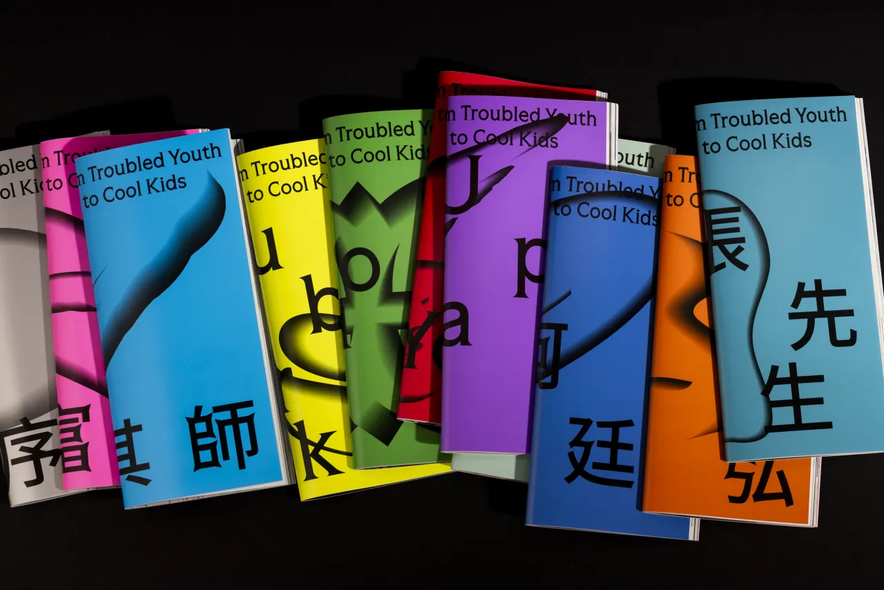
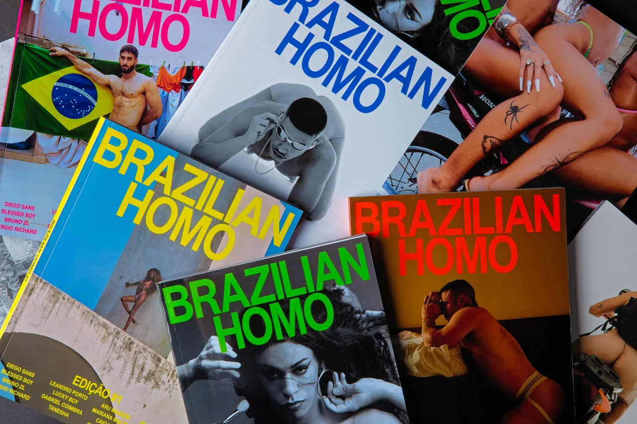
Porto Rocha's approach to Brazilian Homo's design was as bold and dynamic as its uncompromising content. The agency created five distinct covers, each highlighting a different contributor and featuring a unique hero colour.
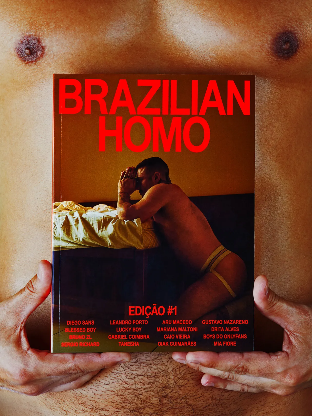
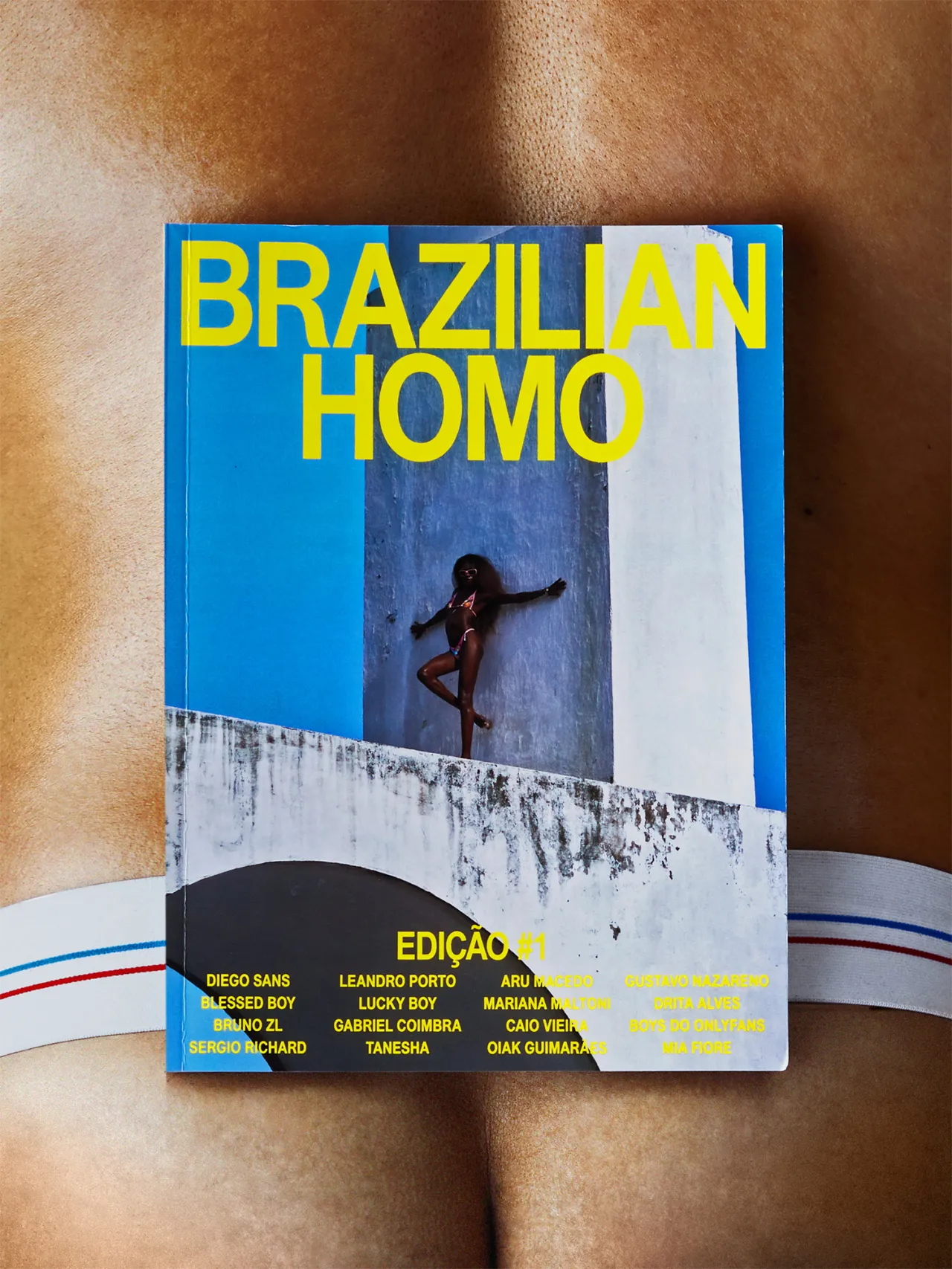
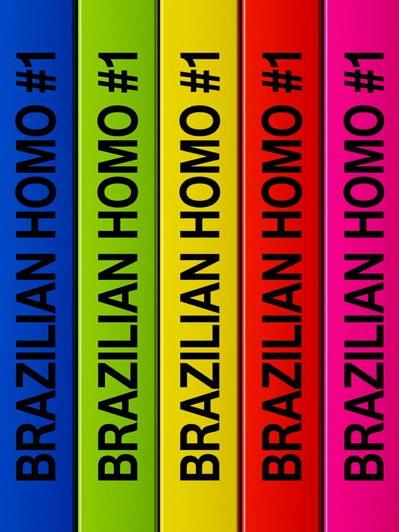
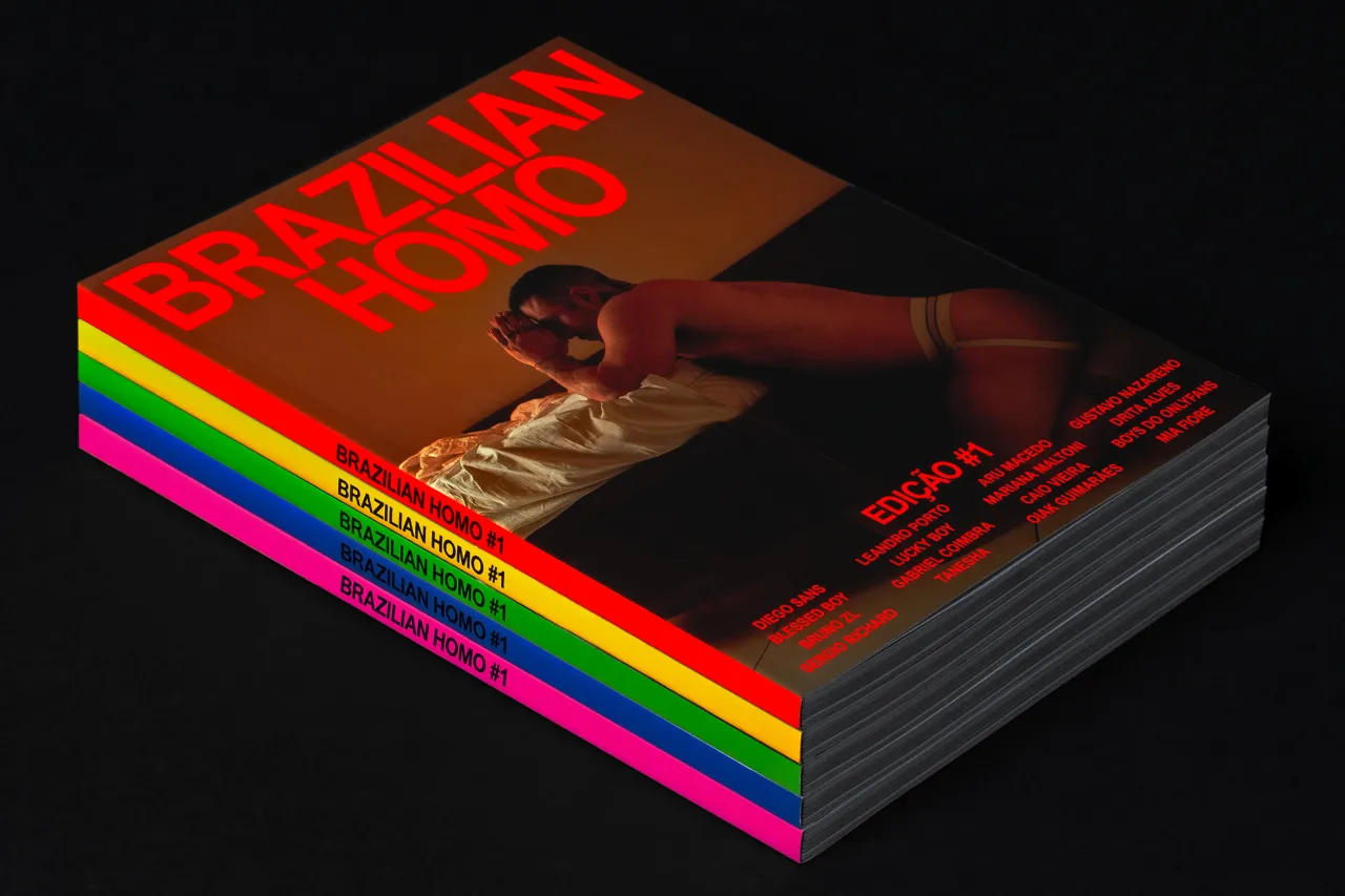
When displayed together, the magazine's spines form a powerful rainbow – a deliberate visual metaphor for community and diversity. Consistent in their typographic layout, all covers prominently feature the names of contributors, including photographer Maria Maltoni and stylist Leandro Porto.
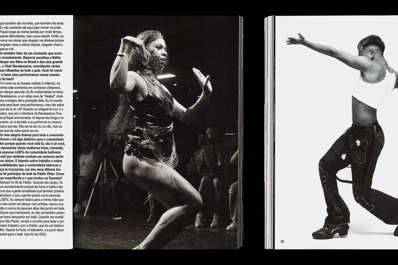
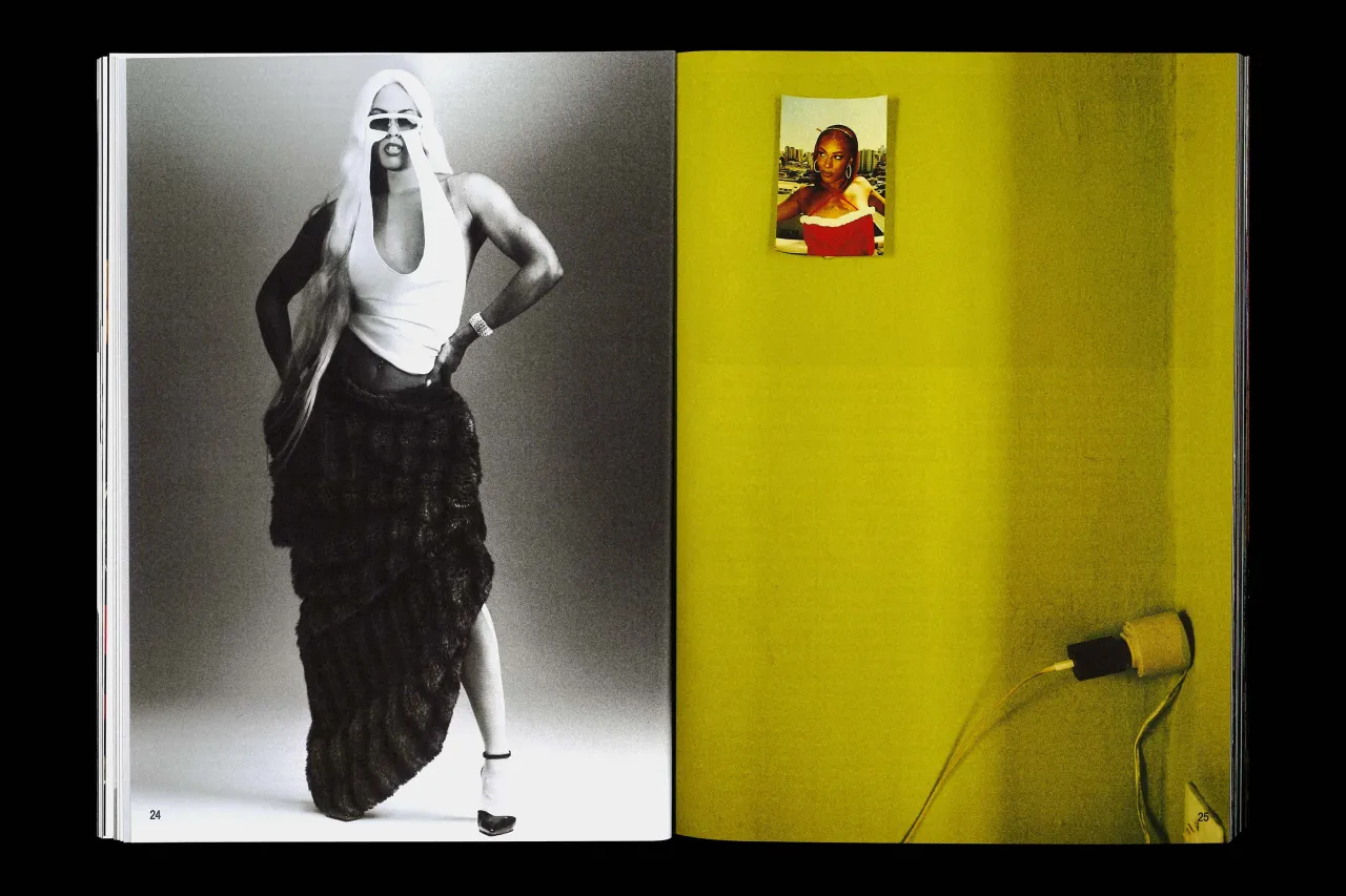
The interior layouts reject conventional magazine design, embracing a fluid and dynamic aesthetic. Full-bleed photography intertwines with unstructured text, creating a visual narrative that feels both intimate and revolutionary. Inspired by the visual portfolios of OnlyFans creators, spreads become intentionally eclectic, mixing formats to reflect the diverse experiences and styles of the subjects.
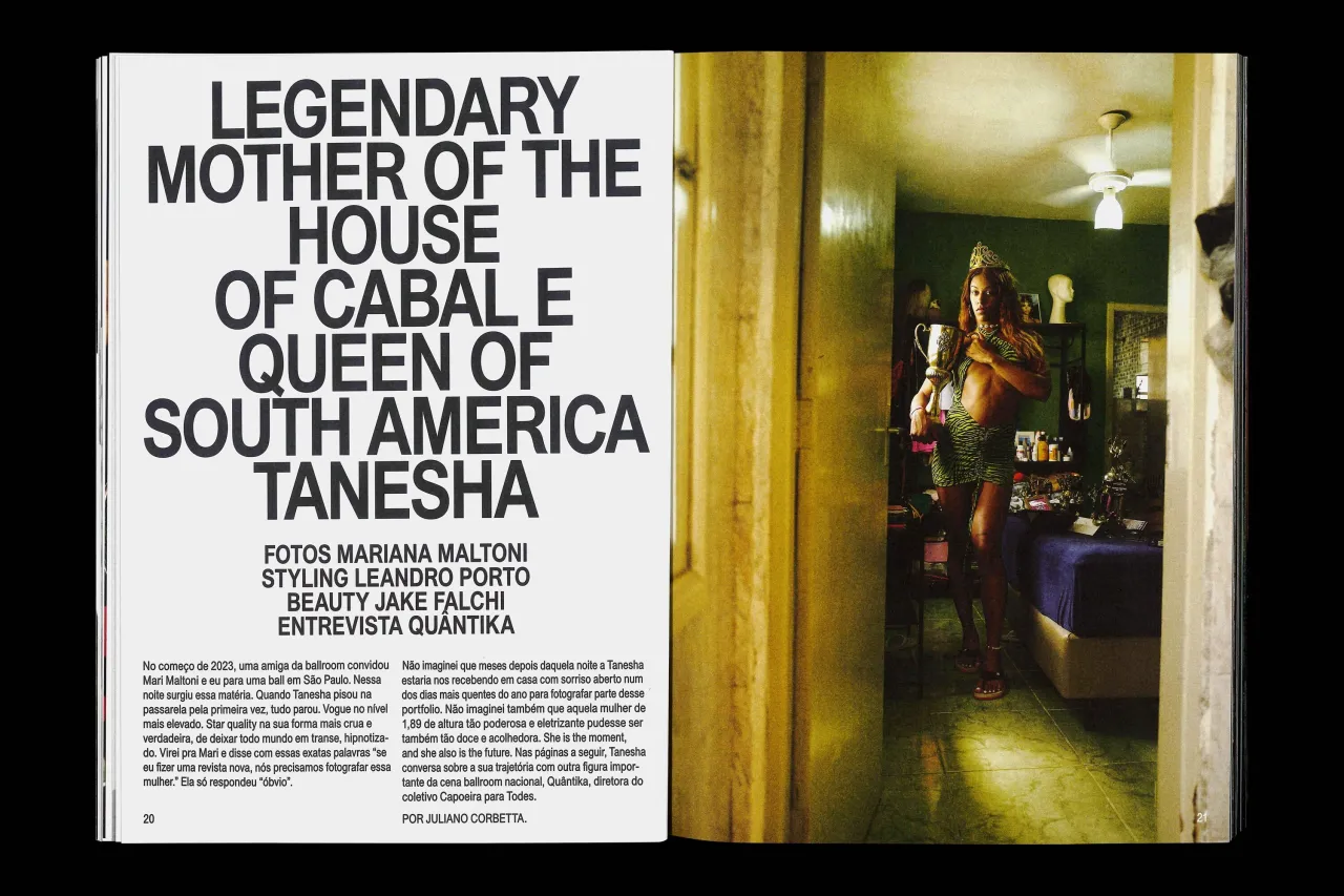
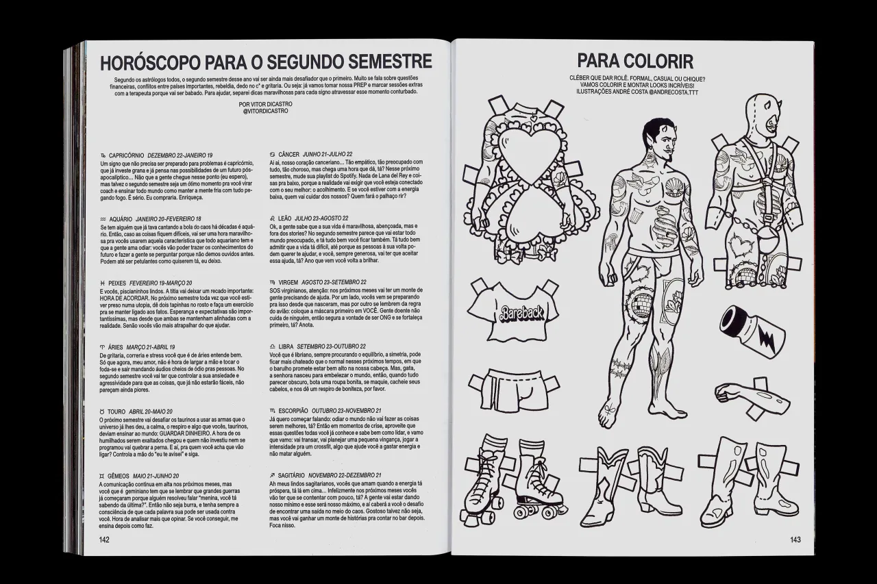
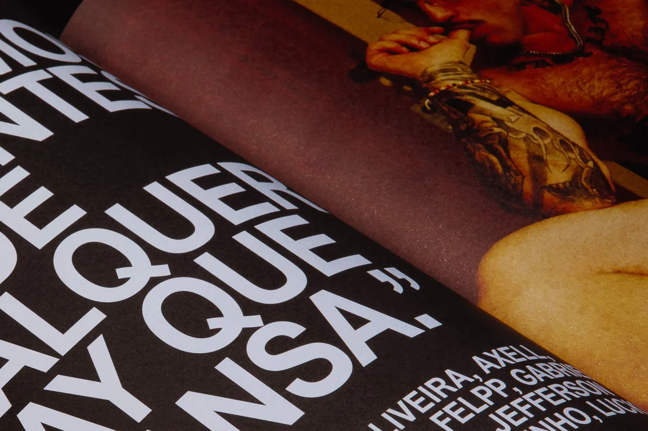

Taking a deliberately 'un-designed' approach, the team selected Union, a hardworking sans serif font by Radim Pesko, across the publication to ensure the imagery and personal stories remain the focal point.
More than just a mag
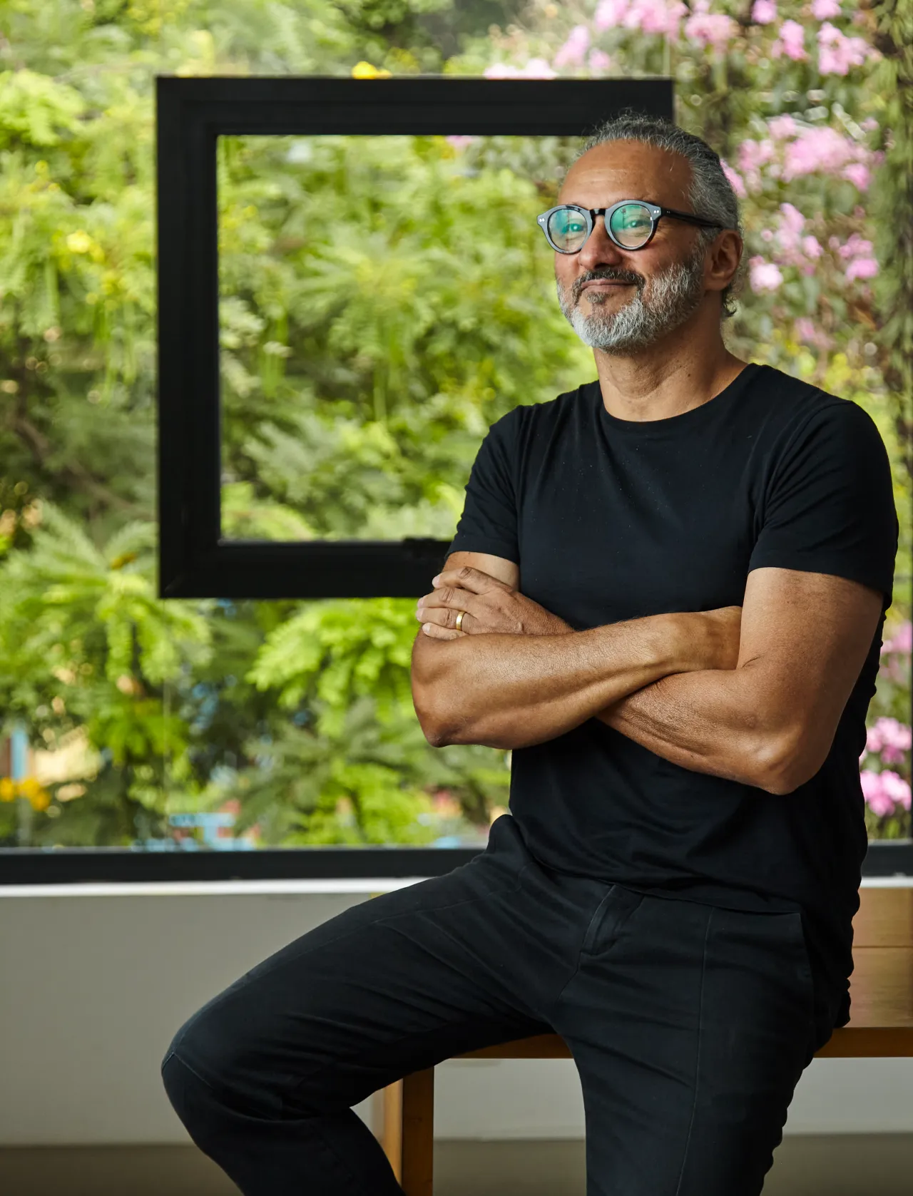
Design Eyal Chowers explains the visual philosophy behind the new title. "Our design for Brazilian Homo reinforces the publication's unfiltered tone and collaborative spirit," he says. "We let the stars shine by stripping the design down to its raw essence. Featuring the talents on multiple covers wasn't just bold—it pulled readers straight into Brazil's vibrant queer culture. Projects like this remind me why I became a designer."
Released to great anticipation, the first print run of Brazilian Homo sold out in just days; the second edition is now in the works. Beyond its symbolic impact, the magazine's launch included limited-edition merchandise and posters.
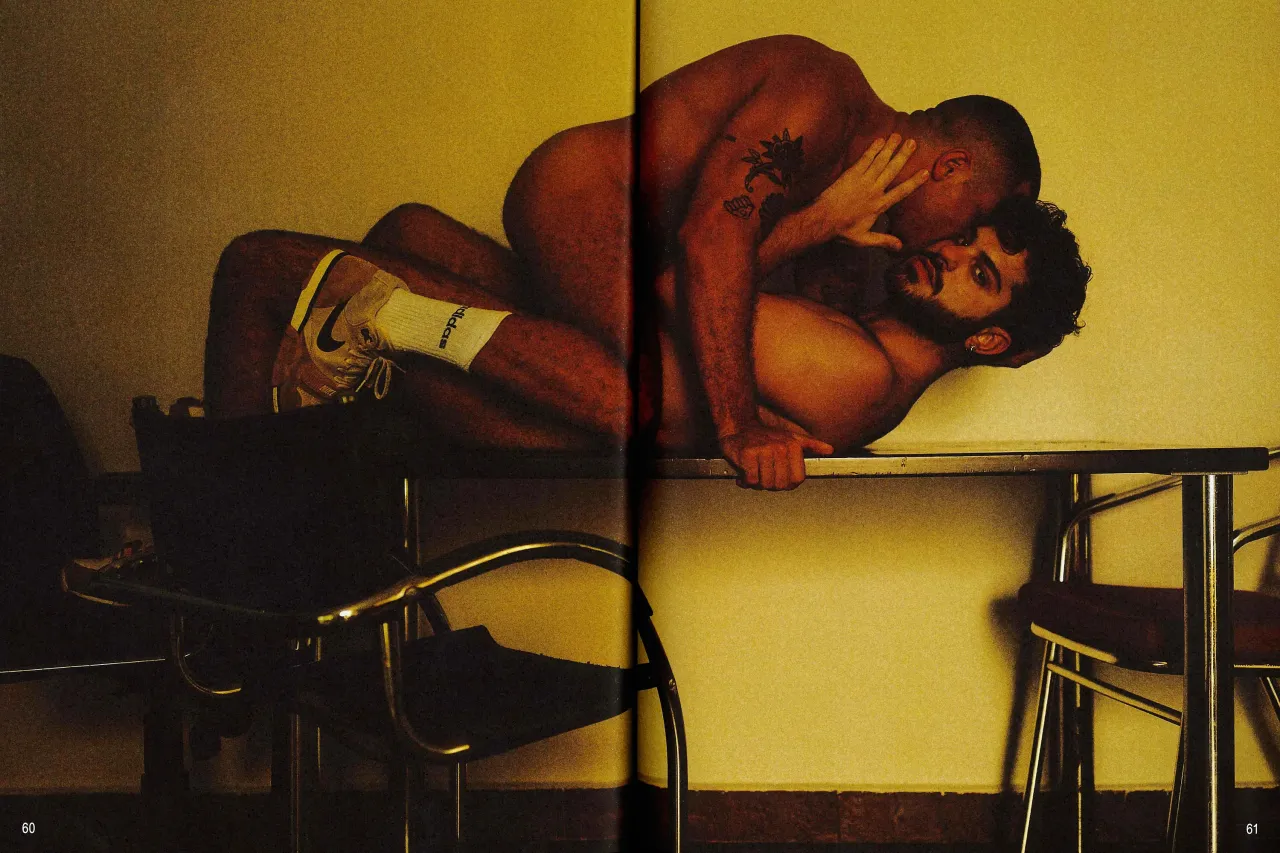
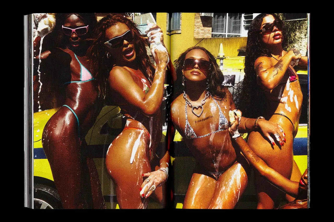
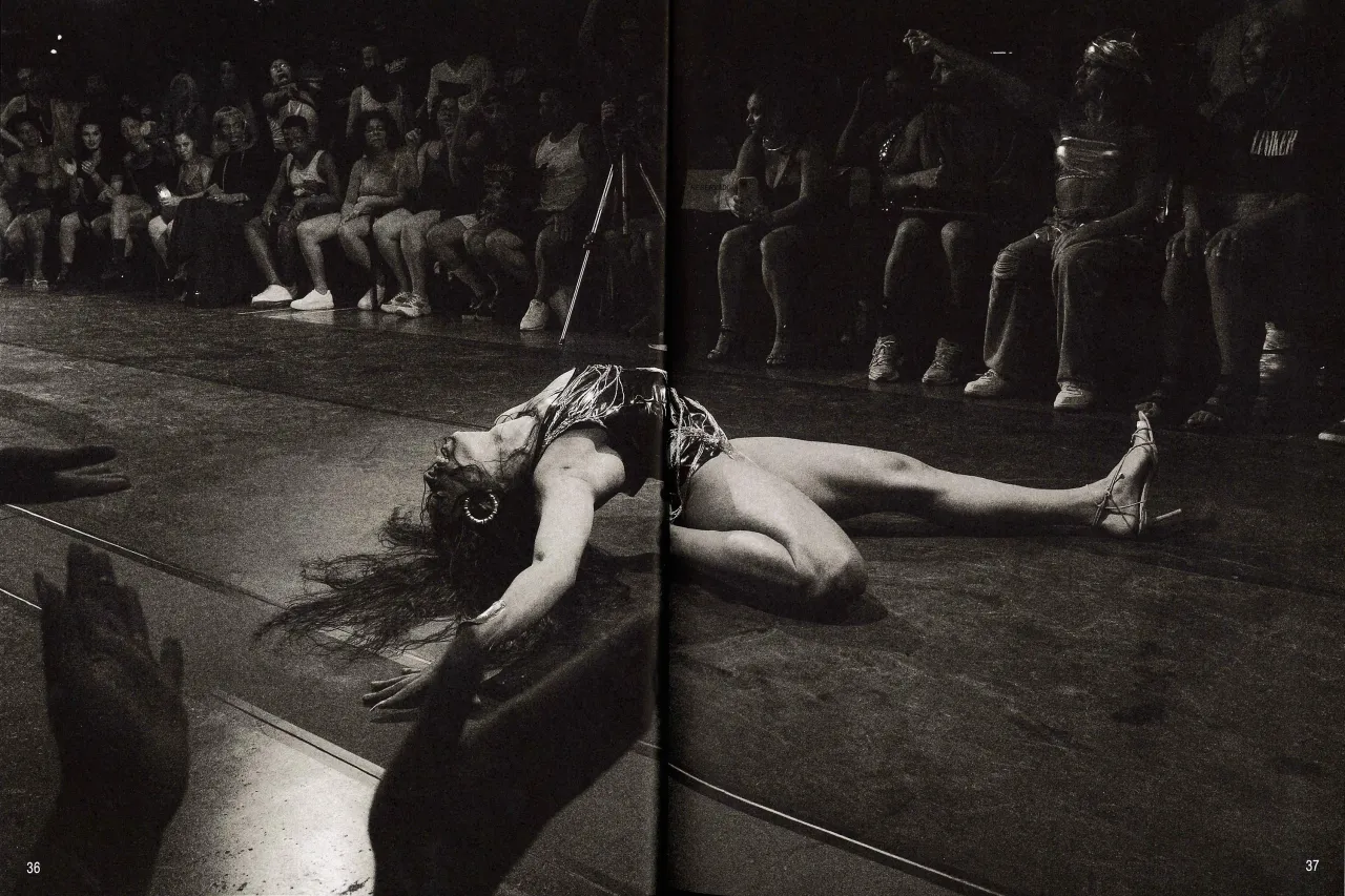
Beyond its artistic merit, Brazilian Homo carries significant social impact. The first print run sold out within days, with proceeds supporting LGBTQIA+ causes in Brazil. Limited-edition merchandise and posters—the proceeds from which went directly to LGBTQIA+ causes in Brazil—further amplify the magazine's mission of visibility and support.
Ultimately, Brazilian Homo represents more than a magazine – it's a powerful statement about representation, design, and the transformative potential of creative storytelling.
Editor's Picks





Trending




Latest Jobs
Manager, Visual Design Art - TFT at Riot Games
Full-time·Los Angeles·$166,600 – $232,800
Design Director, Opinion at The New York Times
Full-time·New York·$160,000 – $180,000
Senior Producer, Marcom at Code and Theory
Full-time·New York·$100,000 – $130,000
Copywriter & Content Strategist at Chapel
Full-time·London·£30,000 – £40,000
Motion Design Lead at Huge
Full-time·United States·$108,000 – $142,000
Senior Project Manager at Engage
Full-time·Leeds·£42,000 – £52,000