Pentagram brings shifting identity to life in titles for Riz Ahmed's Bait
What if who you are depended on wh's looking? Pentagram's title sequence for Riz Ahmed's new comedy-drama uses colour and motion to show several versions of the same truth at once.
Have you ever noticed you're a slightly different person depending on who's in the room? I know I have. I'm sweary and relaxed with some, reserved and considered with others. Mostly harmless. The same applies to all of us. But it gets less harmless when the whole country is looking at you in a certain way.
Which is the predicament of Shah, the struggling British-Pakistani actor at the centre of Bait, Riz Ahmed's new comedy-drama out on Prime Video. An unexpected audition for James Bond and suddenly everyone has an opinion about who he is and who he's allowed to be.
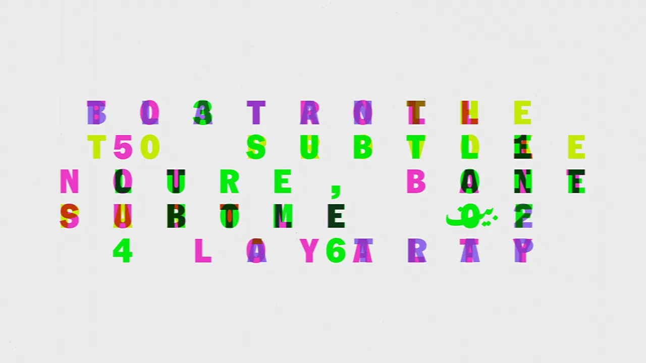
It makes an interesting brief for a title sequence, and Pentagram's Luke Powell and Jody Hudson-Powell have made the most of it. Their titles and location cards are built on the idea that identity isn't fixed. That it moves around and gets projected onto you by others whether you like it or not.
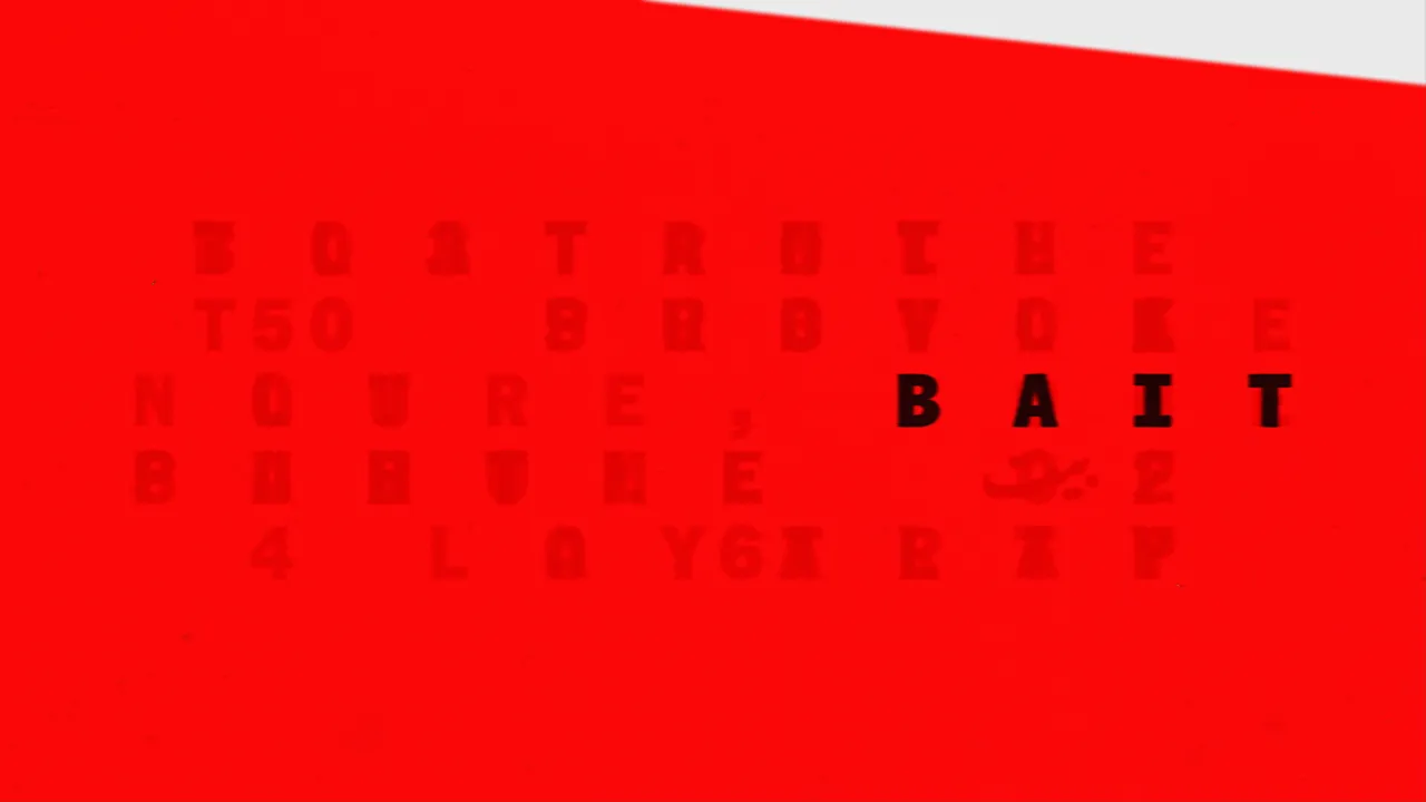
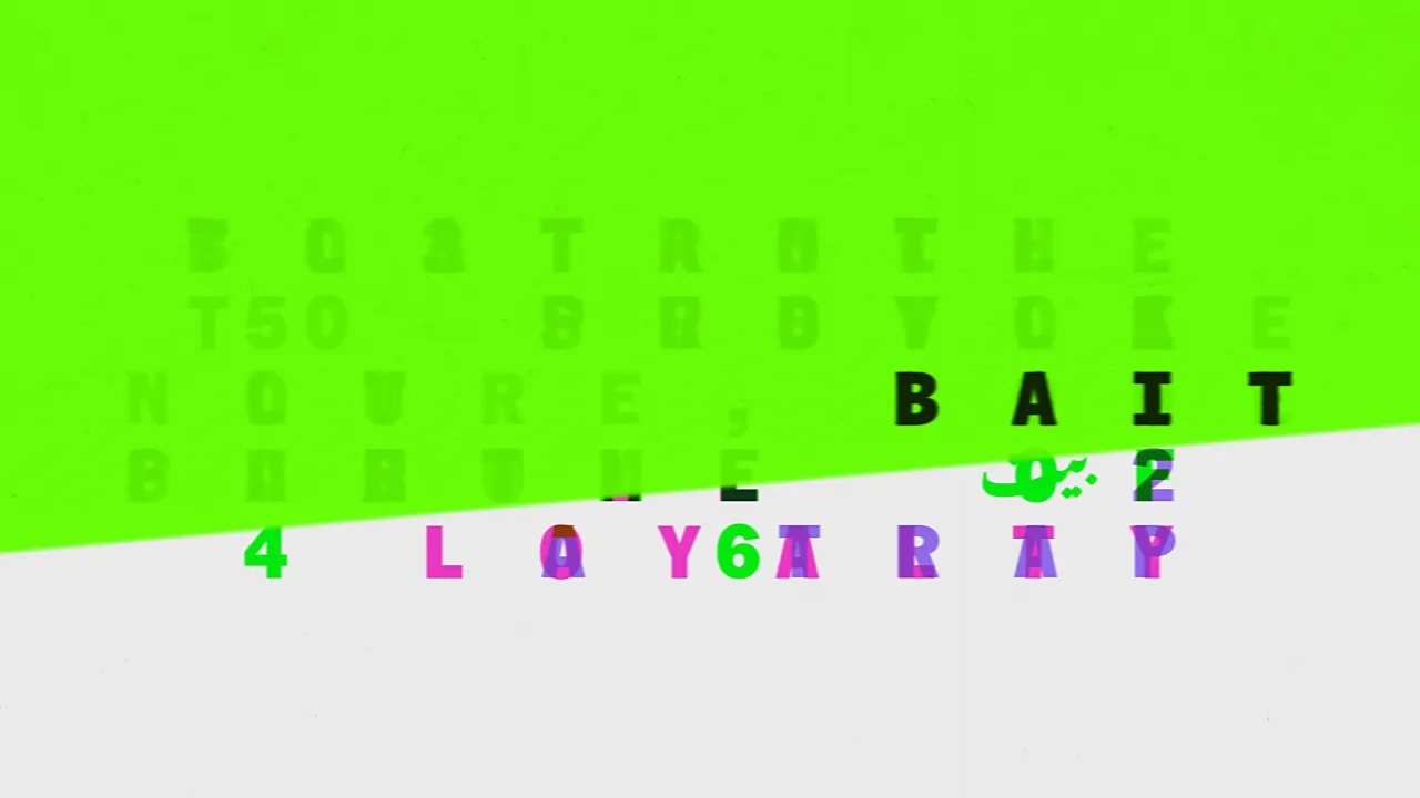
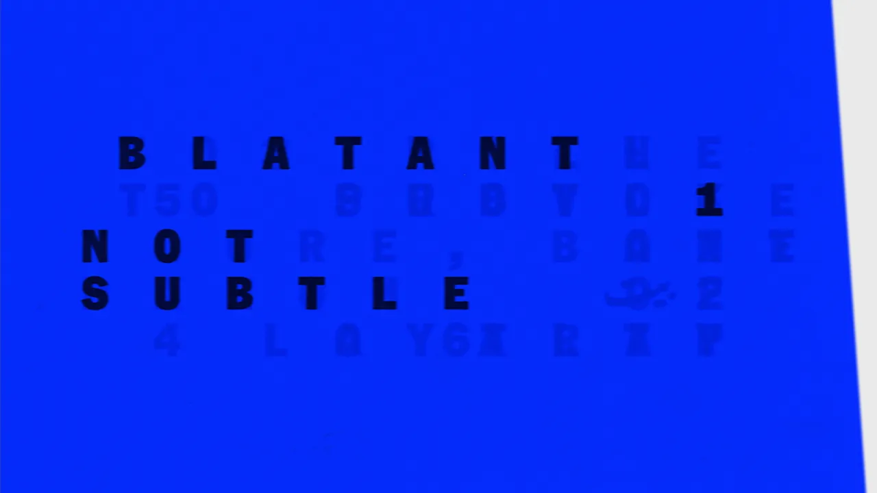
So instead of a single, static title, the London studio created a system that hides and reveals meaning through different colour filters. It's like being stood in the audience of a gig and seeing those overhead stage lights change colour to bring one part of the band forward and push another into the shadows. Only in this case it's with typography. As such, one composition can hold several readings, but you can only see them when you look at it under another colour.
The idea is that it matches Shah's own experience. He's under pressure to perform whichever version of himself works for whatever room he's in. Whether that's the industry, his local community or the one the public has already decided on. As Riz Ahmed puts it, life can feel like "one big audition", and the titles get that across beautifully.
The word 'bait' carries a fair bit of this premise. In British slang it means one thing, online it's trolling, but in Urdu it means loyalty and home in Arabic. All of these definitions sit in the same typographic space and take their turn as the colours shift. So the title never quite settles on one thing.
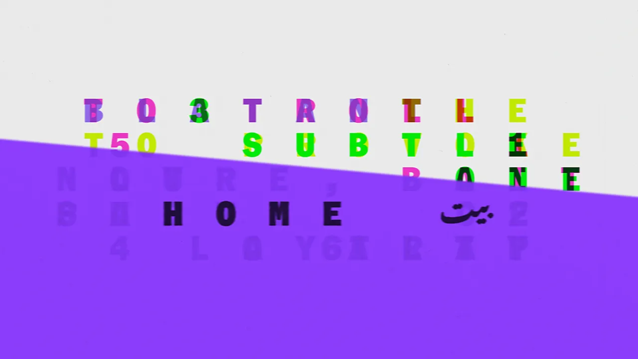
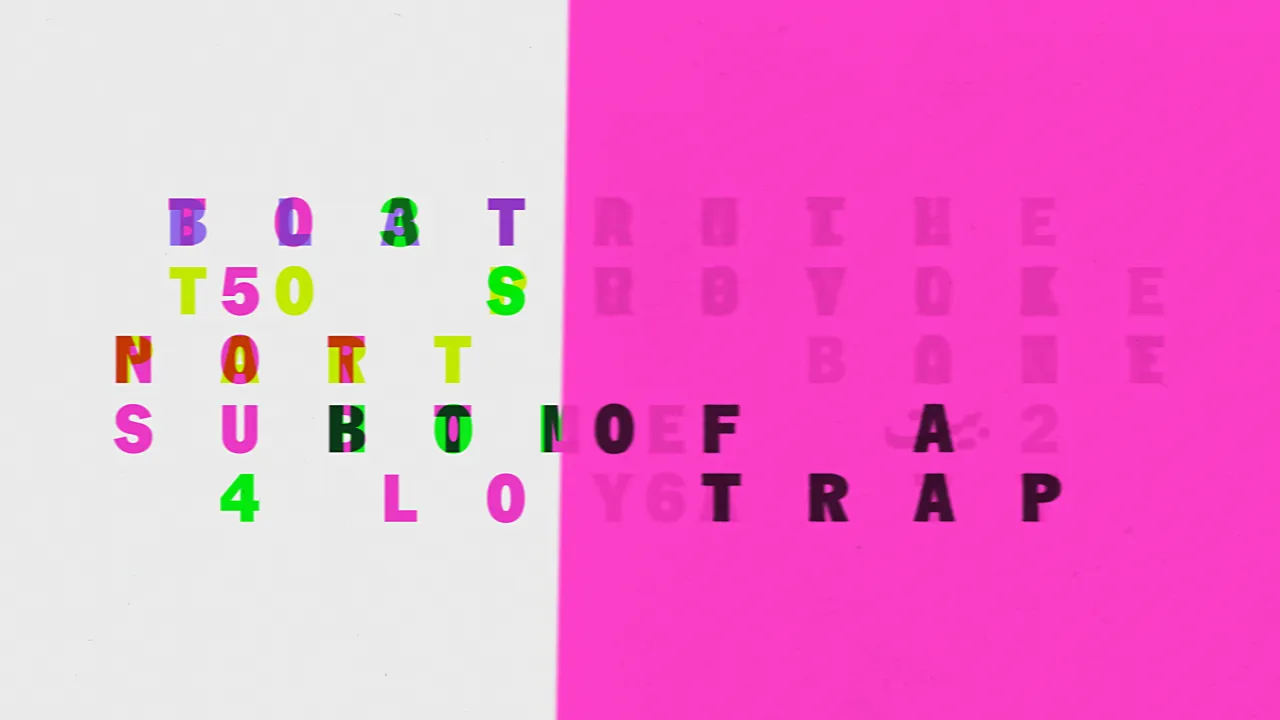
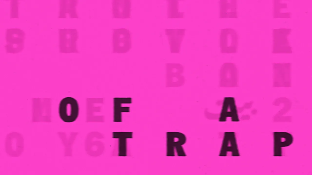
There's a little spy reference in there too. A monospace typeface and a code-like layout hint at the Bond audition that's driving the story.
What I admire most is how little the sequence explains. It trusts us to notice what's going on and we're left wondering why one reading was hidden while another was easy to see. Of course, there's a bigger question to ask here... about who gets to be seen as British and who decides. Pentagram doesn't answer it, and it's not really their job to do so. Doesn't half make us look twice, though.
Editor's Picks





Trending





Latest Jobs
Creative Content Executive at Cognition
Full-time·Birmingham·£28k–£35k
Graphic & Motion Designer at The SHARP Agency
Full-time·Leeds·£26k–£33k
Senior Designer at BKC
Full-time·£50k-£60k
Senior Front End Developer at Crown Creative
Full-time·Belfast·£50k–£60k
Senior Creative Lead at Random Studio
Full-time·Amsterdam / Paris·€90k-€110k
Account Director at How&How
Full-time·London·£73k-£79k