How Sip Studio built La Borosa, a non-alcoholic spirit that doesn't ask for your forgiveness
Non-alcoholic spirits have a perception problem. Too many brands have gone overboard with the health aspect that it feels like they're apologising for what they are. La Borosa takes a different approach entirely with packaging that does most of the work.
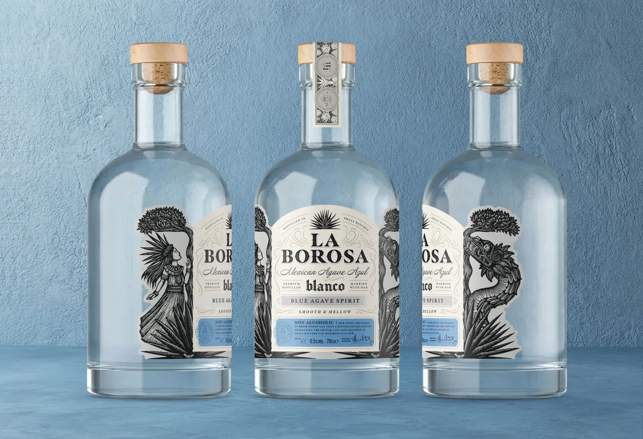
Non-alcoholic spirits have a hard time being taken seriously. Their branding often signals quality and authenticity while avoiding the clean, clinical aesthetic that can make them feel flat and boring.
Sip Studio, the drinks packaging specialist founded by Kirsty Holton, is behind the identity for La Borosa – a non-alcoholic agave spirit that wanted to stand confidently on the shelf next to premium tequila. "From the outset the client said that this shouldn't feel like a lesser alternative," says Kirsty. "Their product had depth and complexity, and the packaging needed to reflect that."
With the brief asking for a strong emphasis on provenance and Mexico, it seemed only natural to focus on the drink's main ingredient: agave. Sip Studio carried out a little research and discovered Mayahuel, the Aztec goddess of agave. It's a figure that helps give the brand some depth and personality. "It helped ground the design in something meaningful, rather than feeling purely decorative," says Kirsty.
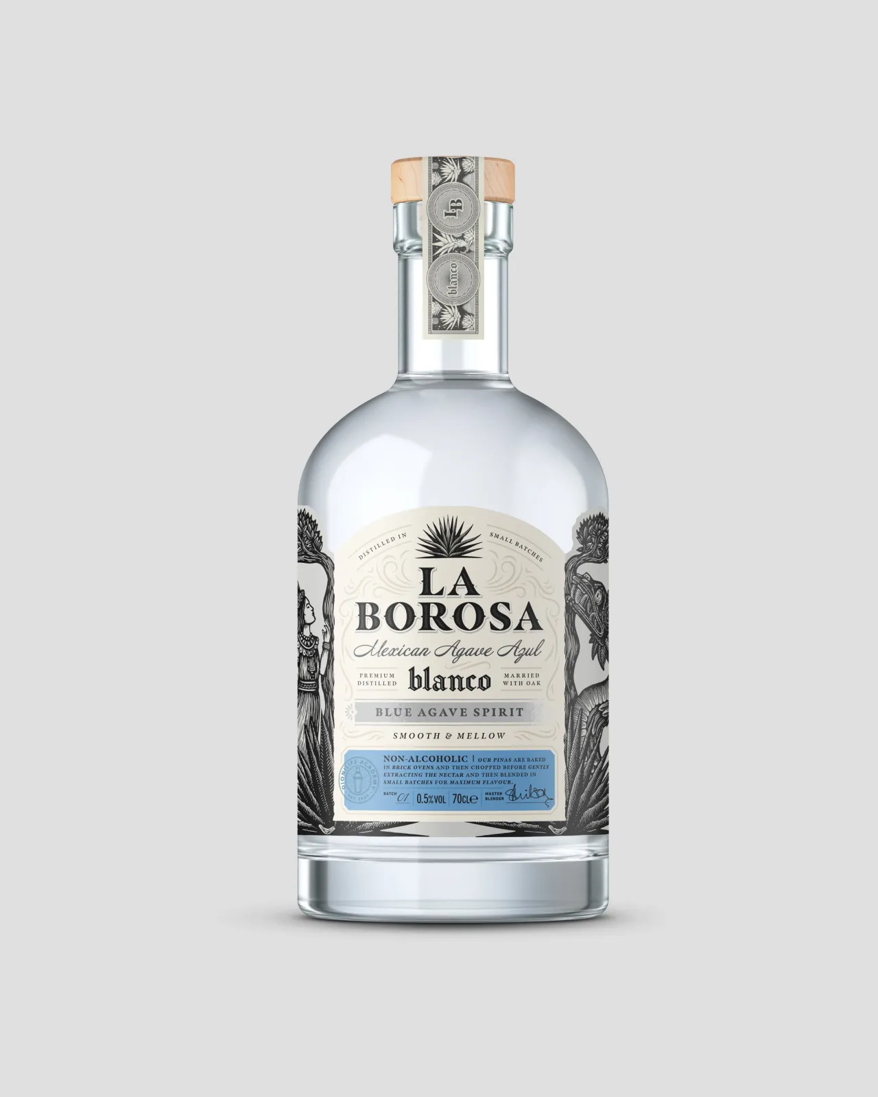
Illustrations were developed with Mexican artist Eduardo Robledo in a linocut style, and depict Mayahuel alongside Quetzalcoatl, the god of wind, and the double-branched tree of their shared story. Linocut was chosen for its texture and rawness, helping to make the product feel complex.
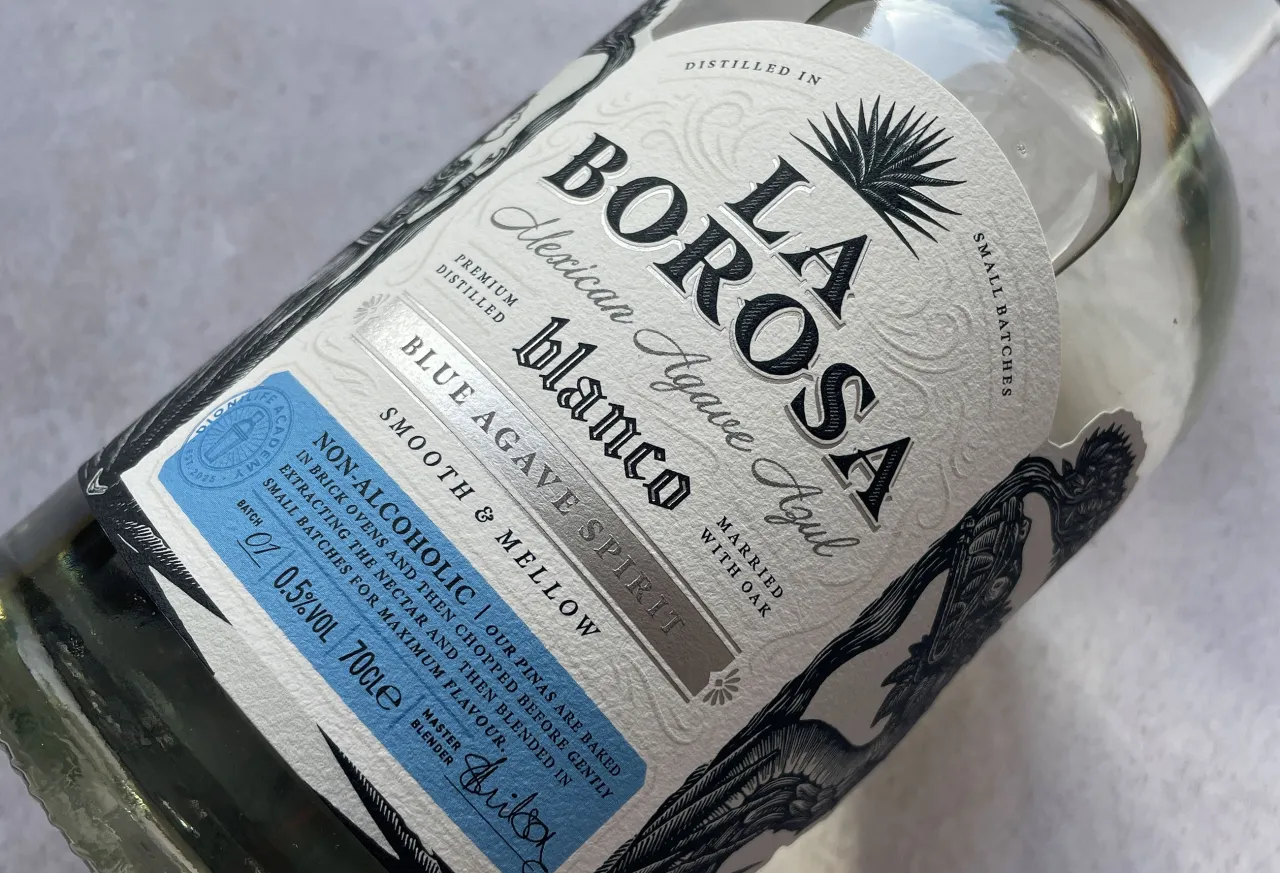
Look more closely at the label, and you'll spot an embossed swirling wind detail. It's little features like this that help the brand feel like a seriously grown-up drink that has gone through a complex process in the making.
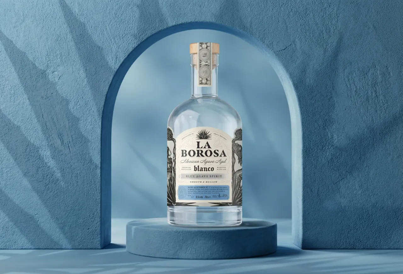
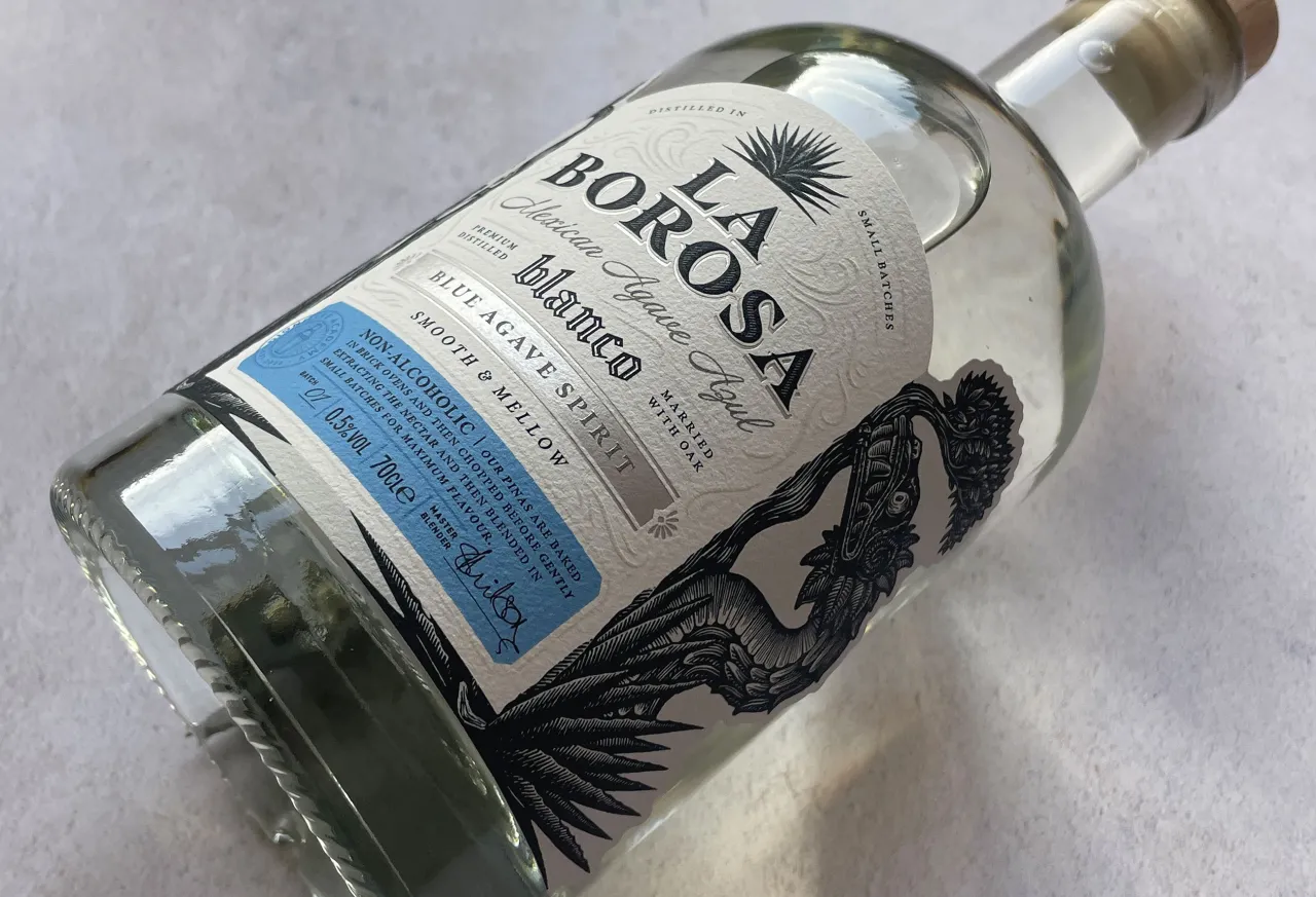
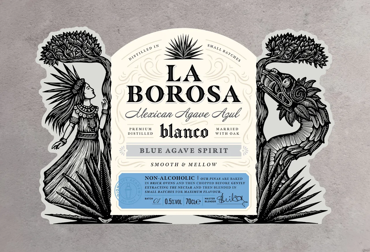
Then you'll notice the heavyweight textured paper stock and embossing with foiling throughout the packaging. And you'll believe this product matches the premium tequila benchmarks out there, meaning Sip Studio has successfully avoided any annoying wellness cues.
The bottle itself (one of Kirsty's favourite parts of any job) is a stock shape, yes. But it was chosen specifically because its proportions most closely mirror those of premium tequilas. Again, the familiarity makes our brains La Borosa as being as good as the real thing. "Clarity always comes first," says Kirsty. "Once the bottle is picked up, the more detailed elements start to come through."
As the category matures, the balance between those two things will only matter more. Consumers want the ritual and the story, and the sense of occasion. They still want to feel like they're having an adult drink, but without the basic mundane packaging of other non-alcoholic brands. I'll drink to that.
Editor's Picks





Trending

Latest Jobs
Creative Project Manager at Analogue
Full-time·Leeds·£28k–£35k
Creative Director at Koto
Full-time·London·£95k-£130k
Senior Designer at Definition
Contract·London·£45k–£50k
Brand Designer, Product Launches at Figma
Full-time·New York·$127k–$269k
Deputy Head of Stage at Factory International
Full-time·Manchester·£35,015
Creative Content Executive at Cognition
Full-time·Birmingham·£28k–£35k