Sangria Creative Studio gives La Reale a surreal new look with crowned camel and retro flair
Featuring a royal camel surrounded by vintage televisions, cacti, and retro fridges, the beer brand's redesign swaps seriousness for humour and charm.
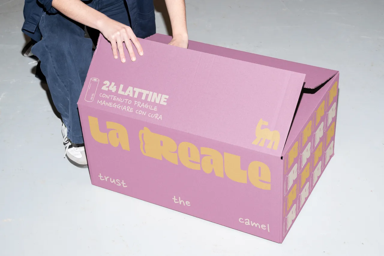
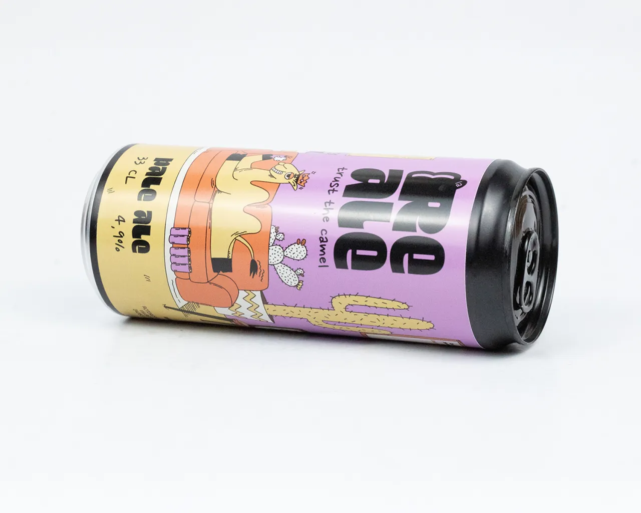
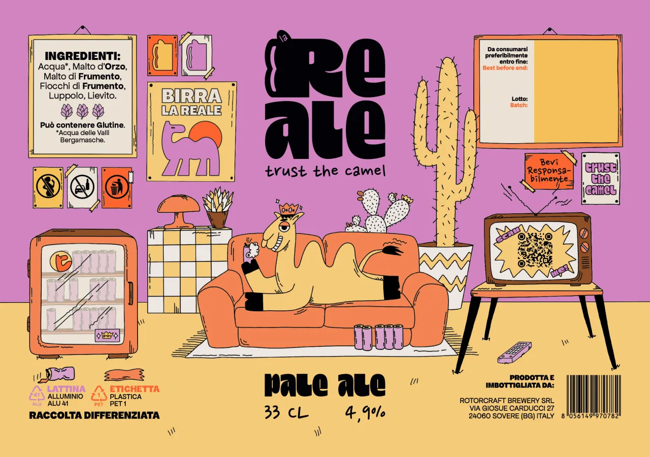
La Reale, the Italian Pale Ale known for its balance of tradition and modern character, has unveiled a striking new identity by Sangria Creative Studio. The redesign repositions the brand with humour, playfulness, and a surreal illustrative world centred on its royal camel mascot, complete with a crown and a beer in hand.
Unveiled this week, the new design marks a fresh chapter for La Reale, breaking away from the crowded conventions of craft beer packaging. Instead, the brand has embraced an imaginative approach that feels both handcrafted and unapologetically original.
The camel mascot – depicted lounging on a sofa, relaxed and carefree – is the hero of the design. Around it unfolds a scene filled with unexpected details, like cacti, vintage televisions, and pastel-coloured fridges, creating a dreamlike desert-meets-nostalgia universe. The composition was designed to tell a story, inviting drinkers into La Reale's playful, offbeat world.
According to Sangria, the camel serves as a trusted symbol for the brand while also acting as a visual anchor. The props that surround it aren't arbitrary either, as they exist to inject irony, charm, and cultural references that help set the beer apart from competitors.
Sangria explains: "Anchored by the brand's signature camel, the illustration captures the essence of La Reale, one that is witty, bold, and unapologetically original."
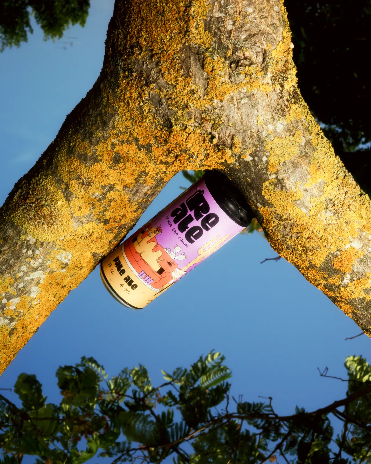
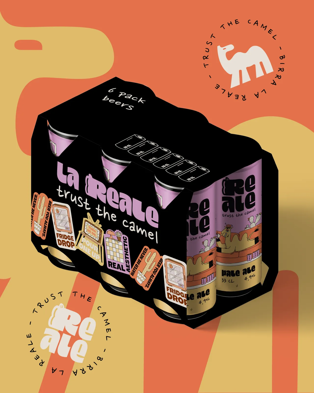
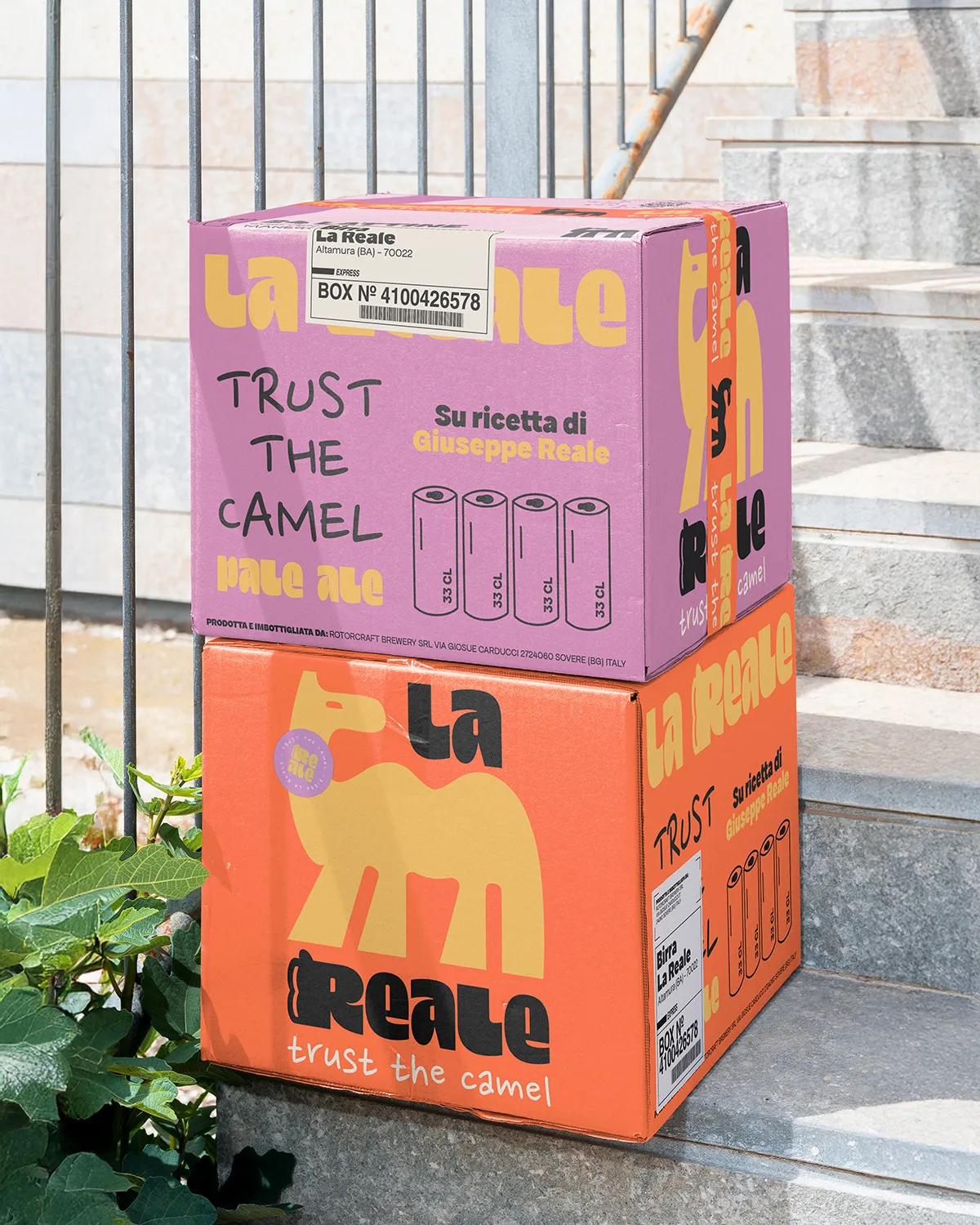
The design employs clean outlines and vibrant colours to stand out, but there's a subtlety to it as well. Sangria has carefully balanced warm desert tones with softer pastels to bring freshness and modern energy. Deeper shades add intensity and depth, while lighter hues help soften the overall feel, ensuring the beer feels approachable and contemporary.
This palette, combined with the surreal illustration style, lays the groundwork for a flexible design system that can evolve beyond the can. From merchandise to digital platforms, the camel and its world can adapt and expand, making La Reale a cultural statement of sorts.
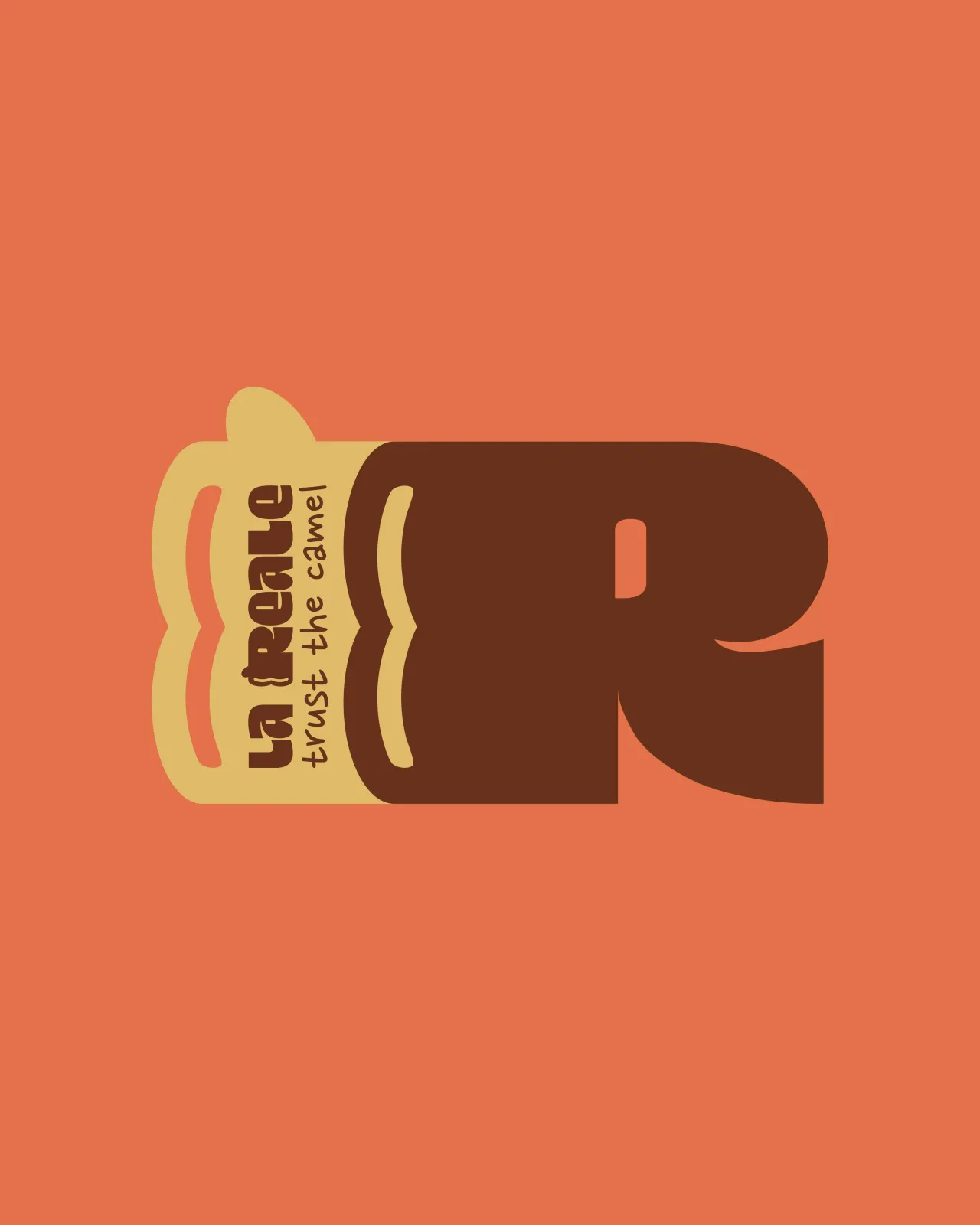
Typography plays its part too, with a redesigned letter "R" featuring two distinctive humps, subtly nodding to the camel silhouette. It's a neat piece of storytelling through type, while also recalling the rounded reflection of a beer can and serving as a visual signature for the brand.
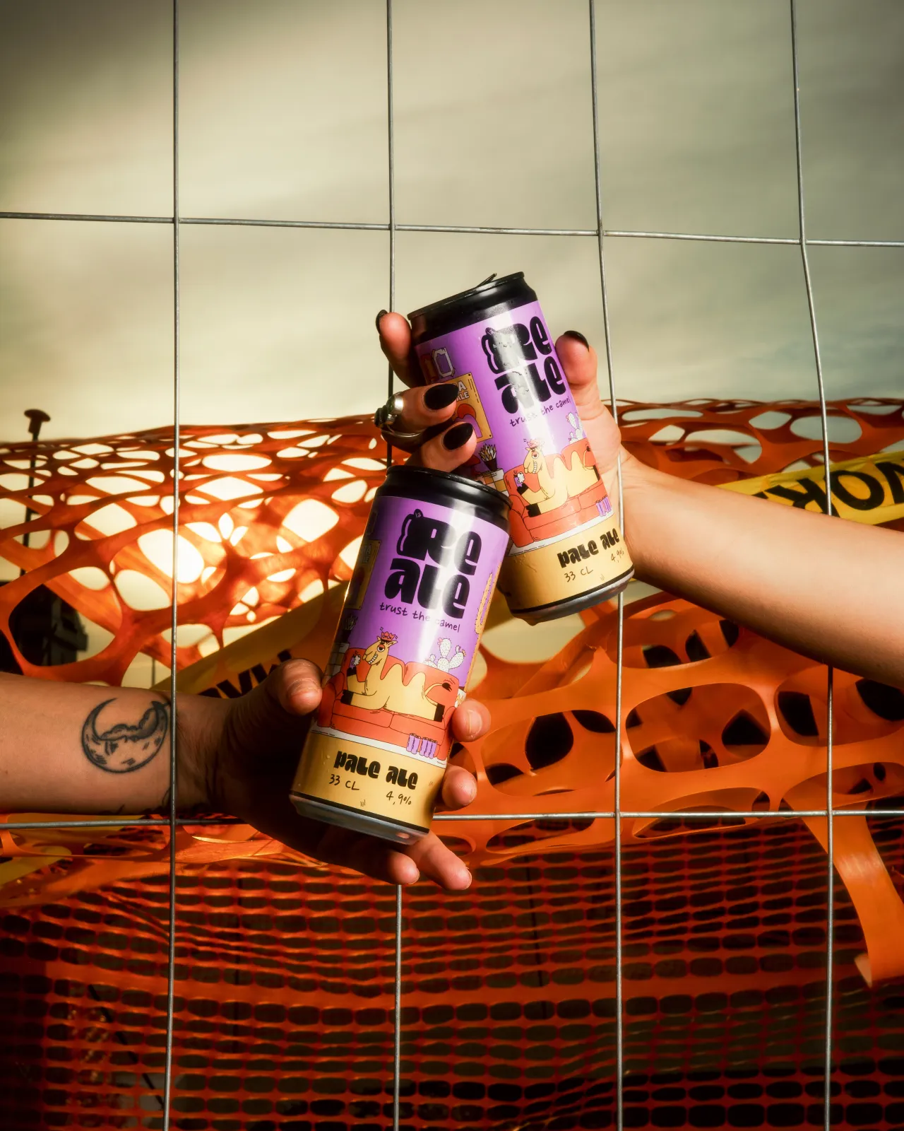
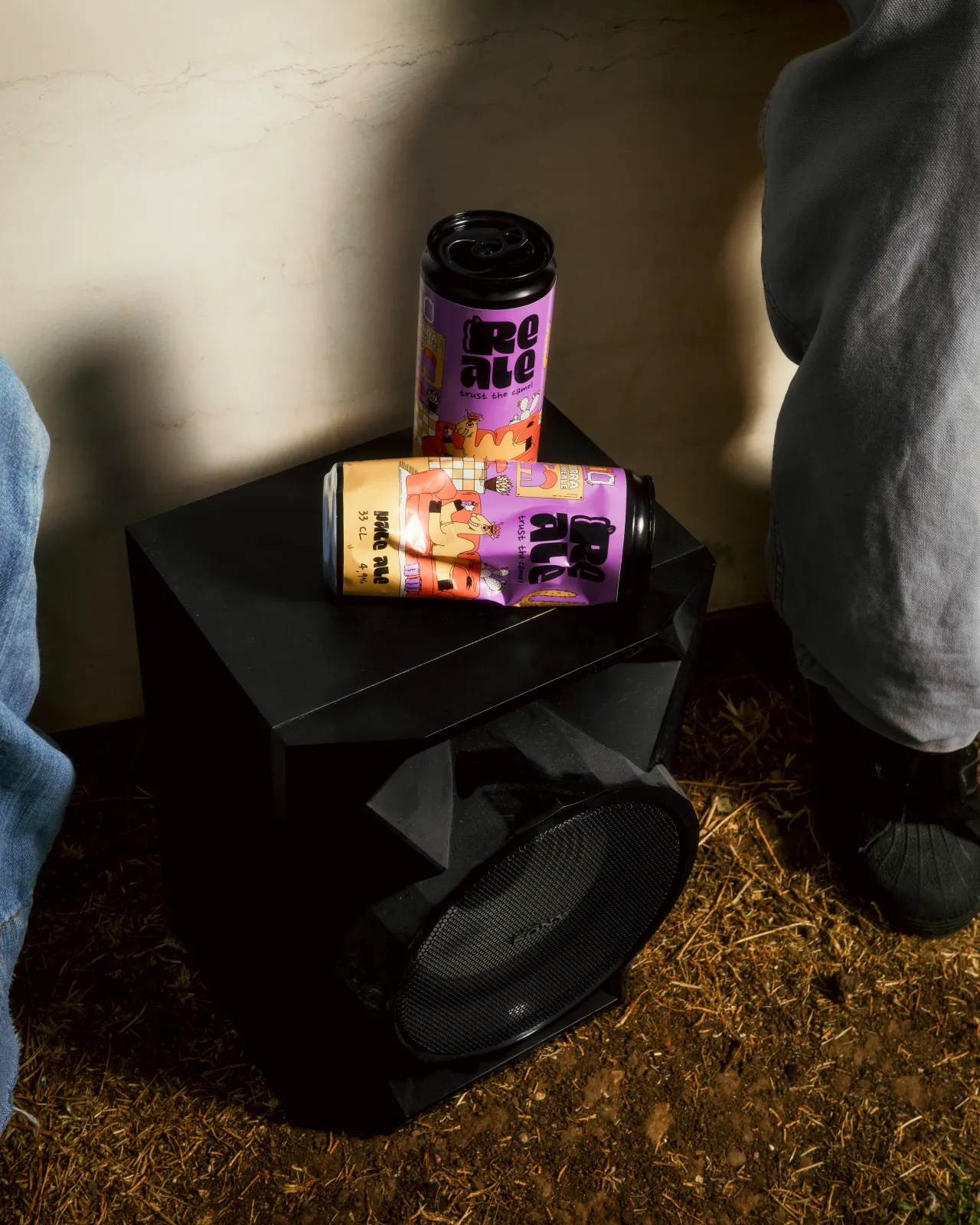
Where many craft beers lean on rustic cues or stripped-back minimalism, La Reale has opted for something altogether different. Rather than mimicking category trends, the redesign embraces authenticity and imagination, ensuring the beer cuts through a crowded market with an identity that is instantly recognisable.
The approach also demonstrates how humour and storytelling can work as effectively as tradition or intensity when it comes to building credibility. The surreal world built around the camel offers scope for a wide range of applications, from merchandise to digital campaigns. It's designed as an evolving ecosystem, where the character and its surroundings can continue to grow with the brand.
This flexibility gives La Reale an edge not only in retail but also in the cultural sphere. By turning its mascot into the centrepiece of a broader narrative, the brand has created a symbol that can travel beyond the beer aisle, resonating with audiences who value creativity as much as taste.
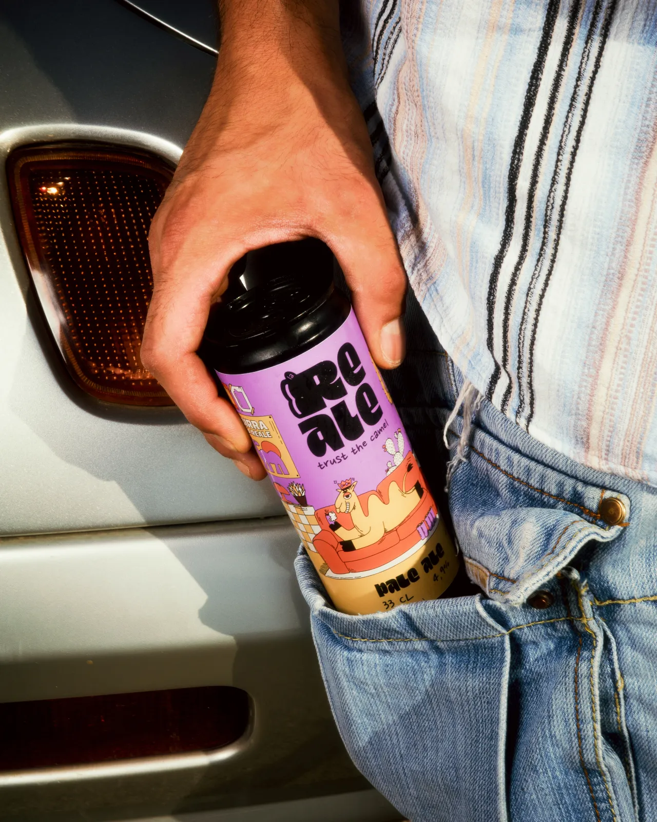

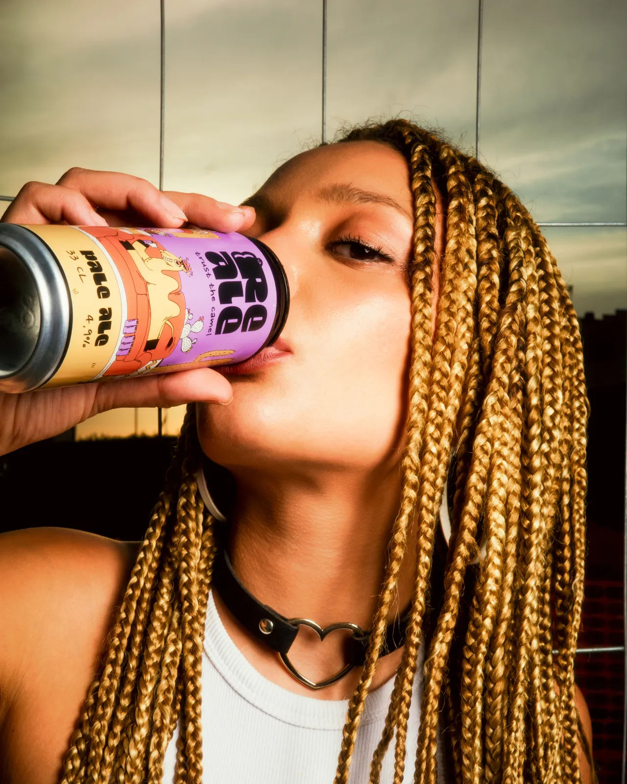
La Reale's new look makes a statement about where craft beer branding might go next. By embracing humour, charm, and surreal storytelling, it challenges long-standing conventions and suggests there's room for more wit and imagination in the category.
Editor's Picks





Trending




Latest Jobs
Content Editor at ITV
Full-time·Birmingham·£41,284 - £57,412
Principal Software Engineer at BBC Media Tech
Full-time·Glasgow·Up to £83,790
Growth and Client Development Director at 3800
Part-time·Sheffield·£60k-80k
Diploma in Professional Studies Coordinator at London College of Communication
Contract·London·£52,977 to £63,815
Deputy Head of Stage at Factory International
Full-time·Manchester·£35,015
Design Lead at Madeo
Full-time·New York City·$85k–$120k