JDO's design for Hennig-Olsen's classic ice cream gets to the heart of the matter
Global creative agency JDO has crafted a bold and contemporary new design for Hennig-Olsen's classic ice cream, Krone-is. Made by the oldest ice cream producer in Norway, it's long been a summer favourite of Norwegians but with competition growing, the brand wanted to stay on people's minds.
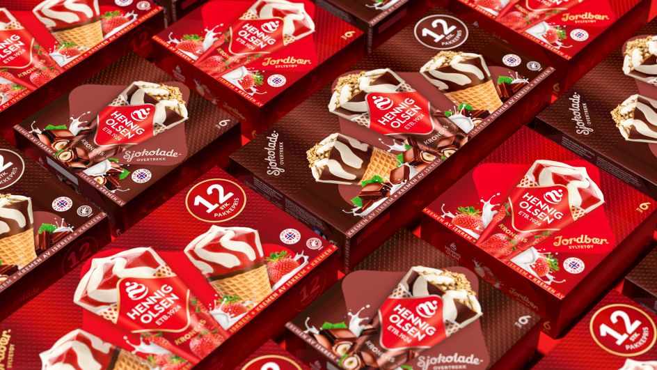
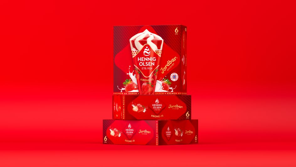
JDO was tasked to revive the identity with a visual strategy that would "stand out, strengthen memorability and improve likeability". The new Hennig-Olsen wordmark is placed with pride in the centre of the pack to drive recall, while a 'wafer' pattern that uses the shape of the Hennig-Olsen logo is incorporated into the background. The design is finished with the 'Kremen Av Iskrem' ribbon – Hennig-Olsen's mark of unrivalled quality. This provides texture, reinforces the product and stirs a bit of nostalgia.
"The design showcases the mother brand's new identity creating a new brand expression with distinctive design assets to position Krone-is as the quintessential Norwegian treat," says Ray Smith, creative director at JDO. "With crafted brand assets like the heart-inspired logo, the 'wafer' pattern, the ribbon and indulgent ingredients surrounding the hero cone, the latest design powerfully delivers standout and recognition whilst also awakening nostalgia for the treasured treat."
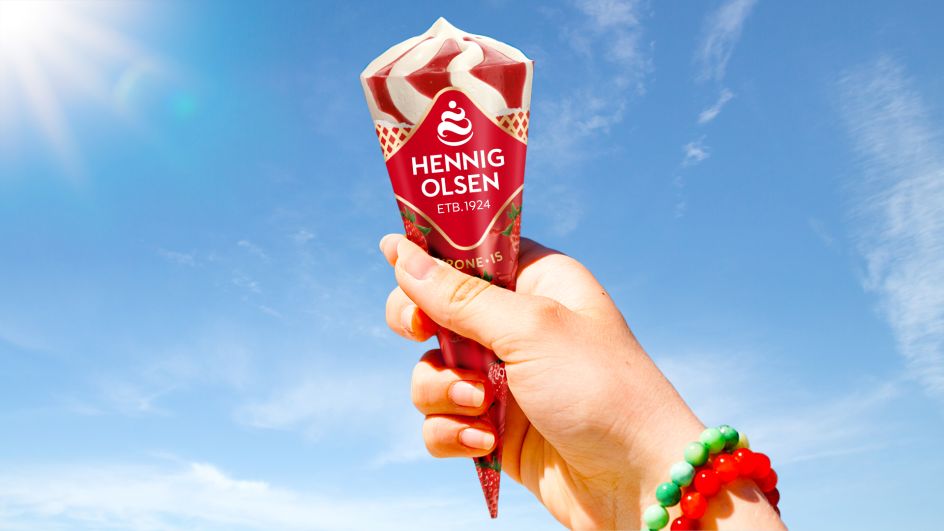
From a typographic perspective, Krone-is falls into the heartland products from Hennig-Olsen and so the brand logo and therefore 'the logotype' in the heart shape is the main driver of the qualities of the products. The Hennig-Olsen logotype font was designed to have a "strong minimal Scandinavian quality and a rich creamy fullness to the letterforms", supporting the creamy whip icon above the letters.
With such minimalism at play, it means the rest of the pack can use more characterful fonts – the strawberry and chocolate variants add a vintage ice cream script style font. All of the other supporting fonts are in a style close to the main Hennig Olsen logotype to keep the packs as simple as possible.
The colour palette is about "maximising the flavour and adding maximum taste appeal to the cone image so it's almost super-real," explains JDO. And it also hopes to connect the sauce on the top of the cone to the pack design to increase the flavour differentiation, so any new future flavours could easily be added to the folio.
And finally, the waffle texture in the background of the packs was created from the Hennig-Olsen heart logo. It's shown in the flavour variant colours to maximise the variant, but most of all to reinforce the fact that this product has a wafer cone cornet, so a brand equity heart shape can also work as product equity for the Krone-is cornet range.
Editor's Picks


Trending


](https://www.creativeboom.com/upload/articles/86/862919952c0ad18439004228895a431dc6e45ffc_732.jpg)
Podcasts


Editor's Picks
Further Reading