Poland-based studio Uniforma designs a human-centric identity for Short Waves Festival 2021
Mirroring the complexities of humankind, the studio's latest identity plays on the typical tropes of a person: "layered and extreme, bored and intrigued, narcissistic and uncertain, lonely and surrounded by people, introverted and extroverted."
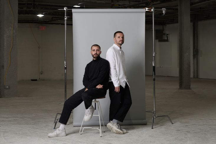
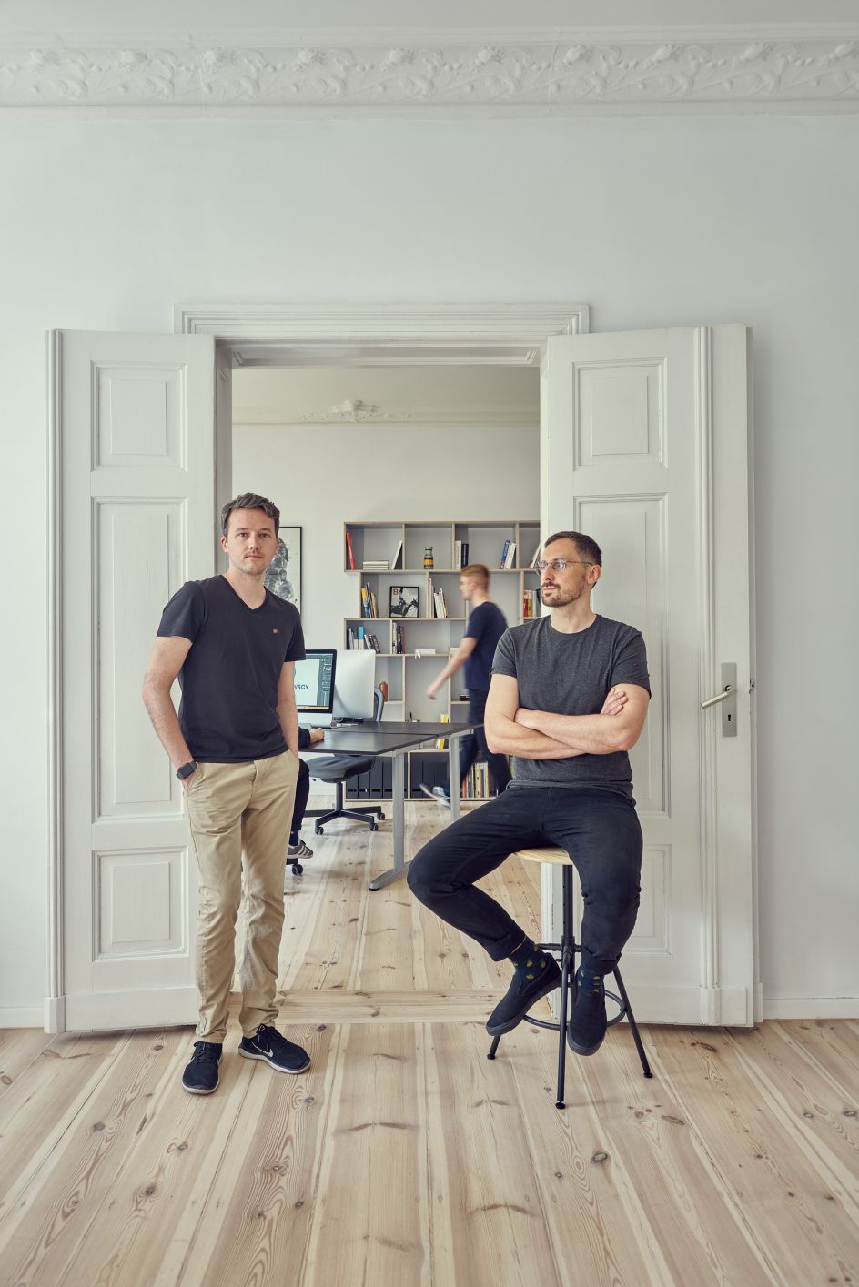
Collaboration forms the crux of Uniforma, a studio based in Poznań, Poland, and founded by Maciej Mach and Michał Mierzwa. Spanning commercial and cultural work across all of its output, the studio has garnered huge success over the years – and its founders have their broad and in-depth experience to thank.
Merging their UI/UX plus art and culture backgrounds, the duo can tackle any brief handed to them. This includes the recent identity for Short Waves Festival 2021 – an international short film festival that took place over the summer. Here, the studio's founders give us the low-down of their latest project, all the while discussing how they met, their design ethos and what they hope to achieve in the future.
How did you meet and come to form the studio?
Uniforma is a design studio located in Poznań, Poland and run by Maciej Mach and Michał Mierzwa. It all started in September 2018, but both of us had already had around 10+ years of experience in design. There are currently six people working in our team. Before deciding to run the studio together, we were both freelancers. Maciej was always focused on UI/UX, working for brands like Warner Music and Audi, but most of all, startups in Europe and the US. Moreover, he is also an academic teacher at the School of Form in Warsaw, where he is responsible for User Interface workshops at the Communication Design Department.
Michał has years of experience as a designer working for art and culture. He was responsible for the visual identities of many commercial brands and cultural events that took place in Poland. Some of them were co-organised by him, so it's safe to say that he knows the industry from the ground up. He is a VJ, an artist, a creator of club visuals and a live performer.
Around 2013, the two of us met at the Citadel – a creative co-working space in Poznan, where we shared the studio with designers like Krzysztof Domaradzki (StudioKxx), Piotr Buczkowski (Tato Studio) and Tom Biskup. After some time, our paths crossed again, and it turned out that we really enjoyed working together. Web design wasn't Michał's thing, and Maciej felt the same way about branding and content creation. It turned out that we could help each other but, most of all, create something that we couldn't do on our own. This is how we decided to start the studio.
What's your design ethos, and what projects do you usually like to work on?
We love to work on projects where we can mix different skills within our team; using 3D or motion design as a base for an identity, or a website is always really exciting. It's fun to watch how visual assets travel from one desk to another and how collaborative work can impact final designs. A setup like that has been working really well for festivals like Short Waves and projects where a strong creative concept is fundamental to branding. We always look forward to working with people who value that.
How did you come to define your visual language? Is there a particular time, moment or place that inspires you?
We are constantly looking for new ways of doing our job, but the fundamentals of our visual language are typography and layout built around strong visual content. We never take shortcuts when it comes to these three things. It's always a process with many revisions, testing and never-ending discussions within our team.
What inspires us most is culture in its many dimensions. We strongly believe that we use visual codes to reach a specific audience in both cases, whether we design for cultural events or commercial brands. Getting to know the culture and lifestyle of a given social stratum and then experimenting with them is the most exciting part of our job. It also lets us stay inspired and motivated as the world around us is changing all the time.
What's a typical day like for you, and what software do you use?
We use a mix of different software like Photoshop, Illustrator or Figma, but the fun part begins when we introduce 3D and motion design to our projects. For those, we use Cinema 4D with Octane and After Effects. We use Figma not only for UI design but also for concept development. The ability to work live with our team and clients has had a huge impact on how we work today. Many designers have problems with showing work in progress. What we value the most is being open about having someone sitting next to you, taking what you have just done, spinning it, adding something new and giving it back, so you can see a totally different perspective.
This is something we learned at Citadel. Krzysztof, Piotr and Tom have their fingerprints all over our projects from back in the day. We are trying to teach our team the same thing.
Our day usually starts in the kitchen. We arrive at the studio around 9am, and there is always someone there to talk about what's going on. After a few minutes, everyone is talking, drinking coffee, having breakfast, and suddenly – it's 10am already. We really enjoy spending time together. During Covid019 spikes in Poland, we couldn't stand working remotely.
Talk us through Short Waves Festival 2021 identity – what was the brief like?
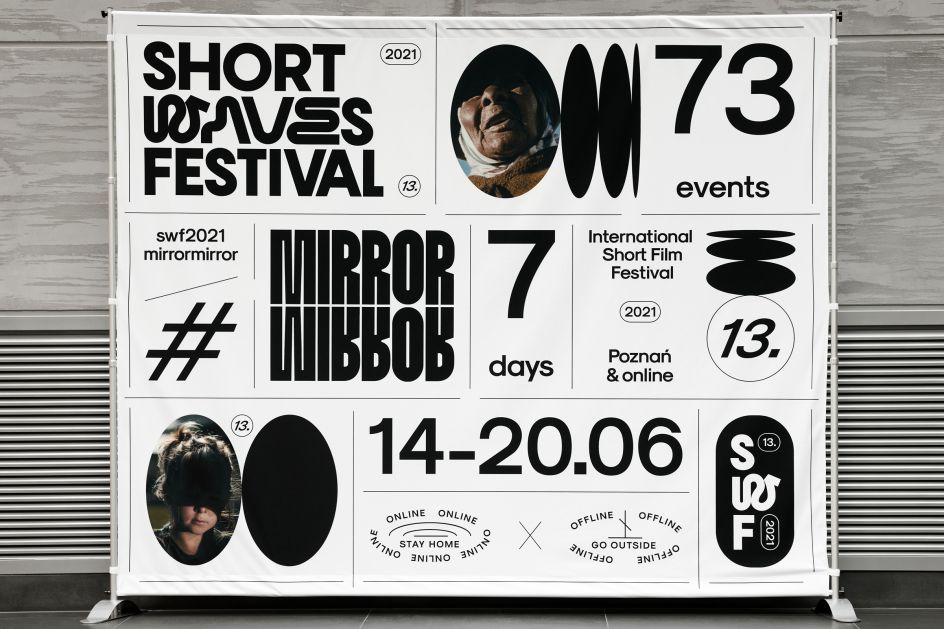
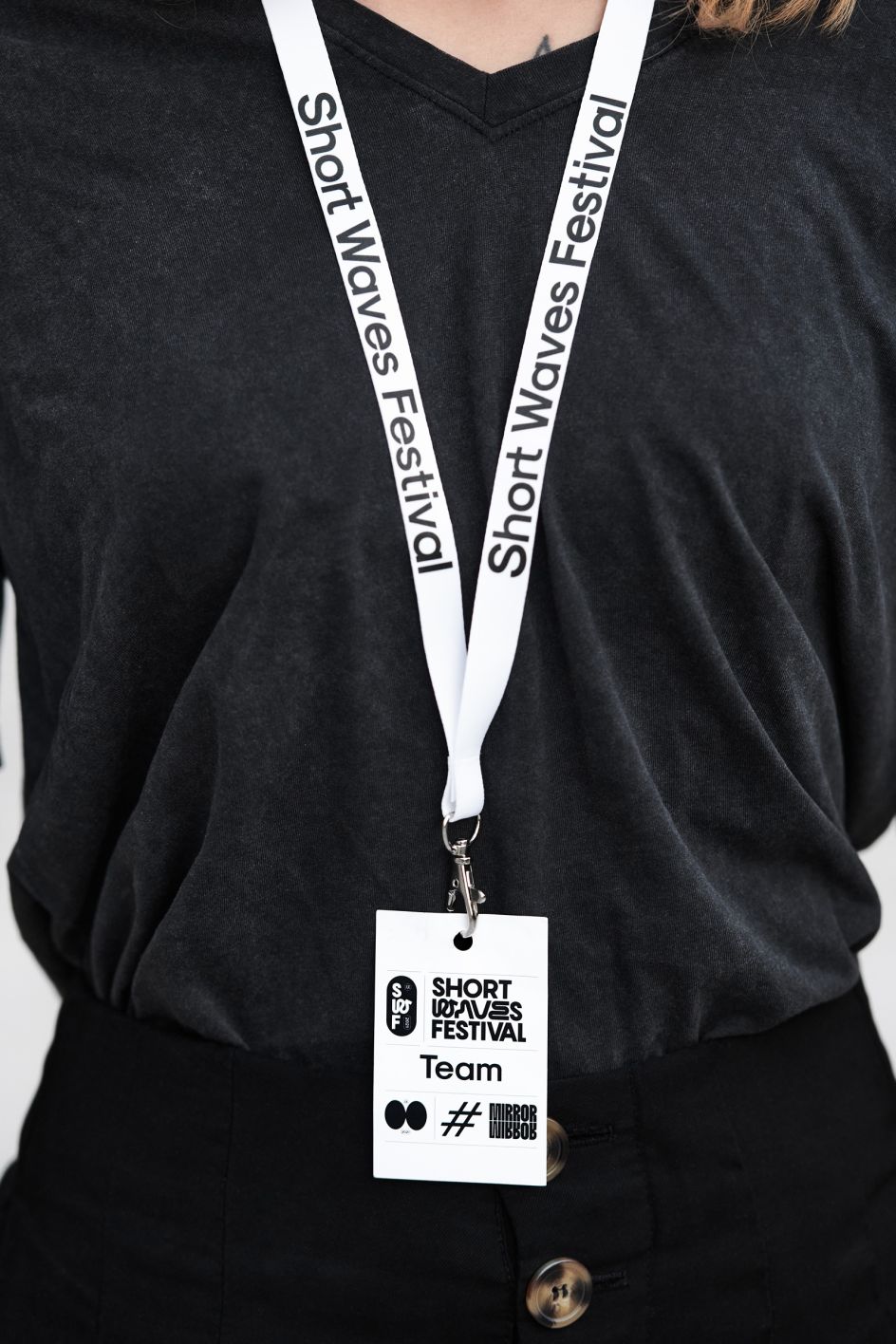
Short Waves Festival asked us to design the visual identity for their brand and 2021 edition. We started with the overall identity as we knew that the system we were about to create would set the ground rules for future creations. We say system, not a set of a few rules, because Short Waves Festival as a brand publishes dozens of visual messages every month: visual messages that, on the one hand, need to be flexible enough to keep the audience engaged, but on the other hand easy to use by junior designers and volunteers.
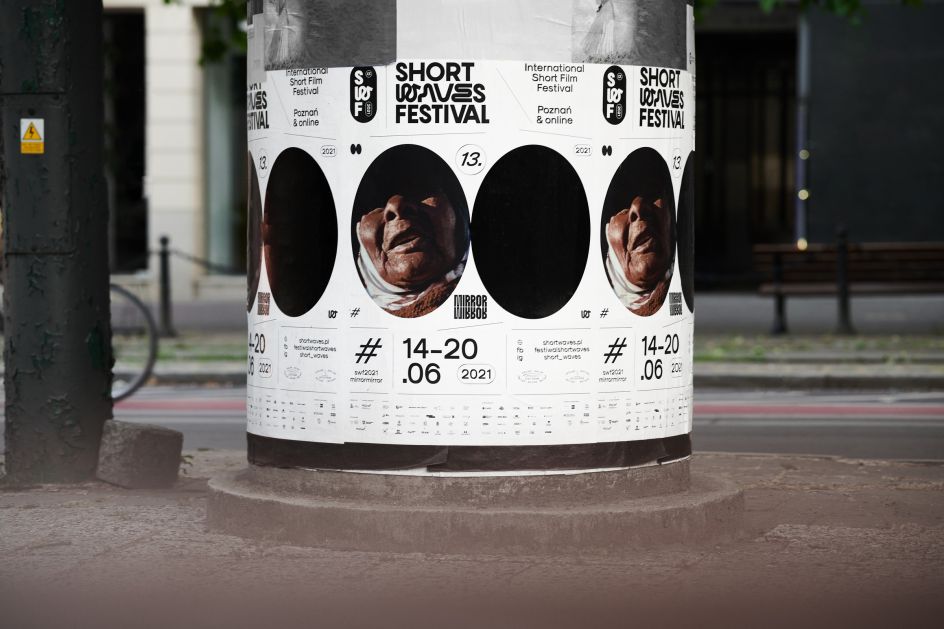
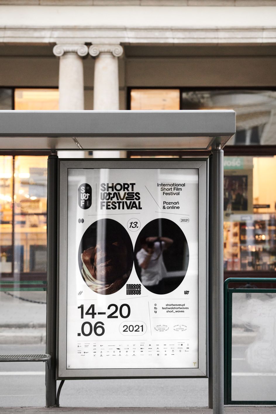
The theme of this edition set the basis for this year's visual identity: MirrorMirror, as it is first and foremost our new normal, our experiences, changes and different reality that make us examine ourselves more intently. The pandemic has significantly intensified the internet immersion and the dual functioning in online and offline mode. Not only does a mirror reflect reality, but it also creates it – just like films that present the complexity of being here and now.
What design details have you used and why?
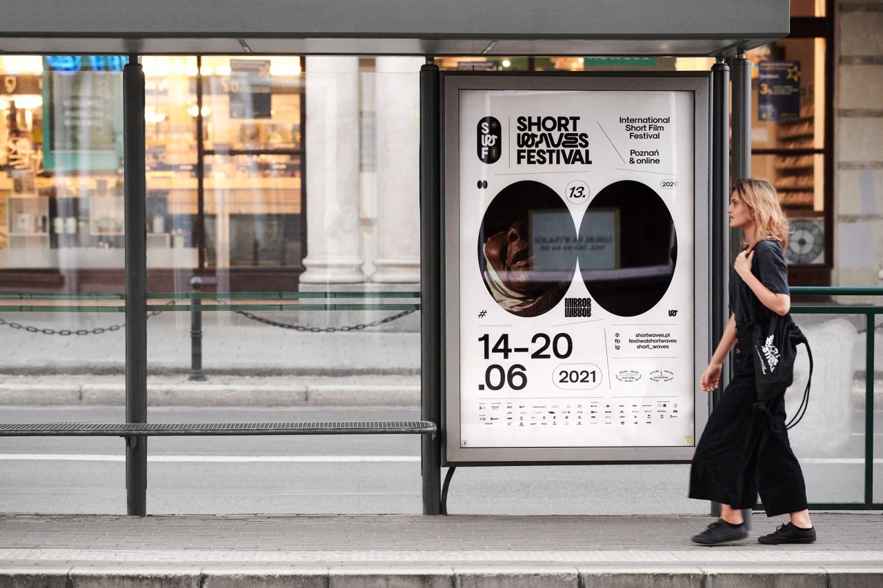
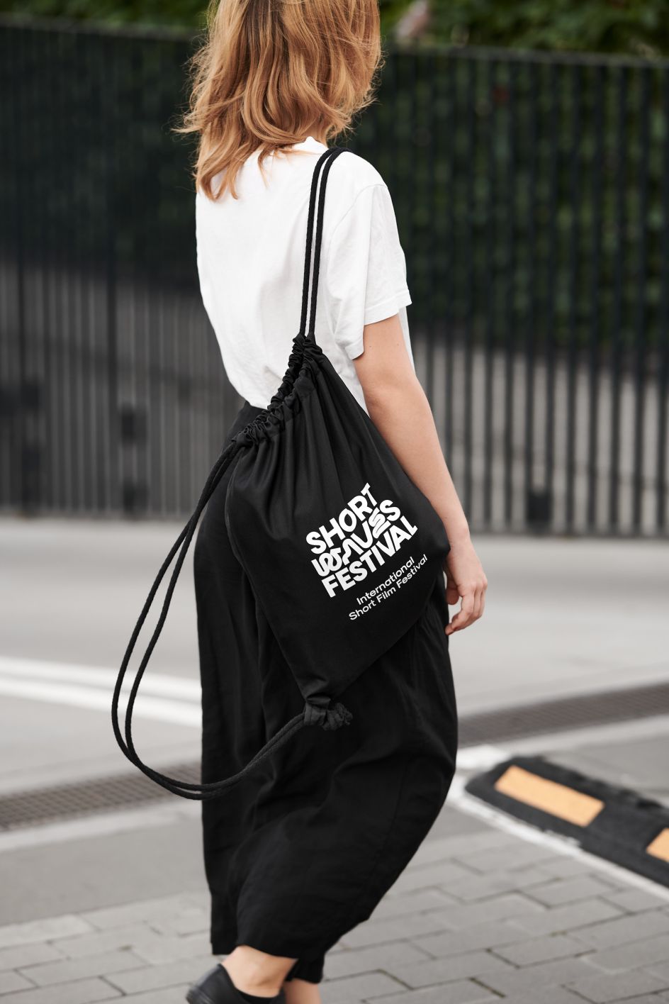
For the overall branding of the Short Waves Festival, we decided to go with brutal simplicity; an elementary, black and white layout resembling classifieds with sections divided by lines creates a framework for creativity within them. It allows designers to prepare a wide range of visual messages, from very official announcements to fun and creative compositions full of complicated elements. Everything is complemented by a set of additional elements like a short version of the festival's name or icons.
The motif of a mirrored reflection inside a pendant is the core of the poster, illustrating the 13th edition of Short Waves Festival and the Mirror Mirror motto. It takes a closer look at contemporary humans being layered and extreme, bored and intrigued, narcissistic and uncertain, lonely and surrounded by people, introverted and extroverted. One mirror includes a person, while the other remains dark and mysterious.
As a whole, what's your main goal with the identity?
As the festival is over, we already know the response. For the first time in the 12-year history of the festival, a system that was created guided participants clearly through the complexities of the festival's program. According to the organisers, visual identification in Poznań could reach an audience of up to 20,000 people daily. Introducing the festival to the online platform and social media in the time of a pandemic showed identification to the world. Over 8,000 participants in Poznań and online took part.
Visual ID responded to the hybrid form of the festival, with its mature style perfectly suited to the expectations and tastes of the audience. The flexible system made it possible to consistently adjust numerous elements to various festival activities – such as shows, workshops, offline and online events. The most important was that identification did not die with past editions of the event, as finally, it identified this event and is further used and developed based on the created system. We receive words of appreciation from all over the world and Poland. And thanks to new visual identification, the festival stood out from other similar events; it has brought freshness and a new perspective to the global environment of short film festivals.
What's next for you?
No idea, but this is the most exciting thing about it since the whole industry is constantly changing. Currently, we are more and more into content creation as we see it gives us joy, but on the other hand, we see that times of visual identities perceived as a system of rules set at the beginning of the brand's existence are gone. Brands need to stay fresh, so their visual identity needs to be constantly in motion, attracting an audience with new engaging content.
We love working on complex identities and design systems, but we see that the balance is shifting. Brand books are getting simpler and simpler to free the potential of designers working on videos, illustrations and creative assets used in day-to-day communication. As authors of identities, we have to consider that, and as graphic designers, we love that there are fewer restrictions and more room for creativity.
Editor's Picks


Trending


Podcasts


Editor's Picks
Further Reading