Module by A-Studio and Co
Yes, it's still a little chilly out, and you definitely need your coat. But you can't have failed to notice those plucky buds forcing their way through the earth everywhere you go. In short, Spring is on its way; as the natural world starts to reawaken, it's a great time for us creatives to revitalise our visual palettes and sources of inspiration.
In this article, we'll get you started with a plethora of captivating new typefaces. That's not to say there's anything wrong with sticking to the same old reliable workhorses; indeed, our Top 50 fonts of 2024 lists many old favourites along with new releases. But it's always good to see what fresh typeface designs are out there, and who knows? One of them may become your favourite go-to in the future.
From whimsical scripts to bold serifs, this season's offerings promise to inject new life into your design projects. So, let's delve into our curated selection of 11 remarkable typefaces poised to invigorate your designs and spark joy in your audiences.
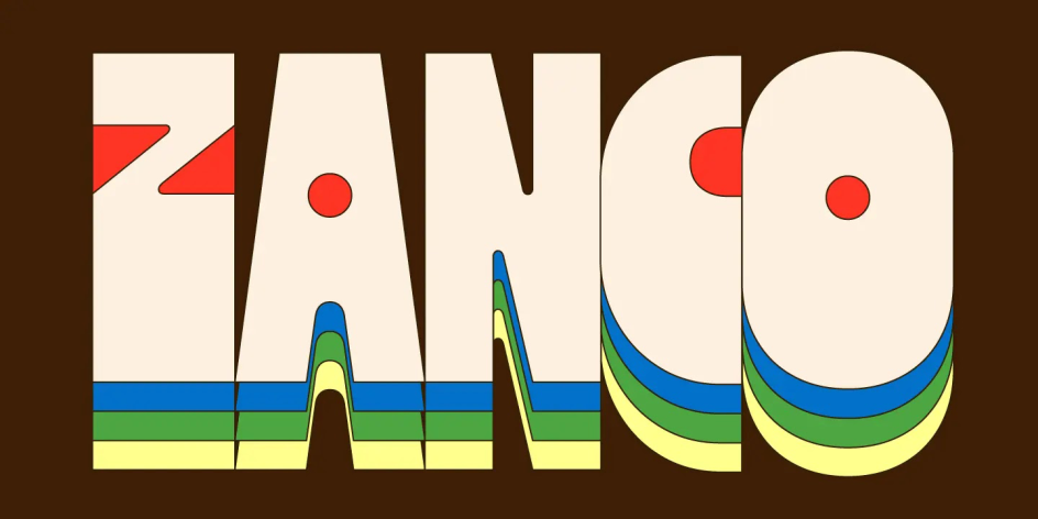
1. Zanco by In-House International
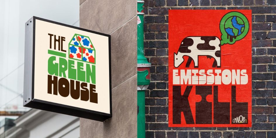
We're big fans of In-House International, a branding studio based in Austin, Texas, with team members worldwide. Indeed, we featured their Brinca typeface in our 2024 Top 50. So we were intrigued to learn that right now, they're shifting their focus to 'climate branding', i.e., design work that influences behaviours, policy and technology changes. And as part of that shift, they have a new typeface on the block.
Standing tall and narrow, Zanco features stressed curves, softened internal angles and an unconventional weight distribution that nonetheless seems to fall just right. It goes from lanky to heavy, thickening shadows filling in the bottom halves, which works especially well on interlocking descenders.
Designed by Alexander Wright and developed by Rodrigo Fuenzalida, the typeface is named, co-founder Michu Benaim Steiner explains, "after its long, stilt-like limbs; the zancos worn by acrobats towering above joyful crowds. Across the full family, characters stand tall in a range of styles, from heavy-footed and funky platforms to slim lifts that lend it an ethereal, art nouveau vibe. The effect is curved, melty, and a little nostalgic. You get the relaxed, versatile, legible, sensuous and useful, all in one."
In short, this is a fun typeface that's light years away from the seriousness we were expecting. "We wanted to bring this good-time type to the climate space," explains Michu. "With samples built around a made-up climate conference, we imagined the usual swag and public-space banners replaced with PSAs that could stick around long after irreverent graphics made with delight. Changes are needed to mitigate catastrophe, but we can embrace action and alignment with joyful determination."
2. Seabirds by Rosalie Wagner
Designed by Berlin-based type designer Rosalie Wagner, Seabirds is a homage to the historical legacy of lineals. In other words, it combines different sub-genres of sans-serif within a single typeface, allowing you to navigate between geometric and humanistic shapes while maintaining overall coherence.
Its design was inspired by book covers from the first half of the 20th century, particularly those crafted in the 1930s for the renowned publisher Albatross. These featured new and "modern" sans-serifs, most probably contributing to their worldwide popularity.
The default set is predominantly geometrical, while the use of OpenType stylistic sets enables a transition from orthogonal to flat terminals, guiding the design to a more humanistic style.
The uppercases maintain proportions reminiscent of classic Roman capitals, while revisions to the lowercases have been made to achieve a more balanced and cohesive rhythm. The ratio between ascender height and x-height is deliberately generous to ensure convincing legibility in body text.
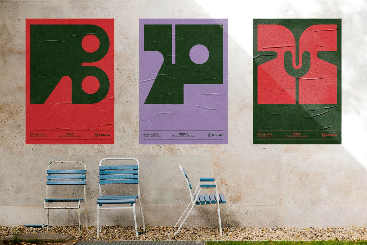
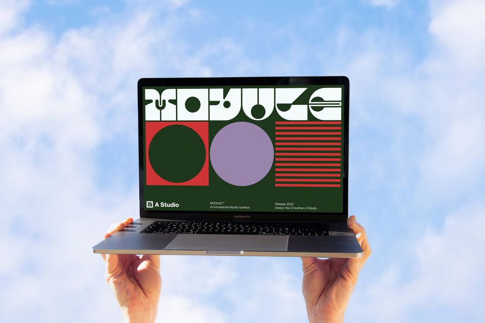
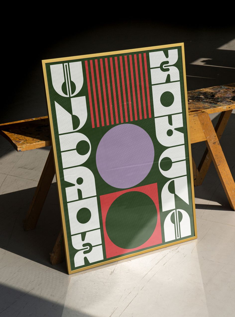
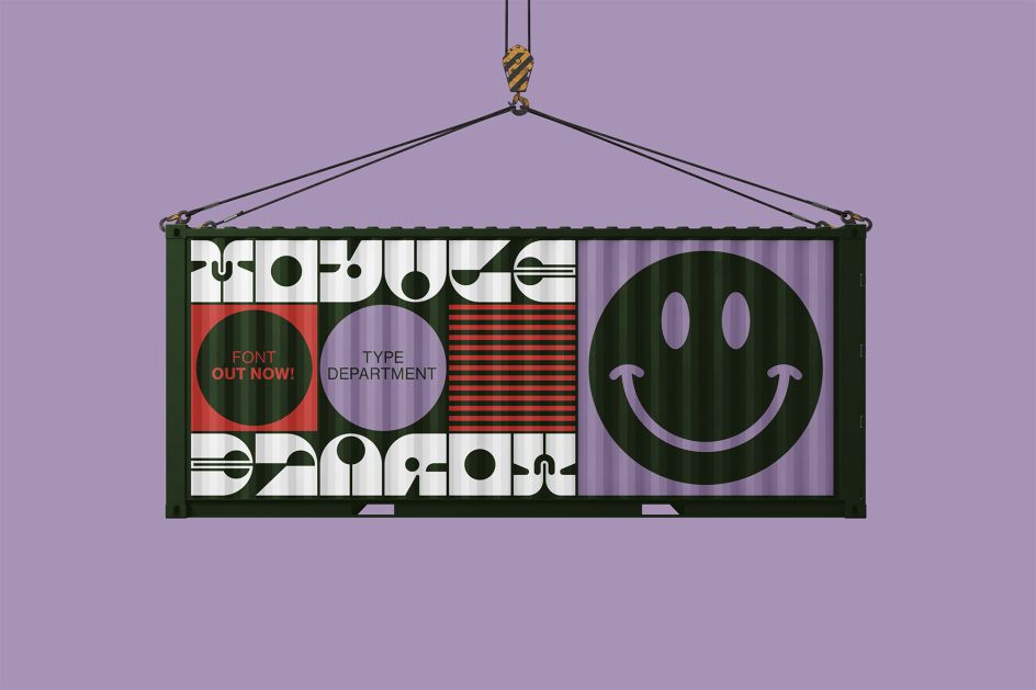
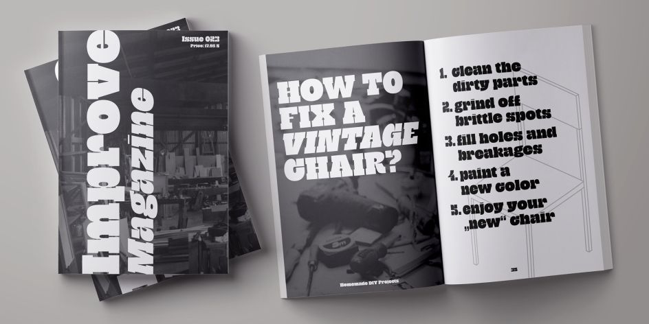
3. Module by A-Studio and Co
Freelance senior brand designer Alan Cheetham describes Module as "the result and fluke side hustle from the 9th edition of the 36 Days of Type challenge that I took part in 2022".
This uppercase, monospaced display font was inspired by the aesthetics found in everyday simple geometric forms. Composed on a strict uniform grid system from a combination of sharp edges, bold curves and signature circular cuts, each character has been uniquely designed to offer as much visual impact in its solidarity as well as when used in its collective state.
In short, Module is a distinctive contemporary display font that's suitable for both digital and print-based projects that you want to stand out.
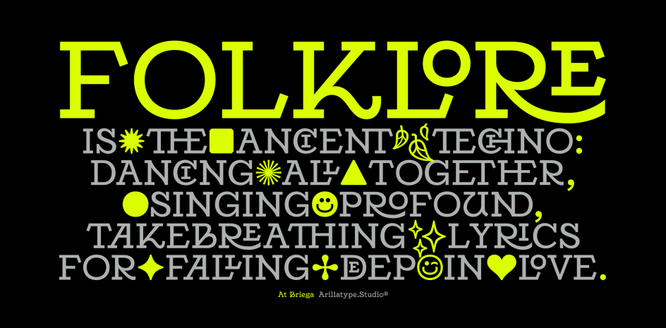
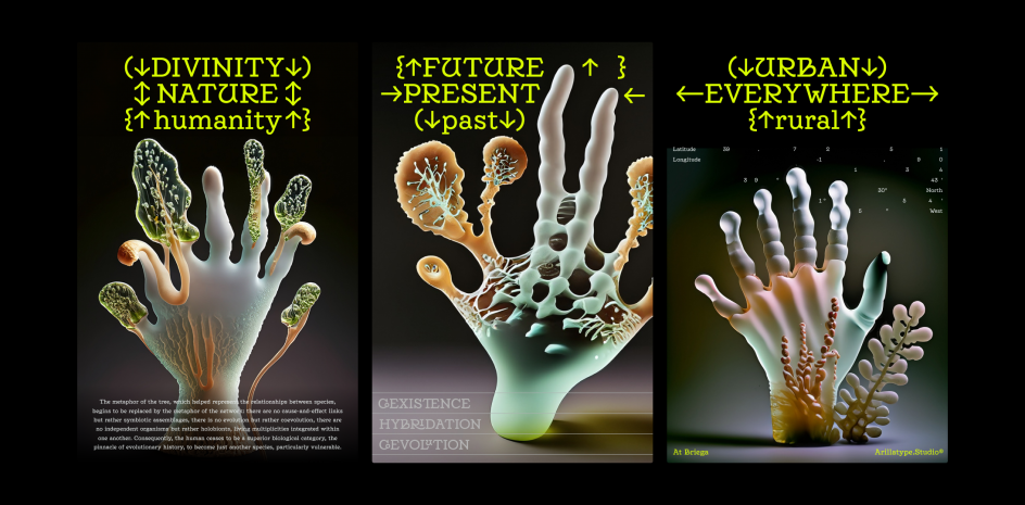
4. At Briega by Arillatype.Studio
Arillatype.Studio is a design studio based in Málaga with a passion for typography and exploring the intersection of creativity, craft and technology. Their latest font release, At Briega, was originally conceived as a revival of Charles Robert Ashbee's "Endeavour" typeface from 1901. But it then went in a different direction, inspired by the concept of hybridisation.
"At Briega represents the harmonious coexistence in time and space of contrasting elements," the studio explains. "Rural villages are meeting megacities, craft intersecting with technology, and nature harmonising with anthropocentrism. This delicate balance of ideas is not only the foundation of our design philosophy but also an embodiment of this creative journey."
At Briega includes almost 1,000 glyphs, including characters, symbols, emojis, ligatures, floral titling caps and numbers. The font is available for customisation, language extensions and special licensing needs.
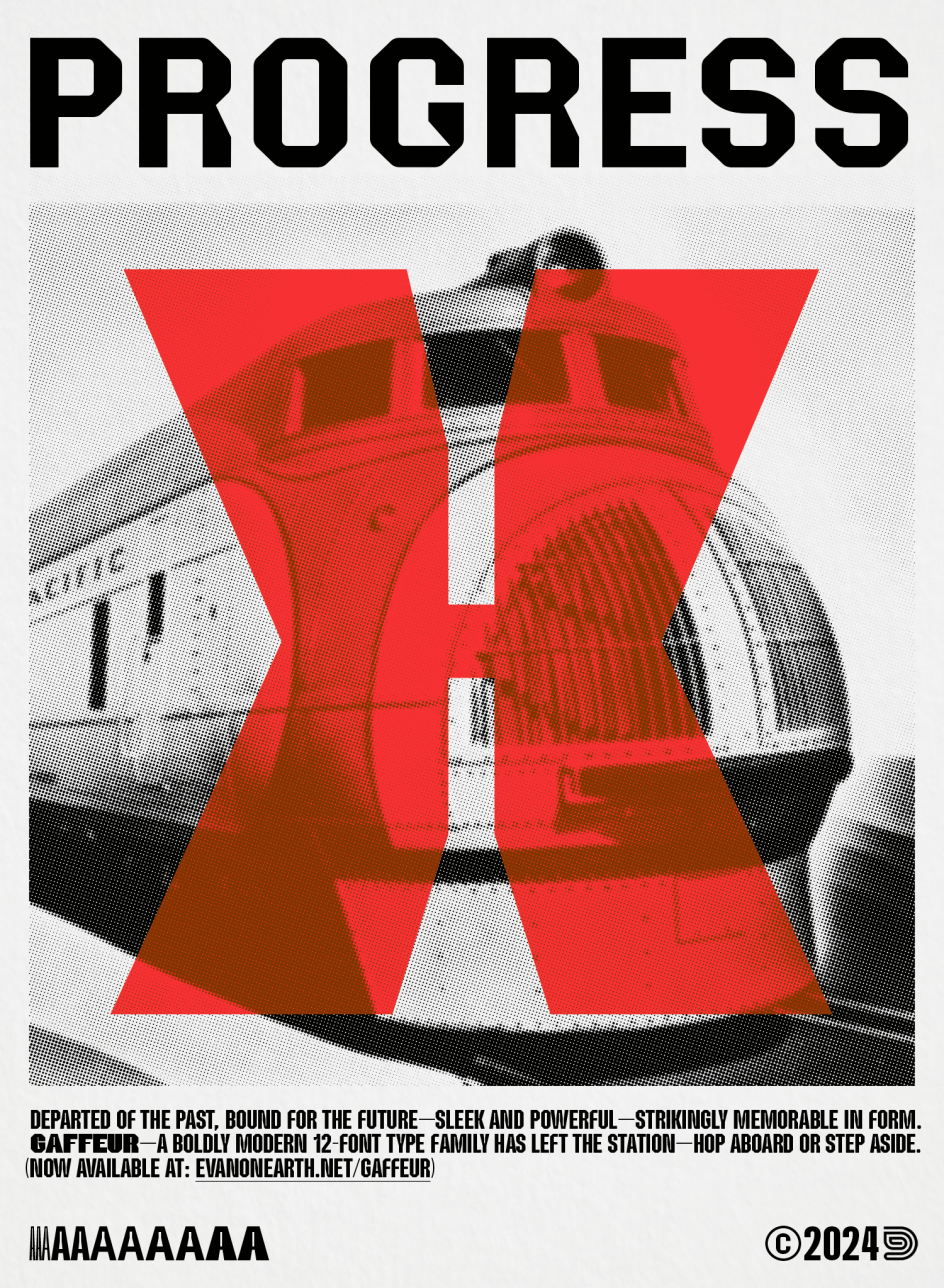
5. Gaffeur by Evan Deterling
Evan Deterling's three-decade career has been spent largely as an editorial art director and design director for Condé Nast, working on design-centric magazines such as Details and GQ. Over the pandemic, he began working on his own retail typefaces and is on track to launch a new type foundry over the coming year.
Evan's first public release is a 12-font family titled Gaffeur, which was inspired by improvised letterforms fashioned from gaffer tape. The idea was to greatly refine the genre while retaining a certain signature 'folding' motif. It's an intriguing idea, and the result is a typeface that looks like nothing we've seen before.
The design has two other expansive workhorse typeface families in development, aiming for a spring and summer release date. We can't wait to see them too!
6. Galnoy by Daniel Iglesias
Galnoy is a unique serif by Spanish typeface designer ByDani, which seamlessly blends the classic elegance of Garalde fonts with the exuberance of two prominent Baroque movements: Gothic art and Art Nouveau.
By reinterpreting the artistic and visual richness of these styles towards a more modern and contemporary approach, the result is a timeless font with character and versatility. Galnoy stands out best in larger sizes, making a bold impact in headings and titles, yet remains versatile enough for various design contexts.
7. Hour by Federico Parra Barrios
Designed by Federico Parra Barrios, an independent type designer based in Bogotá, Colombia, Hour is intended for motion design but can also display its originality when used to compose the title of a book or a magazine. The concept behind it is a contemporary interpretation of engraved letters, exploring how we perceive their forms based on the angle of incidence of the sun and the ambient light.
This is an accomplished variable font despite having only two axes. The first, titled 'hour', determines the angle at which light strikes the surfaces of the letters, similar to a sundial. This axis evolves logically from 0 to 12, with the light appearing to revolve around the letters, generating an infinite number of variations.
The second, 'okta', borrows the measurement of cloud cover from meteorology. By varying it, you can give the sensation of modifying the intensity of the incident light, as if adjusting the nebulousness and opacity of clouds in the sky. Like the original unit of measurement, this axis extends from 0-800: from cloudy to sunny, progressing through clear.
8. Grantig by Julien Fincker
Grantig is a bold, serif display typeface inspired by the opening titles of old Western movies. But while it takes the genre of Western slab serifs as its starting point, designer Julien Fincker has translated this style into a modern context and adapted it to today's needs.
With its massive serifs and strictly rounded curves, it comes particularly close in character to Western slabs of days gone by, and it's accompanied by two leaning companions, Slant and Backslant. Grantig, which means "grumpy" in German, comes in three weights: Regular, Slant and Backslant.
This typeface is a great choice for eye-catching and type-accentuated headlines. Its expressive nature also makes it suitable for editorial, packaging and advertising.
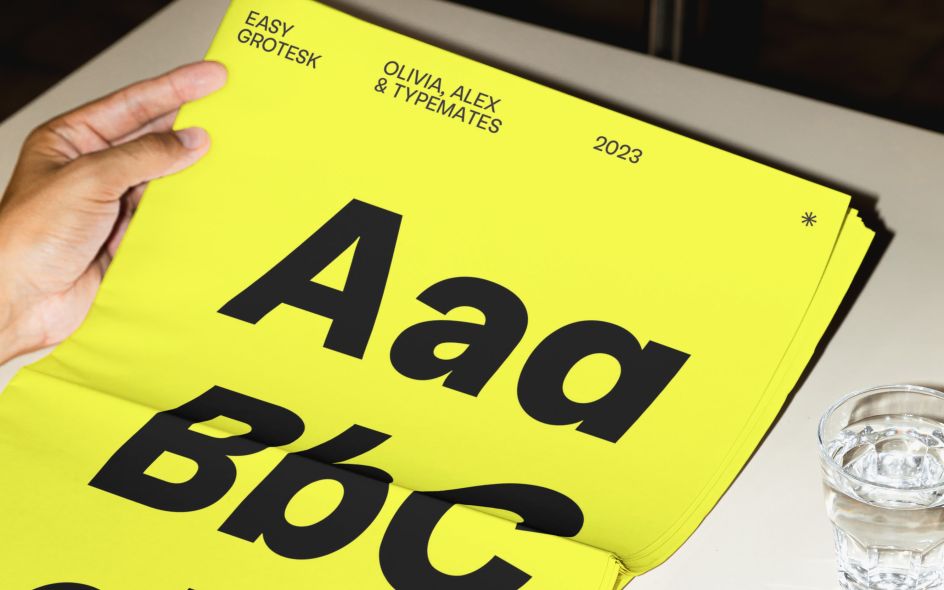
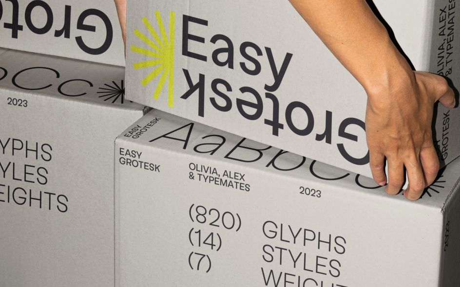
9. Easy Grotesk by Alexander Rütten & Olivia Wood via TypeMates
Designed by Alexander Rütten and Olivia Wood, Easy Grotesk brings together two opposing aesthetics: an easy-going typographic texture on the one hand and a quirky character on the other.
It may follow a standard neo-grotesque model, but it plays with the principles. So where, ordinarily, the lower parts of a letter are a little larger to make it feel more stable, Easy is dynamic; the top is heavy. An almost upside down 's' and signature 'a' are just a couple of other details that bring a playful character to your designs.
While its proportions give the typeface distinction and impact at display sizes, they're subtle at smaller ones. Level-headed proportions, ample body and spontaneous detailing, deliver content with joie de vivre. Originally designed for a tech startup, this typeface's seven styles, matching italics and relaxed attitude make it a good choice for organising complex information and making it approachable.
Along with Tabular Lining and Oldstyle Figures, its OpenType features include a wide range of alternates (a simplified 'a' and 'g', a distinctive 'G' and 'k', and a tailed 'l' for extra legibility) and plenty of typographic extras: arrows, case-sensitive forms, and symbols. Furthermore, the variable font implementation of Easy Grotesk opens up additional ways to create motion graphics.
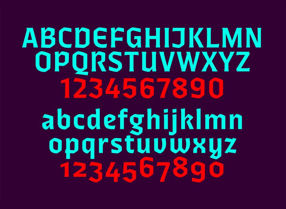
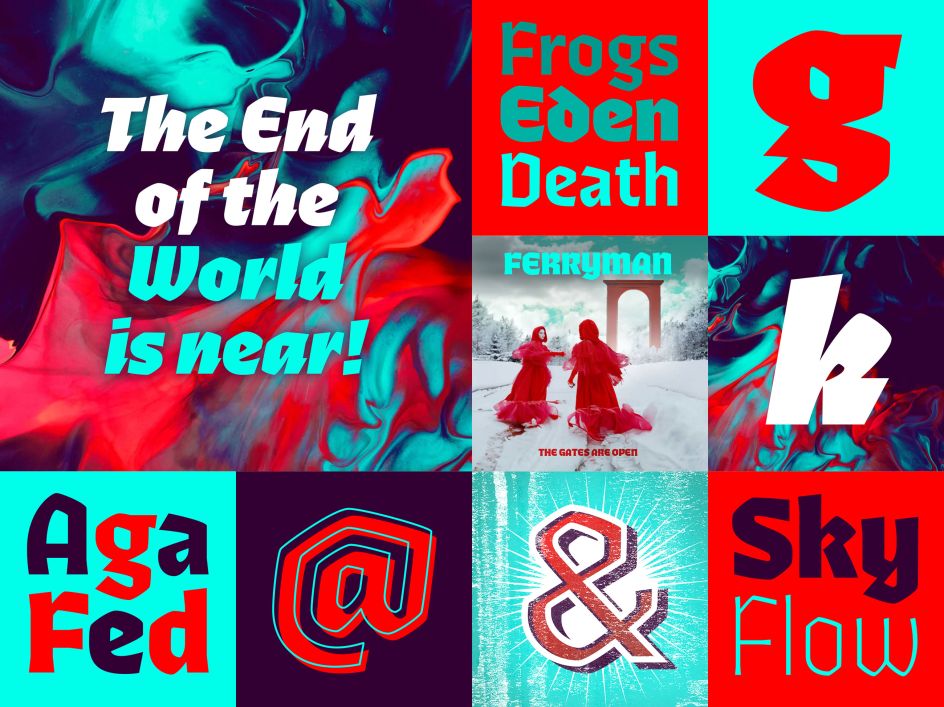
10. Ferryman by Felix Braden
Cologne-based designer Felix Braden works full-time as an art director at MWK Cologne. He also designs fonts, almost all of which reference water. This veritable typographic aquarium includes fonts with names such as Pulpo, Kontiki, Capri, Tuna, FF Scuba, Bikini, Moby and Turbine.
Into this oeuvre comes Ferryman: a Blackletter for the contemporary reader. The objective was not to create a historically accurate Blackletter typeface but rather to design legible letters suitable for contemporary users, functioning well as a cohesive family.
As such, unfamiliar Blackletter characters have been replaced with adapted common Latin characters (Antiqua) or with letters from other historical scripts that are more legible to a modern audience.
Ferryman is the antidote to the overused geometric and neogrotesk styles. An expressive display typeface with a strong character, it's well suited for counterculture projects and progressive concepts, for instance, in visual art, indie music, and alternative lifestyles.
With nine weights and corresponding italics, Ferryman offers many creative possibilities. Each style offers 590 glyphs supporting all Western-, Eastern- and Central European languages and comes with four sets of numbers and various currency symbols.
To maximise usability, Ferryman offers various alternatives for many glyphs, granting designers the flexibility to choose between optimal readability and the historical richness of expression. Ferryman also stands as a rare example of a Blackletter typeface accompanied by a corresponding cursive.
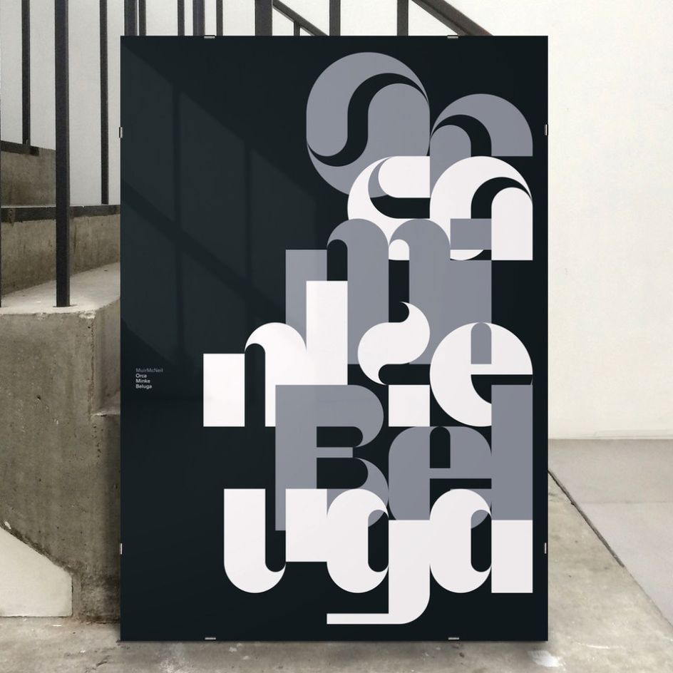
11. Orca, Minke and Beluga by Natasha Lucas
Orca, Minke and Beluga are the members of a new family of typefaces designed by Natasha Lucas, a graphic designer based in London, in collaboration with MuirMcNeil, a studio founded in 2009 by Paul McNeil and Hamish Muir.
Exploring flowing curves within the constraints of modular geometric construction, these three typefaces represent a logical progression of the ideas that Natasha had begun to examine in the type systems she developed and published previously with MuirMcNeil. In each of the new designs, she has investigated how positive and negative spaces can be modulated in a reciprocal harmony to construct the shapes and voids from which letters, words and sentences are made.
While playfully ambiguous, the characters of Orca, Minke and Beluga consistently serve the linguistic signs for which they stand, balancing their vibrant personalities with easy readability and elegant geometric form.