Fiona Burrage of The Click launches her own bodycare and fragrance brand, Sop
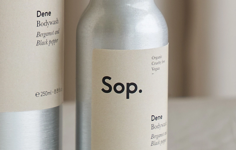
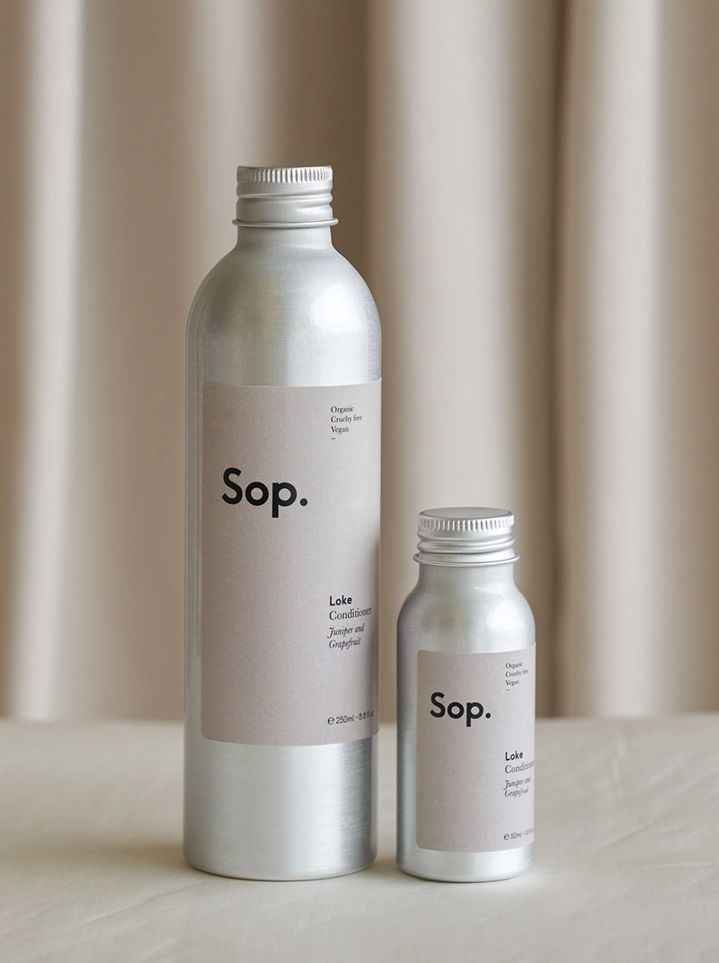
"A love for our landscape and language", so reads the sentiment behind Sop, a new Norfolk-made bodycare and fragrance brand by Fiona Burrage, one of the co-founders of design studio, The Click.
](https://media.creativeboom.com/f47a969e-13b3-46e8-88f3-2e67d8ef1029/conversions/af0189f62d7572345cc4567b09cbf08cbc79a1ef-medium.webp)
All photography by Fiona Burrage
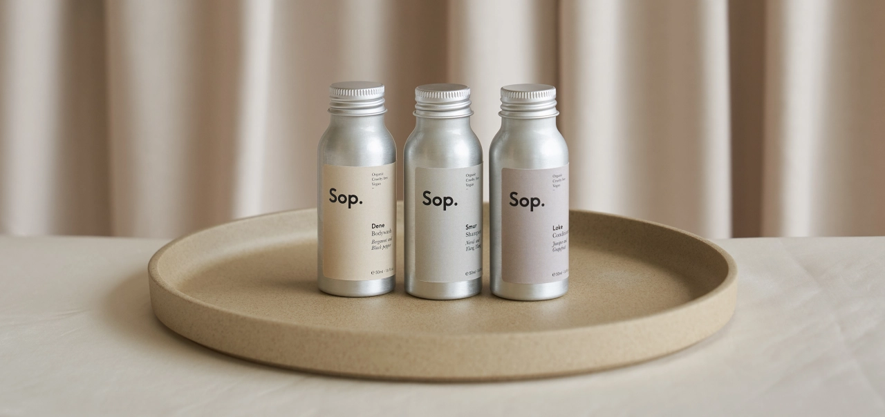
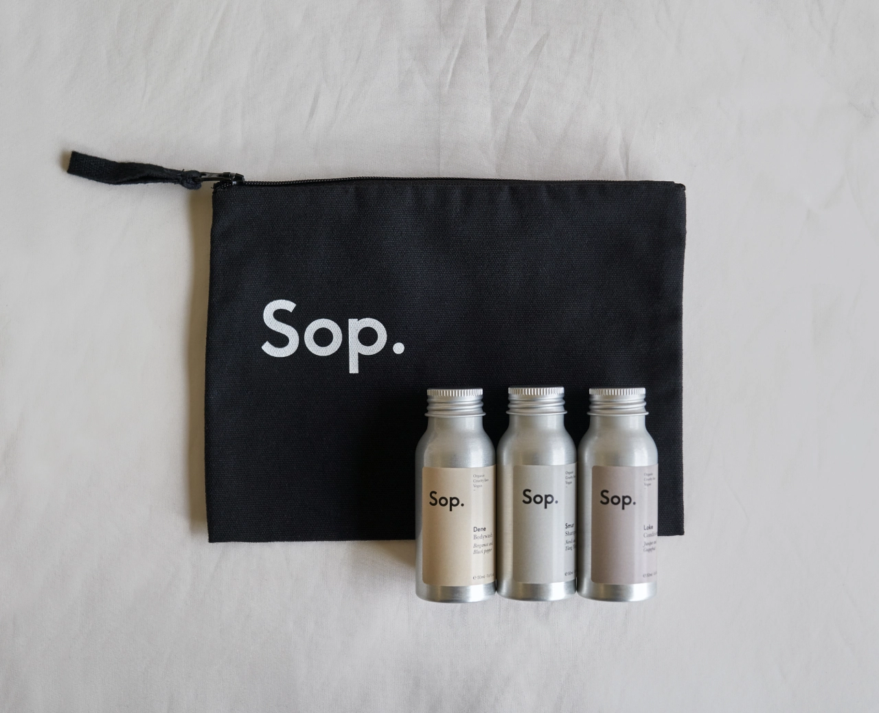
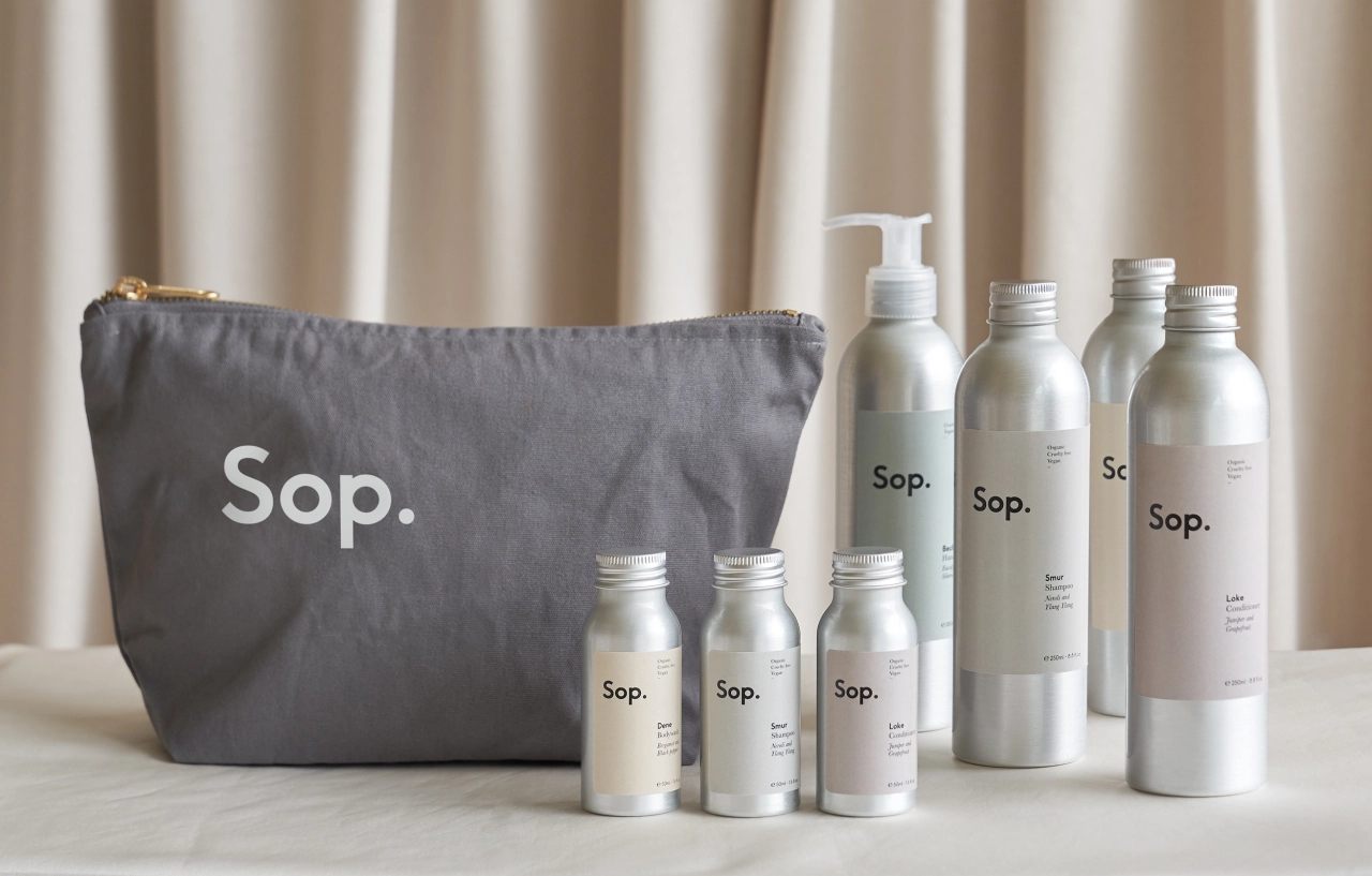
She's also the creative director of lifestyle brand Nor–Folk and a photographer, too – not a bad set of skills to have when creating body wash, shampoo, conditioner, hand wash and soon-to-launch bath salts, candles and room diffusers.
With Sop being another self-initiated venture for The Click, its role was both the creative team and the client – led by Fiona to realise her vision for the brand. The project included naming, visual identity, packaging design and writing.
What was the inspiration? Fiona apparently wanted to offer bespoke bodycare products to her guests at the Water Cabin (a place to stay in the heart of the Broads National Park), which is also part of Nor–Folk.
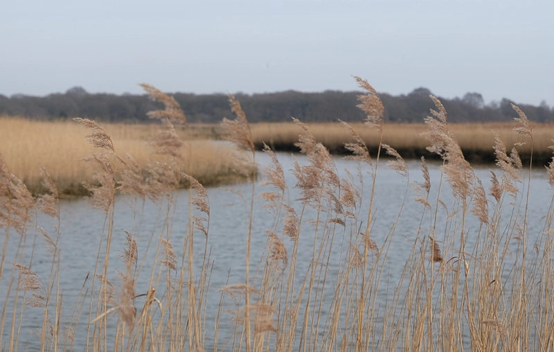
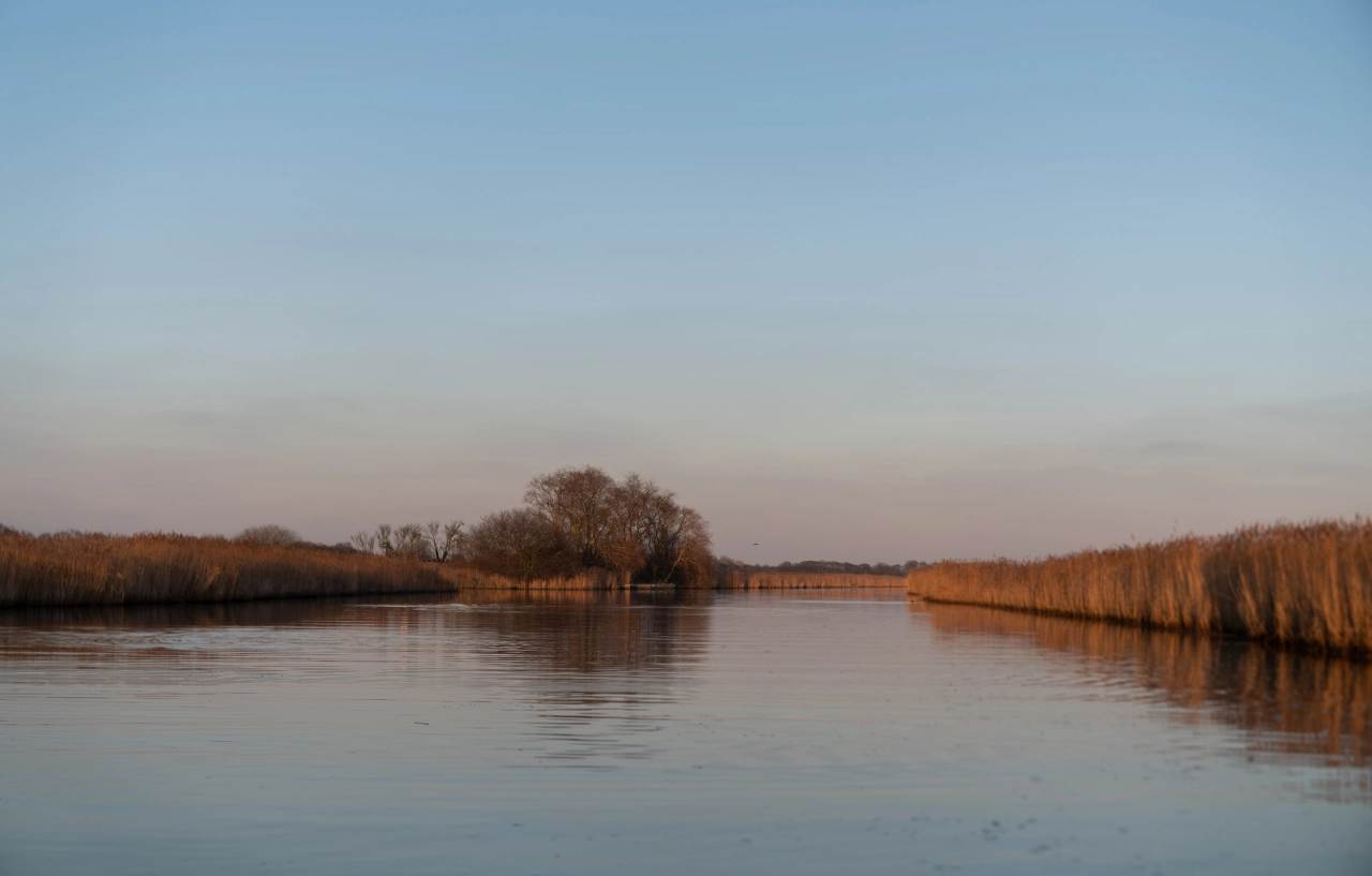
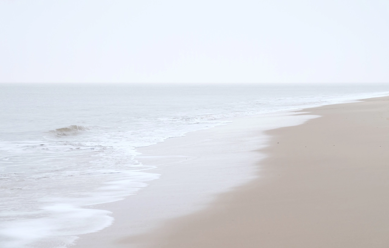
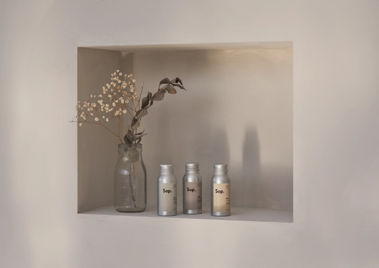
Sop's brand identity is inspired by the Norfolk landscape and language – both visually and verbally. The brand name, the product names and respective descriptions along with the wider visual identity have all been influenced by Norfolk as a place.
"The name came first," says the studio, "a playful twist on the popular saying 'a sense of place'. By changing this to 'scents of place', we encapsulated the product range (all of which comprise beautifully crafted scents) and capture the original inspiration (the wonderful place of Norfolk)".
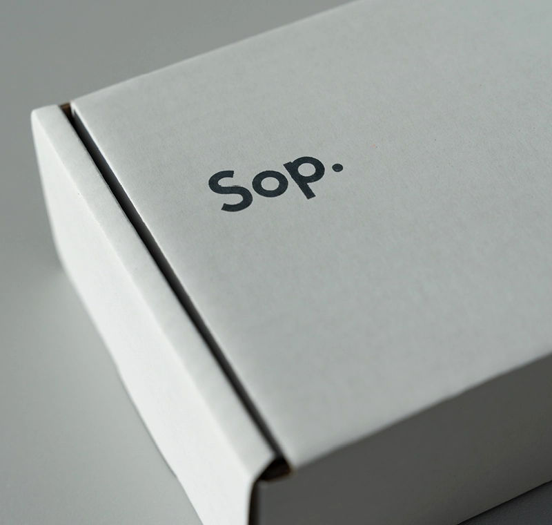
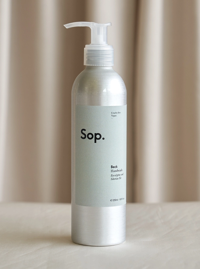
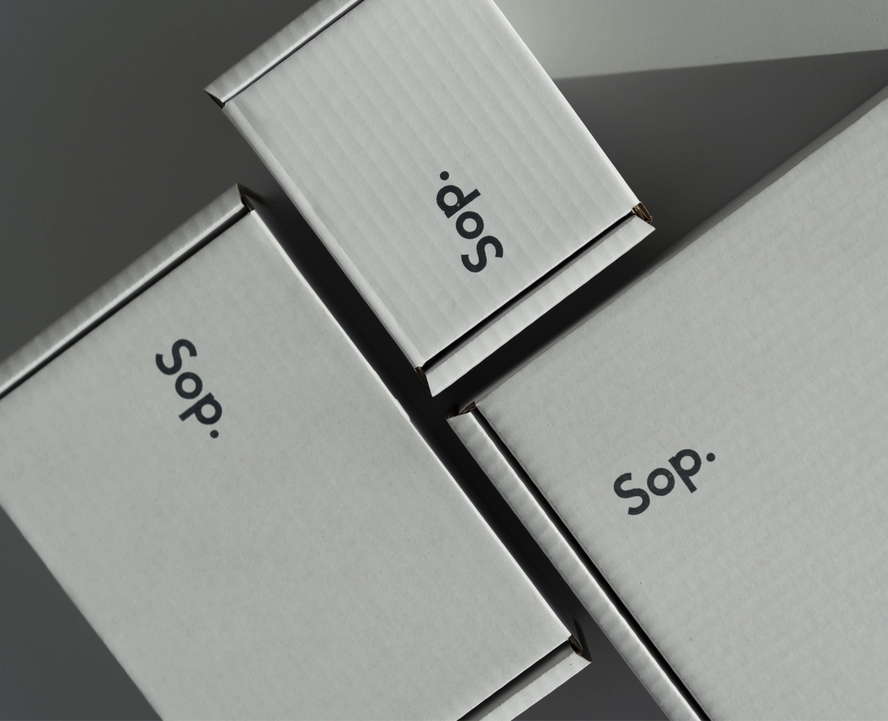
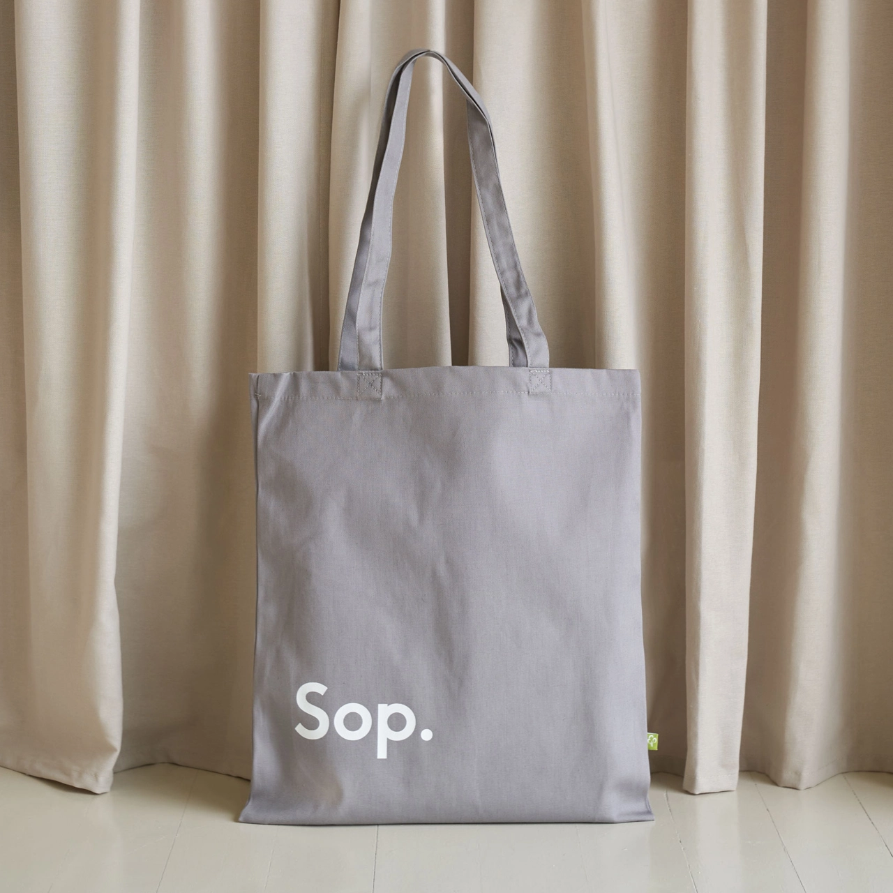
Sustainability is key to Sop with every detail is carefully considered. The shipping boxes and bags are fully biodegradable and made from recycled sources. "The decision to use aluminium bottles was based on much research and consulting with a number of environmentalists," adds The Click. "Whilst we sourced some good recyclable plastic options we discovered aluminium to be not only easier to recycle but infinitely recyclable. Plastic pump dispensers are sold separately to facilitate easier but also for multiple uses."
Everything is made, bottled, printed and fulfilled in Norfolk – the majority of it within five miles of the brand's home in Norwich.
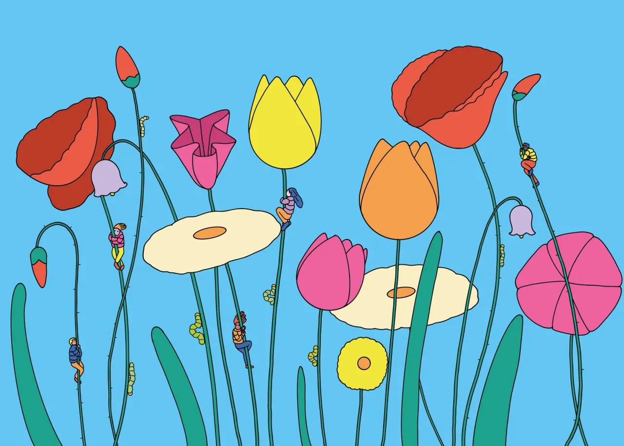
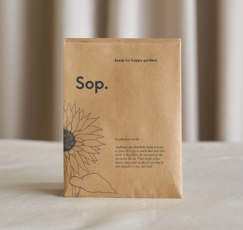
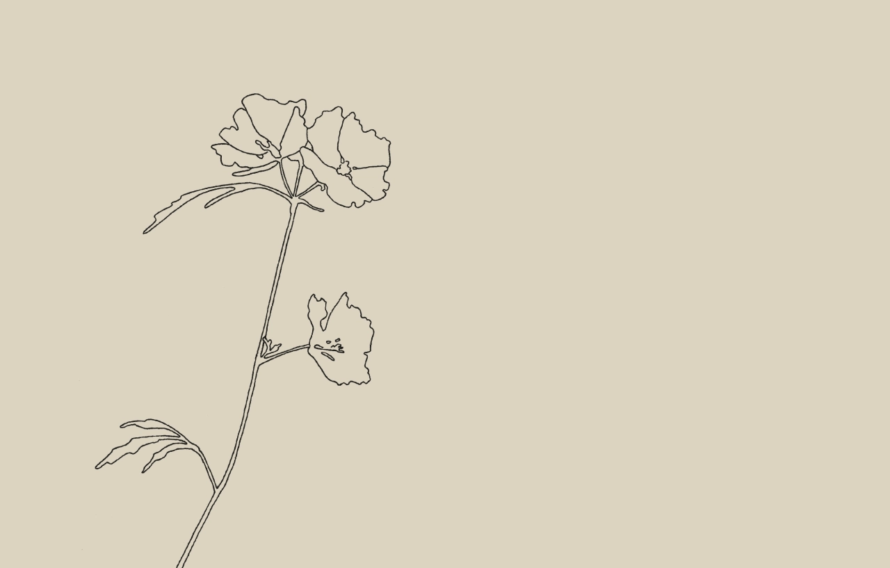
Sop also has a small range of seeds – some of which are included for free on customer orders – encouraging the planting of wildflowers and sunflowers. The Click worked with local Norfolk artist, Ruth Howes on the illustration.
Fiona isn't herself originally from Norfolk but does have a regional accent (Essex) and knows all too well the stereotypes and perceptions that are often associated with local accents and dialect. In the globalised generation that we all live, it was her vision to create a brand that celebrates what makes it unique. This celebration comes in many forms – by embracing local dialect and words, photographing humble botanicals as sculptural art forms and in turn capturing the real essence of "place". She says: "My aim is for Sop to be a celebration of everything it stands for and all that it’s inspired by – from the regional dialect to the natural environment."
Editor's Picks





Trending






Latest Jobs
Brand Designer at Adfin
Full-time·London·£30k–£50k
Midweight Designer at Catalyst Creative
Full-time·London·£32k-£36k
Brand Copywriter at Origin
Full-time·Porthleven, Cornwall·£35k–£40k
Senior Designer at Creative Spark
Full-time·Manchester·£35k-£50k
Account Manager at Moxie and Mettle
Full-time·Cheltenham·Up to £35k
Graphic Designer at Crux Product Design
Full-time·Bristol·Up to £36k