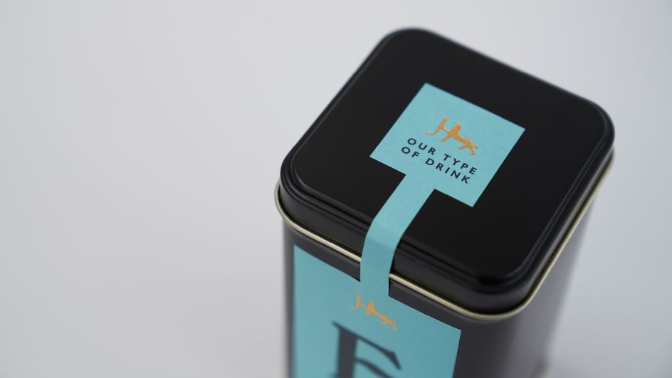
The Click gets the dream brief, creating a new identity for Jarrold's own label food and drink range
When a 250-year-old department store that was once a printing and publishing firm decides to launch its food and drink range and needs a name, identity and packaging, what's a design studio to do but take inspiration from its rich heritage?
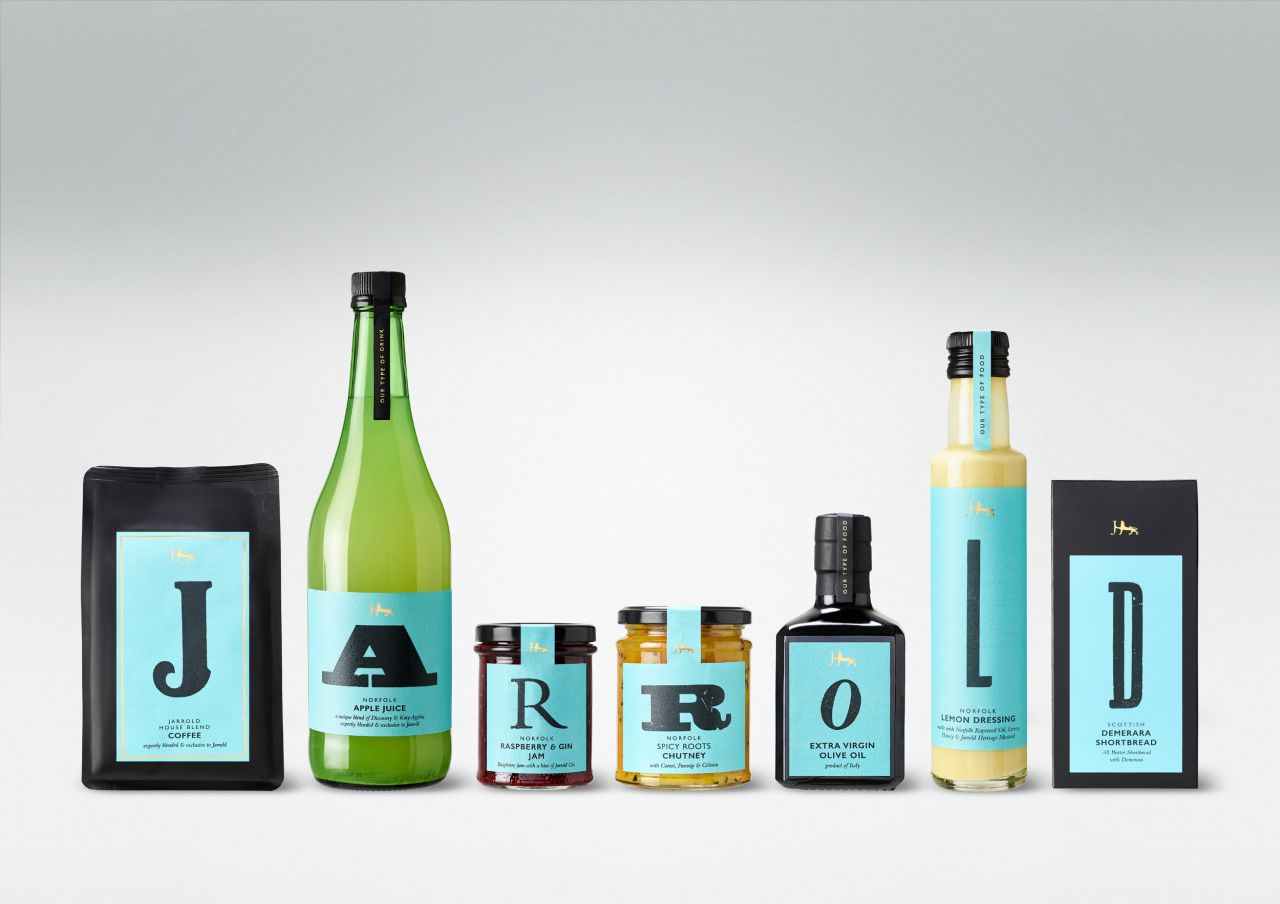
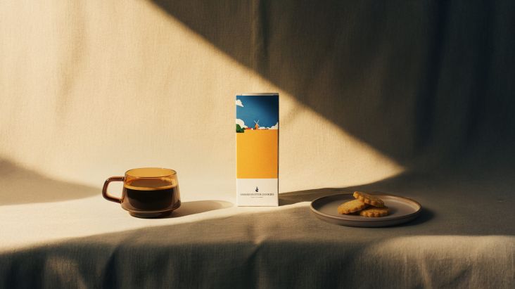
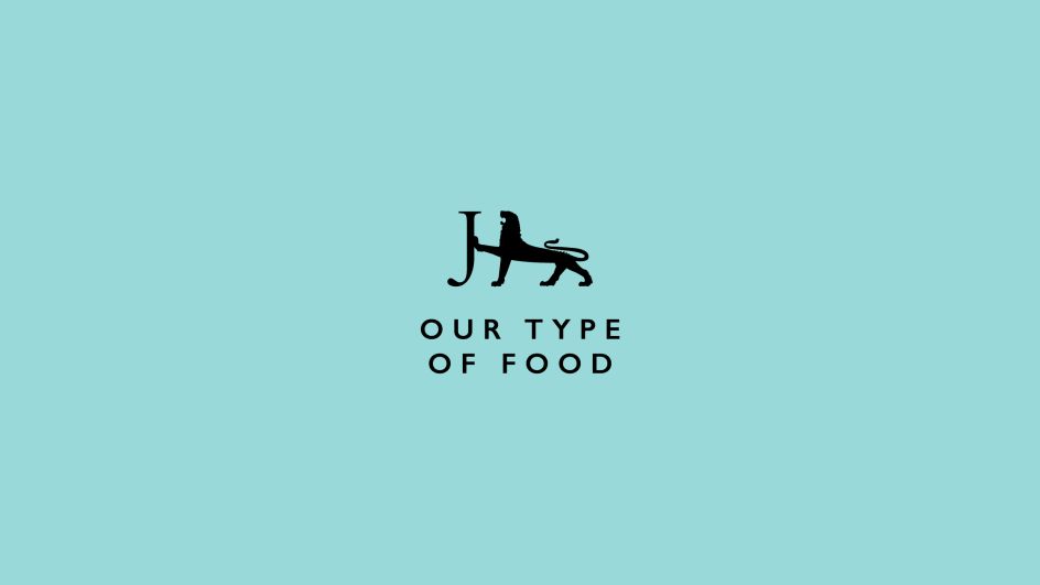
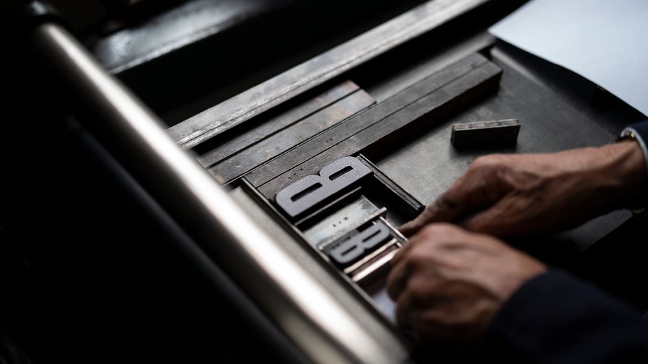
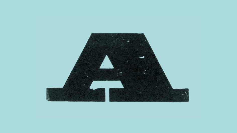
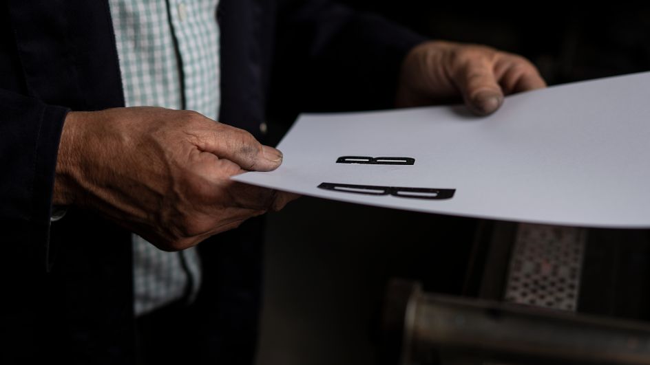
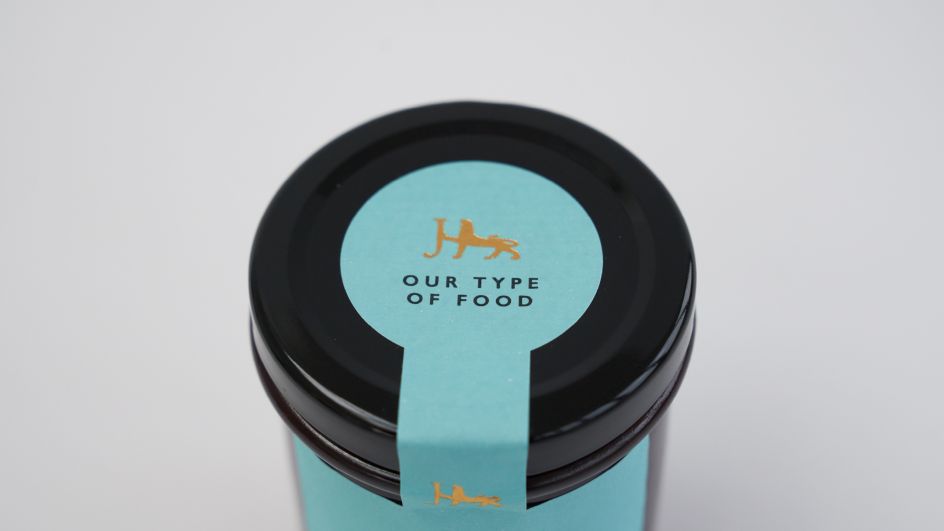
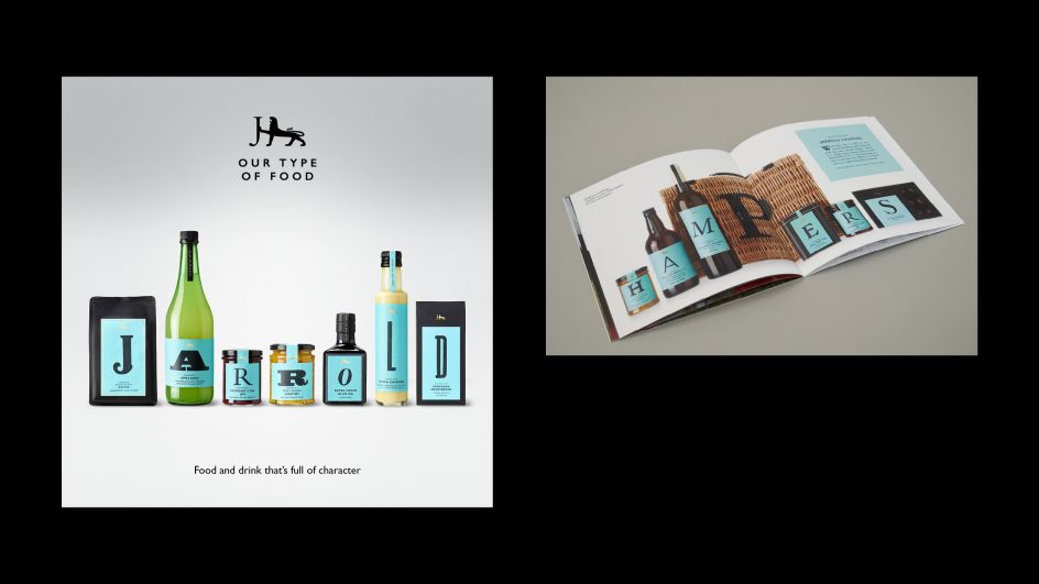
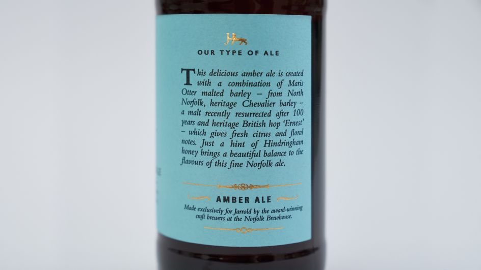
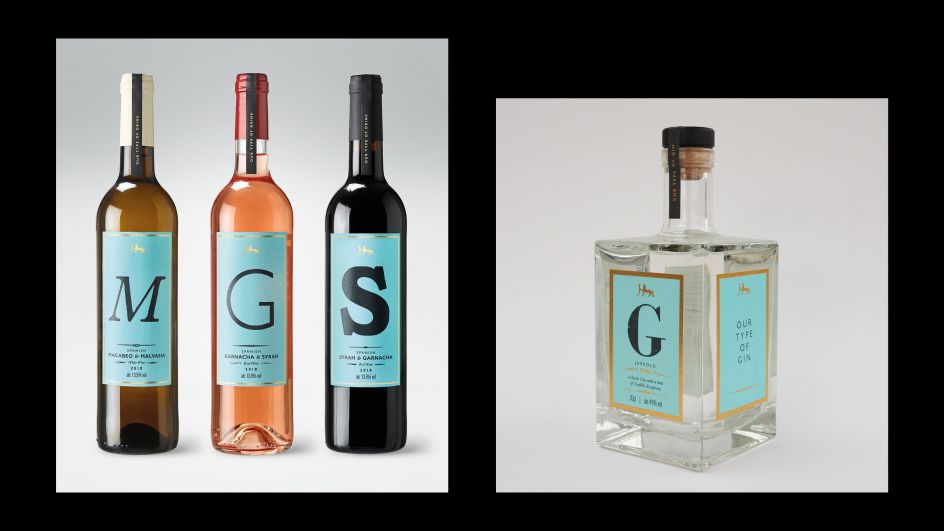
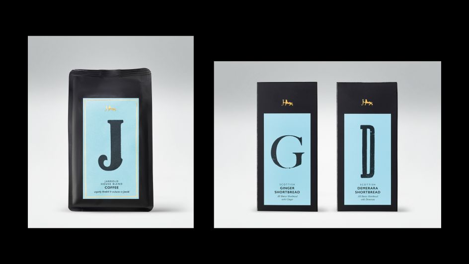
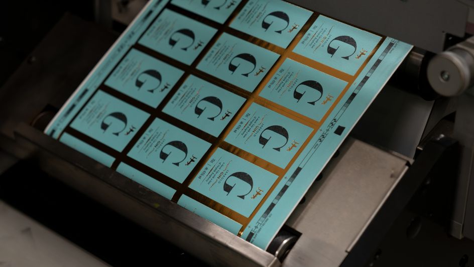
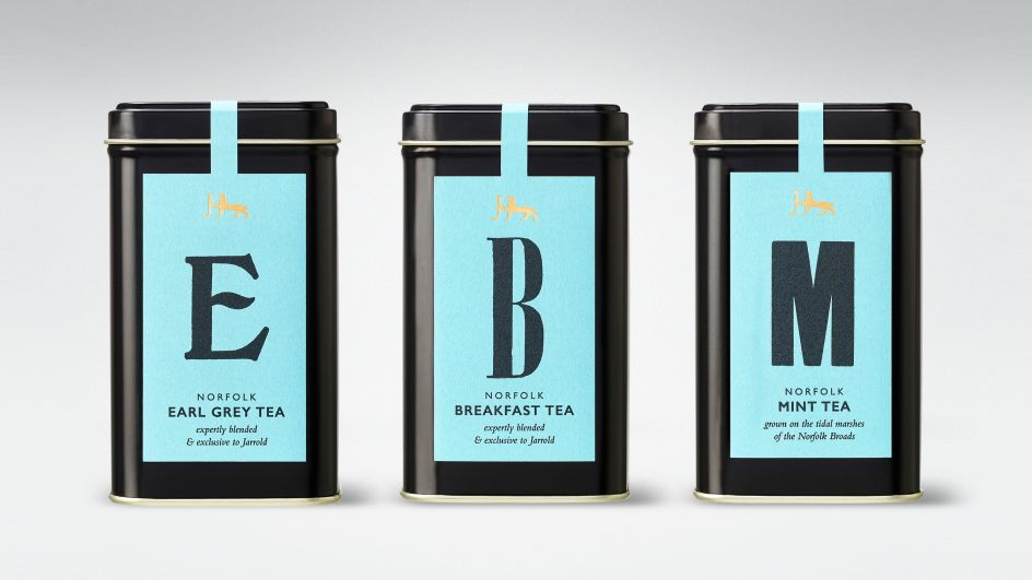
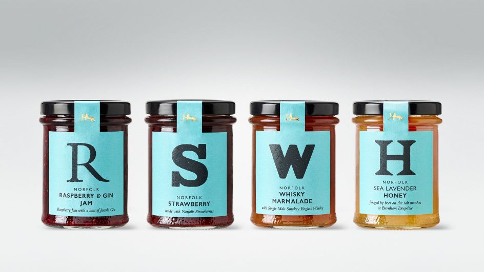
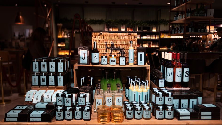
The Click got the dream brief from Jarrold, the largest independent shop in Norfolk, founded in 1770 by John Jarrold. Naming the range, Our Type of Food – see what they did there – The Click used Jarrold's historic collection of woodblock and letterpress type, as well as its old printing presses, to create the actual packaging artwork.
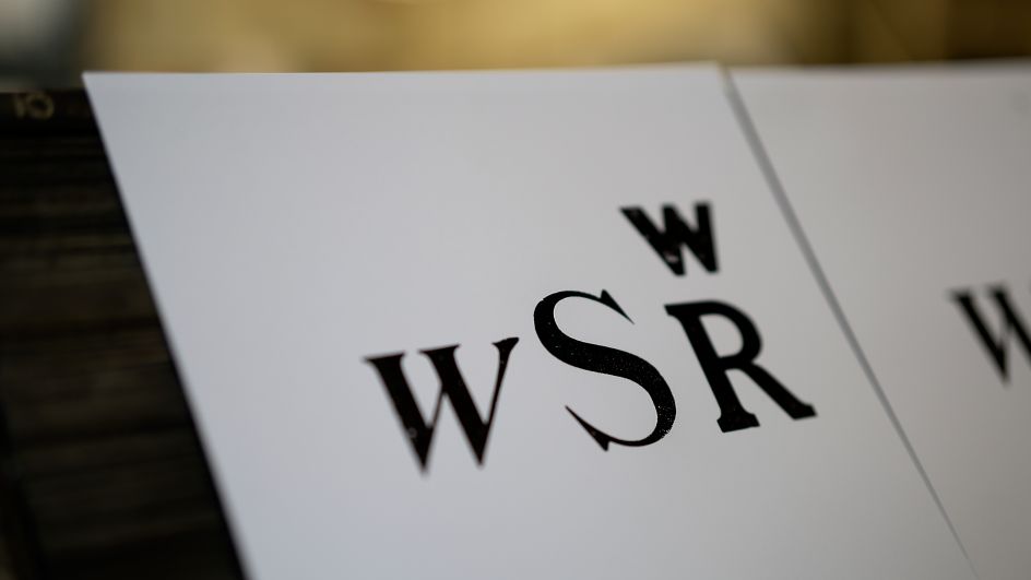
The individual products, which range from artisan chocolates, shortbread, mustard and jam to honey, chutney, olive oil, tea, and real ale, each feature a letter which can be used to spell out words. It sets things up nicely for future campaigns.
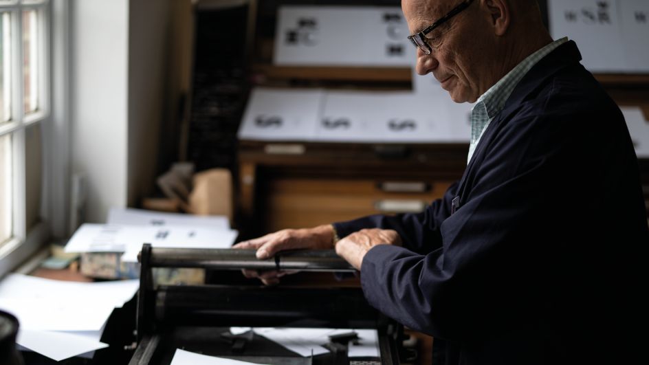
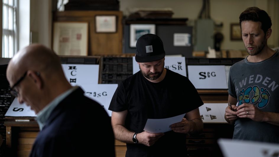
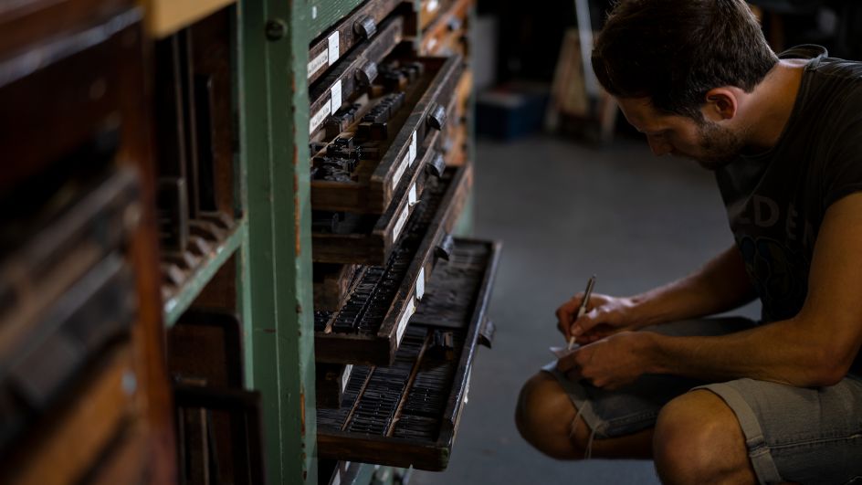
"We worked closely with volunteers at the John Jarrold Print Museum and set about sourcing the perfect typefaces to suit our range of packs – considering scale and proportion as well as selecting a range of styles and weights to fit each product," says Creative Director Bobby Burrage.
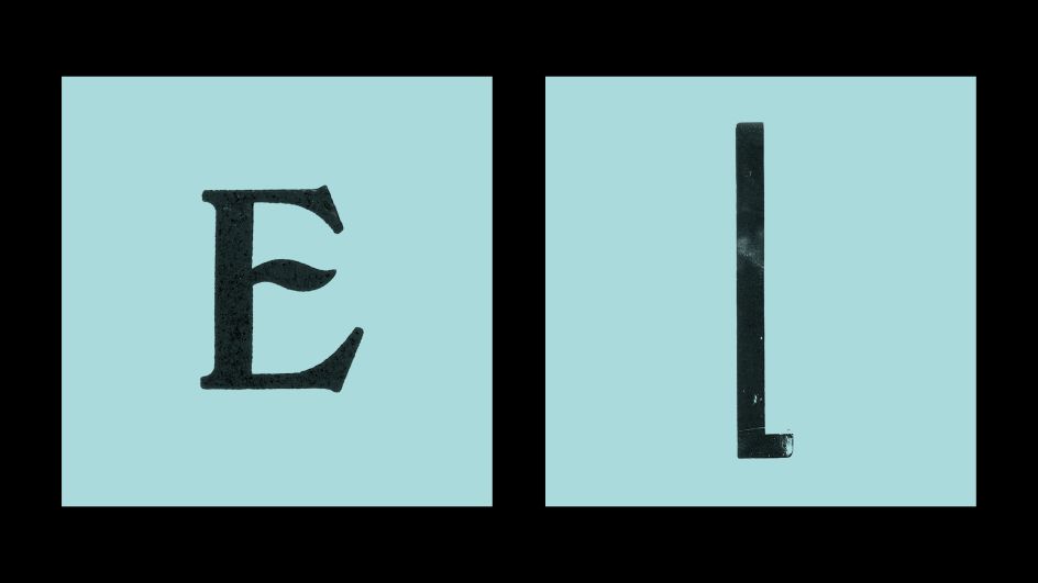
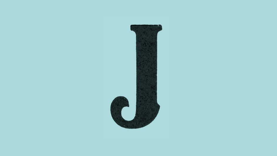
"We then used the old printing presses in the museum to make prints of each letterform, retaining their physical imperfections and quirks. Once the final suite of letterforms was selected, we applied them, in all their raw beauty, to the final packaging range."
Watch the video below to hear more about the project. Or visit theclickdesign.
Editor's Picks


Trending


Podcasts


Editor's Picks
Further Reading