'Champions of Choice': Ragged Edge reveals its rebrand for Go.Compare
Go.Compare, the brand we all can't help but sing in our heads, has enjoyed a big and bold rebrand courtesy of Ragged Edge. The London studio leaned into its point of difference, highlighting the many benefits of the UK's leading price comparison site.
If you hear the words 'Go Compare', you'll undoubtedly summon the image of Gio Compario, the infamous mascot played by Welsh singer Wynne Evans, who, since August 2009, has starred in an advertising campaign for the UK insurance comparison website Go.Compare.
With a brand so strong and instantly recognisable (97 per cent awareness, apparently), you can imagine it was quite the dream brief to help it reinvent itself and freshen its identity for existing and new customers. But why the need? Go.Compare approached London studio Ragged Edge to help it continue to stand out in an increasingly competitive marketplace.
The flamboyant, operatic tenor is still there; you'll be pleased to know, but for its new and evolved brand, Ragged Edge not only sought to leverage the company's fame but wanted to persuade more people to actively choose it. How? The rebrand focused on a genuine point of difference in that Go.Compare is the only comparison site accredited by BIBA, ensuring integrity and trustworthiness in every recommendation.
"Unlike others, Go.Compare doesn't just list options; it serves up choices genuinely beneficial for users, placing their interests at the forefront," explains Max Ottignon, co-founder of Ragged Edge. "So we amplified that difference, positioning Go.Compare as the 'Champions of Choice'."
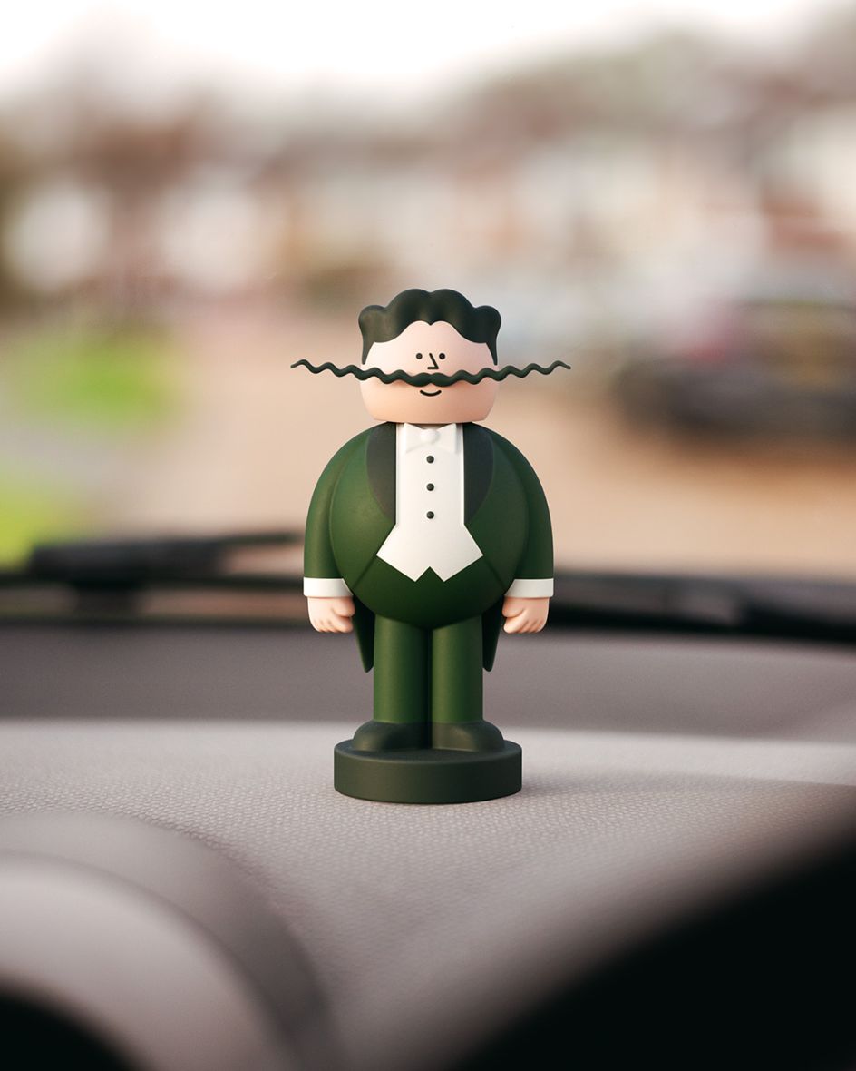
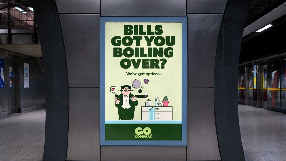
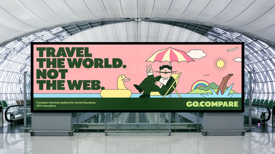
Does the new look retain the beloved central character? Yes, it does. In fact, the new identity puts Gio Compario at its heart, exaggerating his distinctive features in cartoon form to create a charming choice champion. "The animated Gio now advocates for you and your choices across every part of the Go.Compare experience, from comms to check-out and beyond," explains the studio.
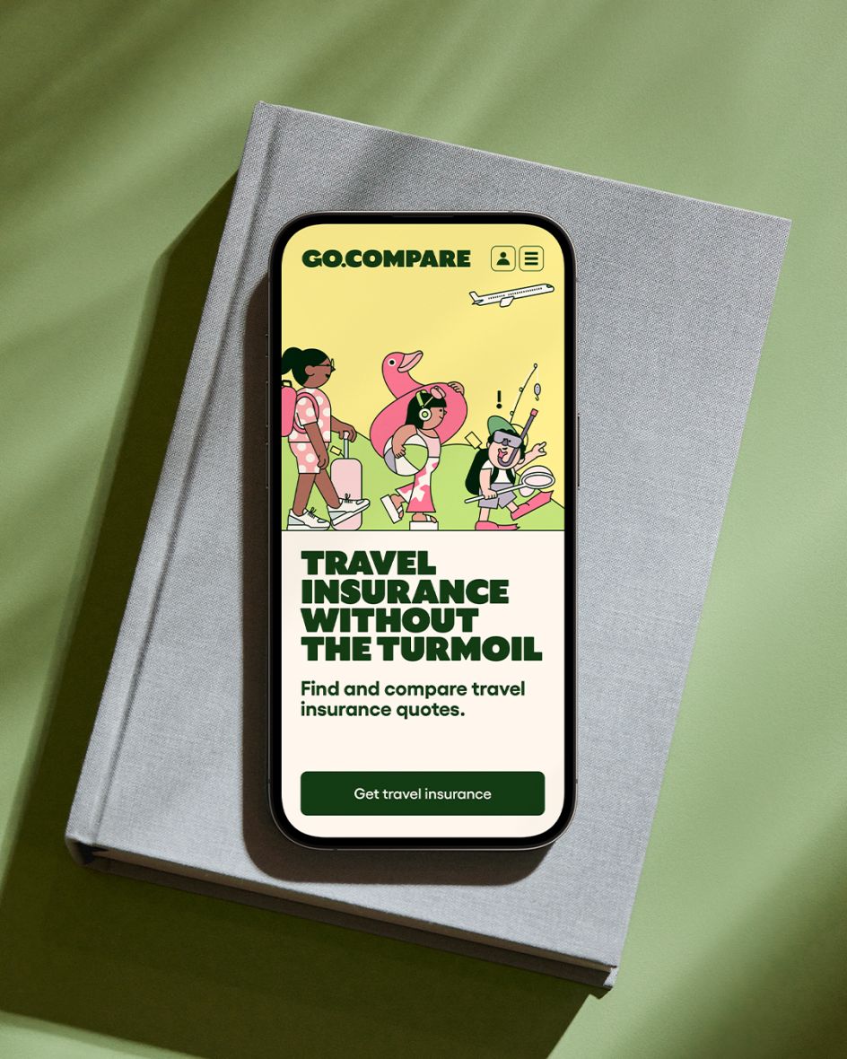
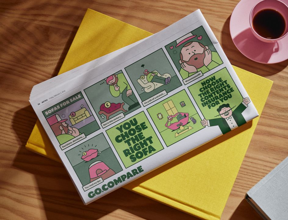
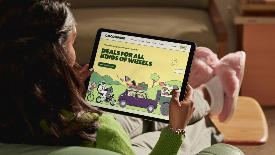
To further help the brand stand out, Ragged Edge realised that the category is dominated by stock photography, so it adopted an illustrative style created in collaboration with artist Rami Niemi, who is renowned for his fun yet simple editorial style and has worked with the likes of The Wall Street Journal to Vanity Fair. The illustrations help add flourish to a suite of different situations, bringing the brand's insurance products to life in an entirely new way. It's smartly done. And Rami's interpretation of Gio, the mascot, is as satisfying as you'd expect.
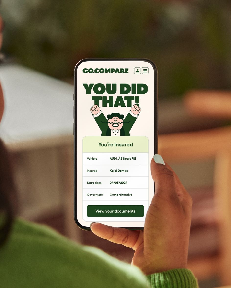
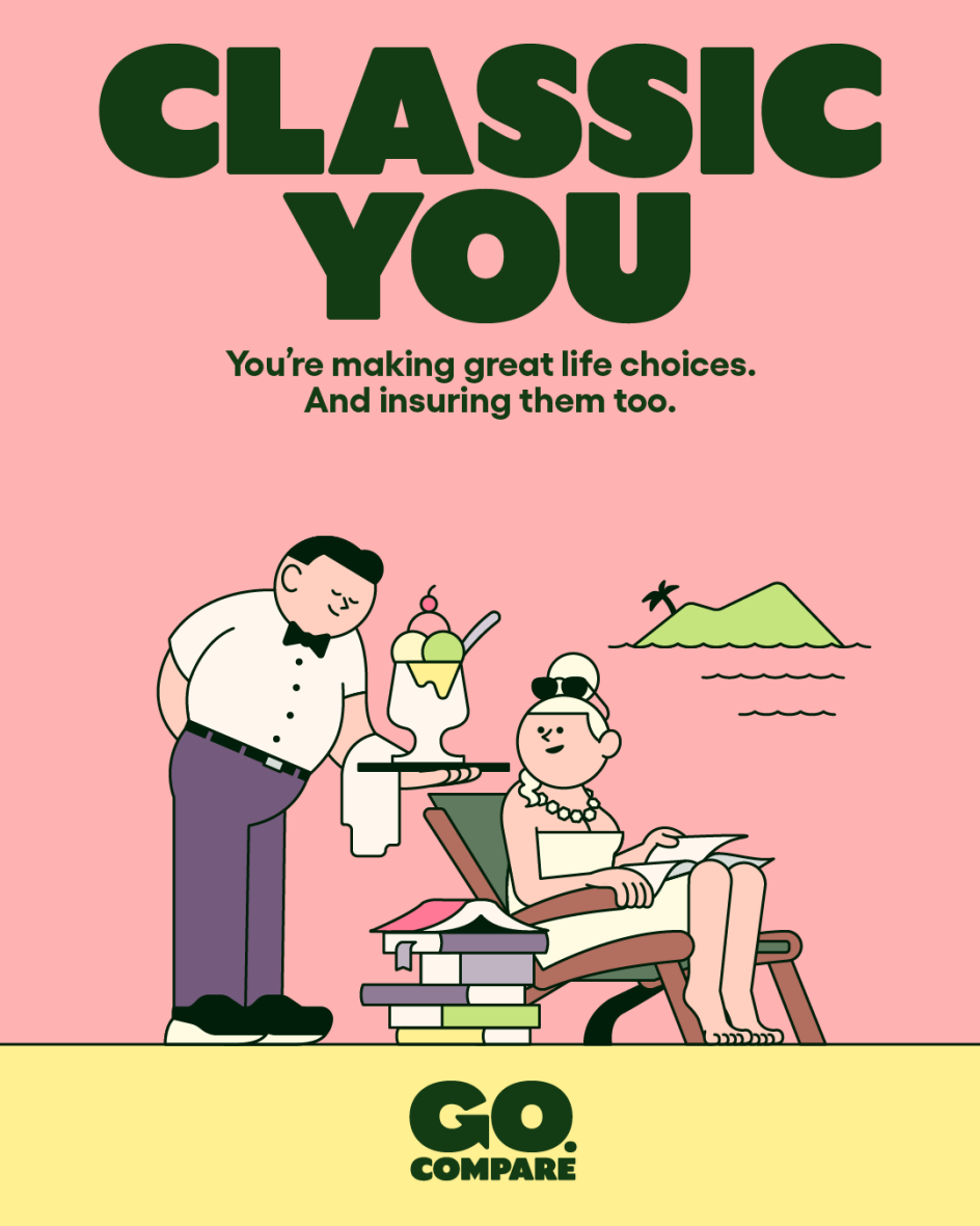
The verbal identity, 'the voice of choice' – as they put it – uses relatable wit and charm to connect with customers. Meanwhile, a customised typeface has been designed to echo the warmth and characterful style of the illustrations. It's big, bold, squishy and adorable, helping convey any message. The colour palette is soft and uplifting, with pinks, purples, yellows, greens and off-white hues – applied across campaigns and illustrations, the company's website, and other marketing materials. We particularly like the cute physical dashboard mascot we presume you can have if you're a customer...asking for a friend.
You could say it's all a bit twee, but actually, the fresh identity works beautifully well and lifts Go.Compare above its competition quite effectively. It's also been designed to be instantly campaign-ready, iconic and scalable. Take, for example, Ragged Edge helping to bring the re-imagined Gio to life as part of the brand's high-profile sponsorship of the Wales rugby union team. No easy feat in a space stuffed with options and, indeed, threats to its business in the 2020s. After all, it's been over 17 years since Go.Compare was founded by Hayley Parsons. To survive, one has to thrive. And Ragged Edge's work has reminded us of its value and relevance.
"Ragged Edge worked closely with every part of our business to ensure they understood exactly what our aspirations were and how we wanted to evolve in the future," says Paul Rogers from Go.Compare. "Insurance can be heavy going – a grudge purchase. Ragged Edge has made it fun and rewarding. The rebrand has helped us to evolve visually and strategically and given us an even stronger sense of purpose, authority and momentum as we continue to provide transparency and support for customers across a broad range of complex products."
Editor's Picks


Trending


Podcasts


Editor's Picks
Further Reading