Coffee & TV's rebrand by Ragged Edge celebrates 10 years of 'something different'
For Coffee & TV, the UK's first B Corp certified creative studio, London branding agency Ragged Edge brewed up (yes, we really went there) a new identity that marks almost a decade of making magic behind the ads with visual effects, motion design and direction being a speciality.
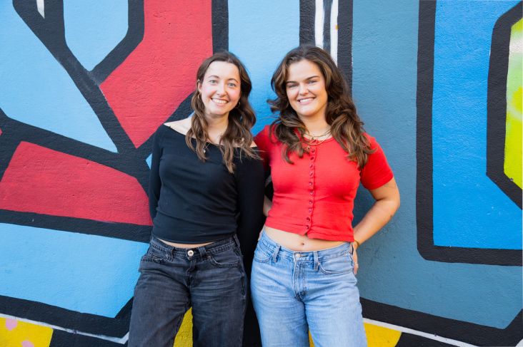
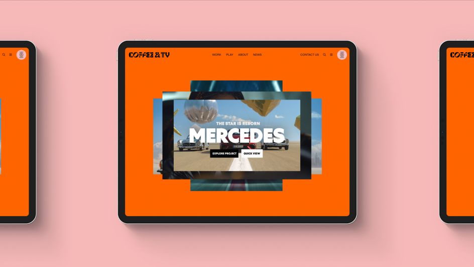
The four founders of Coffee & TV launched the business nearly ten years ago and the studio has since become known as the place where the industry's leading talent goes to create award-winning work that delivers for clients including Sky Sports, Deliveroo and Mercedes.
"Coffee & TV's rebrand marks a step-change in its business, moving from the industry's safe pair of hands to leaders in creative culture," says Max Ottignon, co-founder at Ragged Edge. "So in stark contrast to the slick, monochrome identities of its competitors, we created a vibrant production playground where creativity is allowed to flourish. A celebration of creative practice."
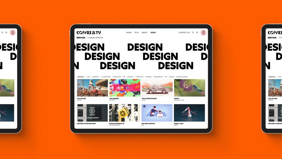
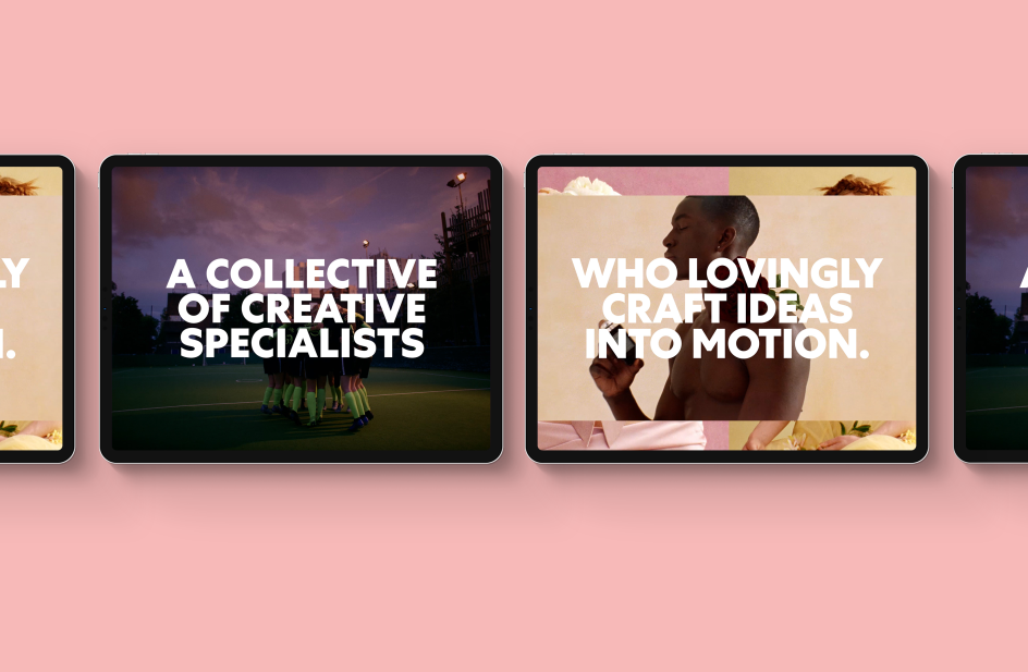
That playground is centred around a playful, stand-out logo with bespoke typography that's representative of the diverse range of the studio artists' talents. The headline typeface is Centra No 1 by Sharp Type while Briton Smith's variable typeface Universal Sans is used elsewhere in the body copy including on a brand new website that's bursting with life and colour.
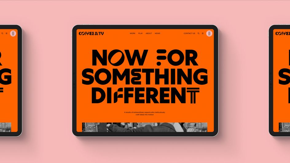
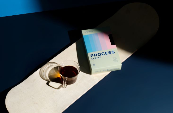
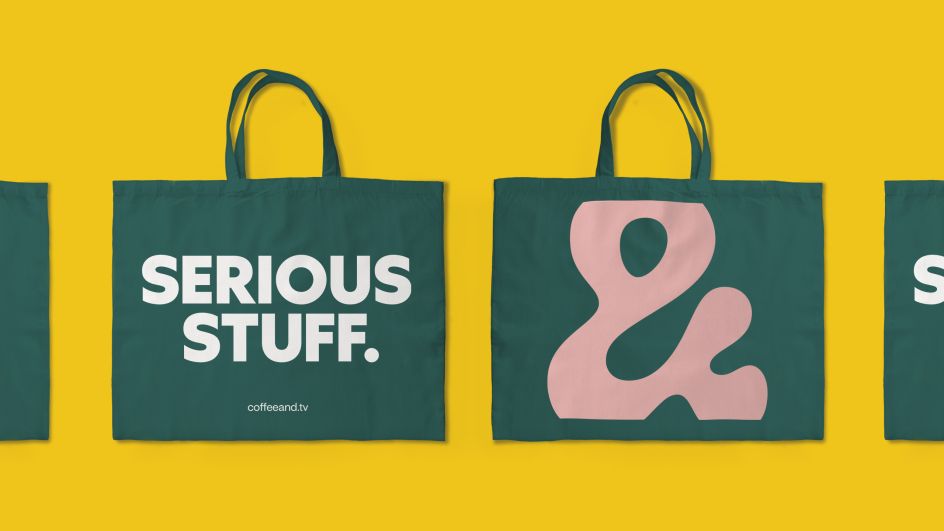
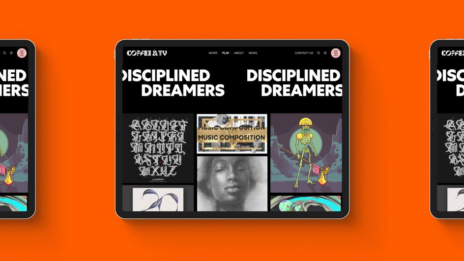
The entire home page surprises you with the identity's new overriding colour theme, an almost burnt orange that hits you between the eyes rather pleasantly and definitely makes the studio more memorable compared to its competition. An accompanying palette of baby pink, emerald green and mustard yellow is softened with a dash of monochrome here and there. In Coffee & TV's opening statement, Now For Something Different, different it really is, as it uses an interesting combination of the Centra No 1 with the glyphs Ragged Edge created for the logo.
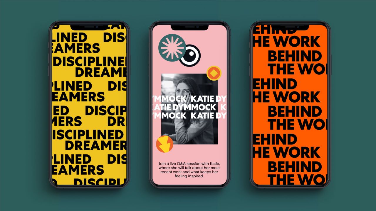
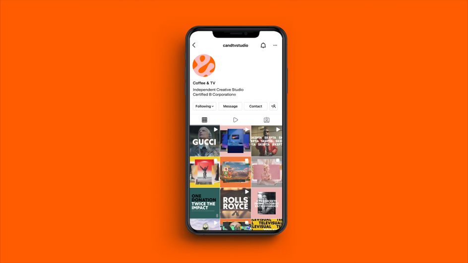
Bold type helps to make impactful statements elsewhere across the rest of the website, social media, merchandise and more. We like 'Disciplined Dreamers' and 'Work, work, work', which are simple yet effective words dotted around to add confidence and integrity. The fun continues on the website's Play section where the studio's quirky creativity is celebrated and showcased. The icon, meanwhile, is based on the ampersand of Coffee & TV – a detail that can be seen in the studio website's favicon and via its social media profiles.
“We needed a brand that would reflect who we've become,” says Steve Waugh, creative director. "It had to represent not only the love and care we put into our work but also the joy of the creative journey that we share with our collaborators. Ragged Edge's team are the changemakers, and the only people we'd trust with this job – we love what they've done here."
Editor's Picks


Trending


](https://www.creativeboom.com/upload/articles/90/908fdb6378db1e95d12595416f54e6336d5e80b8_732.jpg)
Podcasts


Editor's Picks
Further Reading