Bringing emerging Asian art to the forefront: Athletics' identity for GOCA
GOCA, a pioneering gallery dedicated to emerging Asian artists, has launched with a striking brand identity by Athletics, seamlessly blending cultural exchange, digital innovation, and artist-first design.
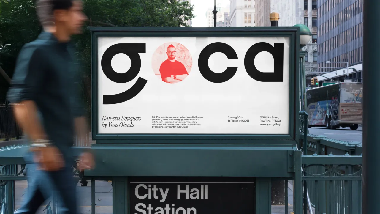
In a city brimming with renowned museums and galleries, GOCA (Gallery of Contemporary Art) stands out as a vital new space championing emerging Asian artists.
Located in Chelsea, New York, and developed as an initiative by Japan-based creative firm Garde, GOCA is dedicated to fostering cultural exchange and introducing both U.S. and international audiences to a new wave of contemporary art from Japan and across Asia.
To bring this vision to life, creative studio Athletics designed a brand identity and digital experience that places artists at the centre, ensuring GOCA serves as both a dynamic showcase and a vibrant hub for creative dialogue.
While New York is home to some of the world's most prestigious art institutions, it was missing a dedicated space for emerging Asian artists. GOCA fills this gap, offering a platform for painters, sculptors, and ceramicists from Japan and Greater Asia to present their work to a broader audience.
Athletics' approach to the brand identity reflects the gallery's mission of cultural connection, balancing warmth and approachability with the formal sophistication of the Chelsea art scene.
The studio shares that a unifying concept of balance was key for GOCA. It needed to channel the gallery's human, artist-first approach while still respecting the tonal conventions of the New York art world.
This notion of balance extends to GOCA's name, which – as an acronym – carries the weight of institutional credibility while also invoking a sense of energy and movement. It is also a fitting nod to the gallery's role as a launchpad for new talent.
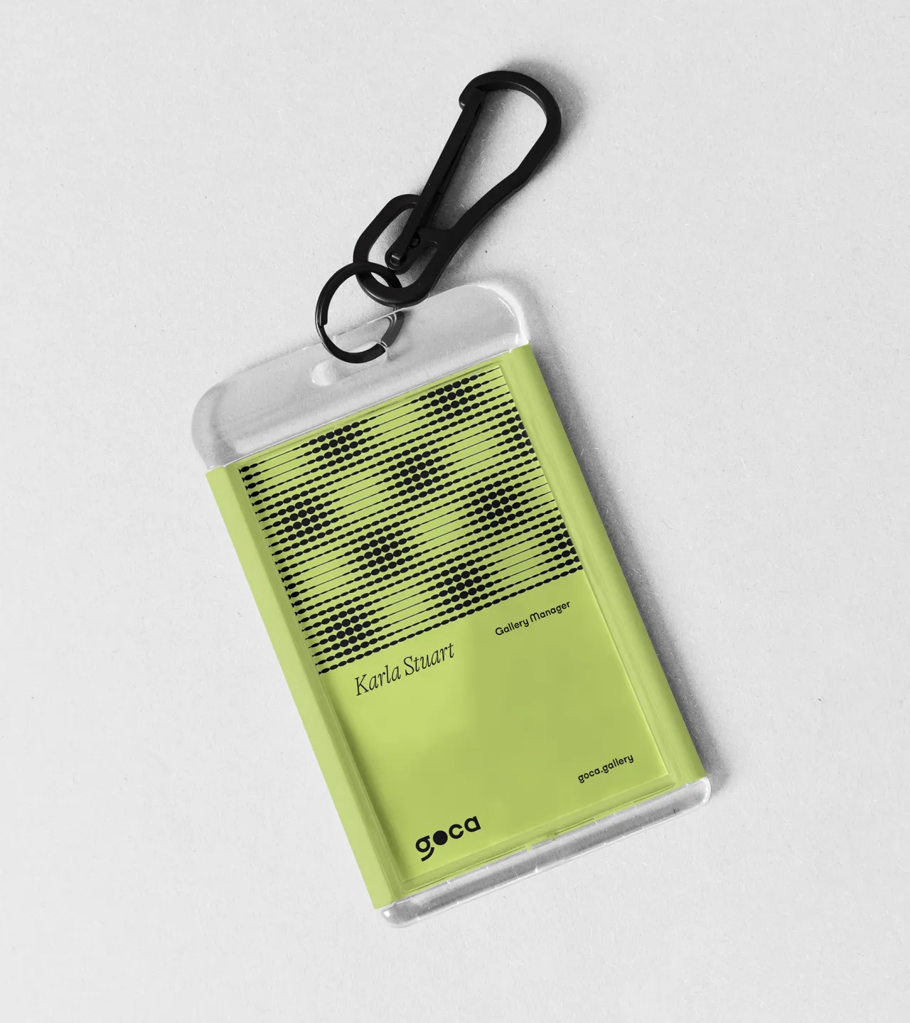
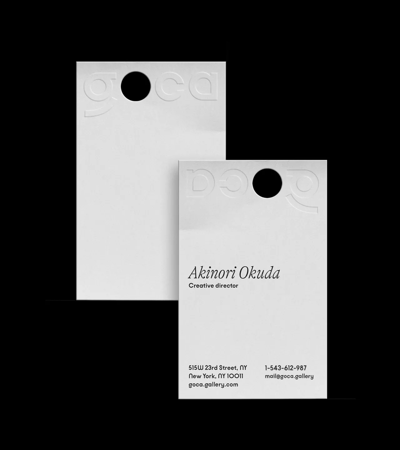
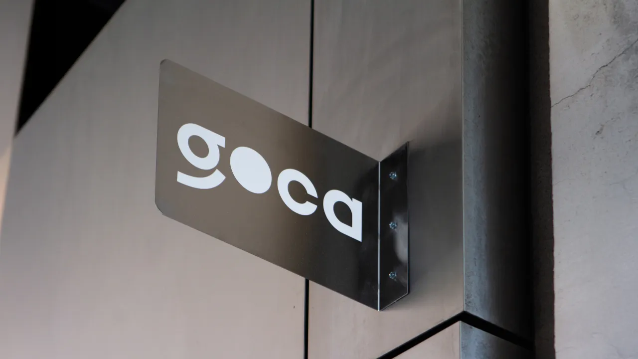
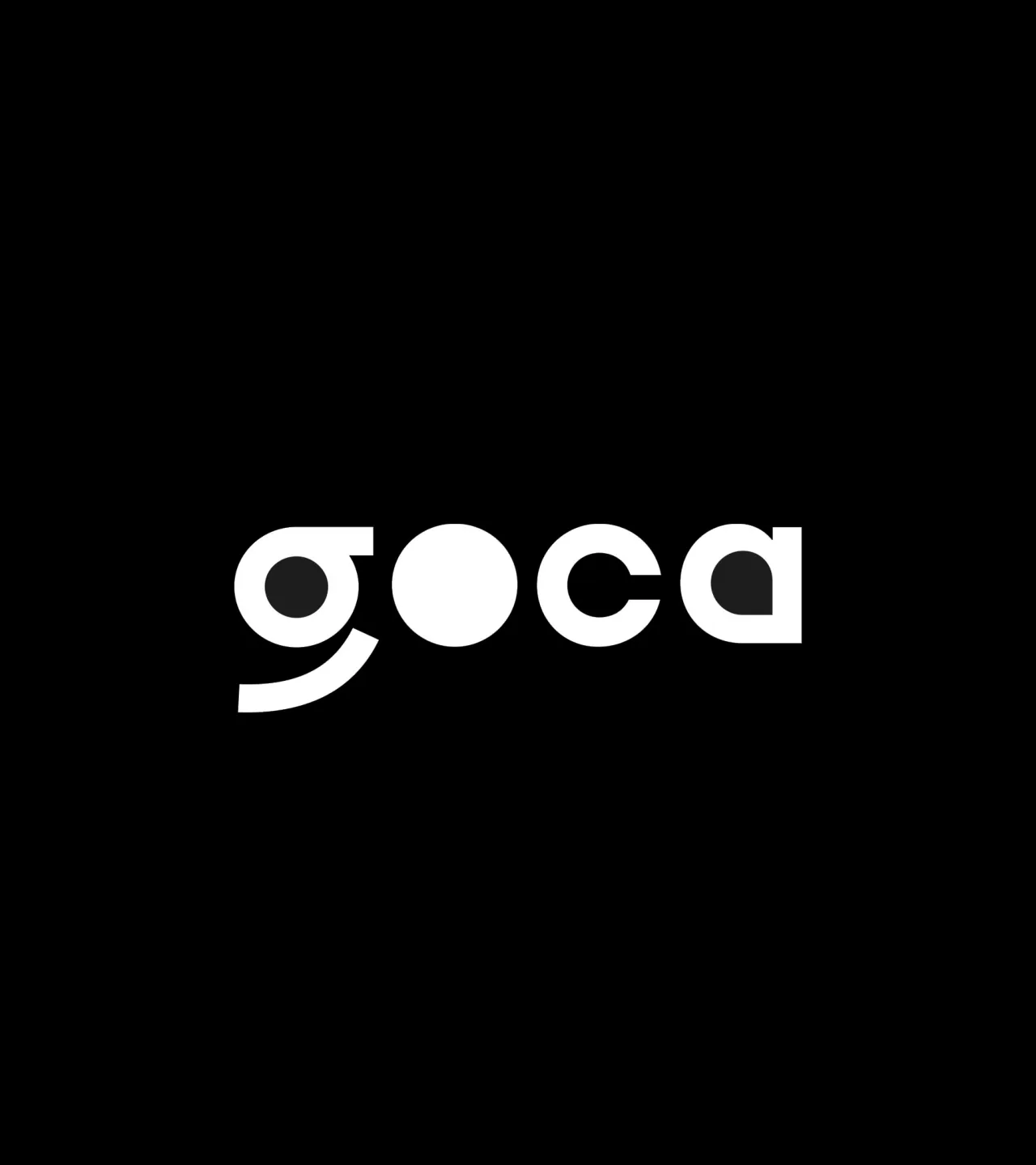
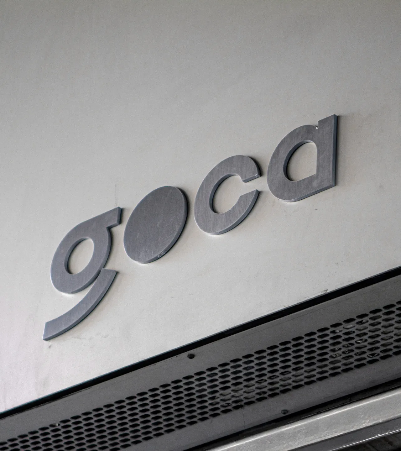
At the heart of GOCA's identity is a striking wordmark inspired by katakana, the syllabic Japanese script. Athletics borrowed curves and corners from these characters to craft a confident and inviting logotype, imbuing the brand with an international sensibility.
The central 'o' in GOCA's wordmark doubles as a dynamic graphic element, transforming into a spotlight that metaphorically illuminates the work of featured artists.
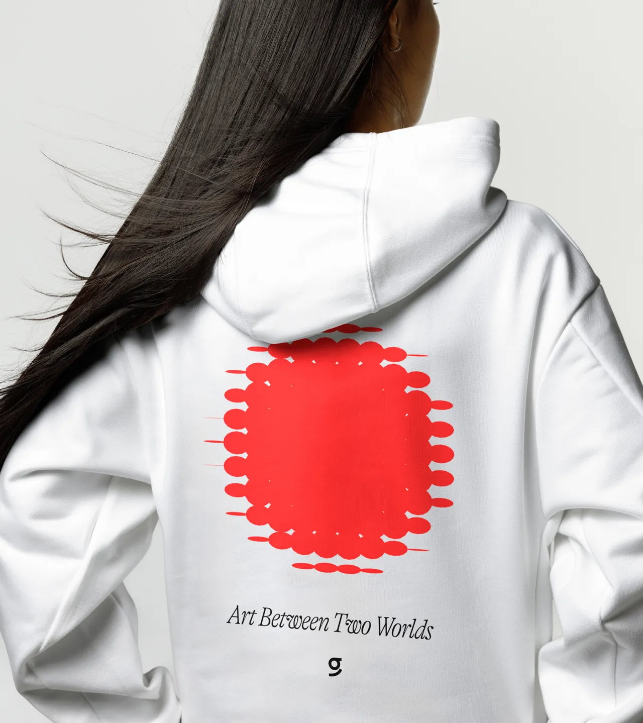
Beyond the logo, Athletics developed a highly flexible design system that adapts seamlessly across digital and physical applications. "Built on the foundational shapes of the wordmark, the identity system flexes and bends to activate at a variety of scales," says the studio.
The team opted for this modular approach to ensure that the brand remains elegant and dynamic, whether framing artist portraits, anchoring out-of-home advertisements, or appearing as an interactive element on GOCA's website.


A lot of thought has clearly gone into the digital component of GOCA's brand experience. Its new website feels as if it's alive and breathing, featuring vibrant animations and responsive design elements that create an engaging, fluid user journey.
Shapes drawn from the logomark evolve in refined motion applications, creating a visual language that shifts over time. The site functions as both a digital gallery and an editorial space, housing artist interviews, exhibit showcases, and featured pieces that bring depth and context to GOCA's mission.
"The digital space needed to extend GOCA's focus on art and artists to a new surface," notes Athletics. "We designed it to be an ever-evolving hub where audiences can immerse themselves in the work and stories of emerging talent."
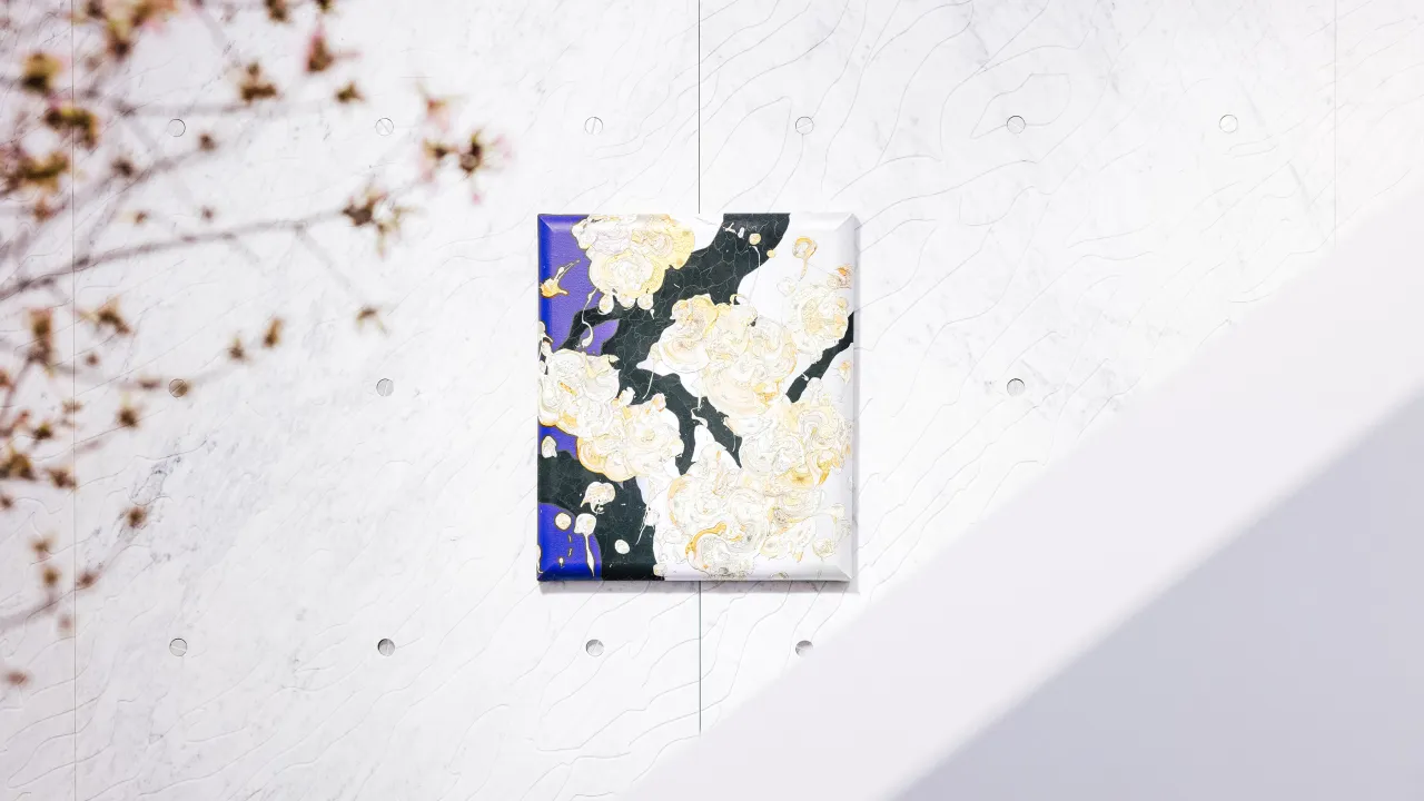
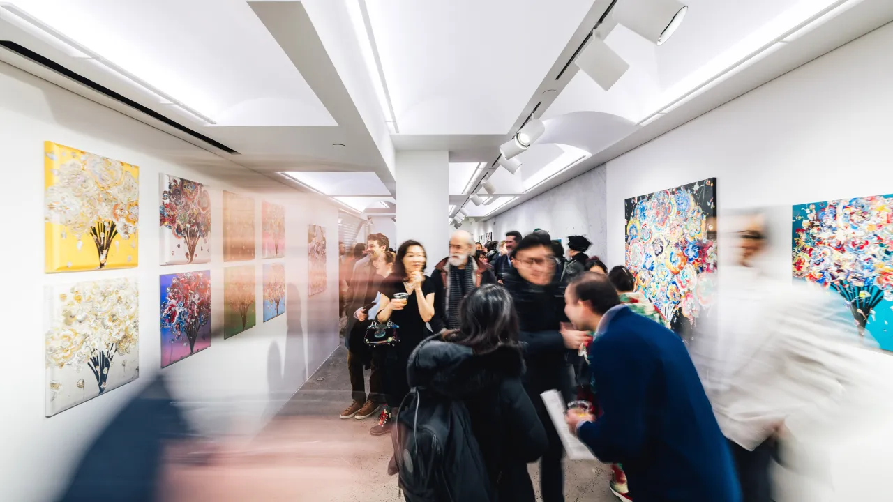
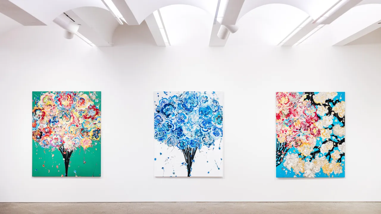
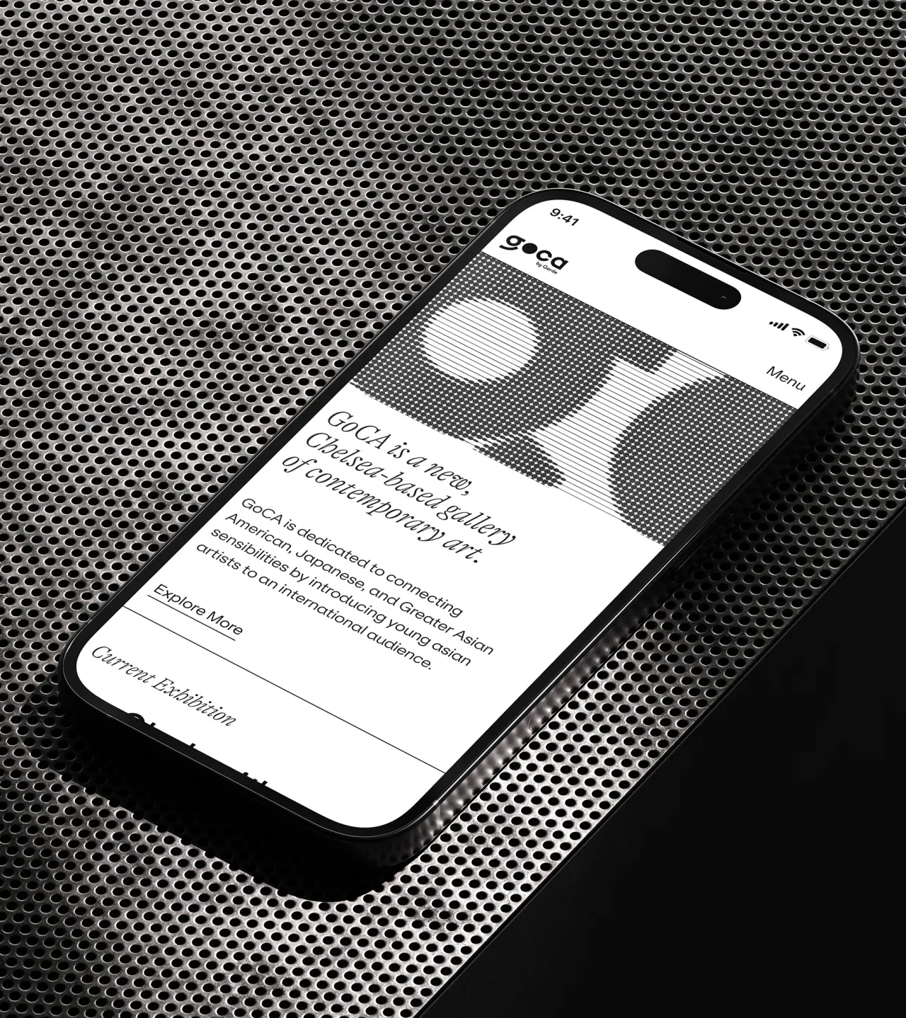
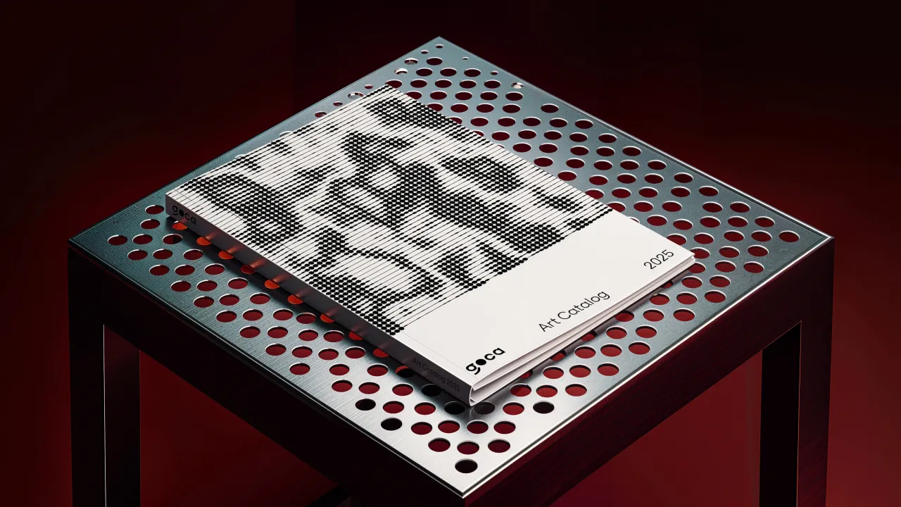
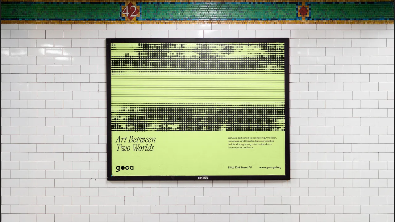
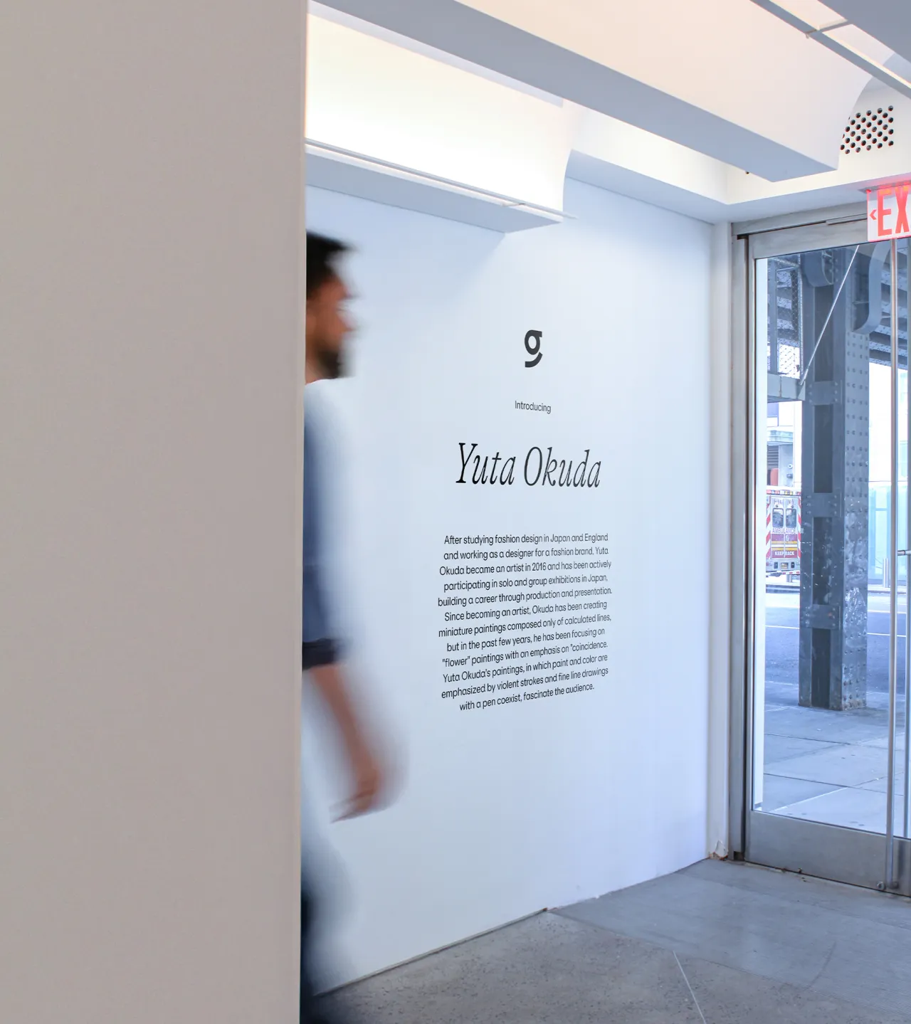
GOCA's physical gallery space, situated below the High Line in Chelsea, is a carefully considered environment designed to reflect the gallery's broader themes of cultural connection and exchange.
The long skylit hall serves as a bridge between continents. It features environmental branding elements such as glass installations and typographic motifs that underscore the gallery's role as a conduit for dialogue between Asia and the U.S.
Another key principle of Athletics' approach was to ensure that the brand identity remained artist-first. The design system not only showcases finished works but also opens a window into the artistic process itself.
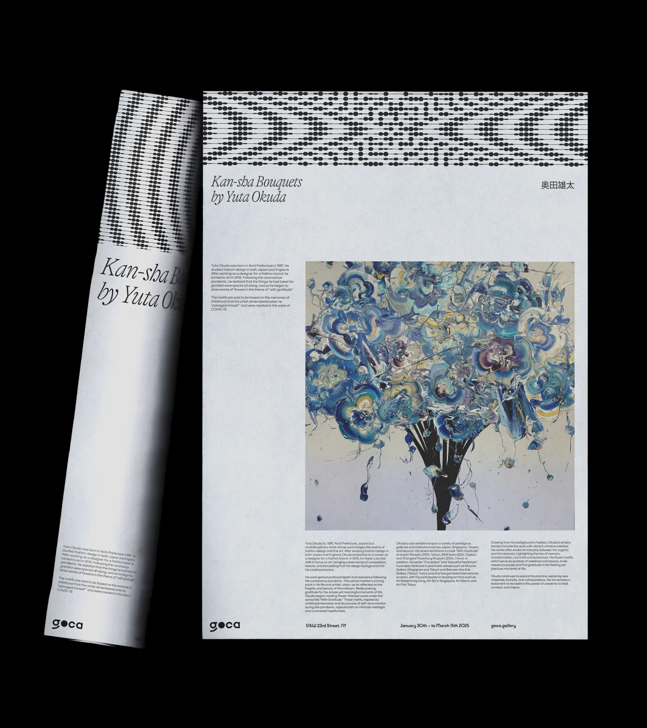
GOCA's identity was created through video and motion graphics to help breathe life into its exhibitions, allowing audiences to engage with the nuances of each artist's practice. This adaptability extends to GOCA's catalogue and promotional materials, where the flexible identity system accommodates everything from detailed deep dives to concise exhibition previews.
By uniting GOCA's mission, identity, and digital presence, Athletics has helped shape a gallery that is as much a cultural platform as it is an exhibition space. This collaboration between Athletics and Garde demonstrates how design can play a crucial role in amplifying emerging voices, fostering connections between artists and audiences, and expanding the landscape of contemporary art.
Editor's Picks





Trending





Latest Jobs
Client Director at Koto
Full-time·Berlin·€70k-€85k
Graphic & Motion Designer at The SHARP Agency
Full-time·Leeds·£26k–£33k
Senior Front End Developer at Crown Creative
Full-time·Belfast·£50k–£60k
Client Partner at Halo
Full-time·Bristol·£30k–£36k
Frontend Developer at Northern Artillery
Full-time·Leeds·£35k–£45k
Principal Software Engineer at BBC Media Tech
Full-time·Glasgow·Up to £83,790