Branding one of the biggest creative success stories of the entire lockdown
Lockdown was bleak. The streets were empty, businesses were tested like never before, and creatives were pushed to their limits. It's hard to imagine how creativity can thrive in this environment, but that's exactly what happened with Camden Open Air Galleries, which its new brand designer Jack Bleakley claims "is one of the biggest creative success stories of the entire lockdown."
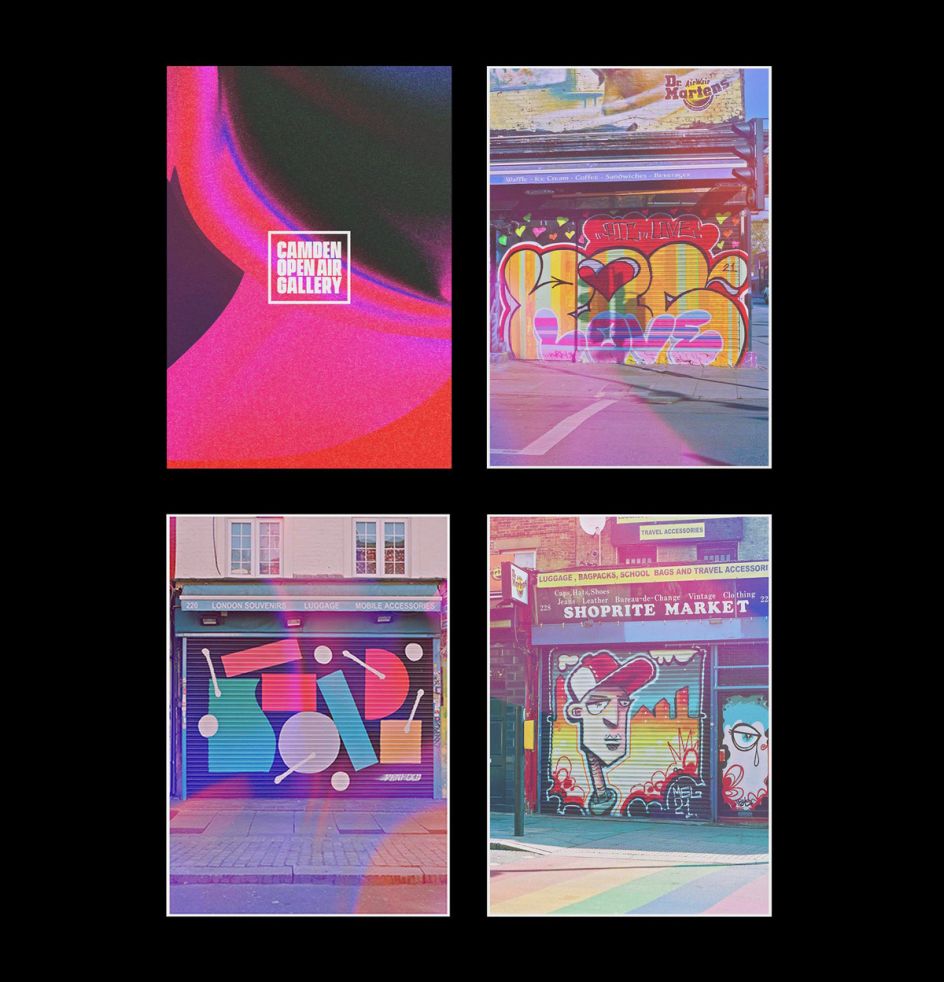
Created by local resident and fashion background founder Finn Brewster-Doherty back in February, Camden Open Air Galleries was a direct response to the gloomy sight of a sad, lifeless Camden, with its endless rows of shops with their shutters pulled down. And while this image was a perfect metaphor for the area's mood of the time, it also contained its artistic salvation.
Finn struck upon the idea of using the shutters as a canvas, so he invited local artists to come and transform them with their work. Within a few months, over 60 shutters across the High Street and Camden had been revitalised by art. Last weekend, the project went even further with the highly anticipated opening of the Camden Open Air Galleries flagship exhibition and shop.
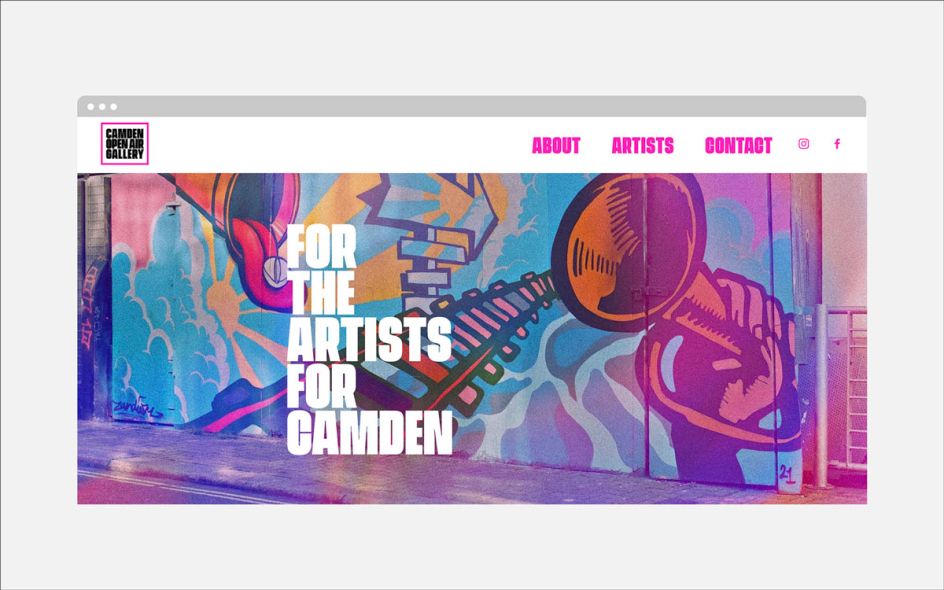
To accompany the launch of this exciting new space, which is anticipated to become a hub in the Camden community and inspire a grassroots creative movement, in line with the Camden of old, Jack Bleakley designed the initial logo and subsequent brand identity that is being rolled out on the gallery's promotional platforms.
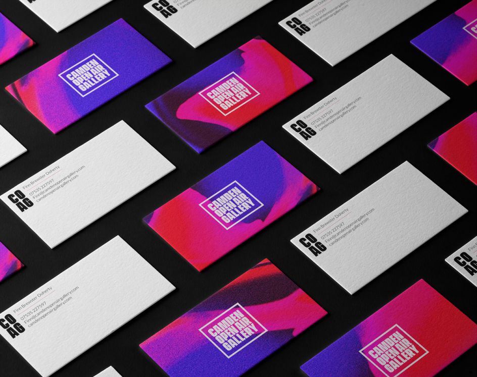
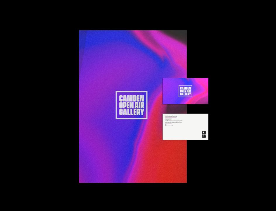
"In execution terms, the design needed to work across every platform and medium," Jack tells Creative Boom. "It needed to be completely flexible, so that whilst instantly recognisable, the brand ID could have multiple forms."
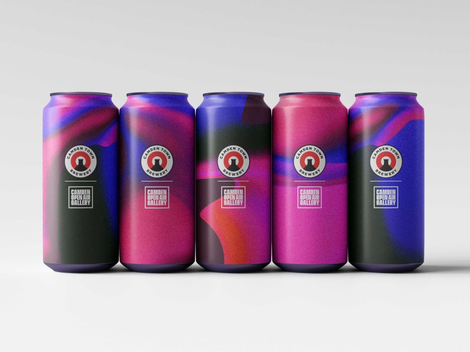
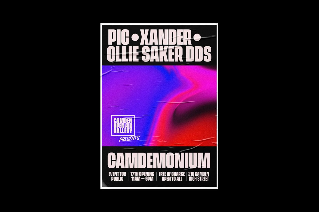
This flexibility was reflected in the brief. The brand had to be at one passionate and brave yet approachable. It also needed to combine a strong tone of voice with the Camden Open Air Galleries values and pay homage to the colourful roots of street art. It sounds like a tall order, but Jack has pulled it off with a cool but versatile brand centred around hazy hues that look like oil on water and an unmissably chunky typeface that speaks of strength through hardship.
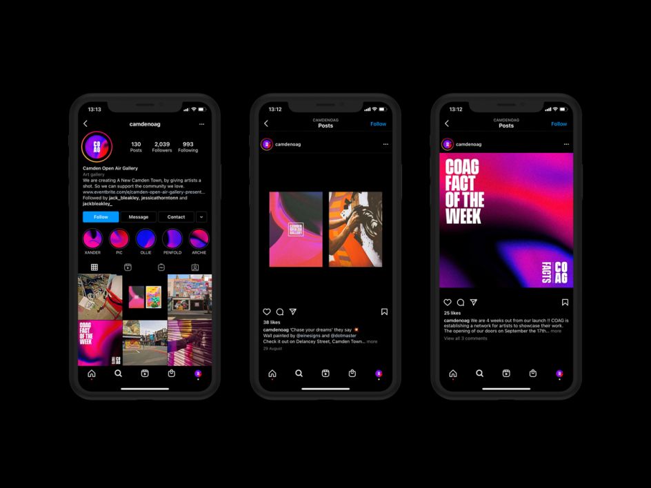
"Meanwhile, the COAG logo was inspired by the street art origins of the brand and their 'canvas' of shop shutters," Jack adds. "The idea was taken further by using motion graphics to represent a shutter action. Bold and simple, it feeds into the core values of COAG."
Appearing on websites, posters, and even special Camden Town Brewery cans, Jack's identity is as much of an artistic triumph as Camden Open Air Galleries itself. He adds: "The story of this gallery and branding project, despite all the odds of the pandemic, is a creative success story on two fronts that will be hard to miss."