OGRE balances dance, colour and light in an expressive identity for a leading arts charity
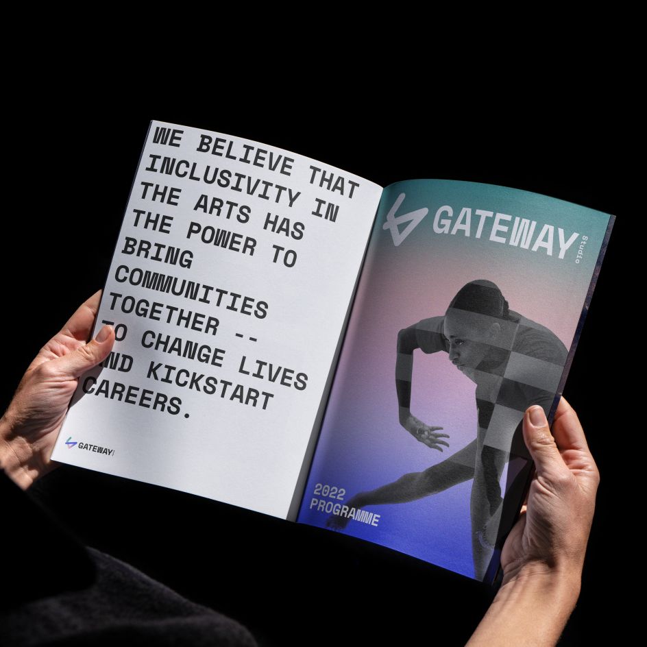
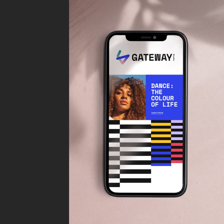
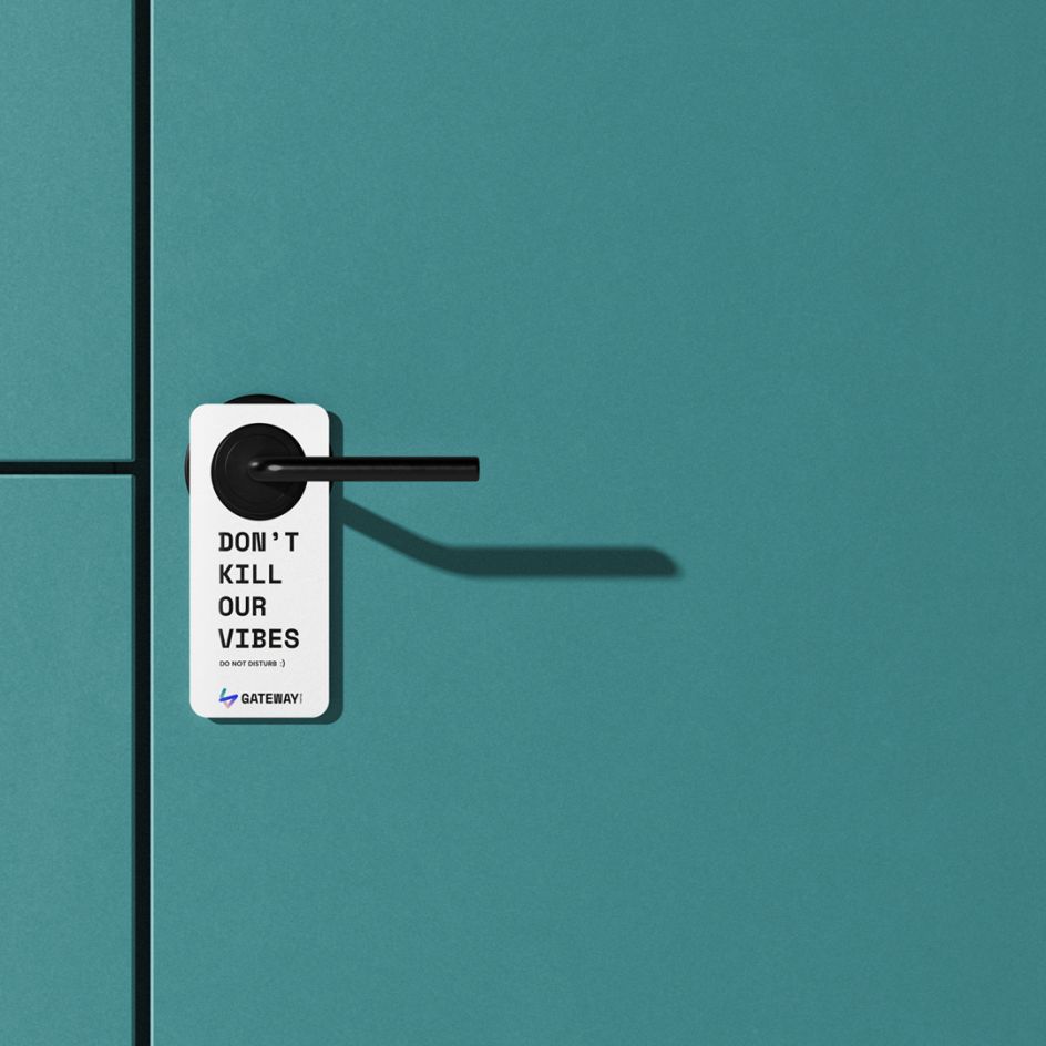
OGRE Studio is behind this cheerful fresh identity for Gateway Studio, a charity that strives to make arts more accessible and inclusive to all. The Gateshead-based agency tackled the rebrand, repositioning and website design for the dance organisation.
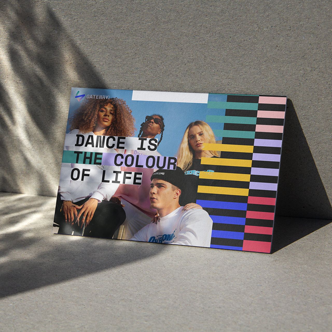
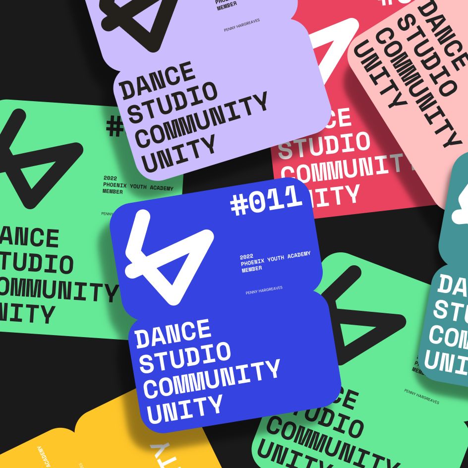
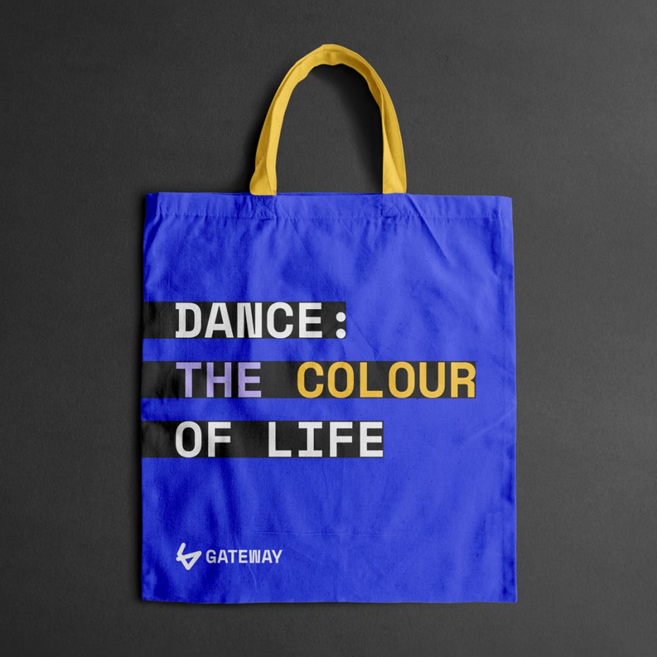
"The brand embraces people, the colour of life, diversity and creative and personal journey at its heart," explains Steven Walker, creative director at OGRE. "This new refreshed brand identity expresses their mission to support, connect and nurture people from all walks of life through a commitment to diversity, dance and community – in which they create and explore new pathways for professional development, creativity, health and wellbeing."
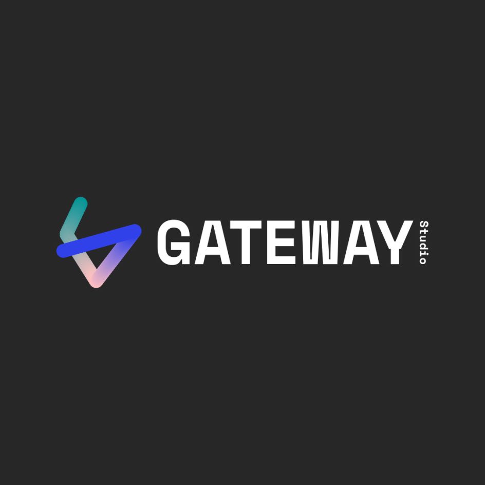
Taking all this on board, OGRE centred the visual style around Gateway Studio's new logo, balancing colour, movement and accessibility with distinctive typography. "The colour in the logo symbol uses a shifting gradient which expresses both an inclusive culture representative of all people, whilst also representing a continuously developing journey, reflective of the Gateway Studio programmes and community," says Steven.
The idea for the colour gradient is a reference to the quality of iridescent light which beams into the Gateway Studio building itself. "The light mixtures projected into the building as sunlight is diffused through the stained glass windows of the listed former church on Gateshead high street," Steven explains.
The logomark is a playful 'G' form that represents a line in motion "momentarily captured". Steven adds: "It's also more figuratively suggestive of dance, movement or pose. It's something you can imitate yourself with your arms to make a body form that is full of dance intent whilst also resembling a protective embrace."