How&How helps a carbon-neutral concrete startup 'spread the hard truth'
How&How has created an identity for a new zero-carbon alternative to concrete. The brand is centred around its maker's huge ambition to reinvent the world's most "overused and abused" building material – one that's currently responsible for eight per cent of global emissions.
Much of what we build today is from the same materials we used decades ago. Concrete, in particular, is a common material that has largely gone unchallenged. But the cement used to bind sand and gravel to create concrete is considered a major emitter of CO2. Cue Biozeroc, a new UK startup that, after much research and experimentation, has created a suitable replacement.
Biozeroc approached How&How to help it develop a brand for its reinvention and bring building materials to the forefront of the conversation around climate. "After getting to know their team and category, we knew the answer wasn't just to bring a camera crew into their laboratory and show how smart it all is," says Cat How from How&How. "In fact, we feared associating the brand with research and lab coats may make their materials appear experimental and unscalable.
"We also wanted to be careful not to come across as overly friendly and soft, or else risk being lumped in with all the other 'green' companies trying to compete with legacy solutions in the construction industry."
As such, Cat and her team concluded that Biozeroc's brand had to represent more than just concrete; it also had to highlight the need for widespread change. It was this line of thinking that led to the brand idea: 'House of Hard Things'.
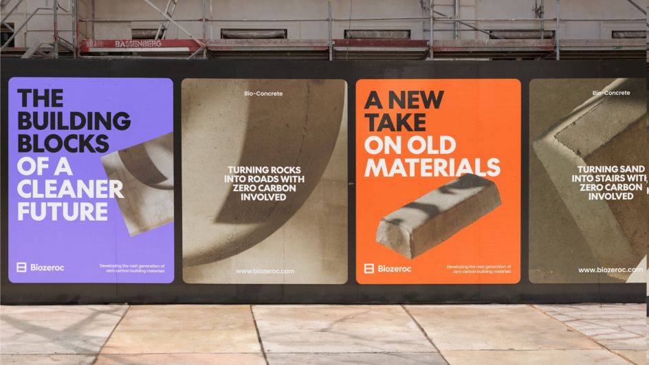

The logo was then rooted in this approach. "Very early on in this project, we looked at breeze blocks as a graphic reference", explains Luke Scott, How&How's design director. "There's a world of interesting graphic patterns within the different types of these blocks which feel distinctly modernist and immediately remind you of concrete. While we decided using the patterns themselves was a little too intense, during this exploration, we stumbled on the idea of creating a simple B using these breeze block forms."
Hardness inspired How&How's choice of typeface, too. "Concrete has an inseparable link to brutalism," says Scott. "When choosing a typeface for the Biozeroc brand, it felt natural to use something that shared a similar architectural lineage and felt at home paired with brutal concrete forms." The Future by Klim Type Foundry was therefore used as the headline typeface – a revival of Futura, a classically architectural typeface. Haffer was then chosen as an accompanying body type for its "clean, modern aesthetic, bringing a technological flavour to a brand that is otherwise dominated by physical forms".
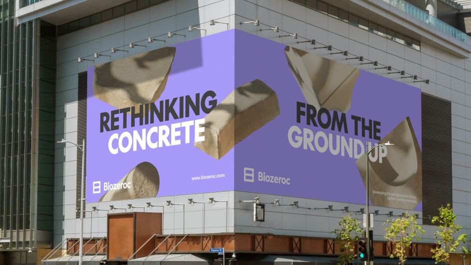
Looking across the Biozeroc brand, How&How says it lands somewhere between cutting-edge science and modernism. And as the startup has different audiences – architects and developers on the one hand and material scientists on the other, it was important to have a colour palette that felt at home in both worlds. "So I guess you could say the palette is a mash-up of Le Corbusier's Polychromy and a science lab," adds Scott.
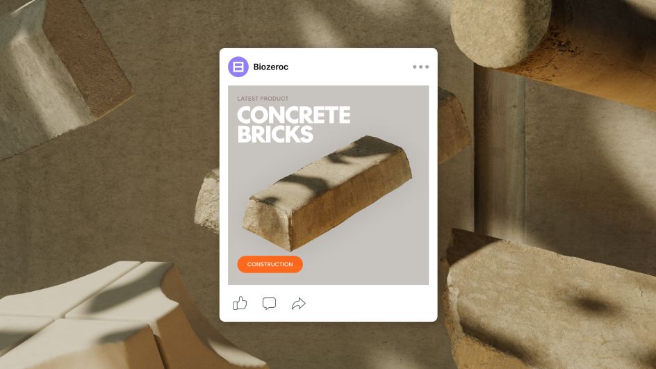
But as Biozeroc is only a startup working on the molecular science of concrete, it means its actual physical product could be months or even years away. This presented a communication challenge for the How&How team in that they had nothing to really show. So they decided it was important to incorporate 3D to bring some tangibility to the brand. It was also a natural follow-on from the brand idea, 'House of Hard Things' that How&How nodded to the double meaning and actually showed some...hard things.
No matter what happens next, How&How hopes the brand is seen as the construction industry's "new source of solid" – the go-to brand and team for "all things bricks, panels, blocks and more that strive to do what previously thought impossible," concludes Cat.
Editor's Picks


Trending


Podcasts


Editor's Picks
Further Reading