Koto's adventurous identity for Kikin takes inspiration from the Great Outdoors
Koto is behind the identity of an early-stage UK startup that supports sustainable businesses as they grow. The new brand for Kikin has outdoor adventure club-like references, earthy colours and bespoke illustrations that celebrate the harmony between people and the planet.

It's always difficult for new firms to get off the ground, but those focused on sustainability often face the biggest hurdles, as they're seen as high risk. Enter Kikin, a company that provides liquidity to those green businesses as they grow.
Grounded with the motto, 'Better finance. Better business', Kikin pitches itself as the "ultimate growth companion", offering access to much-needed capital and covering various expenses, from operations to sales and marketing. The idea is that businesses can then spread their wings and soar independently without worrying about securing funds. It called on global design studio Koto to help craft its launch identity, focused on cooperation and community.
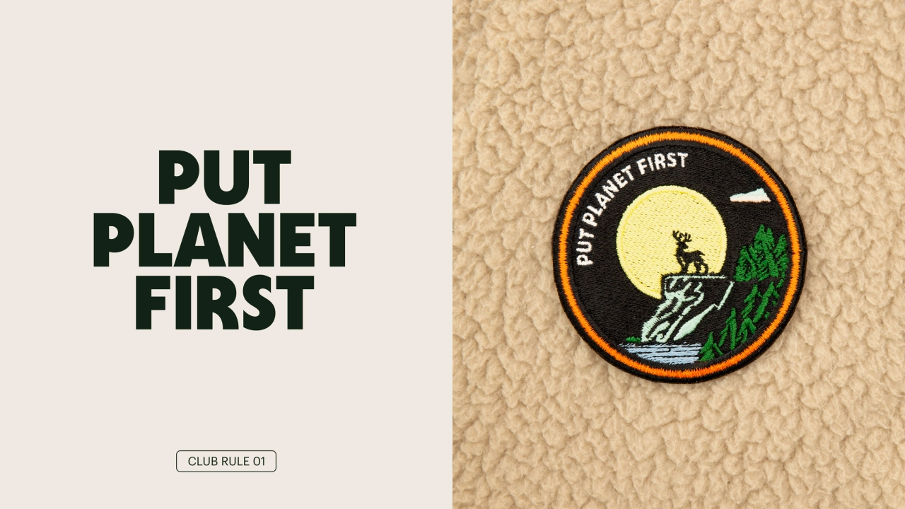
Starting with the verbal identity, Koto based it on five fundamental Kikin community rules, taking the brand's voice with a mantra-like quality through short, impactful sentences like 'Put Planet First' and 'Work Together'. Alongside these, open and inviting statements encourage people to join the empowering new movement.
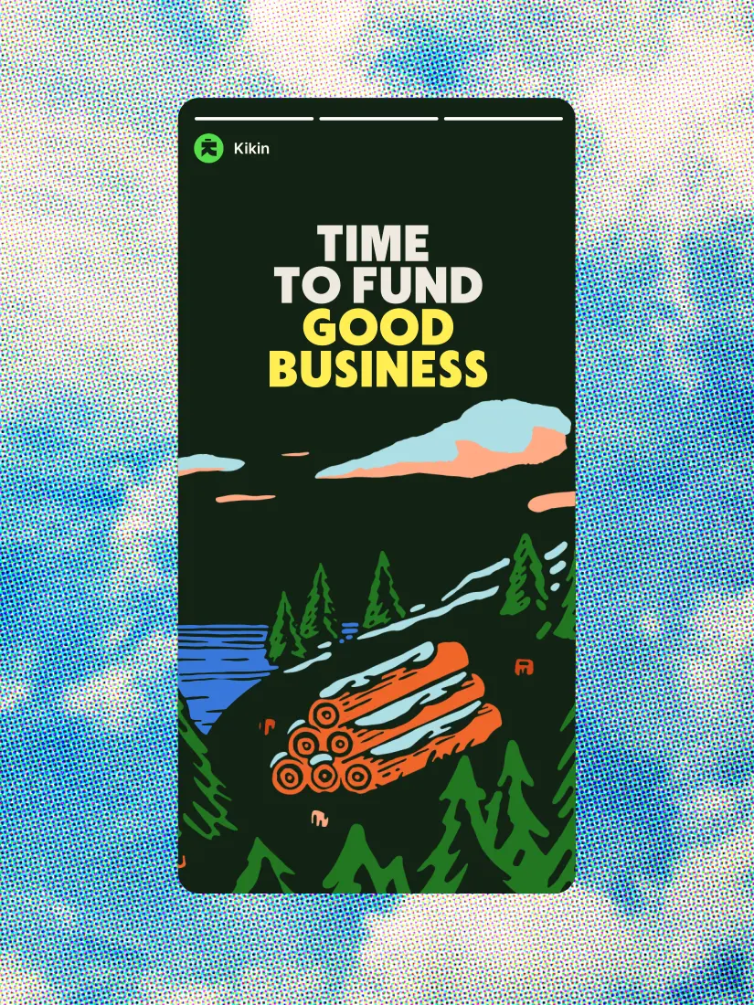

The logo then takes Kikin's core values with "humanity at its heart" through an approachable wordmark. The Kikin symbol reflects the company's commitment to businesses that believe in putting people first. The font is a humanist sans-serif that Koto says adds enthusiasm and immediacy to Kikin's headlines. The colour palette, meanwhile, is inspired by the natural world – all greens and browns, blues and oranges.
Central to Kikin's brand are the badges and illustrations inspired by outdoor and adventure clubs. The badges represent shared goals and values, grouped into three tiers – the top being based on the five Kikin commandments, at the core of everything the company does; the second being typographic-led brand messaging badges used to communicate Kikin's purpose, setting the tone across marketing materials, and the third featuring seventeen re-illustrated United Nations ESG goals, mainly used in the product experience.
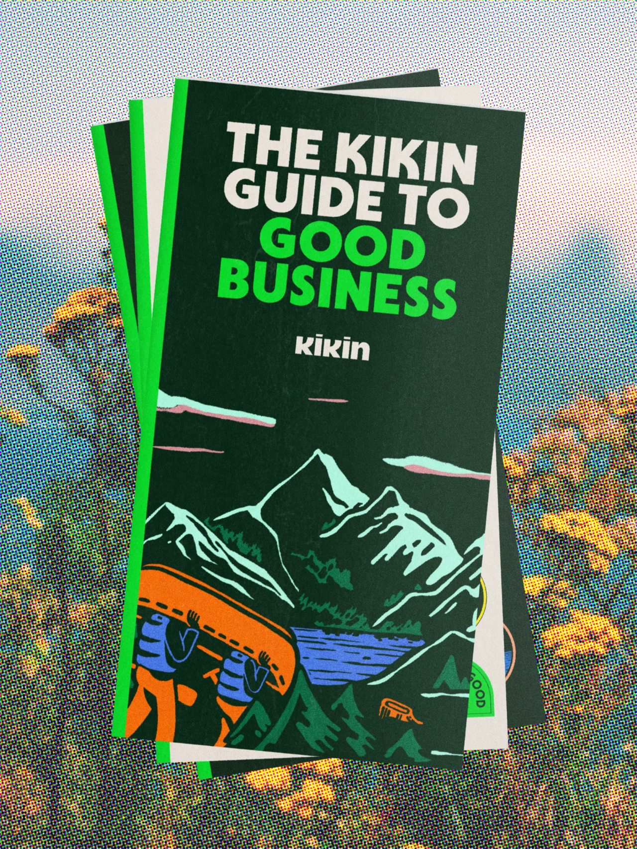
Looking at the accompanying illustration, there are hints of park rangers, mountains and woodcut artworks with two brand landscapes laying the foundation for Koto's Kikin commandment badges. It creates a clear, consistent brand language – all entirely crafted in-house. Finally, art-directed photography shows real people and the planet working together.
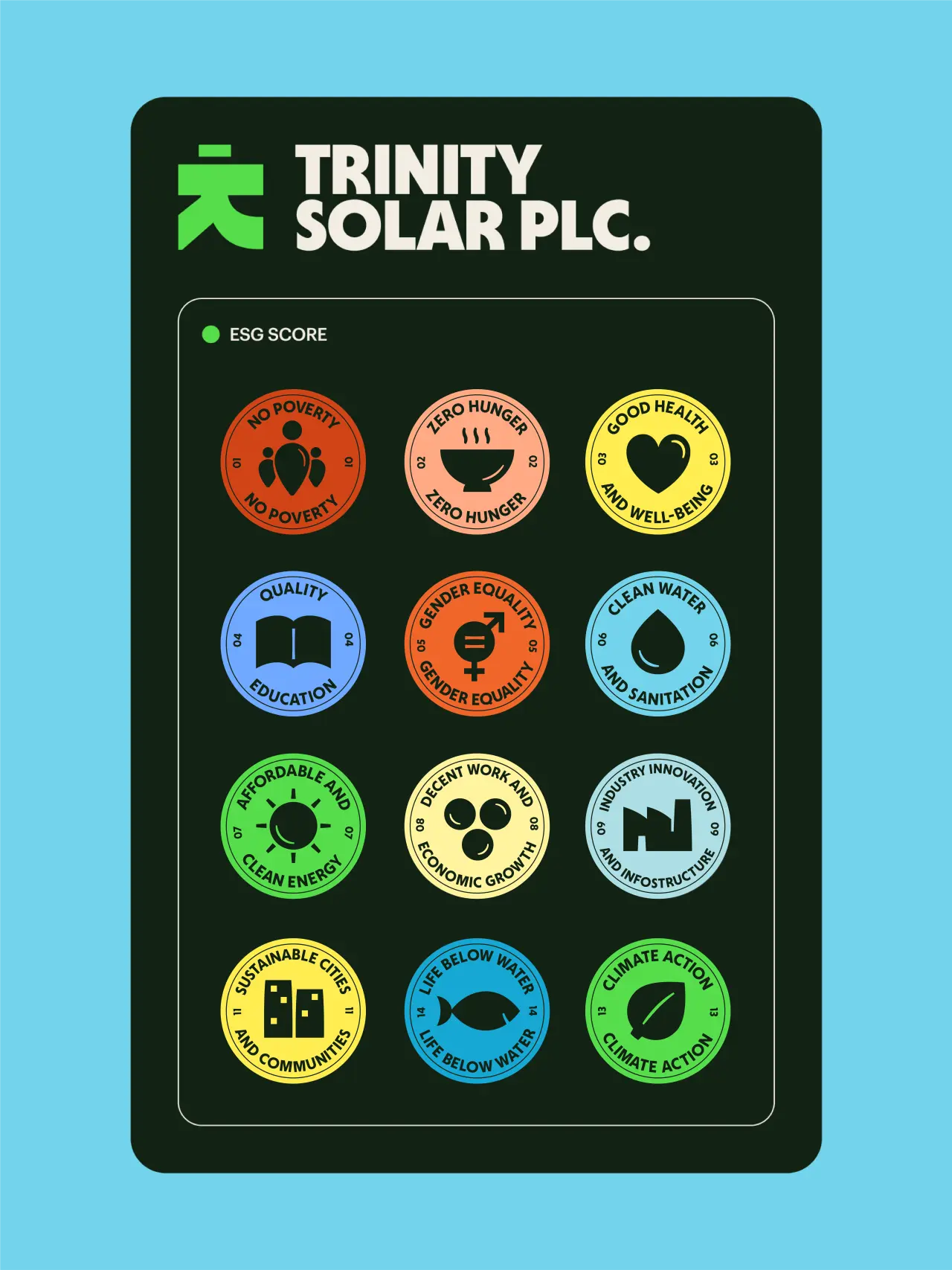
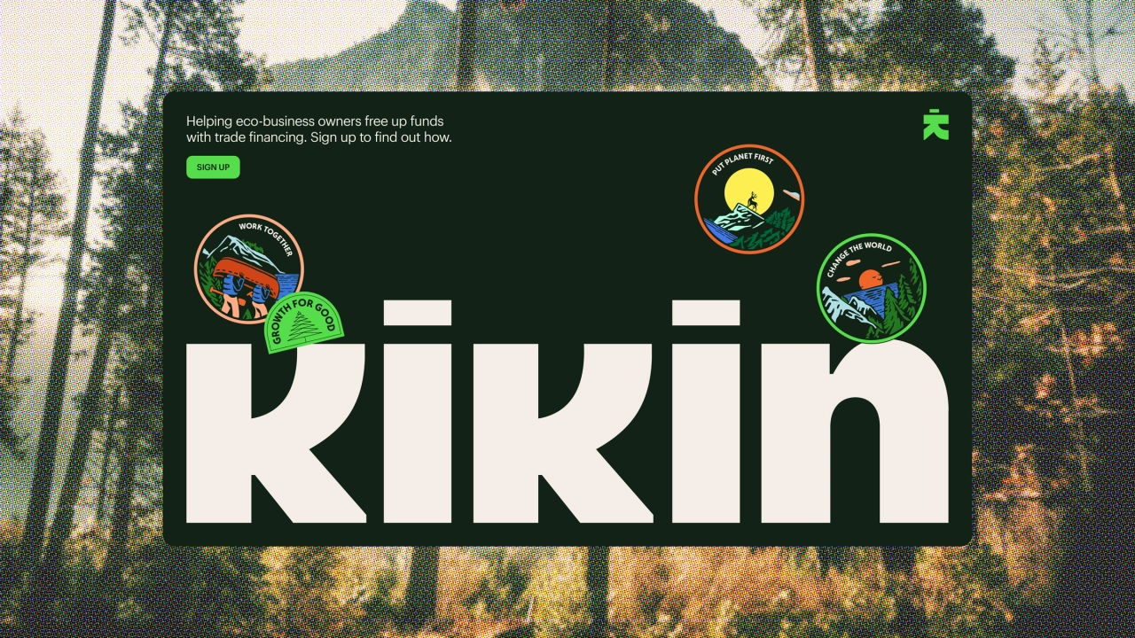
Within Kikin's website and app, the brand elements continue the tone of voice and enhance the user journey. Illustrations add warmth to the customer journey with graphs, statistics, and motion language, all feeling friendly and approachable.
"With Kikin's brand, we wanted to make companies that do good, and those that fund them feel like they're on the same team," explains Sam Howard, Koto's creative director. "Guided by a powerful brand idea, 'Move Together', we wanted to capture the impact that banding together for a greater cause can have. Inspired by clubs of the past whose sole purpose was to protect and appreciate the world around them, we created a brand with camaraderie and a commitment to fostering positive change at its heart.
"For people to want to join your cause, you have to feel approachable. From billboard to button, we worked hard to create a sense of humanity at every level and interaction, signalling a change to a more sustainable financial model."
Editor's Picks





Trending






Latest Jobs
Senior Designer at Creative Spark
Full-time·Manchester·£35k-£50k
Senior 3D Motion Designer at Art&Graft
Full-time·London·£50k-£65k
Senior Creative Lead at Random Studio
Full-time·Amsterdam / Paris·€90k-€110k
Graphic & Motion Designer at The SHARP Agency
Full-time·Leeds·£26k–£33k
Head of design at Cog Design
Full-time·London·£55K
Head of Technical & Facilities at Midlands Arts Centre
Full-time·Birmingham·£40,210