Here Design's brand refresh for a 400-year-old garden balances heritage with nature
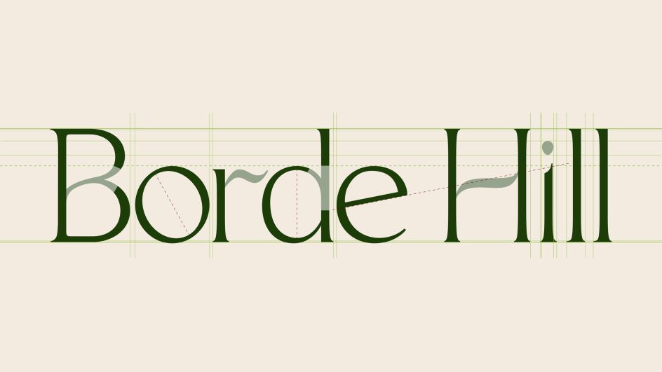
Here Design has reimagined the identity of a 400-year-old English country garden, bringing it into the 21st century to reflect its progressive vision for growth. Taking inspiration from Borde Hill itself, the logo mimics the form of leaves and stems.
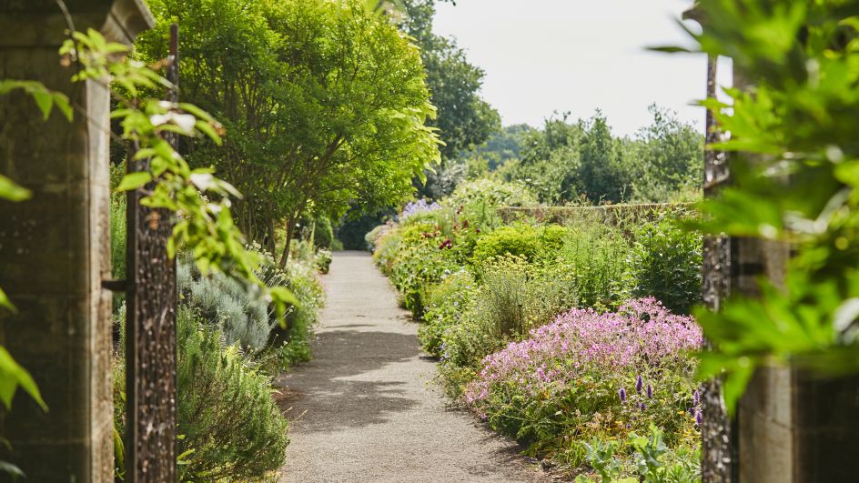
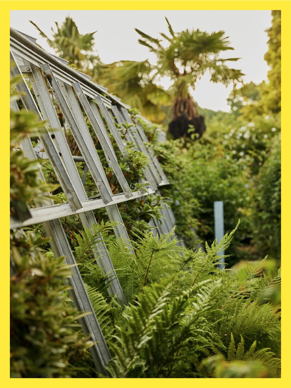
The family-run English country garden Borde Hill has seen its fair share of history over the last 400 years. But this year marks a pivotal moment for the West Sussex attraction. Rather than simply being a place to visit to admire the abundant gardens, it's evolving to include a broader outdoor education programme and hospitality offer with the ambition of "connecting communities with the restorative power of nature".
As such, Here was brought in to refresh Borde Hill's positioning, identity and tone of voice to reflect its progressive vision for the future. The challenge, therefore, was to appeal to a broader audience, including school children, local community growers and hospitality guests. "The creative idea needed to be both egalitarian and aspirational," says Here.
After much research, the strategic idea of 'Joyous Balance' was developed, inspired by a "nature-first approach that lets the natural world find its balance". The visual language draws on the informality and playfulness within the garden rooms. "A visual world abundant in natural charm, moments of joy, spontaneity, surprise and discovery," as Here describes it. This approach inspired every aspect of the identity, from the fluid, expressive typeface to the icons, colour palette, digital assets and tone of voice.
However, rather than make everything perfect, Here incorporated 'natural imperfections' into each element of the brand identity that only becomes apparent on closer inspection. Like a garden, Here wanted to reward people leaning in and noticing little moments of natural beauty throughout the brand toolkit.
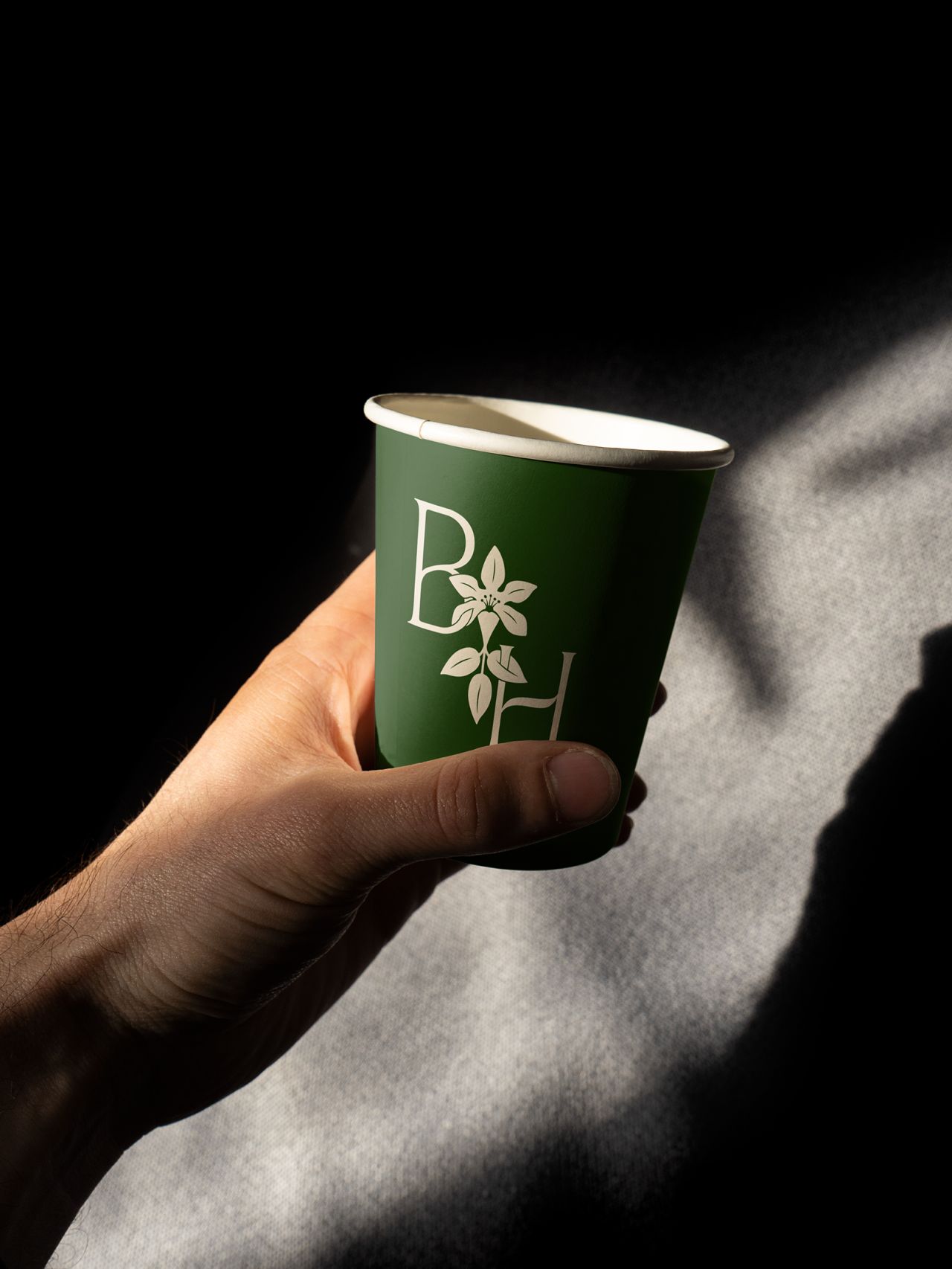
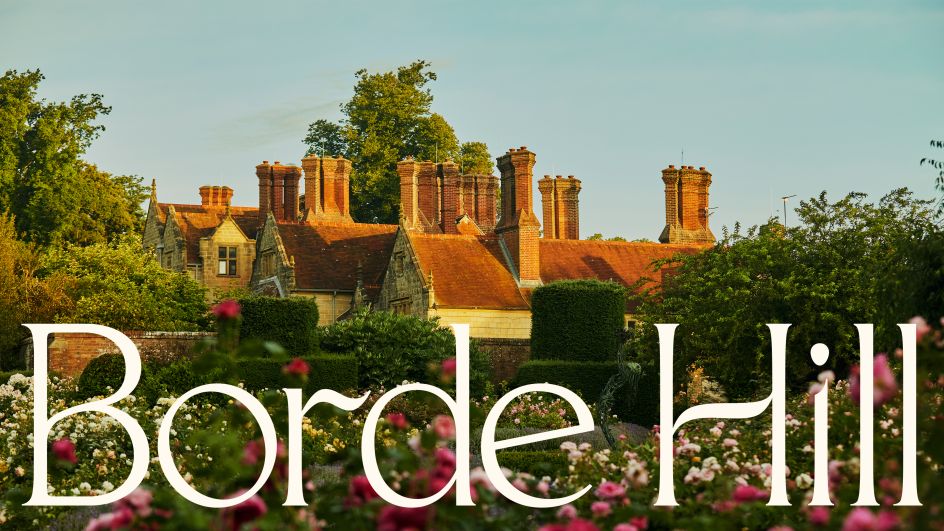
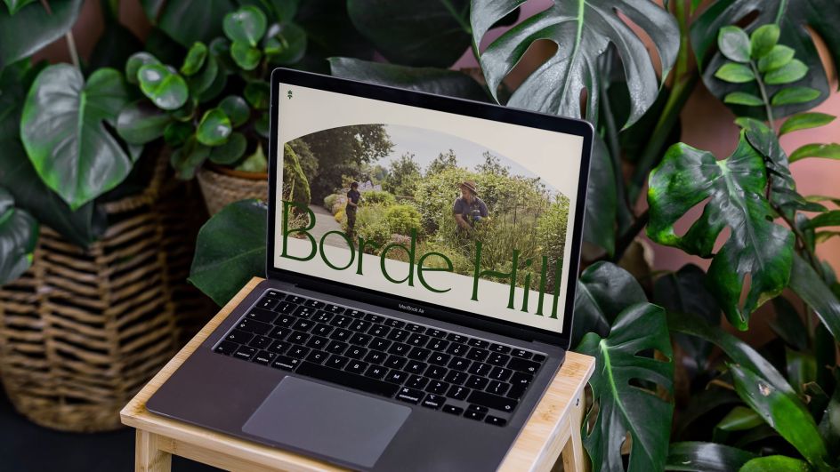
The design of the new wordmark, for instance, was inspired by nature, looking at the form of leaves and stems. Here crafted each of the characters using contrasting widths to add a sense of rhythm and growth. The dot of the 'i' is a subtle nod to a seed. Wide, open counters add elegance and lightness, while the short serifs help the wordmark feel grounded yet contemporary.
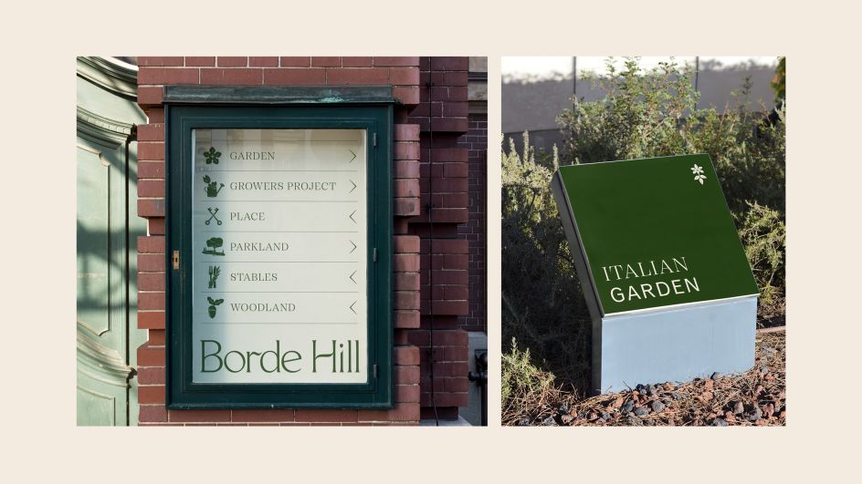
Elsewhere, an Emmenopterys henryi, first planted in the UK at Borde Hill in 1928, has been elegantly illustrated and woven into the monogram and hero icon. A set of bold graphic icons to represent each of the areas within Borde Hill were also illustrated and applied to collateral across the estate – helping visitors navigate and discover new areas.
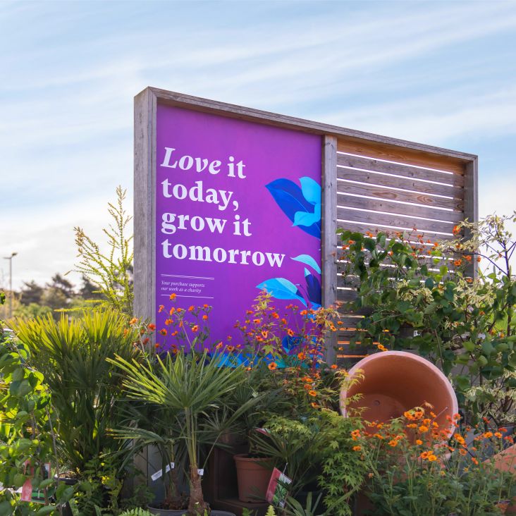
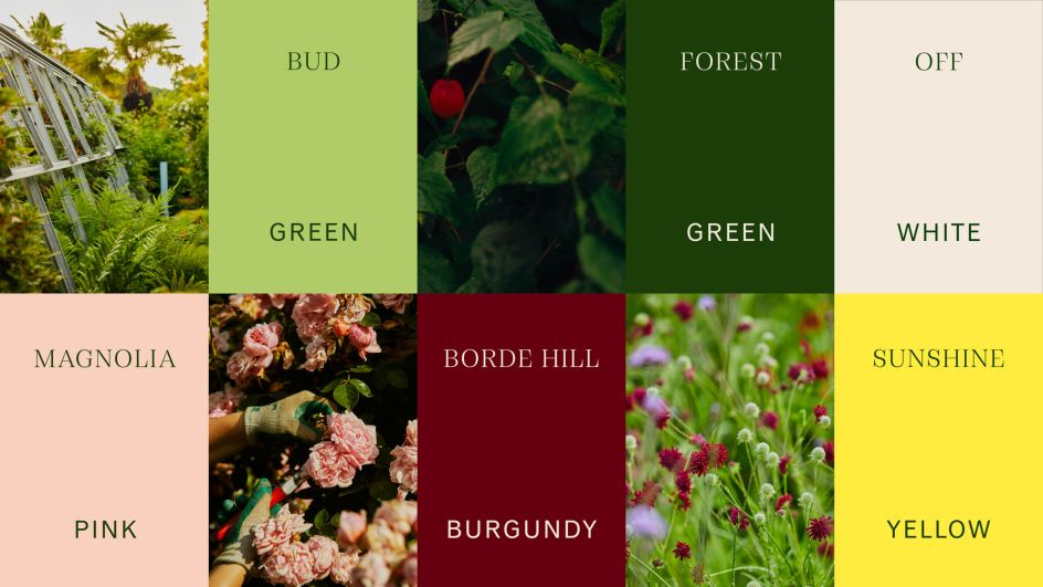
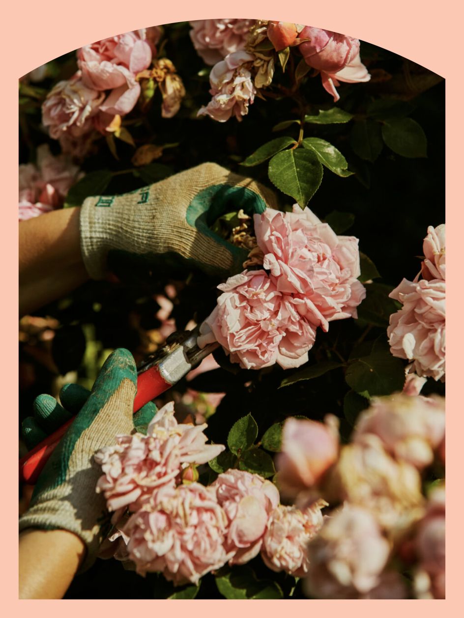
Pops of magnolia pink, bud green, and sunshine yellow are paired with rich dark tones and soft pastels and used alongside new photography by photographer Emli Bendixen, used throughout collateral, website and social media.
Looking specifically at the tone of voice, the brand needed something that would speak to everyone – from families to foodies and locals to London day trippers. It, therefore, takes an underlying theme of charming, surprising, playful and informal to become warm and welcoming, with an unexpected twist. Here's headline, 'A Garden of Possibility', reflects all this and points to Borde Hill's exciting future.
"The design language we chose speaks to the continued growth and change that lies at the heart of Borde Hill," explains Thomas Lacey from Here. "The garden is in constant flux, as is the ambition and scope of the family, so we wanted to create a brand world that speaks to that constant, elegant movement."
Here Senior Strategist Chloe Schneider adds: "It felt distinctly different to hear a boldly ambitious future vision from an English garden with such incredible natural heritage. It is their family home they're reinventing. The desire for us to be at once egalitarian and aspirational in all that we created, to invite everyone in, was a challenge we enjoyed."
From a personal point of view, Mark Paton, Here's creative partner, admits the project for Borde Hill was timely and much-needed. "As a studio, we have been actively seeking out ways to reconnect with nature, whether that's through our work or through our seasonal programme of studio events, so to be asked to create an identity for such a sumptuous horticultural destination like Borde Hill has been an incredibly rewarding experience.
"At a time when design needs to be able to think in the interests of the long term, it's fascinating to learn from a creative process and practice that spans centuries."
Editor's Picks


Trending


Podcasts


Editor's Picks
Further Reading