Robot Food gives German nutrition brand a vibrant new look and feel
Leeds-based agency Robot Food has redesigned German health-food brand More. The new identity is based on a message of joy and self-empowerment.
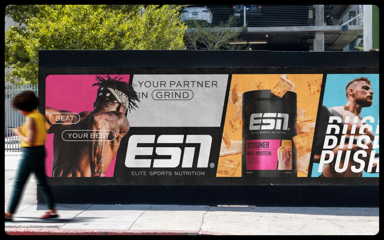
More Nutrition was founded in 2017 and quickly established itself as the leading provider of healthy weight-management nutrition in Germany. Along with all-vegan label Foodist and high-performance supplements provider ESN, German holding company The Quality Group owns three core brands, including More Chunky Flavour, a flavour powder based on vegetable fibre inulin.
The popularity of its products has led to a number of new ranges being introduced over the last seven years, including high-protein food and beverages, zero/low-sugar tasty alternatives, and beauty from within supplements. However, these products and packaging types needed a stronger brand identity to tie them all together—as well as a design system that would help customers navigate their options.
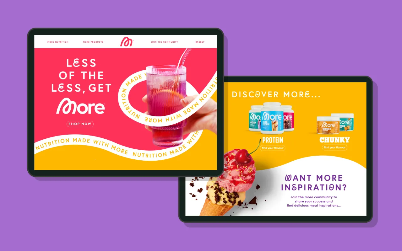
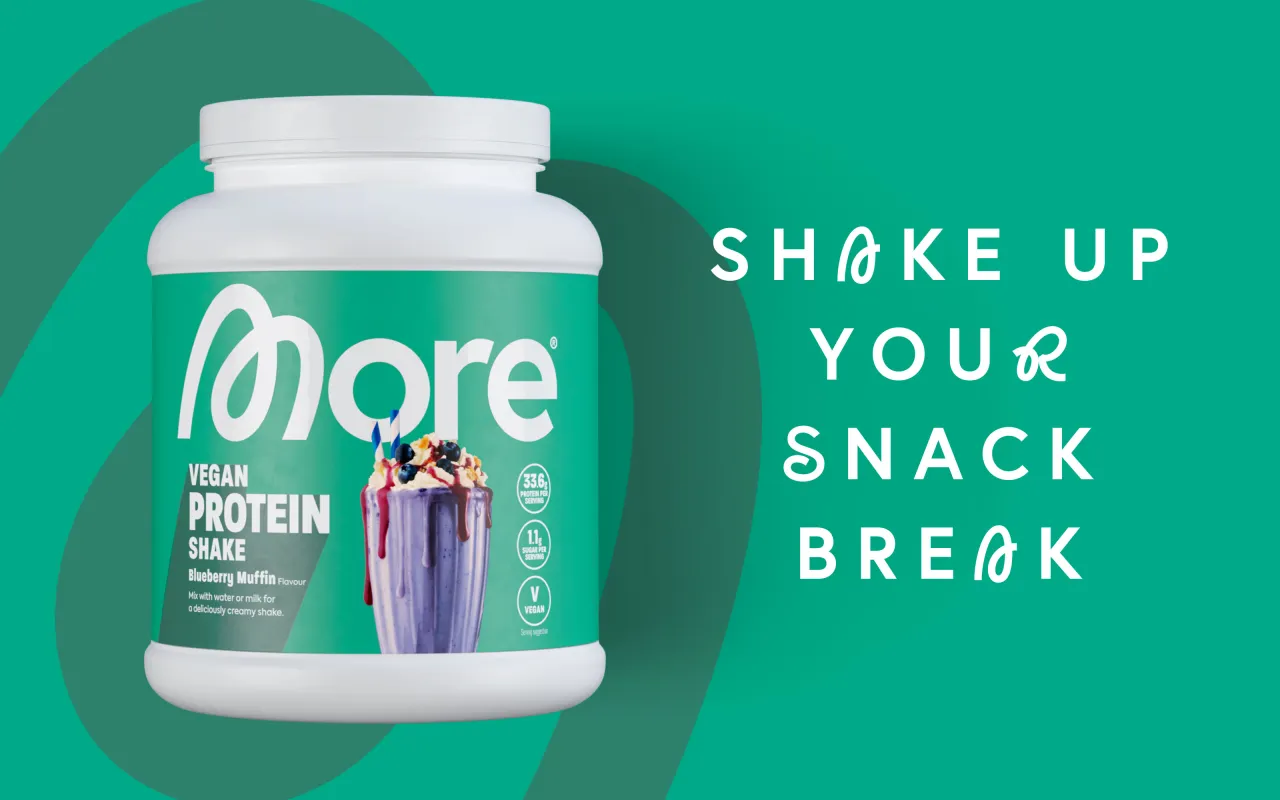
So More turned to Leeds-based creative agency Robot Food, who'd previously worked to rebrand their sister brand ESN in 2024, to update its visual and verbal identity across its wide product range.
Brand concept
Food ranges designed to assist weight loss have traditionally emphasised subtraction: less fat, fewer calories, and removing unhealthy foods from one's diet. Therefore, they were shopped solely on values—nutritional and financial.
But in the process, the joy of food is typically subtracted too. 'Healthy' foods typically have little aesthetic appeal, a fact reflected in bland, neutral-tone packaging.
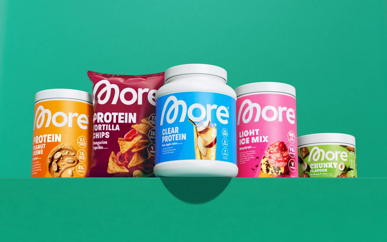
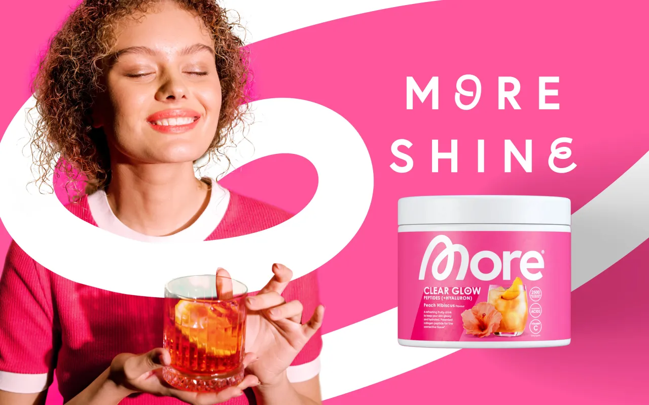
The new brand identity then replaces subtraction with celebration: healthier living, more choices, and joyful eating. The aim is to change consumers' perceptions and alter our relationship with healthy, better-for-you food.
Robot Food's work is built on the brand positioning work established by brand intervention company Alchelab. The organising concept is that "More Nutrition believes that food is not an enemy – bad diets are."
Visual elements
Typically, the health-food category aesthetic is plain and neutral, and the language and messaging are about communicating stereotypical health and beauty standards and how to achieve a 'better you'. Robot Food wanted to challenge these ideas, making More a brand that celebrates the individual as they are.
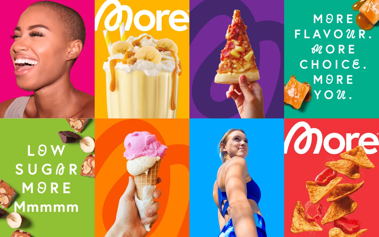
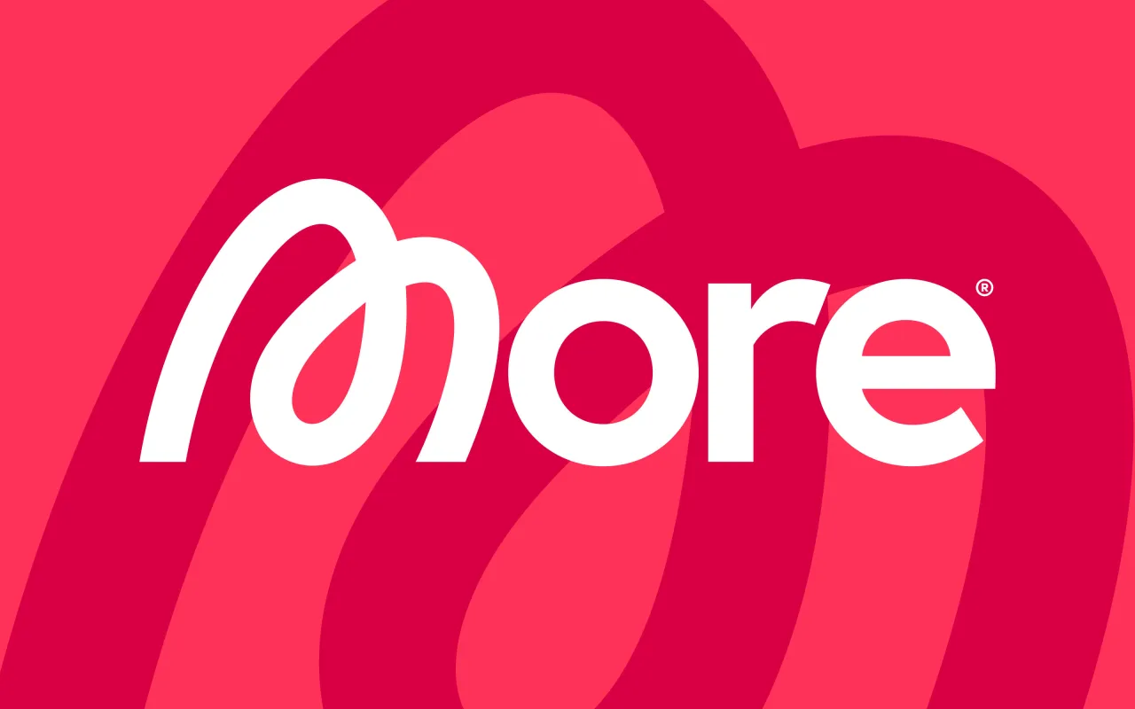
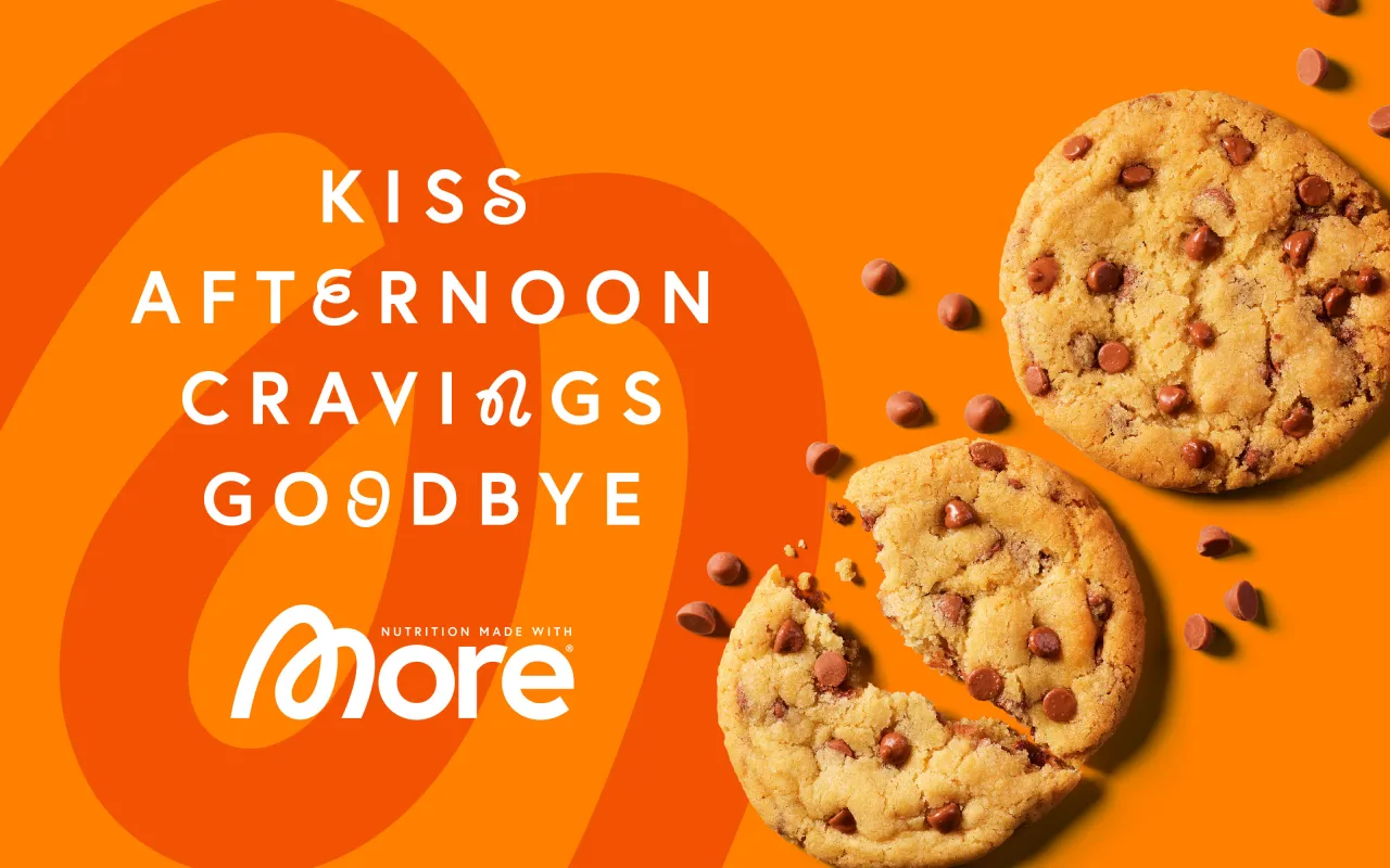
"'Joy outside, Better for you inside" was the driving idea behind the new identity, starting with the wordmark," explains Robot Food creative director Martin Widdowfield. "The expressive 'M' is instantly distinctive, becoming a lifeline thread that runs through the whole design.
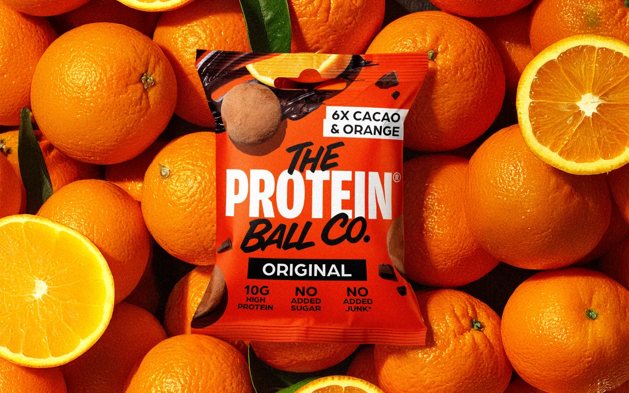
"We complemented it with lots of colour, emphasising that joyful feeling," he continues. "As well as being an impactful counterpoint to the neutral tones of the category, the colours are a key part of the design system, helping customers navigate the product ranges."
Tone of voice and photography
The brand concept was developed into a tone of voice and messaging that's energising, reassuring, and encouraging.
Robot Food's senior copywriter, Lizzie de Jong, explains: "The brand is a cheerleader for those looking for more nourishment, more freedom, more confidence and more 'mmm'. So, the voice had to be unwaveringly positive – celebrating the consumer and empowering them to be their truest self. We focused on heroing the transformational nature of More's products and their many roles in people's everyday routines."
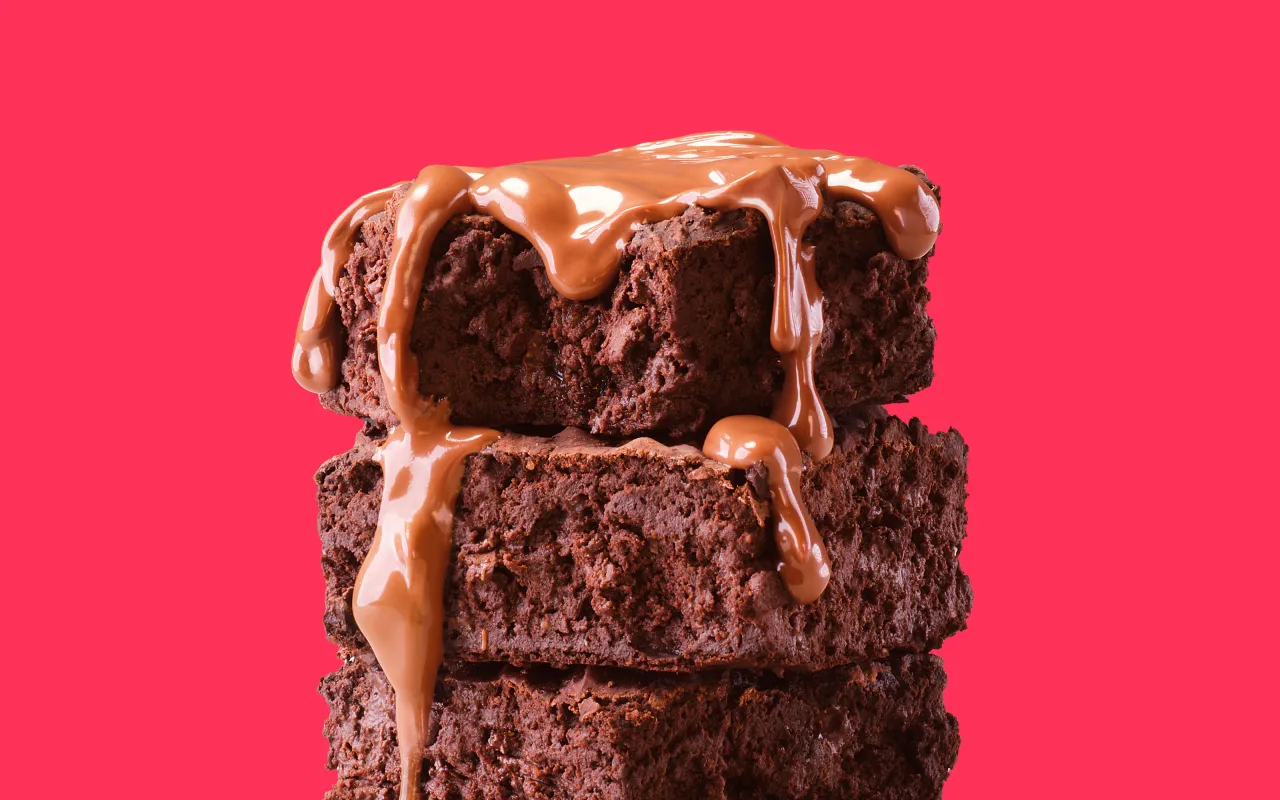
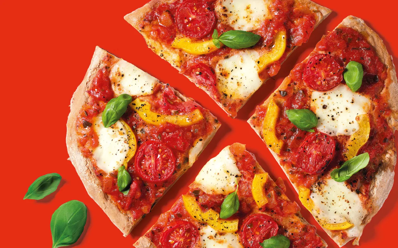
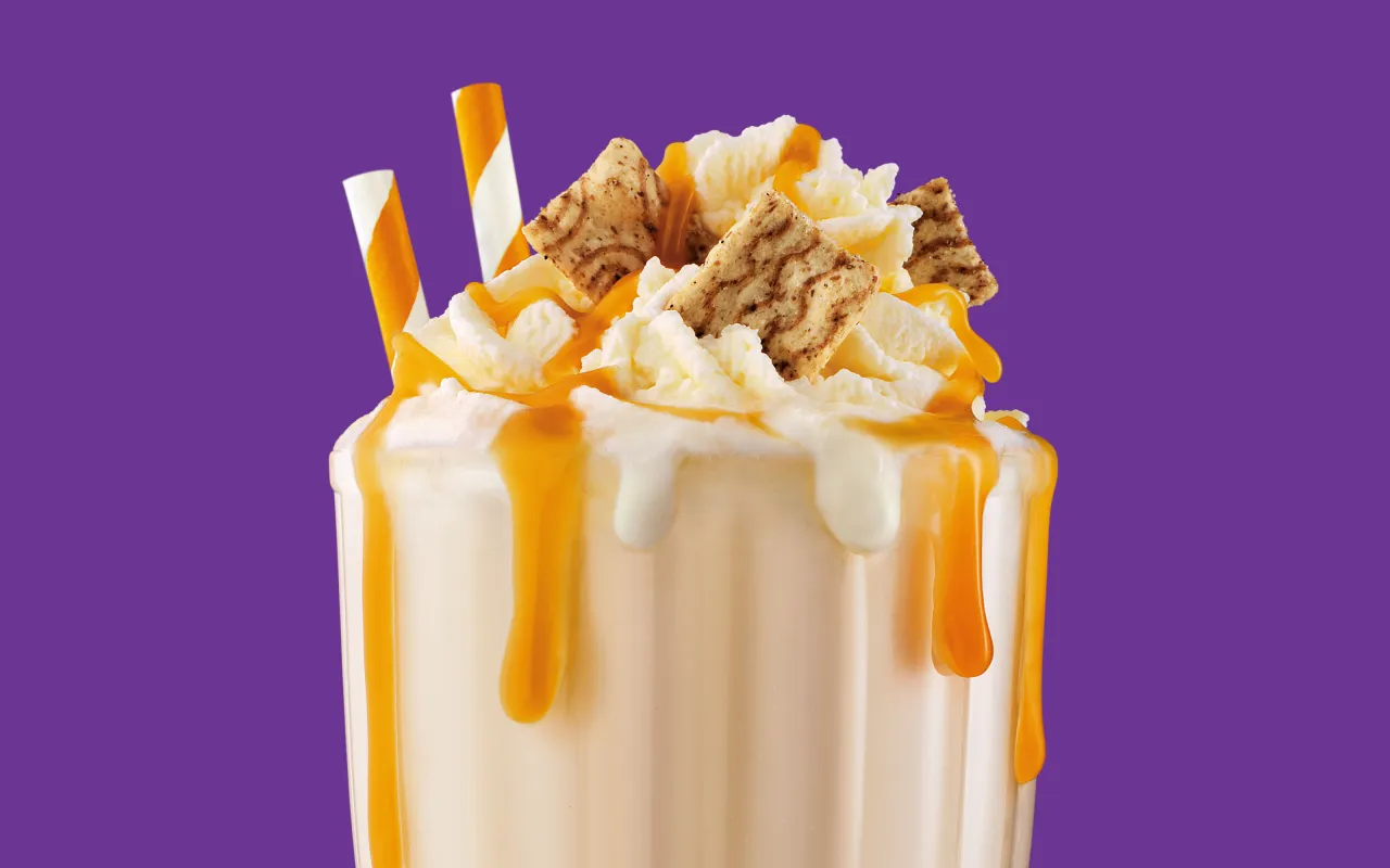
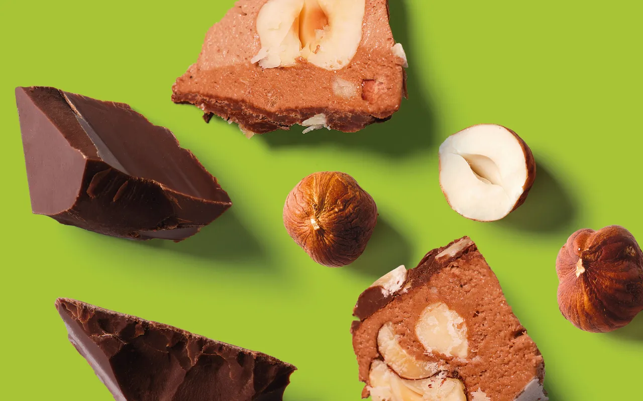
More's wide product range includes feel-good choices that catch the eye, and Robot Food embraced this by putting the food itself front and centre—not just as a functional weight-management product but as something desirable to be celebrated and indulged in.
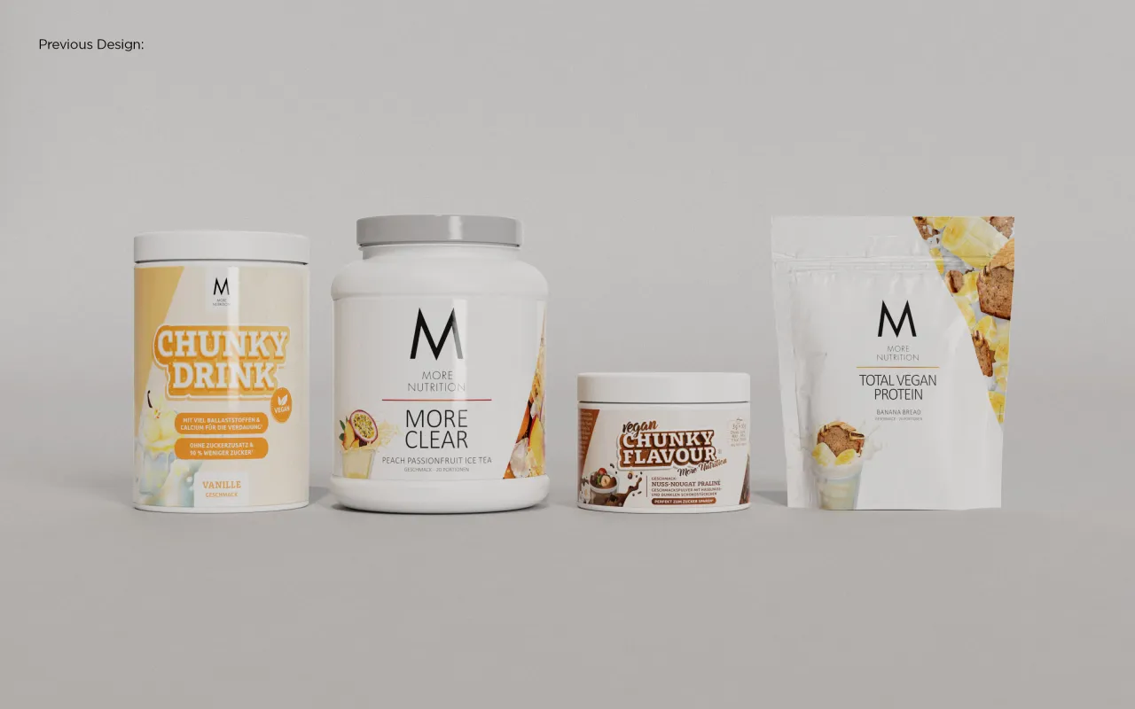
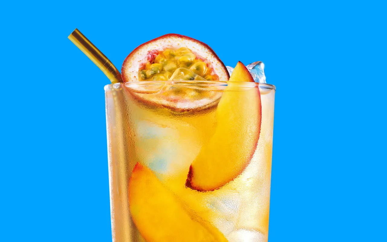
"Photography played an important part in capturing the taste appeal and versatility of the product range," explains account director Libby Goodyear. "We worked closely with the More team to capture the joy of the products in all their vibrancy, which was lacking from the minimal and science-led aesthetic of their previous design."
"More represents the love and joy found in food while also loving your body and being proud of it," says Christian Wolf, founder of More Nutrition. Having options that taste great and make you not only feel great but actually be in great health. The new design really embodies these core values."

Editor's Picks





Trending



Latest Jobs
Lead Digital Designer at Together
Full-time·£55,000 – £75,000
Account Director at David&Goliath
Full-time·Los Angeles·Up to $160,000
Associate Creative Director, Earned Marketing at The New York Times
Full-time·New York·$85 – $97 per hour
Design Director at Interbrand
Full-time·New York·$120,000 – $150,000
Designers / Copywriters / Art Directors / Creatives at Hatched
Full-time·London·£25,000 – £55,000
Strategy Director at Landor
Full-time·New York·$150,000 – $175,000