Upbeat rebrand of homeless charity Barnabus centres on 'the journey off the streets'
If charities evoke too much doom and gloom, it can encourage hopelessness rather than energy and ambition. Angus Prior and Rob Jenkins's rebrand of the homeless charity Barnabus instead takes an optimistic and confident approach.
Pro bono work is central to the work of design agencies up and down the country. It's a great way to give back, as well as an opportunity to flex your core skills in fresh and original directions. And if you're wondering what that might look like in practice, here's a great example.
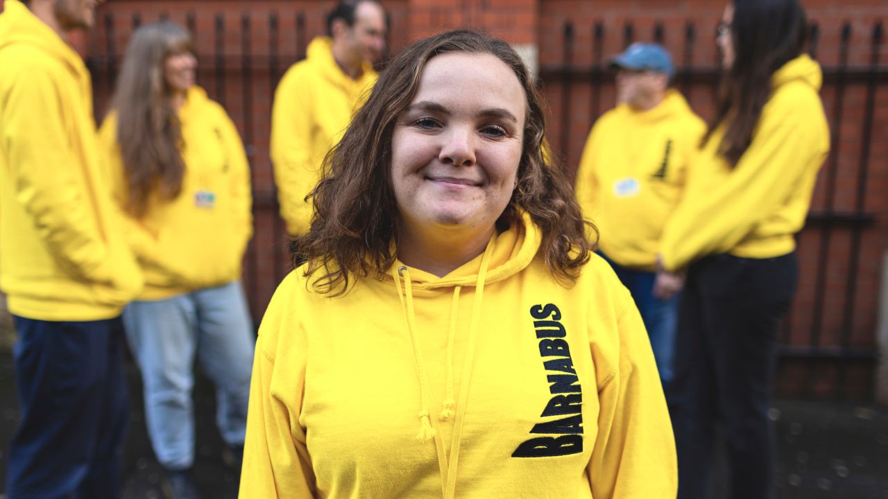
Angus Prior and Rob Jenkins, both creative directors for the creative agency Havas Lynx, have spent the last year and a half working on rebranding the Manchester-based homeless charity Barnabus.
Barnabus is a Christian charity that believes everybody has the right to live in their own home, have friends and family who care, and have a purpose in life. Most of all, they believe that everybody has a right to love.
The challenge Angus and Rob faced was defining the charity's distinctive approach and overhauling the dated look and tone of voice of its branding. More broadly, they aimed to elevate Barnabus from 'another local charity' into a brand with ambition and a bold new outlook.
Project aims
"Barnabus is a charity that's been helping Manchester's homeless for 30 years," explains Angus. "It's been doing phenomenal work over the last three decades. But there's still a job to do – in the wake of a cost-of-living crisis, Manchester has the third highest rate of homelessness in the UK."
But Barnabus had a challenge of its own. Its brand was dated; it no longer reflected its ambitions or new approach to tackling homelessness.
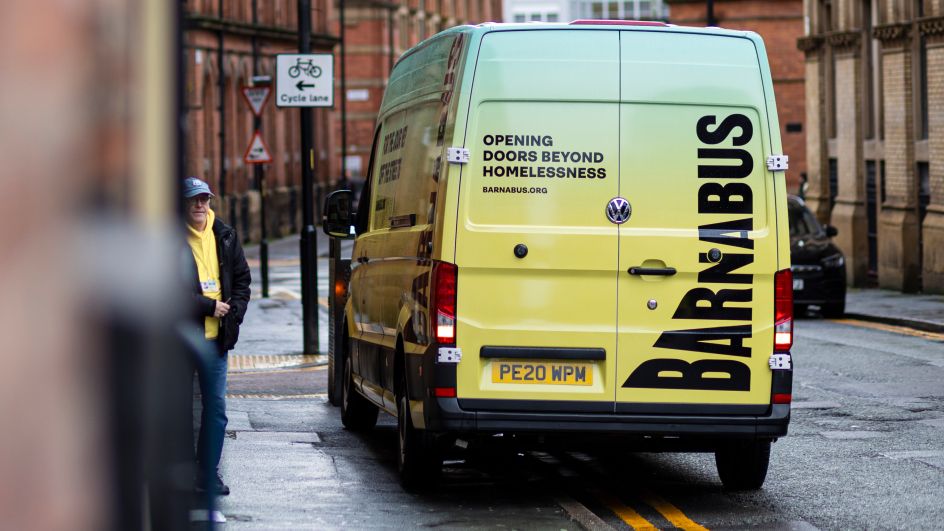
"This new approach was about addressing homelessness in the long-term," says Angus. "Not just about offering a bed, but going deeper to support people as they rebuild their lives. Barnabus had even bought its own housing to ensure they could be as close as possible to individuals as they took their steps into independent living. In that sense, homelessness is never a short-term fix. It's a journey."
Brand idea and visuals
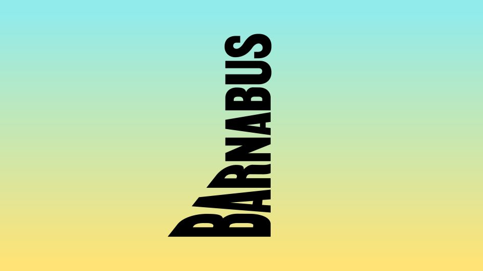
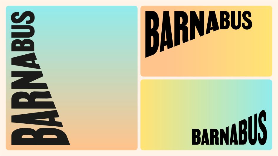
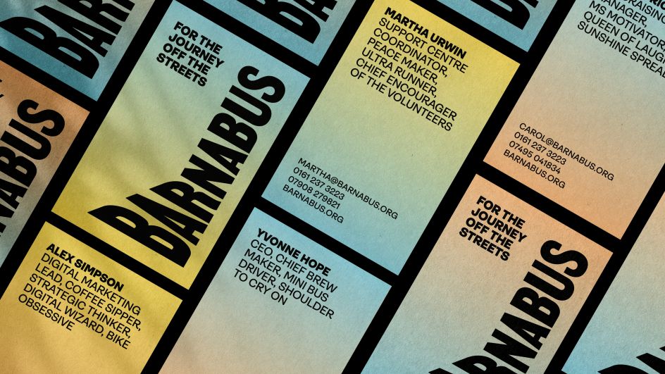
With that thought, the pair reimagined the brand, built on the brand idea: 'For the journey off the streets'. "We used the angles and contours of Manchester's own varied streets and ginnels to create a logo that was built from the streets itself – showing how life can always turn a corner," explains Angus.

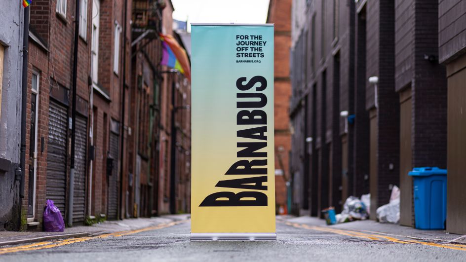
For the logo, they opted for MARTIN, a typeface inspired by non-violent action and based on remnants of the Memphis Sanitation Strike of 1968.
"We used MARTIN, which has a history in making statements, to ensure this was a logo that didn't shy away," says Angus. "It was about being bold, reflecting a charity with huge ambitions for addressing homelessness."
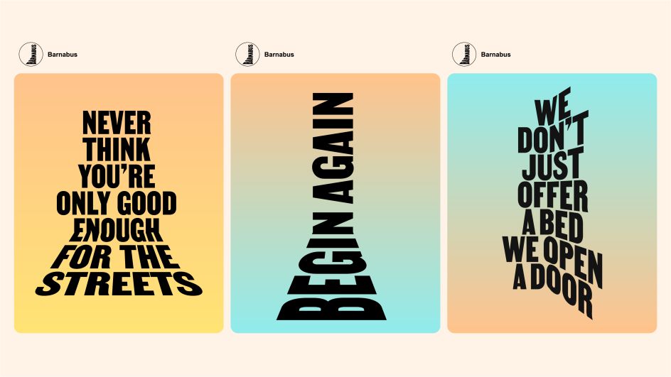
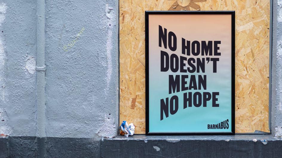
The use of perspective in the logo gave the designers a visual property that allowed them to flex the logo in different ways, reflecting the many journeys people can take. "We brought this into the messaging, too," adds Angus.
"Every line showed that Barnabus could help change the direction of someone's life. It was about instilling hope in people who had lost all of it."
Tone of voice
The tone of voice was crafted to help reflect this new focus for the charity. "It was about capturing who they were on the ground," says Angus. "The warm welcome you receive at their Beacon centre, the kind hearts, the tireless generosity – but also showing their approach in addressing homelessness for the long-term. All of this added up to a brand ready to lead the way in tackling homelessness in Manchester."
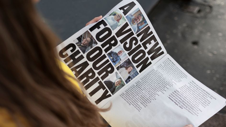
The team spent around 18 months working closely with Barnabus and its stakeholders to define its new approach. Every opinion mattered, with feedback being gathered from individuals experiencing homelessness to understand their view of what Barnabus was about.
The rebrand has seen a universally positive response from staff, donors and people experiencing homelessness. There's been an increase in corporate sponsors directly using the logo on their website or premises to promote Barnabus, and it has helped boost engagement across Barnabus's social channels, increasing post impressions by 31% and engagement by six per cent.
Editor's Picks


Trending


Podcasts


Editor's Picks
Further Reading