Williamsburg Sucks: Toby Triumph's controversial designs for Time Out
Within three weeks of relocating from London to New York, designer Toby Triumph has already managed to offend a large area of Brooklyn.
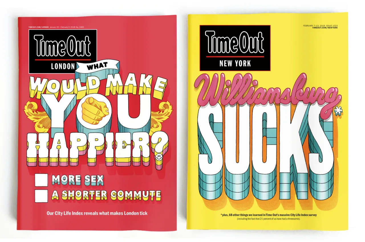
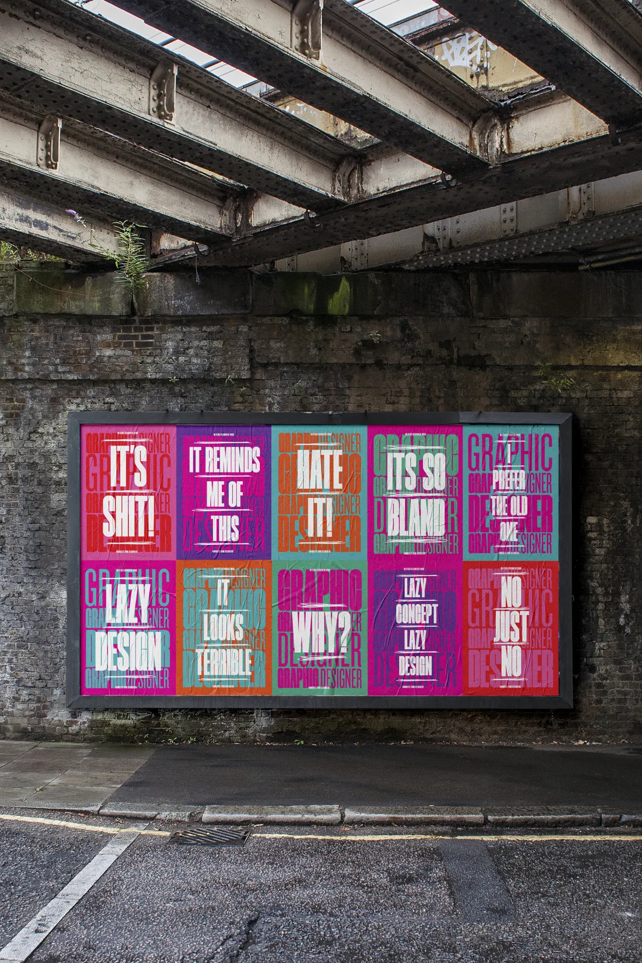
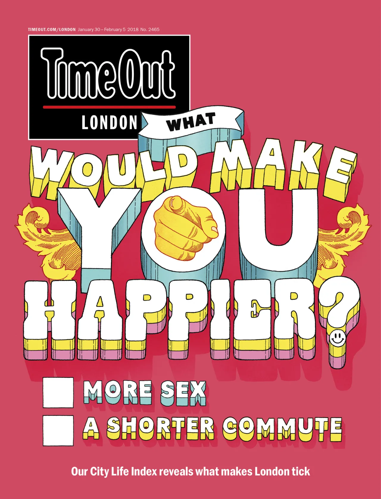
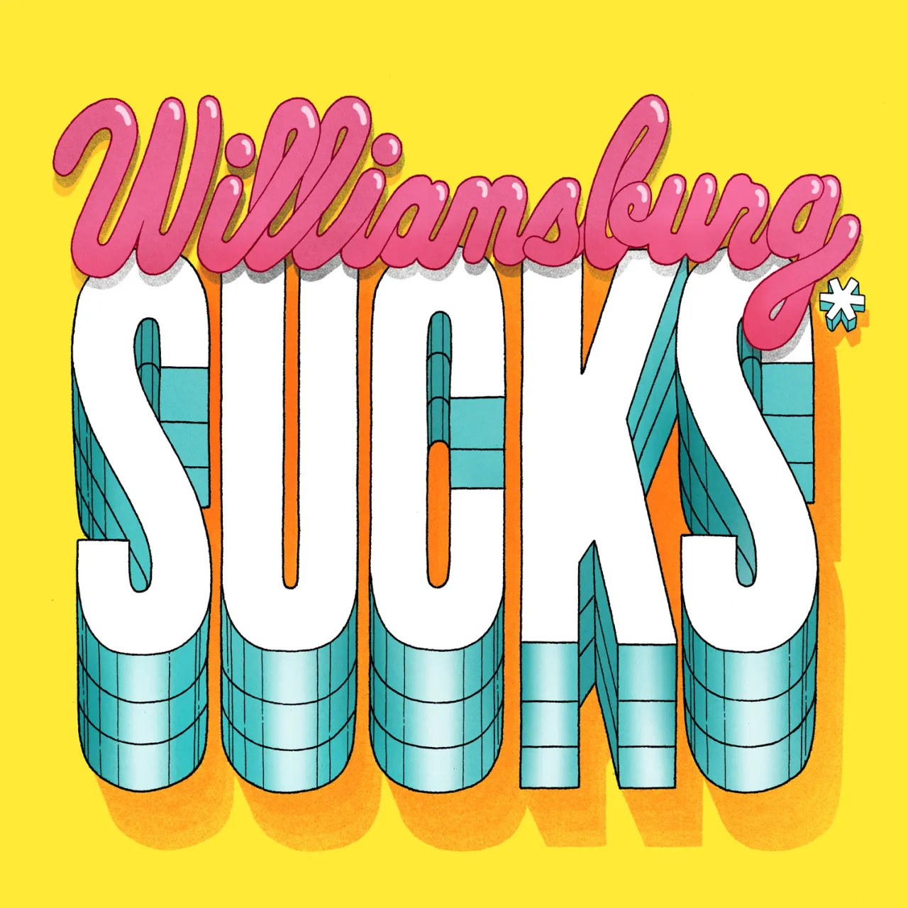
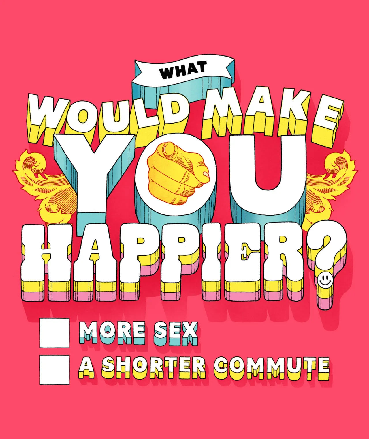
Commissioned by Time Out magazine, both in London and New York, Toby was asked to create typographic responses to their 'Time Out City Life Index Survey', which would be provocative and eye-catching.
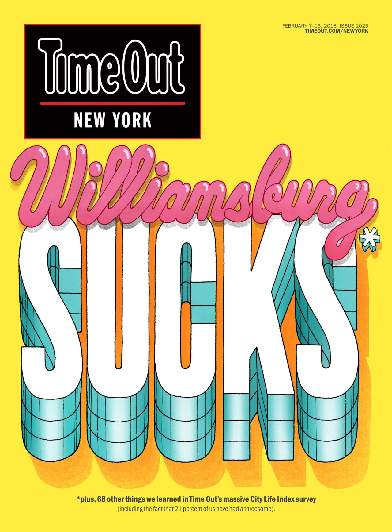
Toby explains: "The New York cover proved to be particularly provocative! The survey brought back results that most people thought that Williamsburg was overrated, so we wrote 'Williamsburg Sucks' on the cover. This proved to be polarising. With a good portion of people agreeing, but also a large group fiercely defending the area."
After surviving a barrage of irate Instagram messages, Toby has recently celebrated the relaunch of his website, which includes projects for YouTube, The Guardian, Turnball & Asser and Coca-Cola. Check it out at tobytriumph.co.uk.
Editor's Picks





Trending






Latest Jobs
Client Partner at Halo
Full-time·Bristol·£30k–£36k
Client Director at Koto
Full-time·Berlin·€70k-€85k
Art Director at The New York Times
Full-time·New York·$120k–$130k
Designer at New Genre
Full-time·London·£36k–£48k
Senior Copywriter at Human After All
Full-time·London·£48k–£66k
Growth and Client Development Director at 3800
Part-time·Sheffield·£60k-80k