Kleenex unveils new identity by Turner Duckworth to mark 100th anniversary
Designed in collaboration with Kleenex's parent company, Kimberly-Clark, the refresh offers more than just a makeover—it unites the iconic tissue brand across global markets as it commemorates a century in business.
Kleenex, the world-renowned facial tissue brand, marks its centenary with a new global identity crafted by Turner Duckworth. This redesign aims to bring consistency to the brand across all regions while giving it a distinct personality that highlights its role in life's "unexpected moments"—from wiping away tears to tackling seasonal allergies.
Kleenex acknowledges that over the years, it had lost some visual consistency, with varying logos and colour schemes across markets. The wordmark itself has also taken on many forms since 1924, most notably Saul Bass' 1961 version. The challenge for Turner Duckworth was to create a unified logo and a meaningful, distinctive shape that ensures legibility across all contexts.
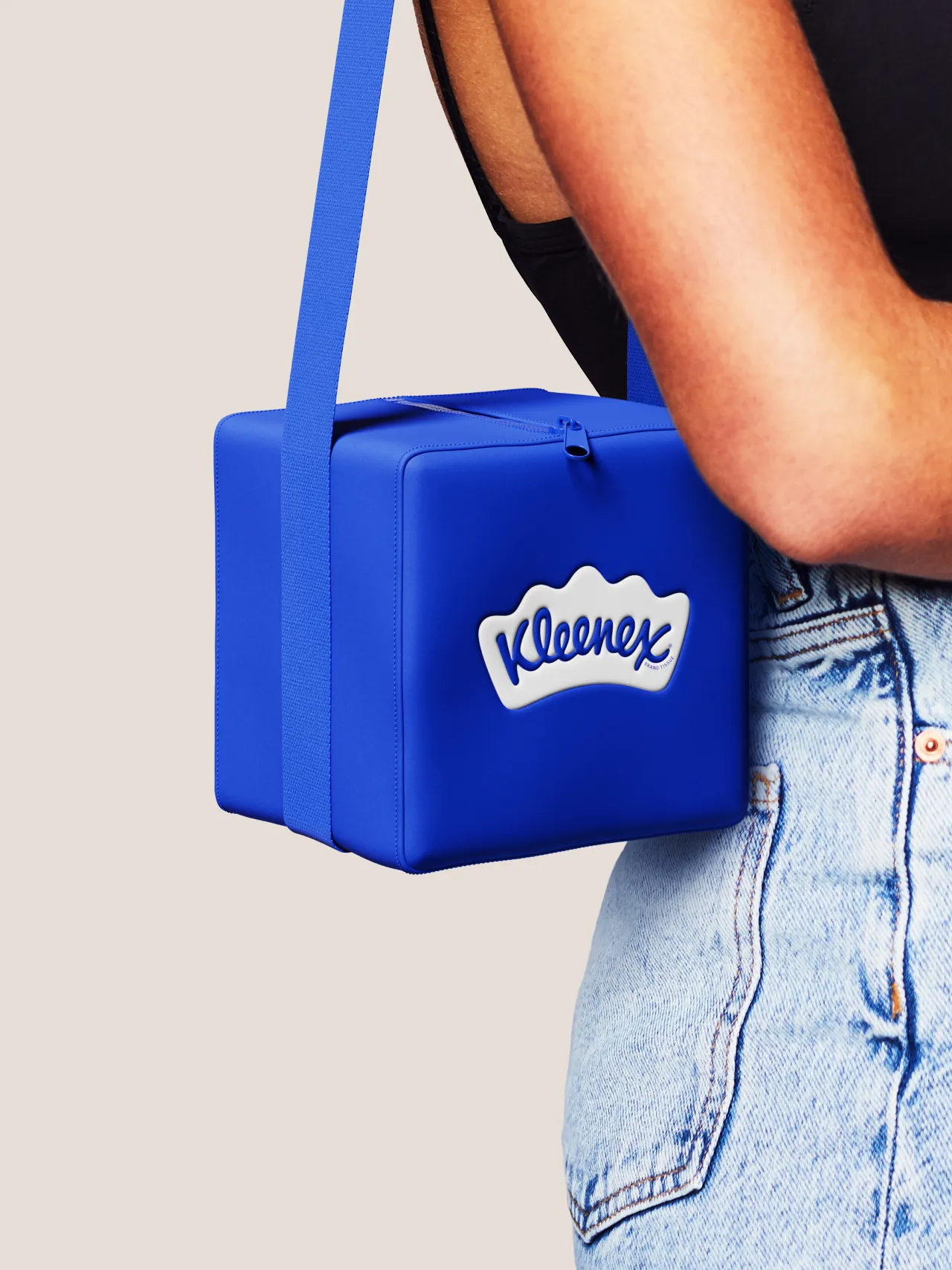
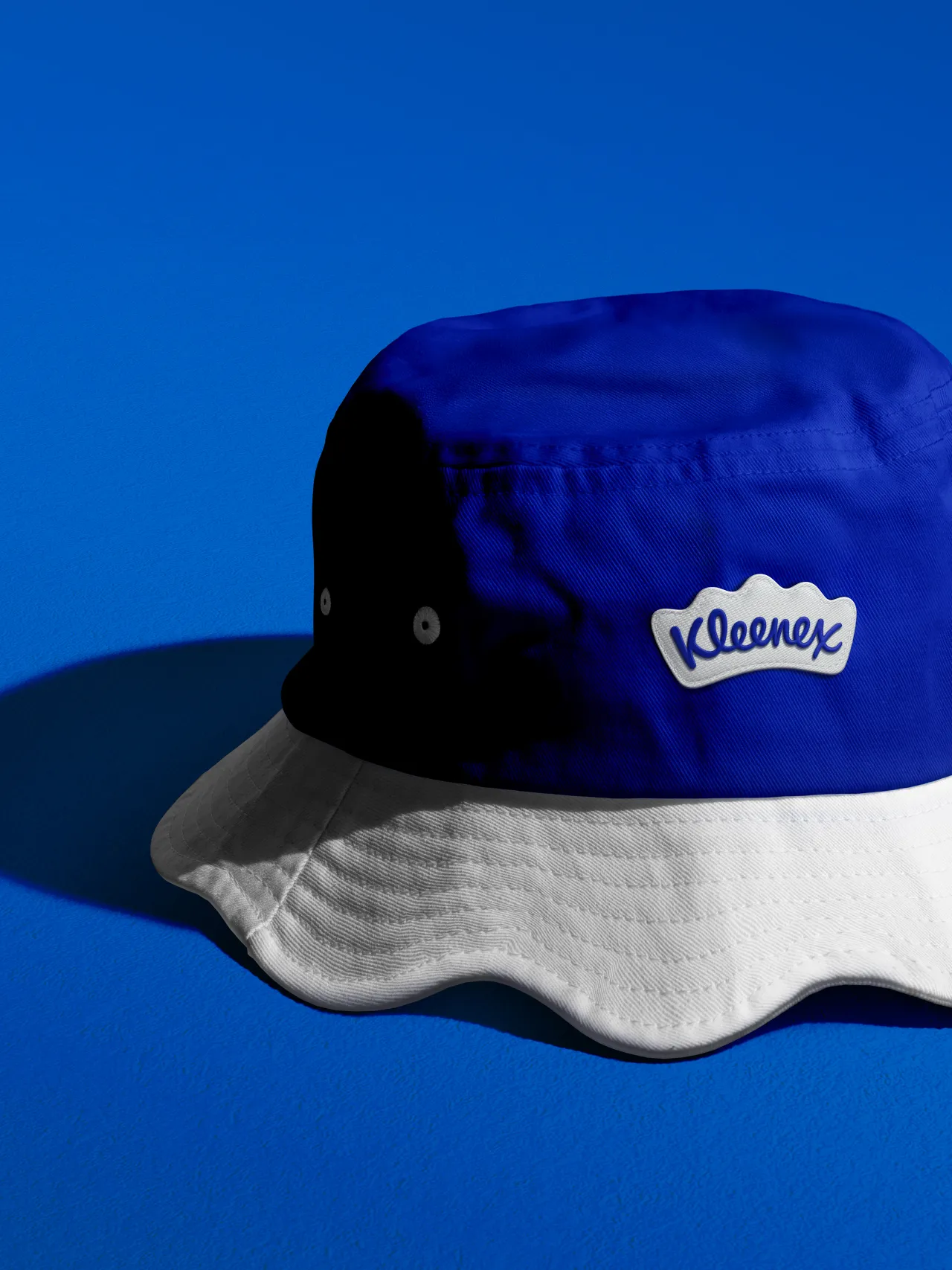
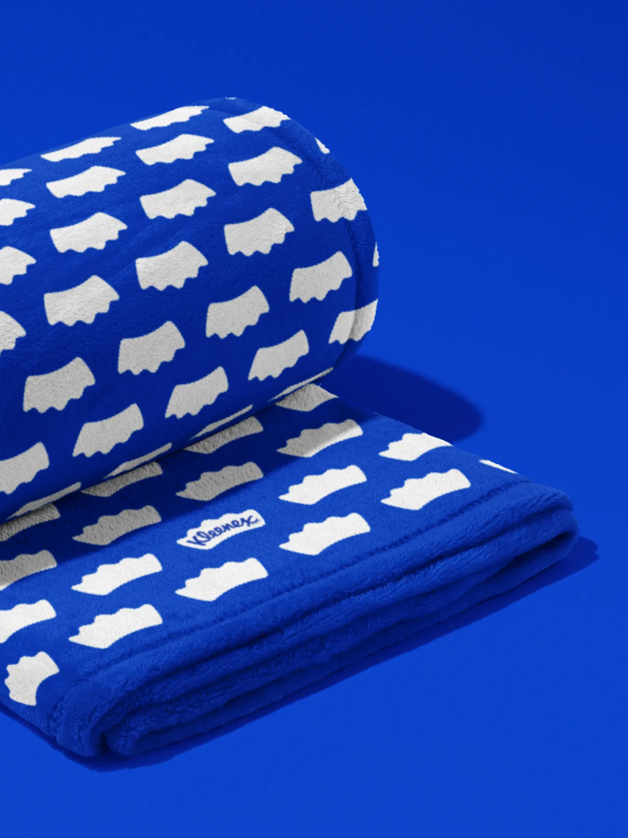
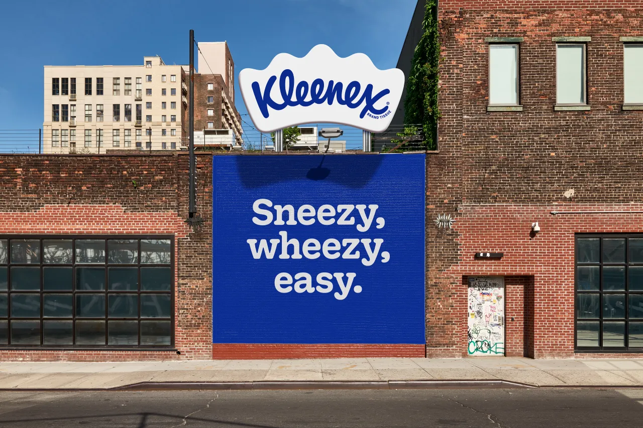
At its core, the work holds a crown-shaped icon that ergonomically frames the classic Kleenex script. This crown, subtly resembling a folded tissue, has evolved from a minor detail into a central design element. Metaphorically, it reinforces both Kleenex's key status in the category, as well as its core brand idea of being there for us when we need it most.
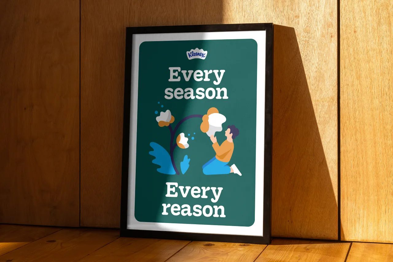
The comfy curves of both the script and the new distinctive crown have influenced the broader look and feel—particularly its typography and illustration. "Every aspect of the new identity reinforces the brand's leadership in the category," says Andy Baron, executive creative director at Turner Duckworth. "It's about delivering strength in everyday moments while staying true to Kleenex's heritage."

Unifying the Brand Across Markets
To create consistency, the rebrand standardises the signature Kleenex Blue as the primary colour across all touchpoints, solidifying its visual presence and building equity.
The refresh also introduces a custom typeface, Kleenex Serif, developed with type designers Alec Tear and Lewis Macdonald. Drawing from the nuances of the original script, the new font conveys the brand's strength and adaptability.
Merging Heritage with Modernity
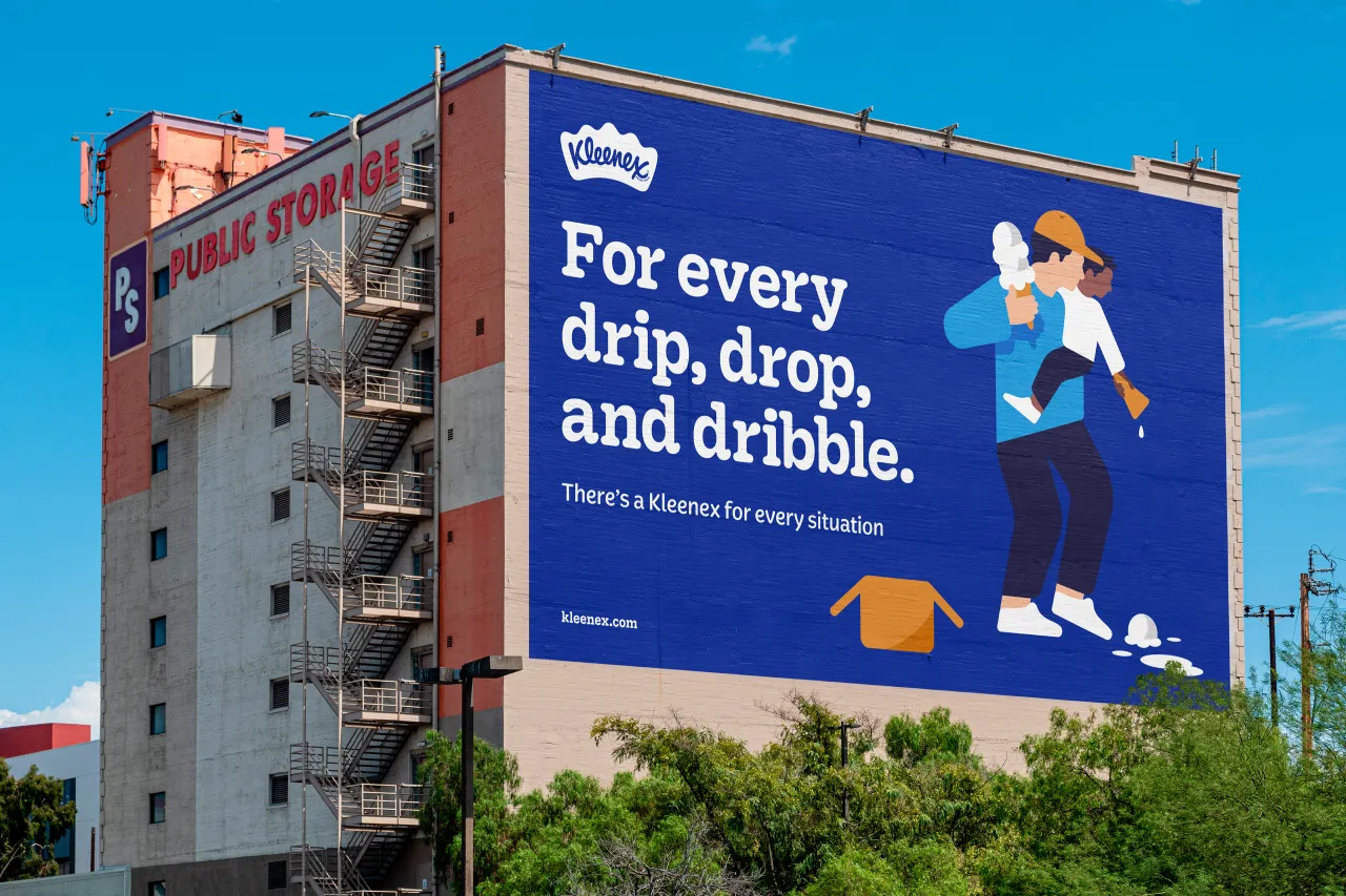
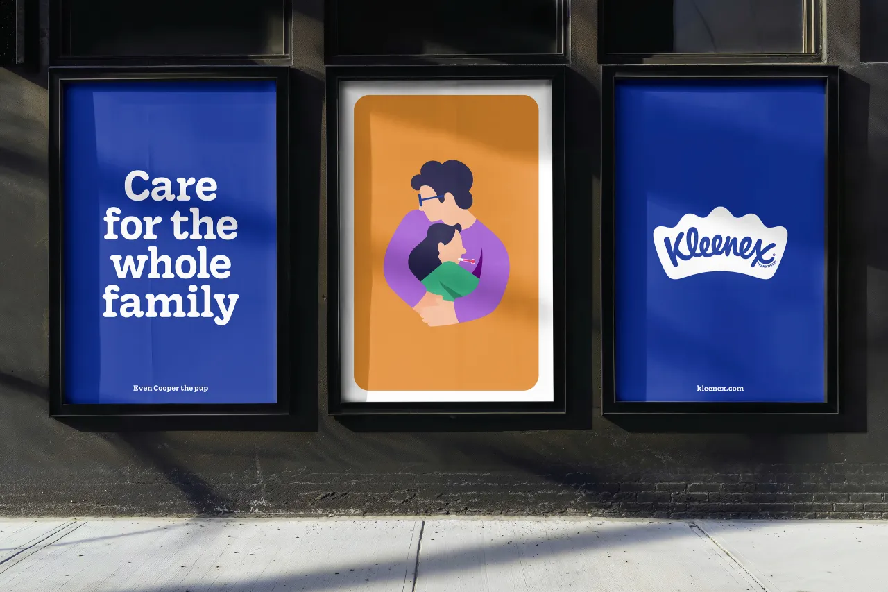
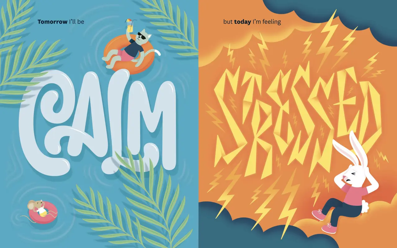
Balancing Kleenex's rich history with contemporary appeal was a key challenge. The updated logo and colour palette are complemented by whimsical illustrations that depict moments where Kleenex plays a role, from joyful tears to soothing cold symptoms.Created by Turner Duckworth's in-house team, these illustrations incorporate the soft curves of the crown, adding warmth and personality to the identity.
The new visual elements are brought to life with gentle animations while wider campaigns feature lines such as 'There's a Kleenex for every situation' and 'Every season, every reason'. The tone acknowledges life's pivotal moments, giving the brand an approachable and memorable feel.
Jennifer Kasmarick, from Kimberly-Clark, explains, "This rebrand represents a pivotal moment for Kleenex. It's not just about celebrating the past; it's about deepening the emotional connection with consumers as we look to the future."
The new visual identity for Kleenex is currently rolling out in North America, with global adoption expected in the coming months, aiming to "reinforce its status as the trusted leader in facial tissues worldwide".
Editor's Picks





Trending





Latest Jobs
Midweight Designer at All Purpose
Full-time·London·£30k–38k
Content Editor at ITV
Full-time·Birmingham·£41,284 - £57,412
Creative Director at Koto
Full-time·London·£95k-£130k
Marketing Manager at University of Birmingham
Full-time·Birmingham·£36,636 to £46,049
Client Director at Koto
Full-time·Berlin·€70k-€85k
Growth and Client Development Director at 3800
Part-time·Sheffield·£60k-80k