Looking for something?

Tap outside or press close

The Plant's K-Pop inspired, Memphis-like branding for Korean fast food joint Wing Wing

The Plant drew on the chicken and beer joints of Korea and their offspring on New York’s Lower East Side in creating the brilliant branding and interiors for Wing Wing, a new fast food spot in central London.
Written By:
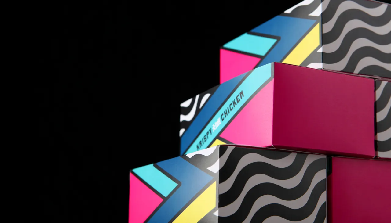
Bright geometric packaging boxes for Wing Wing featuring magenta, cyan and yellow panels with "Chimaek" text and wavy patterned background in The Plant's Memphis-inspired design

All bright popping colours and Memphis-like patterns, the energy of the whole thing is inspired by K-Pop. The agency created a bespoke wordmark which features the Korean characters for "Chimaek", and a was logo created from the “WW” to be used across the identity.

"The bright colours and bold graphics are matched with equally provocative copy, creating a fun, engaging experience," says The Plant. These are echoed in the interiors of the space, which use abstracted patterns and see cute little icons adorn the concrete walls and floors. All in all, it’s a knowingly Instagram-savvy spot. "A hyperreal space that reflects the colour and energy of K-Pop, the aim of the space is to create a mood that's both fast food and cool bar," the agency adds.

The Plant’s designs are shown across all touch-points including the Wing Wing menu systems, website and uniforms.
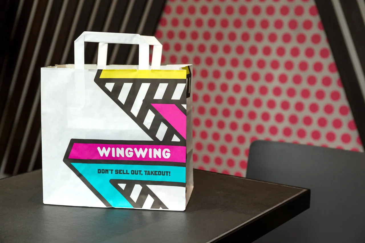
White takeaway bag for Wing Wing with bold geometric patterns in magenta, cyan and yellow stripes, featuring the restaurant name and "Don't sell out, takeout!" slogan
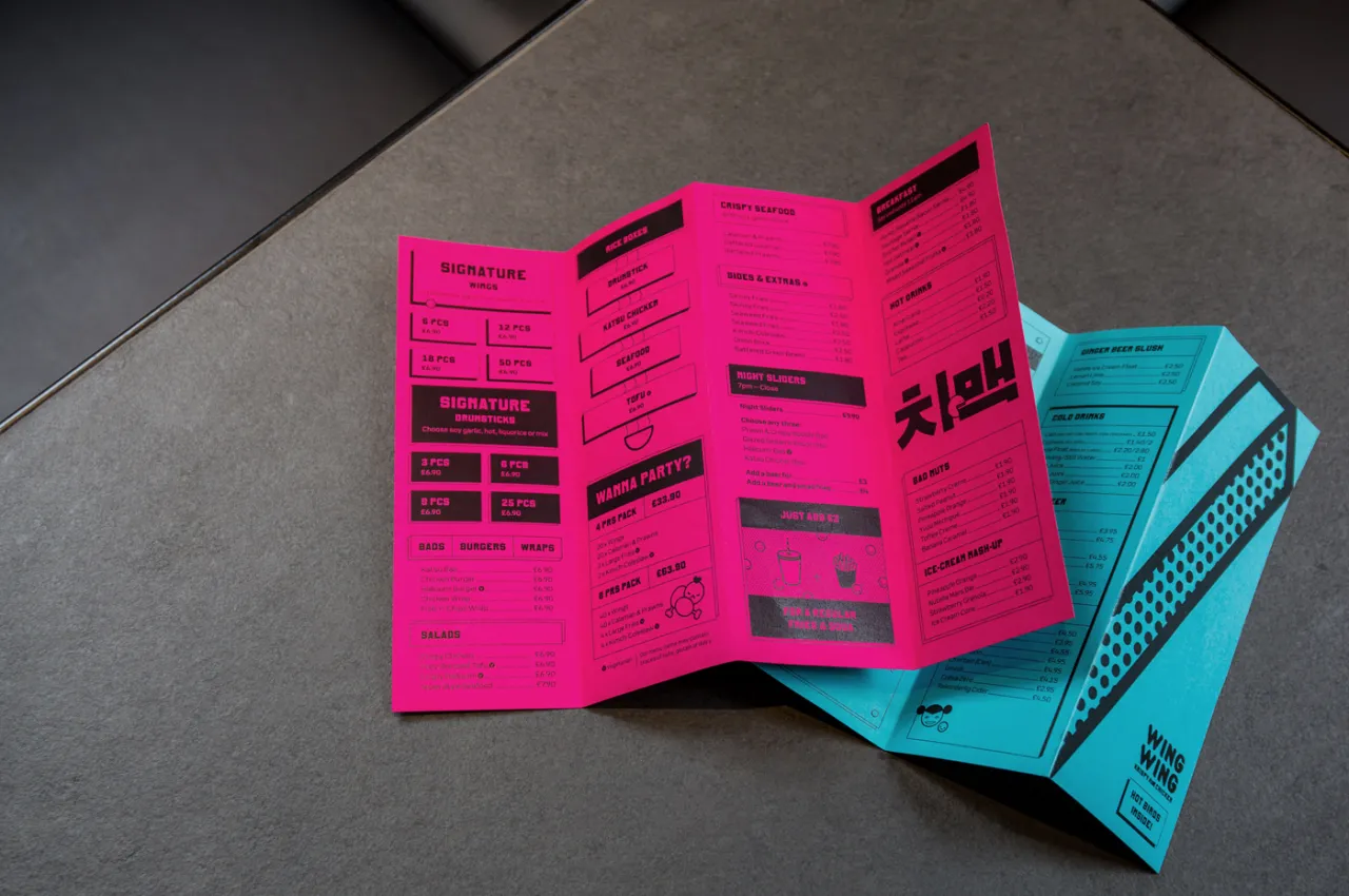
Bright pink and turquoise folded menus for Wing Wing displaying sections and black text on a grey surface
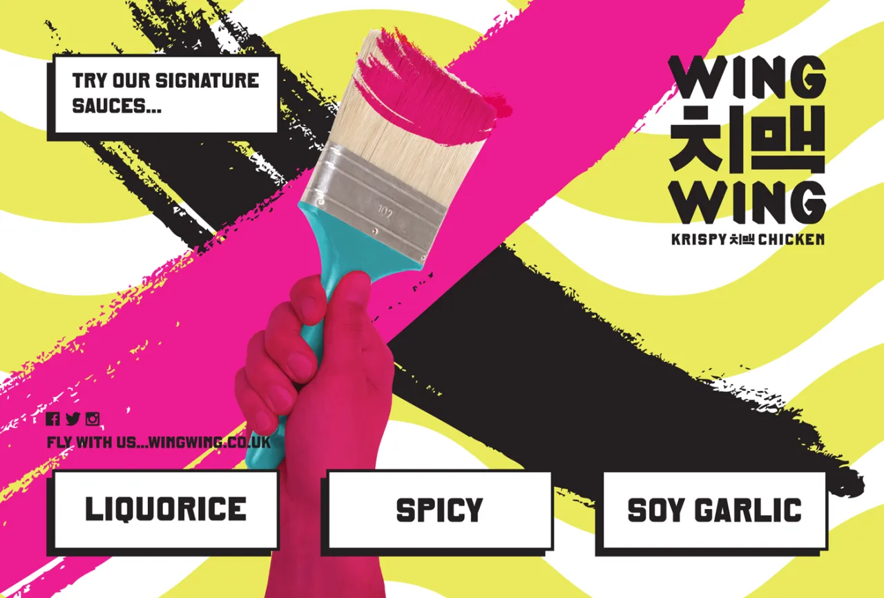
Hand holding paintbrush with magenta paint against yellow, black and white geometric background, displaying Wing Wing's three signature sauce flavours: Liquorice, Spicy and Soy Garlic
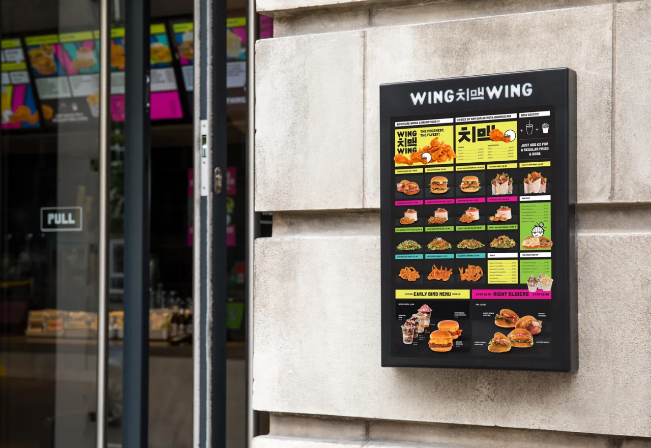
Wing Wing menu board mounted on a concrete wall, displaying colourful images of chicken dishes and drinks in bright yellow, pink and black graphics with Memphis-style design elements
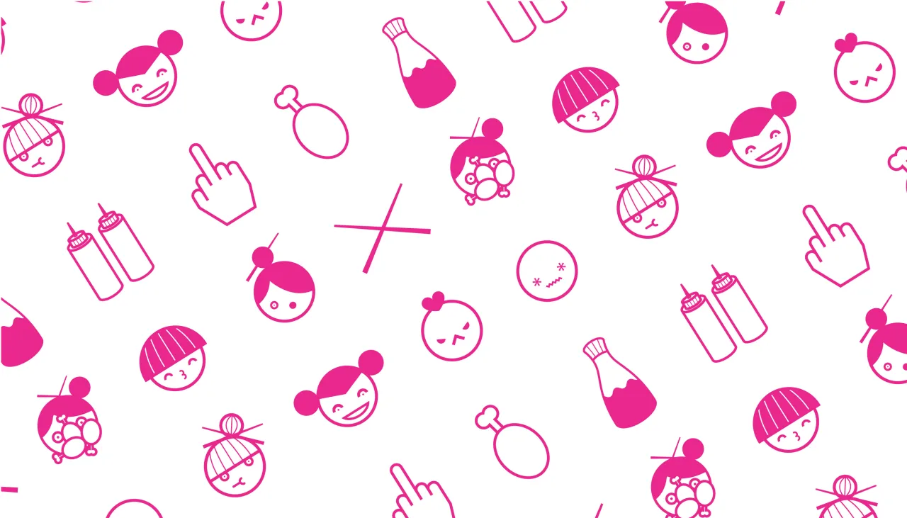
Bright pink icons on white background including smiling faces, beer bottles, chicken, crosses and hand gestures, part of Wing Wing's K-Pop inspired branding system
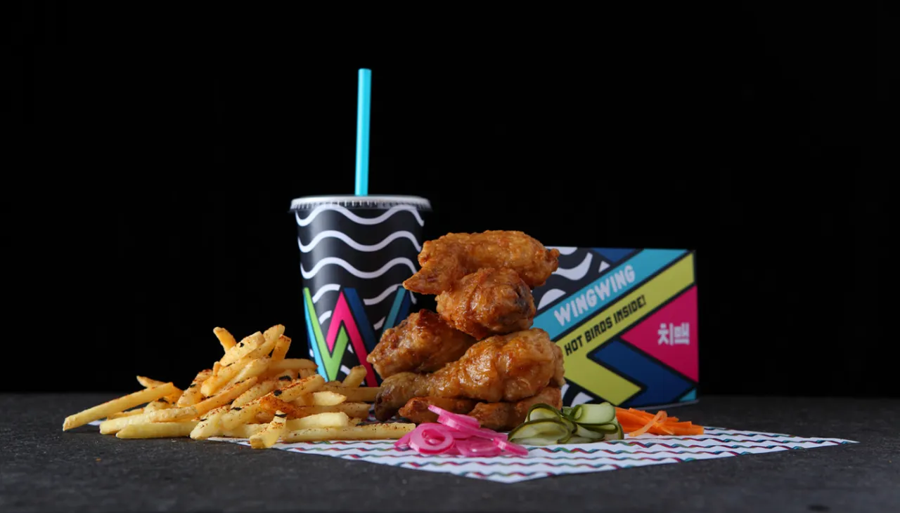
Wing Wing meal featuring fried chicken, chips and a drink with vibrant patterned packaging against a black background
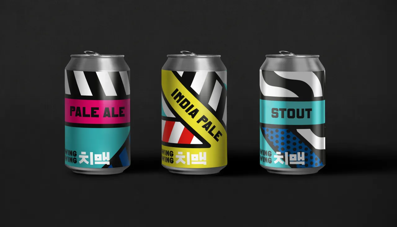
Three Wing Wing beer cans with bold Memphis-style graphic designs in magenta, yellow and cyan, labelled Pale Ale, India Pale and Stout
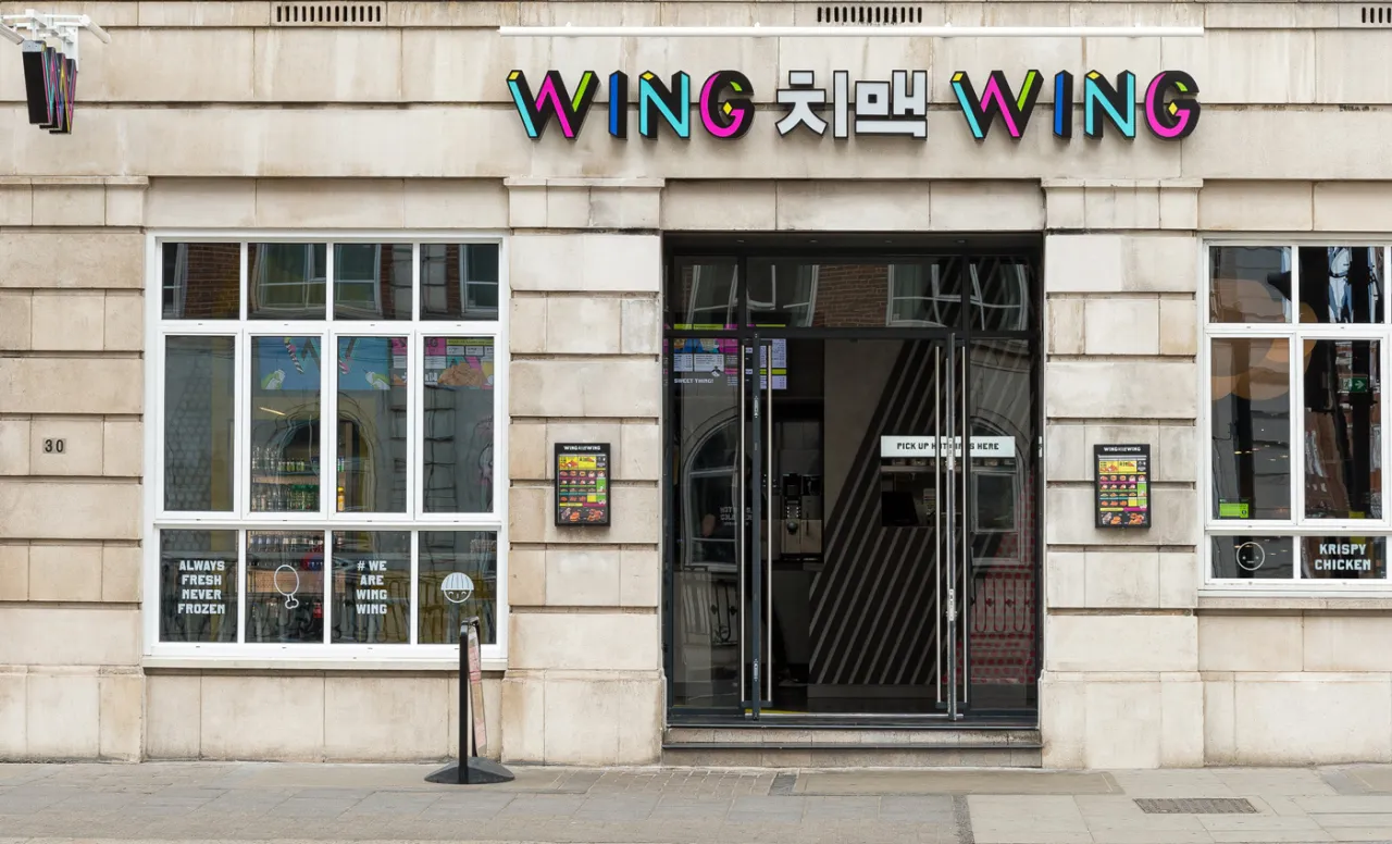
Wing Wing storefront with multicoloured neon signage featuring Korean characters, dark entrance doors and illuminated windows on a stone-clad façade
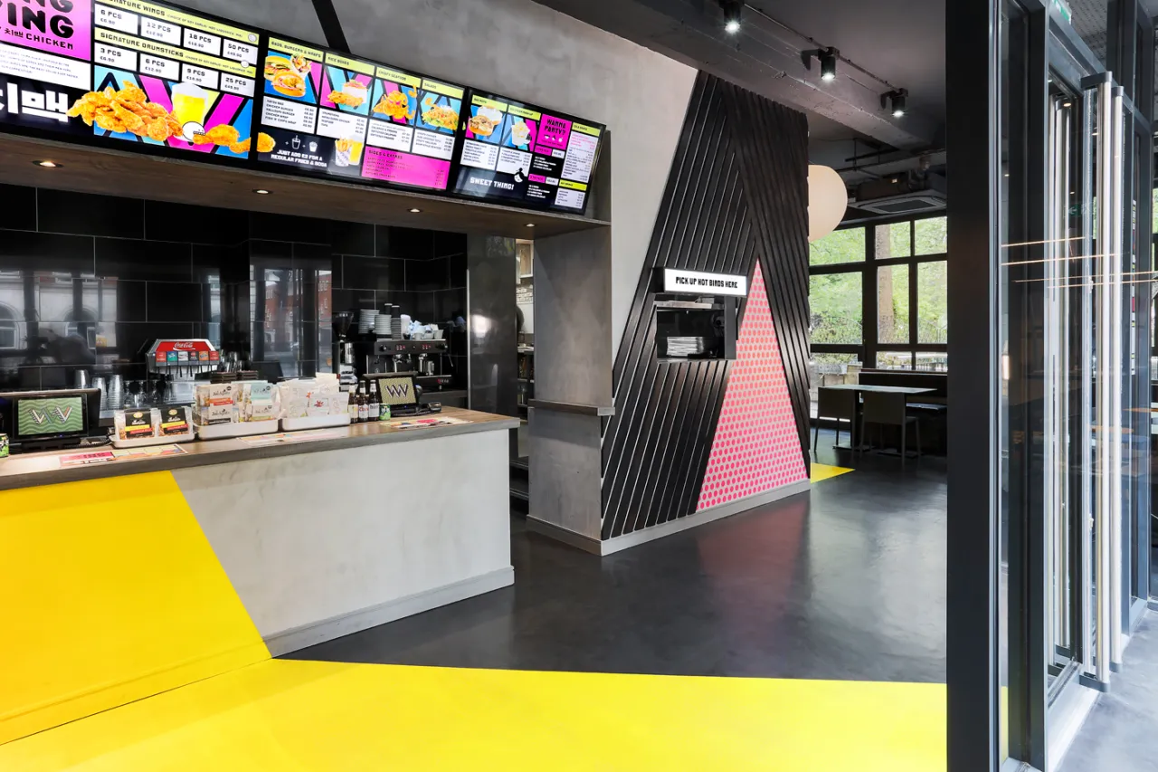
Wing Wing fast food restaurant interior with bright yellow floor, service counter with menu boards, and pink-and-black geometric patterns inspired by K-Pop aesthetics
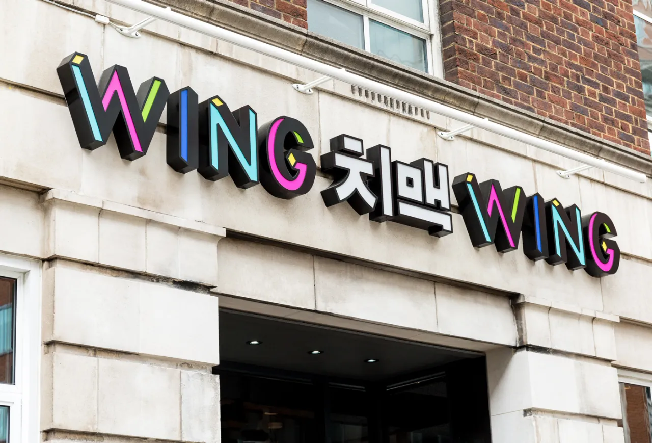
Colourful neon signage for Wing Wing displaying the restaurant name in bright pink, blue and yellow letters with Korean characters for Chimaek in the centre, mounted on a white stone facade
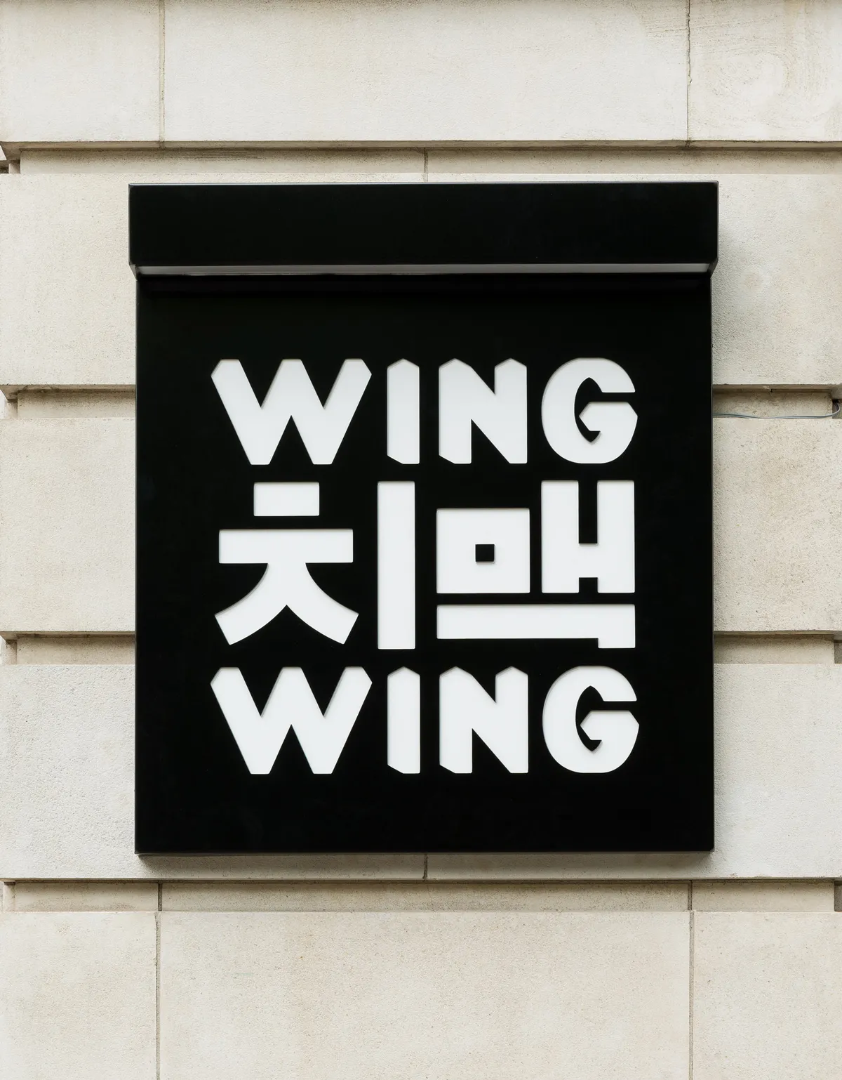
Black storefront sign for Wing Wing with white letters spelling "WING" above and below Korean characters for "Chimaek" on a cream-coloured building facade
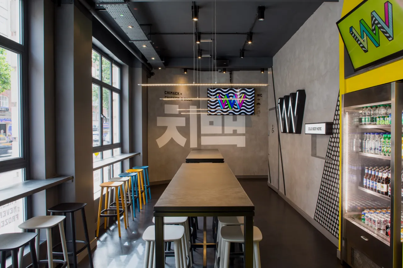
Interior of Wing Wing fast food restaurant with long wooden table, yellow and black stools, neon signage, and Memphis-style patterned graphics on walls and ceiling
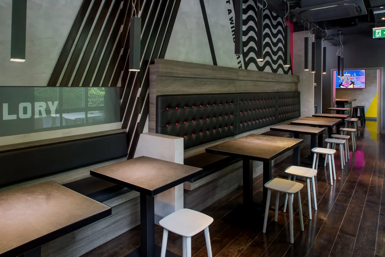
Wing Wing restaurant interior with black upholstered booth seating, wooden tables, white stools and geometric patterned wall hangings above
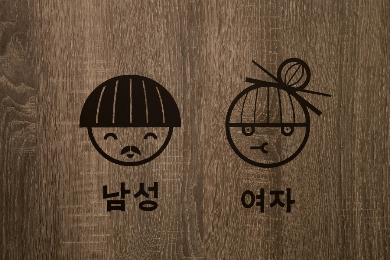
Two simple line-drawn faces with Korean text labels representing male and female characters on a wooden background
Wing Wing Krispy Chicken logo in white text on black background, featuring Korean characters for Chimaek underneath
Share