Without rebrands Wok to Walk to highlight the lightening bolt speed of quality fast food
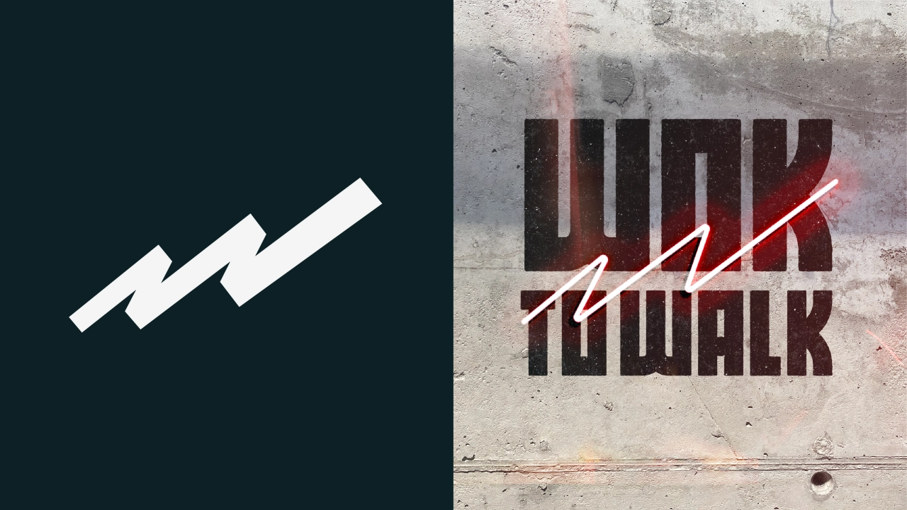
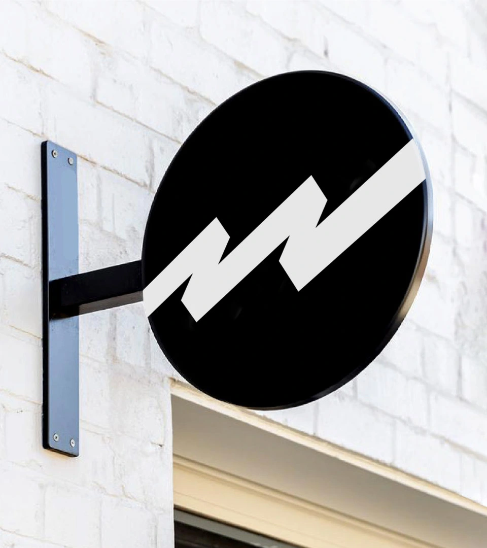
London studio Without is behind a brand refresh for Wok to Walk, helping the takeaway chain to reposition itself as a destination for quality fast food. At its heart is a dynamic logo of a wok with a lightning bolt that doubles as a signature 'W'.
Wok to Walk is considered the number one Wok Kitchen operator in Europe and is relaunching globally this month with a new brand identity from Clerkenwell-based design studio Without. Founded in 2004, Wok To Walk pioneered the quick service movement, but the business got lost in this dichotomy and was mistakenly seen as a convenient but unhealthy grab-and-go.
Hence the new identity from Without which seeks to upend this and position Wok to Walk instead as a healthy destination that provides both speed and quality. "It communicates the atmosphere and design ideals of the East in an authentic and approachable way with a brand that is bold, bright and artisanal," explains Without.
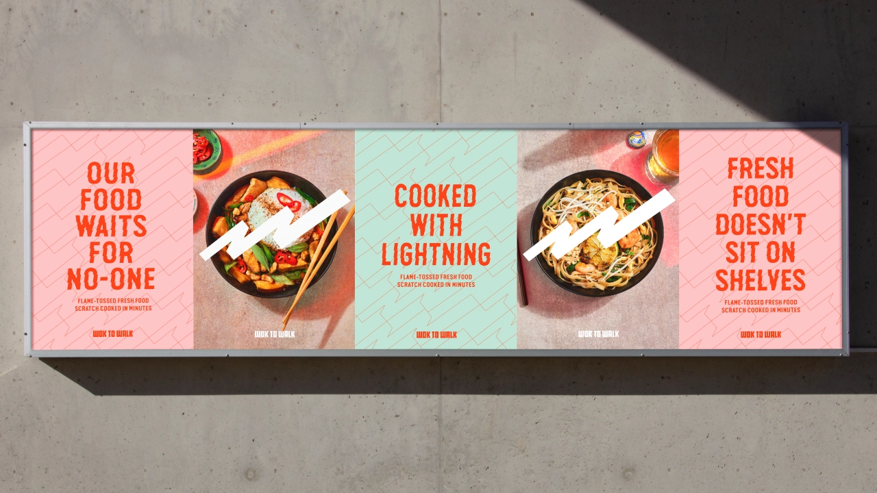
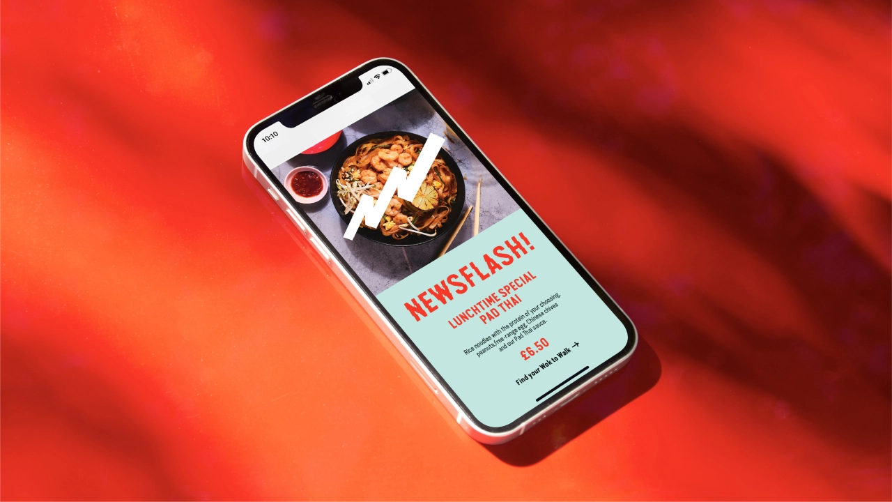
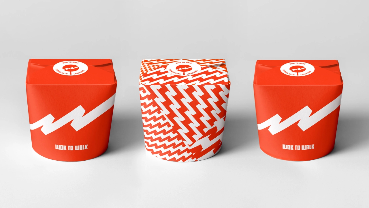
"The repositioning is grounded in logic," Without continues. "The food at Wok to Walk is not fast because it's the easiest or cheapest thing to do, but because they train their chefs to master the wok. The clever piece of kit was invented over 2,000 years ago in China, and its rounded bottom seals in heat and nutrition so fresh food can be cooked quickly with less oil and more flavour while preserving all its nutritional qualities, which makes it very healthy."
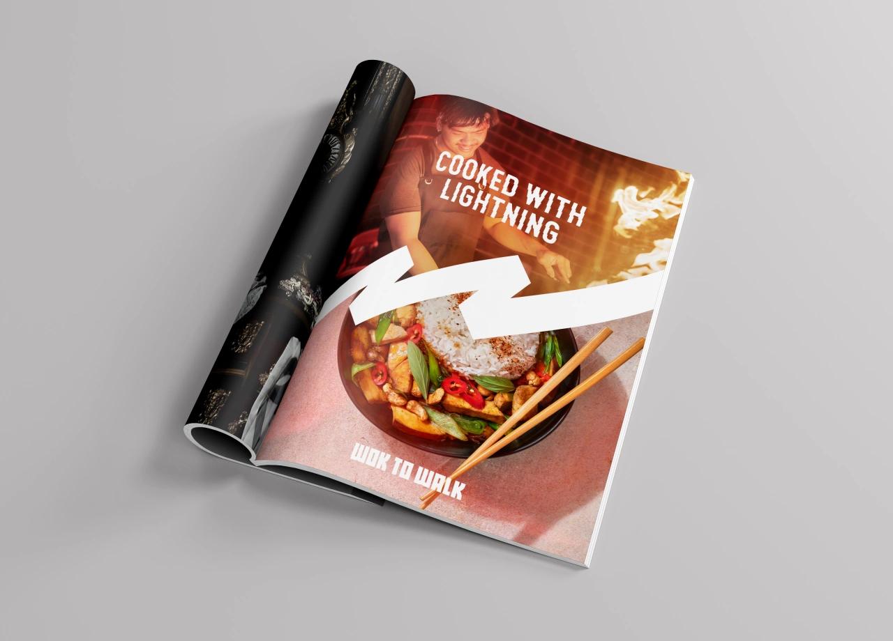
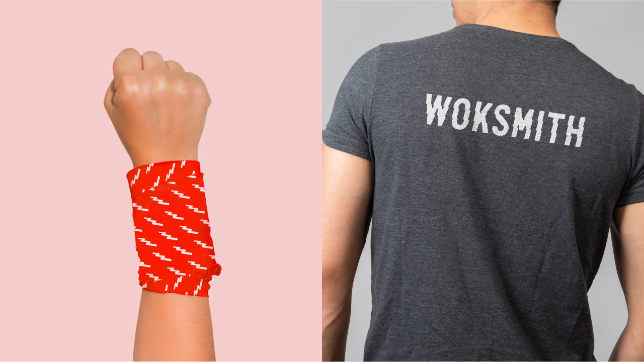
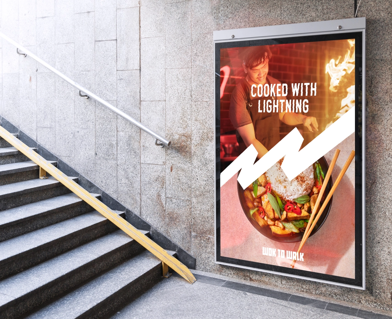
With this in mind, Without made the wok the star of the fresh identity to create a brand that blends these ancient techniques with "modern energy, and high-end craft with high-street convenience". As such, the new logo is a wok with a lightning bolt in the middle that doubles as a signature 'W'. To accompany the mark, the studio created a suite of patterns that sit across uniforms, takeaway bags, and behind typographic posters.
Meanwhile, the chefs, who attend circus school, have been renamed 'Woksmiths' to highlight the artisanal quality of the food and the skills required to cook it. And the new restaurant interiors, which Without advised on, will now be open-plan and built around these talented Woksmiths so customers can see the food being prepared.
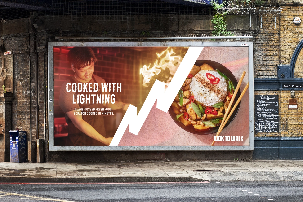
While wok craft takes years to perfect, the rules at Wok to Walk remain simple: make it fresh, fast, and fun.
Looking at the fresh brand language, Without wanted the copywriting to reflect the idea that whilst "wok craft" takes years to perfect, the rules at Wok to Walk are simple: "make it fresh, fast, and fun". The subsequent words and phrases applied throughout the identity focus on food quality, seasonal recipes, and ingredients rather than price or meal deals.
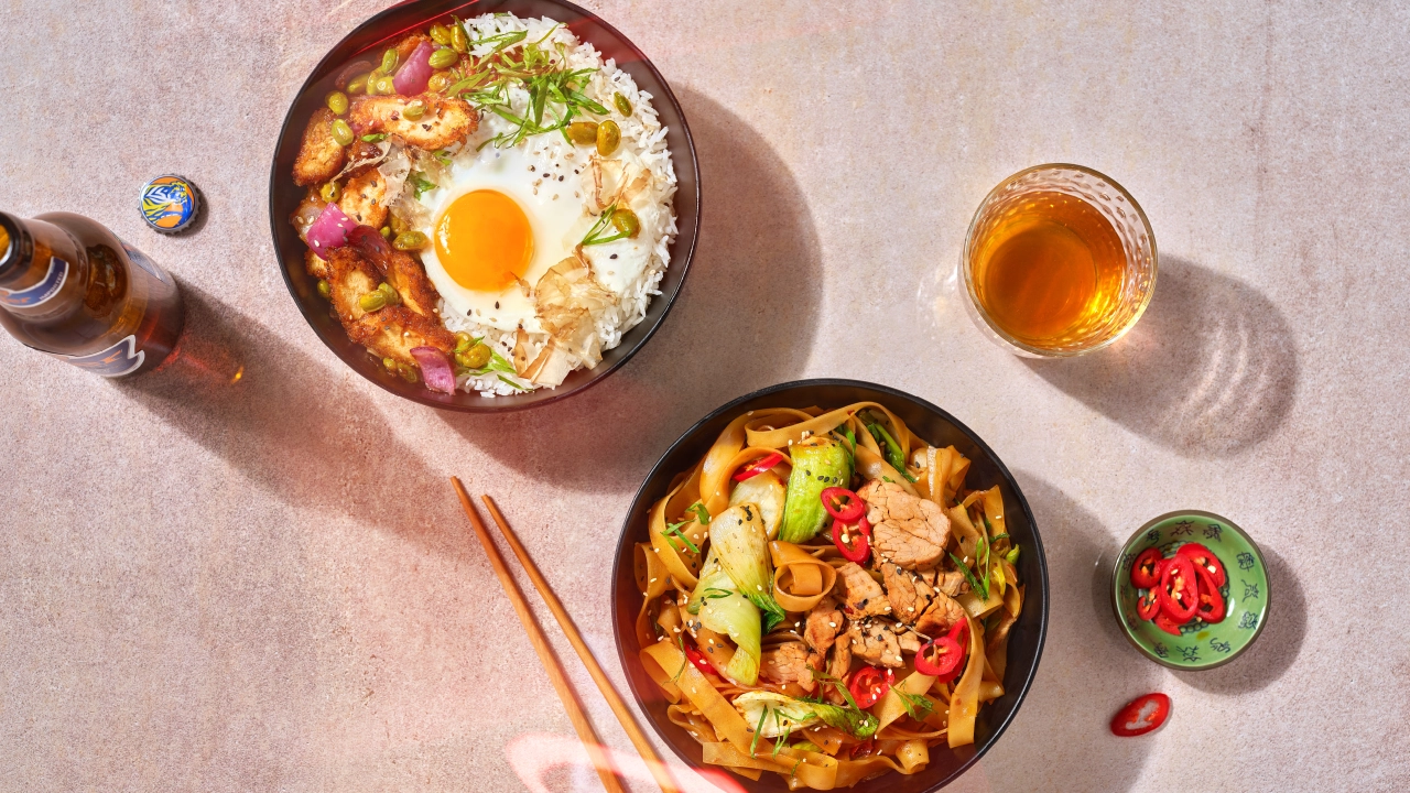
An updated colour palette introduced new gradients and was inspired by the cinematography of Wong Kar Wai. The high-quality imagery builds on this, then takes it a step further and moves away from classic food photography presentations to instead add a subtle layer of contemporary neon glow throughout. Combined, it's a play on the authentic colours, flavours and emotions of Chinese street food instead of falling back on tired clichés.
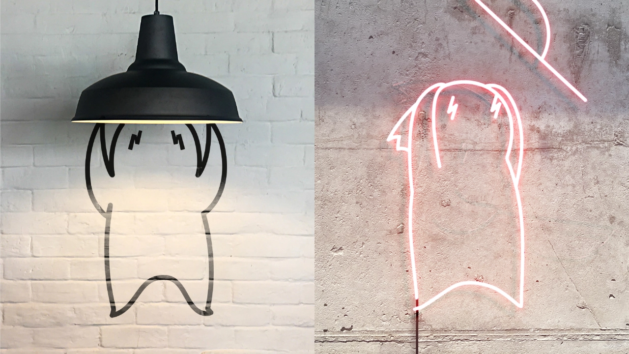
To move away from its image as food for travellers and connect with customers on a more emotional level, 'Woki' has been introduced as Wok to Walk's new brand mascot. Acting as the spirit of the Woksmith, the character is bold, creative and enthusiastic with a mischievous, rule-breaking streak.
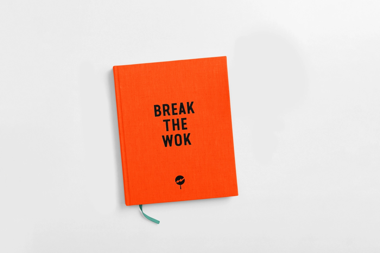
"Refreshing a brand that is already beloved and consolidated is always tricky, but we needed to take a step forward in order to be true to our innovative spirit," says Cristina Piera from Wok to Walk. "Quality perception was falling below the actual quality, and we wanted to make our position in the market clearer: we are fast and convenient, but we are definitely not fast food in terms of quality and experience. Achieving this mission while respecting the DNA of the brand was a big challenge; Without helped us find the right way to bring our vision to customers in a unique way."
Roly Grant from Without adds, "Wok to Walk is special – fast food that's fresh from the flame, not sat in packaging all day. Lightning fast and full of attitude, it deserved a bold mark, energetic imagery and a new pride in the quality of what they create."
The rebrand is rolling out today and will cover all brand touchpoints, including social, digital, and OOH, as well as in over 100 Wok to Walk restaurants across 20 countries.
Editor's Picks





Trending






Latest Jobs
Midweight Designer at Catalyst Creative
Full-time·London·£32k-£36k
Midweight Graphic Designer at We Are Your Friends
Full-time·London·£36k–£44k
Senior Front End Developer at Crown Creative
Full-time·Belfast·£50k–£60k
Senior Designer at Jubba
Full-time·London·£50k-£60k
Creative Director at Koto
Full-time·London·£95k-£130k
Head of design at Cog Design
Full-time·London·£55K