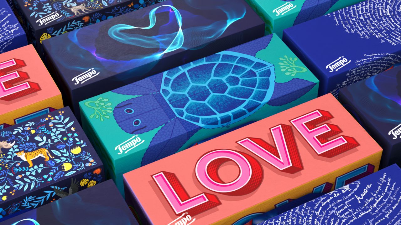
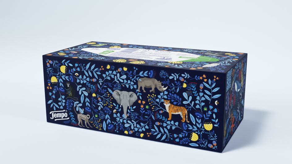
Packaging for tissues is usually pretty functional: you don't expect to see works of art or deep philosophical meaning. It's unsurprising that WMH&I's new packaging for Italian tissue brand Tempo caught our eyes.
Rather than the normal bland patterning, these unexpected creations feature a fingerprint formed by handwritten phrases, an EEG of the brain's response to kindness, and a turtle designed by renowned illustrator Rebecca Sutherland.
The new designs are driven by Tempo's three brand pillars of 'Kind to Self', 'Kind to Others' and 'Kind to Planet', aiming to deepen the connection between the brand and consumers and attract new fans.
Guiding principles
The brief from Essity, the brand's global parent company, grew out of an earlier Tempo rebranding effort, which began in 2022 and saw WMH&I develop a design playbook to be used by local Tempo teams worldwide.
This earlier rebrand laid out the guiding principles behind developing Tempo pack designs while inspiring them to think beyond the usual imagery.
This was driven by Essity's desire to strengthen the presence of Tempo on supermarket shelves amid a worldwide trend for budget, own-brand tissue boxes to be given eye-catching designs.
Design work
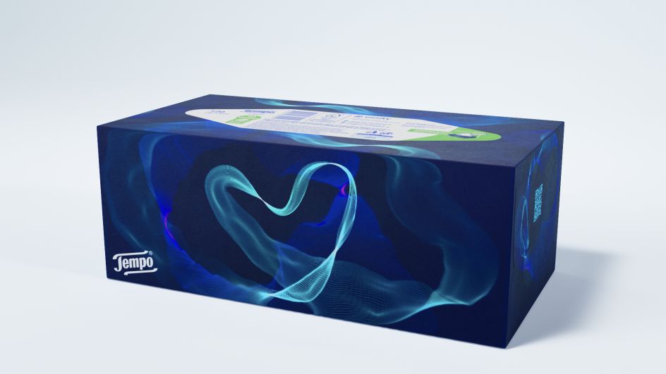
For the design inspired by kindness to self, WMH&I took real-life EEGs recording people's reactions to witnessing acts of kindness, artfully adjusting it to create a heart-shaped motif blending science with aesthetics.
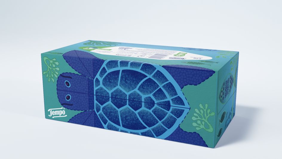
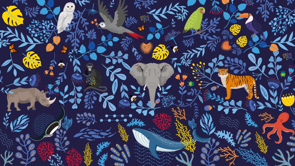
For the design linked to kindness to the planet, WMH&I also brought on board award-winning illustrator Rebecca Sutherland, whose work has appeared on Royal Mail stamps and for brands including Waitrose and Virgin Atlantic.
Her design for Tempo features the Mediterranean loggerhead sea turtle, a globally threatened marine species, which can be cut out and turned into a 3D model once the tissues have been used.
There's also a typographic fingerprint design which reflects each human being's uniqueness, with a closer look revealing that the whorls are formed by handwritten phrases like "There is no small act of kindness" and "Empathy begins with understanding that we all struggle". Two further designs depict other endangered species and striking typography.
WMH&I has created a series of animated videos and website assets to go with the new packaging, including a film showing how to make a model from the loggerhead sea turtle. These are linked to QR codes on the packaging.
Joyful project
"This project bought a lot of joy to the creative department from a broad and ambitious brief came over 20 pack ideas, all linking back to Tempo's thoughtful kindness pillars," says Mark Nichols, creative director at WMH&I. "The five packs taken into production are flying off the shelves as they touch the hearts and minds of Italian consumers."

Emmanuelle Hilson, business director at WMH&I, adds: "At the heart of the Tempo brand is its purpose of bringing kindness to the moments that make us human. We set ourselves the challenge of translating this to packaging which would deepen its meaning and the point of purchase, encouraging repeat purchases and attracting new audiences. Tempo is already seeing the impact among Italian consumers."
Designer and illustrator Rachel Dain also worked on the project, while postproduction was handled by Jason Budgen and Val McCrum.
Editor's Picks


Trending


Podcasts


Editor's Picks
Further Reading