Archetype—Brands looks to the 1s and 0s to create a fresh identity for data firm Precisely
London studio Archetype—Brands has developed a new brand identity for data integrity firm, Precisely, which begins with the foundations of its business – the 1s and 0s of data.
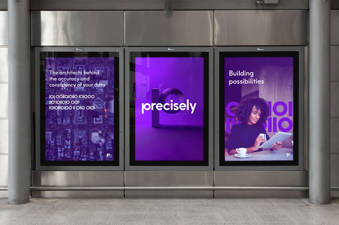
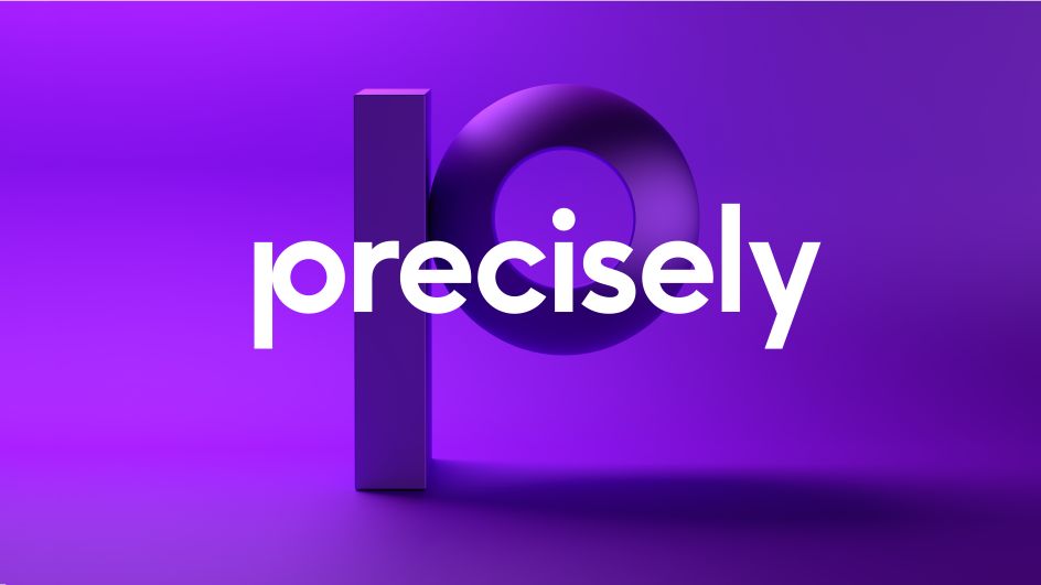
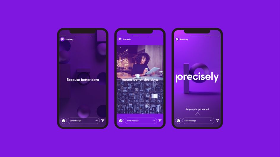
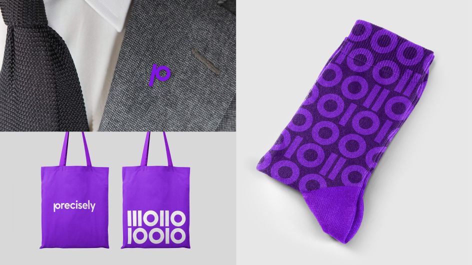
Reimagining that data as a simple but powerful brand language, it extends to animation and a suite of 3D expressions, used around key "brand moments" and in hero placements on the website.
The 1s and 0s were created from a custom display font, Precisely Data, and form the foundation of the Precisely monogram. The logo is constructed from a custom-cut headline font, produced with F37, with "perfect" geometry that denotes accuracy and consistency. All of which is combined with a distinct, digital-first colour palette, with Precisely Purple leading as a key brand signifier.
Precisely is the result of Syncsort acquiring Pitney Bowes Software & Data last year, bringing together decades of experience to create a new leader in its field. Alongside the new identity and fresh name, the scope of work included two brand films for internal and external launch, identity guidelines, custom icons and website design.
"In a sector awash with jargon and bland, impersonal brands: Precisely strikes a different tone: bold and bright, confident and human," says Richard Parkinson from Archetype—Brands. Design Director David Moloney adds: "This project was built on a great client-team relationship, which allowed us to design a brave brand that built on our big idea – that of helping the world’s businesses to trust their data."
Editor's Picks


Trending


Podcasts


Editor's Picks
Further Reading