A LINE gets precise with an identity for a revolutionary cybersecurity company
Creative studio A LINE has rebranded Abnormal Security, a "revolutionary" cybersecurity firm that uses data science to provide complete protection from email attacks, giving it an "approachable and human" new identity.
The San Francisco and London agency worked closely with Abnormal's senior team to develop a fresh brand strategy, tone of voice, and visual identity that reflects its "uncommonly precise approach" to solving "the world's biggest cybersecurity challenge".
The cornerstone of the work is the idea of precision: something inherent in the accuracy of Abnormal's core technology, and in the organisation's total focus on customer needs. "The platform's ability to understand the nuances of human behaviour, identifying and blocking anything that isn't 'known good', puts people at the centre, meaning that while competitors evoked danger and anxiety, Abnormal differentiates through a brand that feels approachable and human," says James Trump, creative director and brand strategist at A LINE.
To create this sense of precision, A LINE built the entire identity system on a grid. Designed to be used across imagery, illustrations, applications, animations, and iconography, the grid also represents the AI inherent in Abnormal's technology – specifically how it provides a depth of insight into people's behaviour that would be impossible for an individual to do on their own.
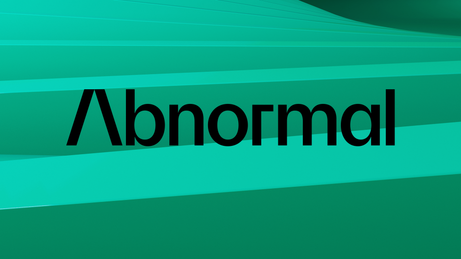
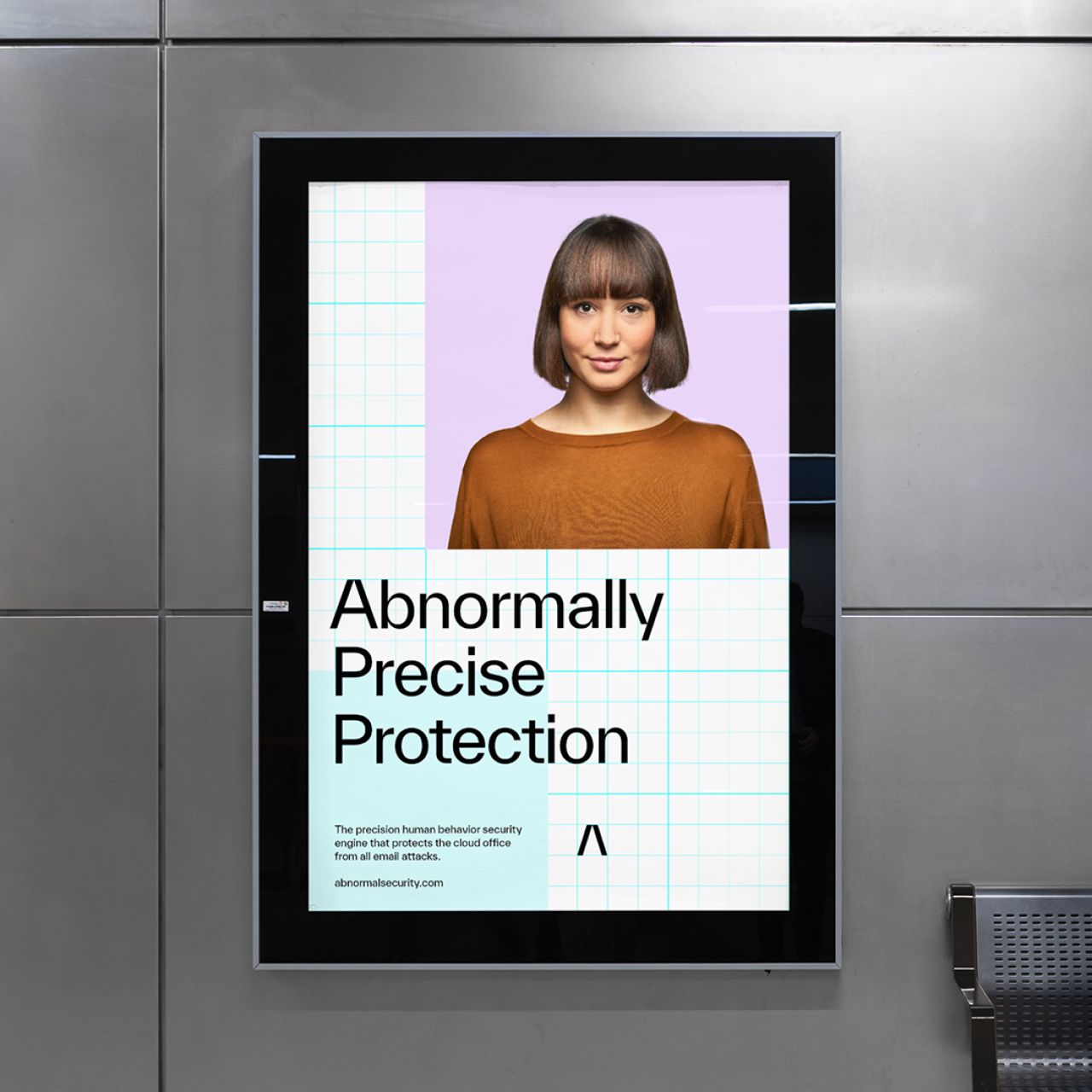
For the wordmark and symbol, A LINE wanted something that would be a "bold and simple" representation of Abnormal. Based on the Everett typeface, the custom-designed wordmark is crafted and intentional with a symbol on an abstracted 'A' that uses a triangular outline and acute points. "It's designed to represent Abnormal's precision and acts as a high-impact shorthand in situations where the full wordmark is too large or too small," explains James.
"The goal with typography was something that felt dynamic, but also high-contrast," he adds. "We used Everett which is perfectly balanced, while still communicating a fresh and accurate look and feel. To make the type truly ownable we also used stylistic alternates such as a lowercase 'a' and the number '0'."
For photography and imagery, A LINE wanted something that balanced approachability with precision. It used a combination of portrait photography, environmental photography, and 3D renders, adding everything to the grid as an overlay to create brand consistency while also representing the way the technology scans and protects users. Then, to differentiate from cybersecurity competitors, the studio used reds and blues to evoke danger or signal trust. "Brand colours were carefully selected to balance technical and approachable," says James. "We used a restricted primary palette of black and white, with purple for CTAs, to feel technical and precise, and a secondary palette of yellow and greens that felt warmer and more human."
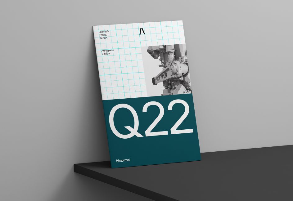
Custom iconography and illustrations complete the identity, with each icon drawn to take inspiration from the forms in the logo and the unique bevel in the characters. "Illustrations were considered, using keylines and geometric shapes to feel technical and precise, while also simplifying the complexity of the platform," says James.
For Abnormal's refreshed website, A LINE partnered with Uniforma to apply the new identity online. And to further bring the brand to life, it built a set of flexible but precise 3D animated assets to be used across the site and other key marketing channels.
Editor's Picks


Trending


Podcasts


Editor's Picks
Further Reading