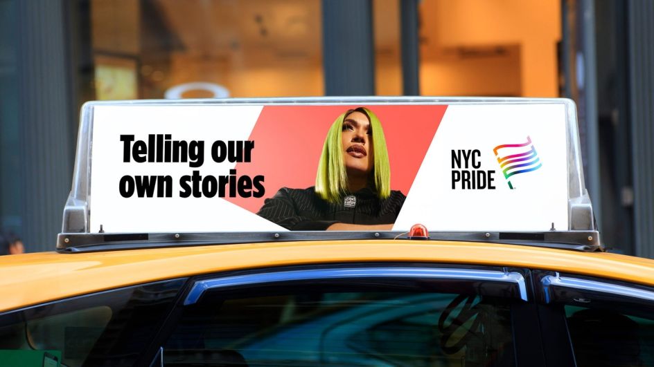
NYC Pride gets a brand overhaul by Lippincott with an iconic flag emblem at centre stage
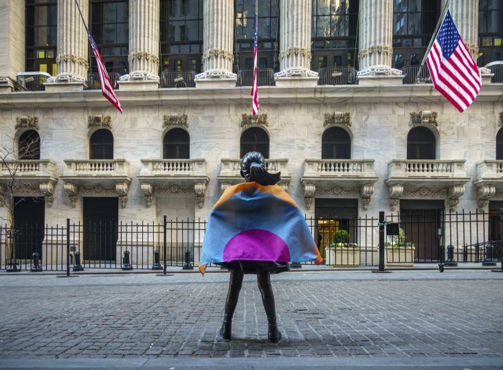
Global creative agency Lippincott has given NYC Pride a fresh new look for 2022, focusing on community and centred around an instantly identifiable flag emblem that is an iconic symbol of the movement.
Heritage of Pride is a non-profit born out of the Stonewall Uprising. It is the organiser of the NYC Pride March, The Rally, and other such events with a legacy of unity, protest, advocacy and, of course, fun. It recently briefed Lippincott to overhaul its brand for NYC Pride, as it recognised it had an inconsistent identity that changed each year to reflect the event's annual theme. Its team recognised that to "drive equity and awareness around the organisation's incredible impact, it needed an identity that endured," according to Lippincott.
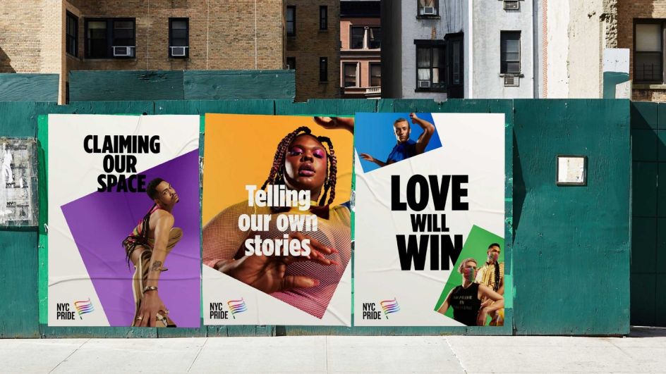
The agency began by creating a new positioning to act as a foundation for the brand and experience. The new brand purpose is "to inspire and empower" the LGBT+ community and "to proudly love and live their truth". Lippincott crafted four key commitments to support this statement that outline what the brand delivers to its audiences.
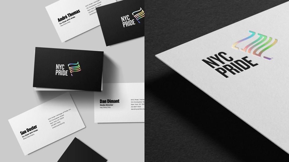
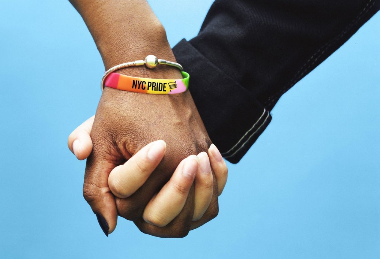
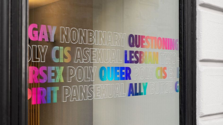
Therefore, the new visual identity is centred around the instantly recognisable emblem based on the iconic Pride flag, a universal symbol of safety, community, and allyship worldwide. It lies at the heart of the brand and subtly features the letters 'NYC' with an adaptive gradient sitting behind it to help distinguish between four different subgroups within the community.
The symbol is paired with Monotype's Gotham and Knockout, two typefaces designed by New York-based Hoefler&Co, which are now part of the Monotype library following a merger with the historic foundry last October. Knockout was chosen for its roots in the eclectic typography of 19th-century broadsides. It sits well with the friendly openness of Gotham, a modern take on a style of sign lettering that's "quintessentially New York" and whose "element forms were made to express as broad and inclusive a range of voices as possible," explains Lippincott.
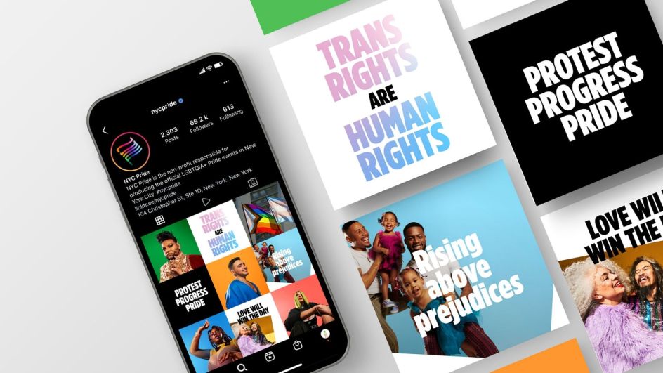
The supporting visual system is bold, direct, and designed to work across various platforms and adapts to evolving annual campaign themes without losing its strong central identity. "It lends the brand flexibility to consider tone and context, dialling up exuberance when needed in celebratory events throughout the year, but also leading with a strong, clear voice in moments of reflection and protest," says the agency.
Launched this week, the refreshed NYC Pride brand has been rolled out across its channels, including its website and social media networks. In future, the new brand will underpin how Heritage of Pride works with staff, members and volunteers to develop stronger connections with the community and its partners. "Ultimately, it enables the organisation to do more in pursuit of its important mission," says Lippincott.