AIGA NY unveils new identity rooted in community and New York's creative energy
The largest chapter of the American Institute of Graphic Arts has launched a new identity and strategy designed to strengthen its role as a civic space for design and reaffirm its place at the centre of New York's creative community.
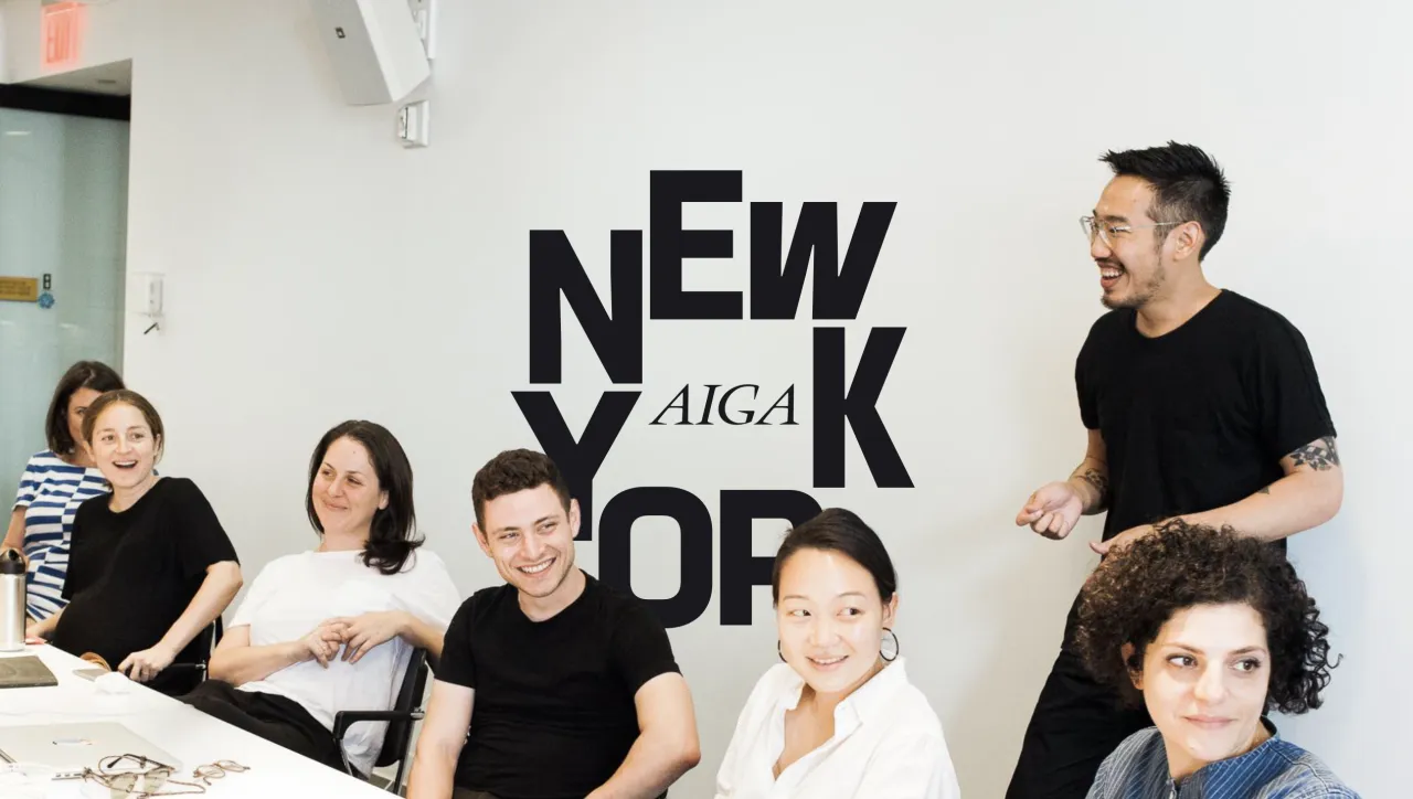
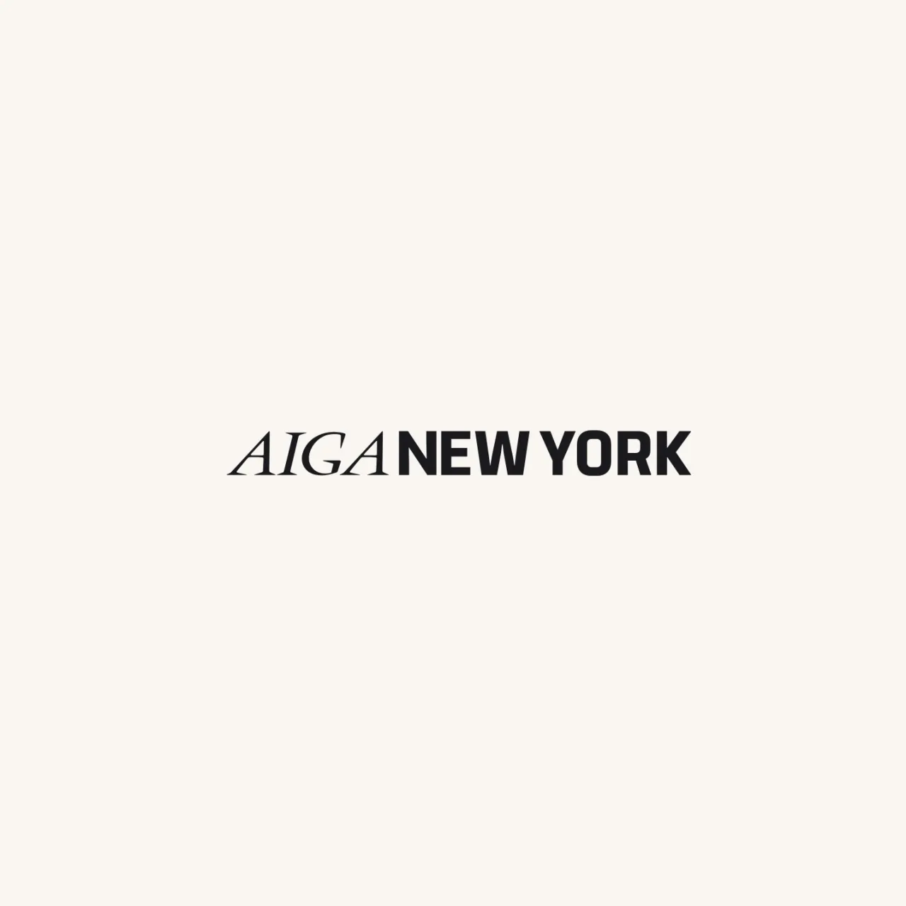
AIGA NY has revealed a new logo and strategic direction, marking one of the organisation's most significant shifts in more than four decades. which remains the largest within the national AIGA network, says the refreshed identity reflects a renewed commitment to community, visibility and open dialogue across the design industry.
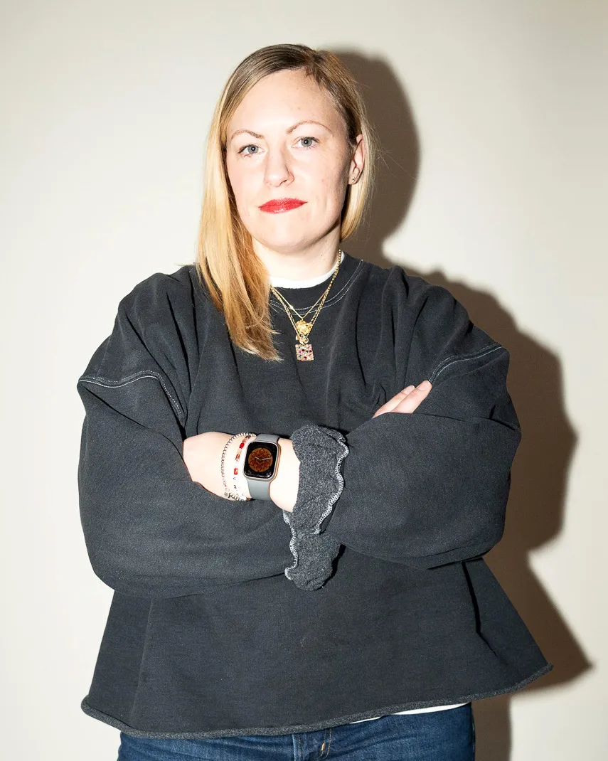
Announced today in New York, the update arrives at a time when the city's design ecosystem is both expanding and evolving. Stacey Panousopoulos, executive director of AIGA NY, says the work is less about reinvention and more about clarity.
"This project isn't about starting something new, it's about actively showcasing what we're already doing so well," she explains. "Our focus has always been on organising and bringing voices together to spark meaningful conversations and create experiences that unite the design community, and we want to highlight and amplify that unique role."
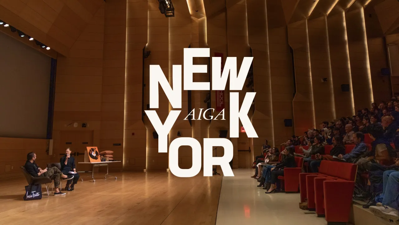
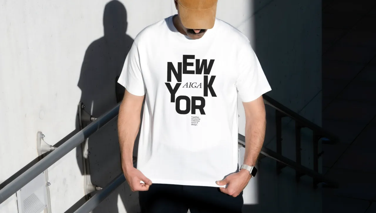
The new strategy positions AIGA NY as a kind of civic square for designers, where people gather, debate, learn and support each other. It also aims to address long-standing misconceptions about the chapter's remit, making its mission unmistakable. At its core, AIGA NY is about community-building and shared ambition rather than top-down programming.
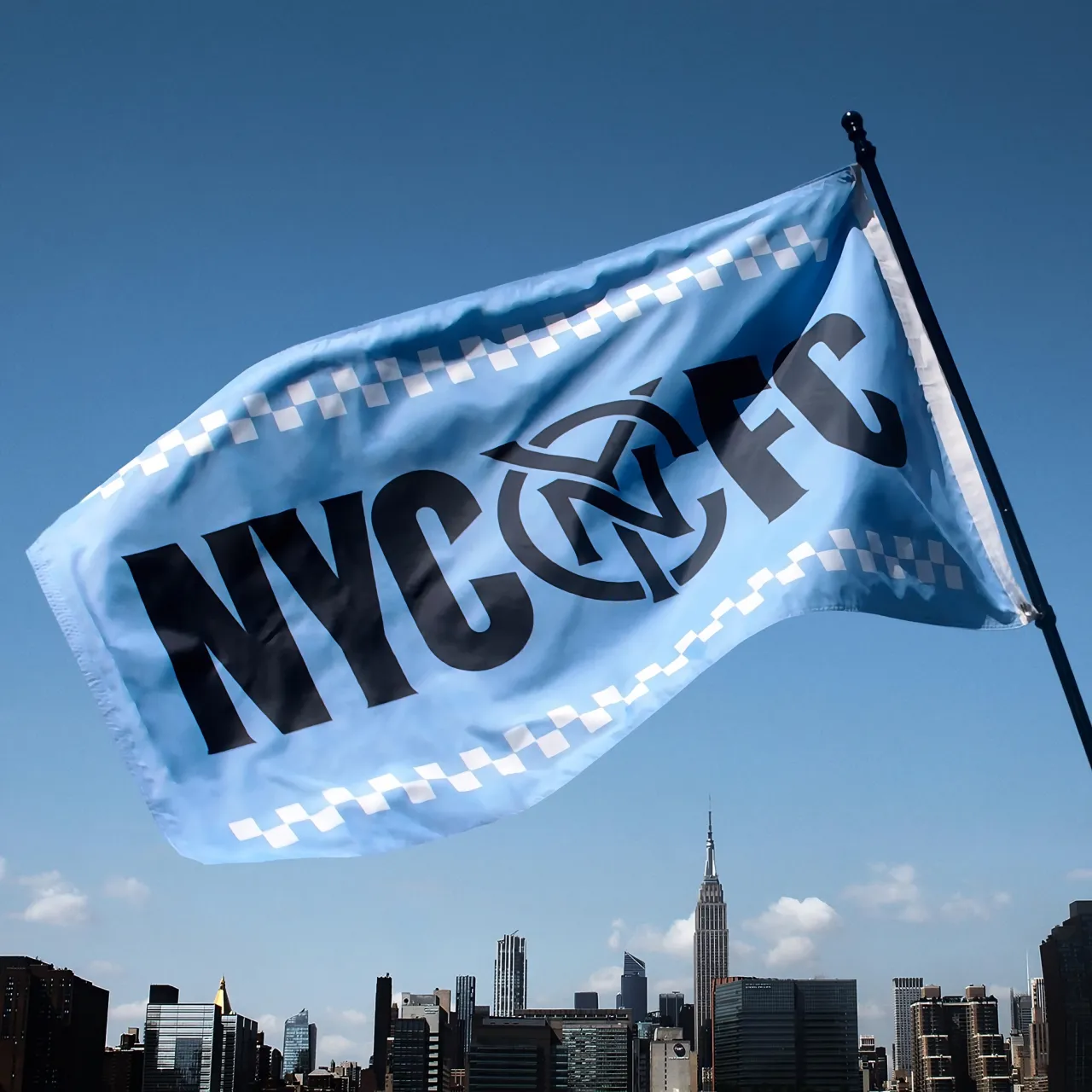
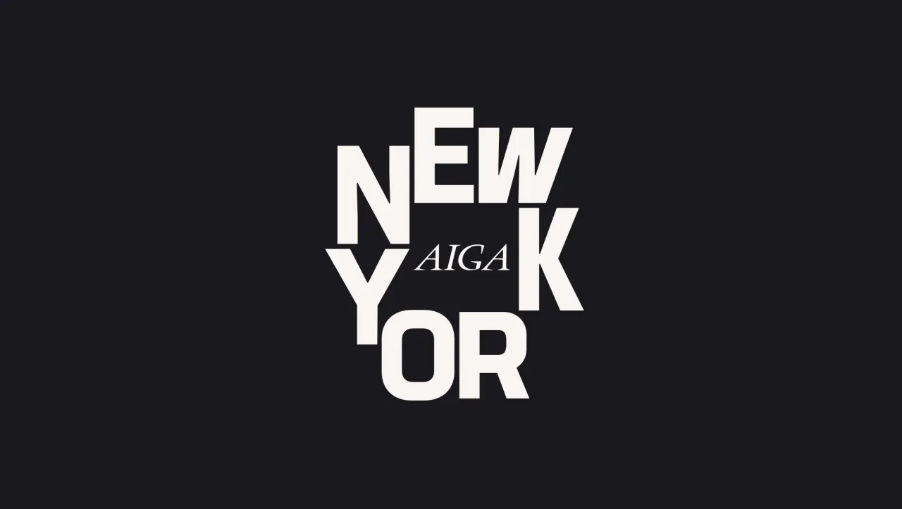
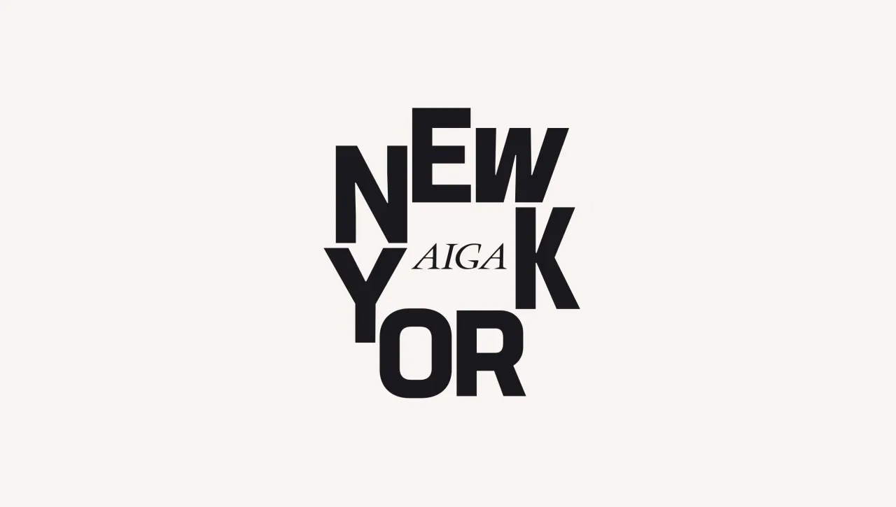
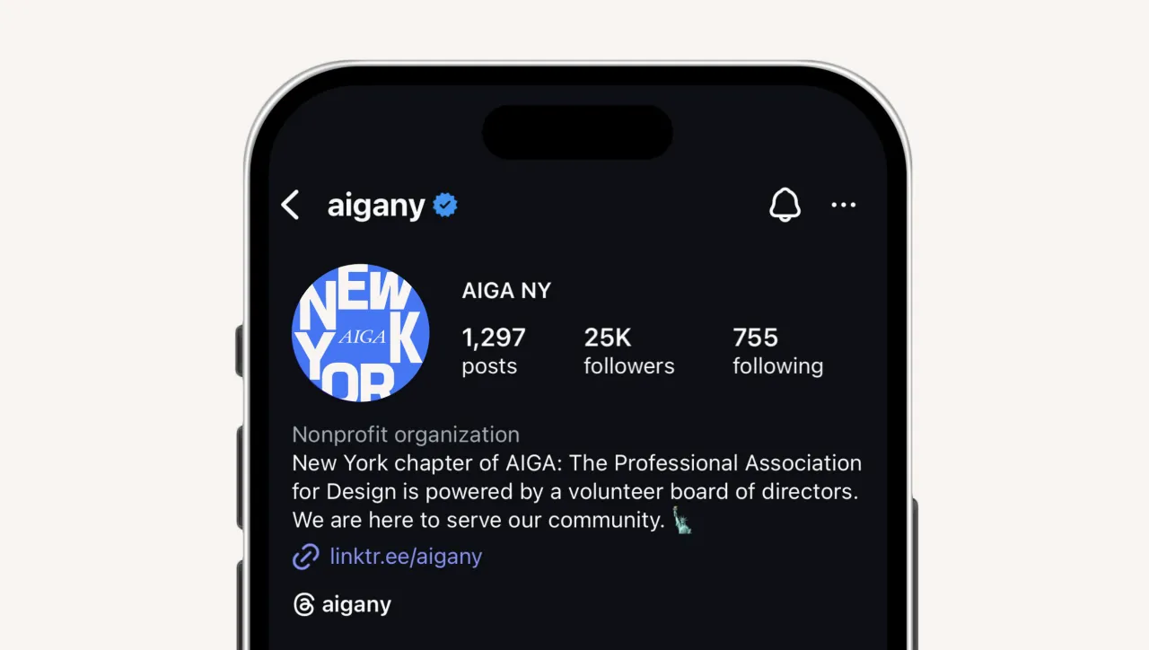
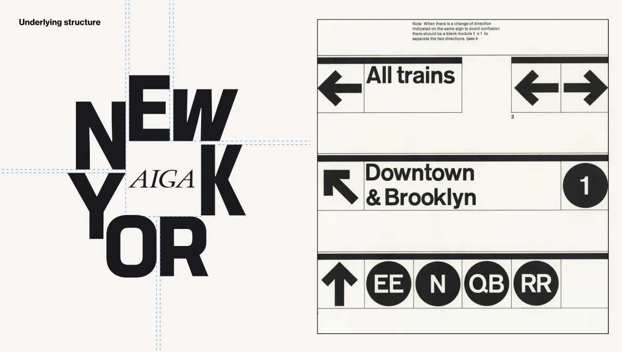
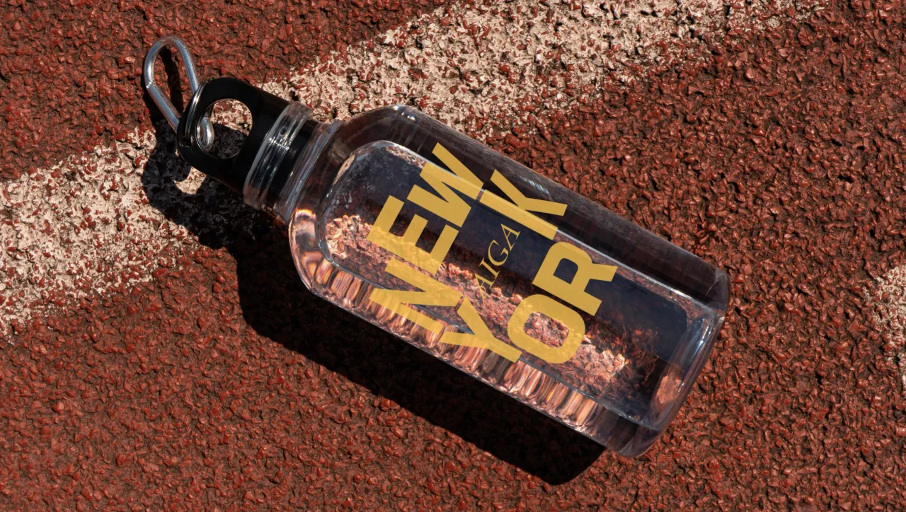
At the centre of the refresh is a custom logo by designer and native New Yorker Christopher Guerrero. Rather than relying on the usual New York visual tropes, Guerrero rooted the mark in the city's rhythm and structure.
The letterforms sit around the original AIGA box, creating a pocket of negative space that becomes the emblematic "town square" in a neat, almost architectural gesture.
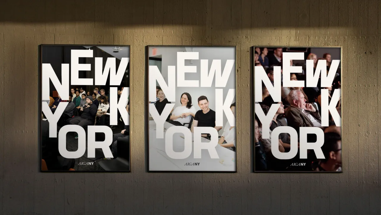
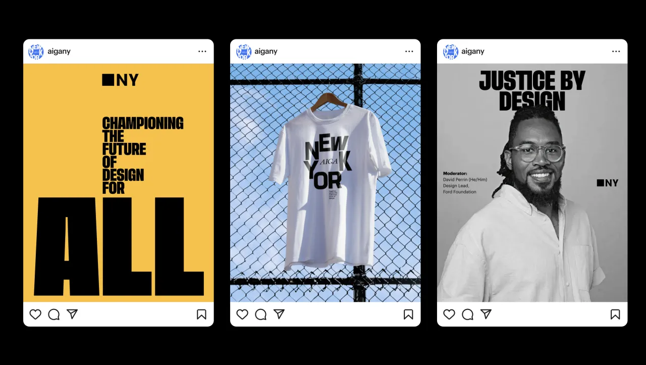
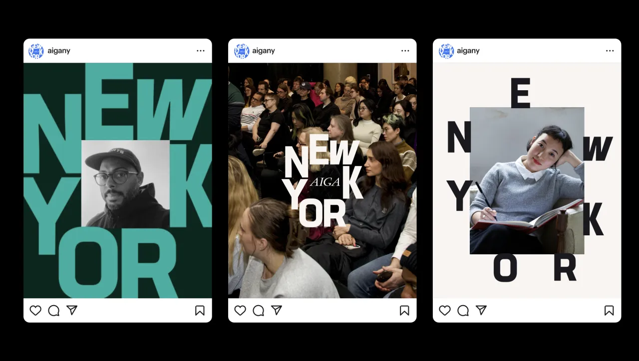
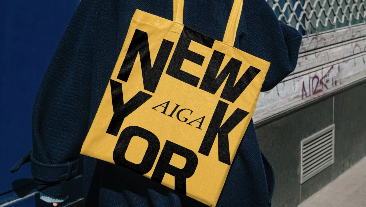
Guerrero worked with further design support from former board member Raven Mo and approached the identity as a flexible system rather than a fixed badge. He says: "Designing for New York is always a challenge because it's so easy to fall into clichés.
"We wanted to tell a story that felt authentic to the city's creative energy without leaning on overused tropes. It was about capturing the essence of New York's system and expression, its structure and chaos, and translating that into a design that resonates with designers and creatives alike."
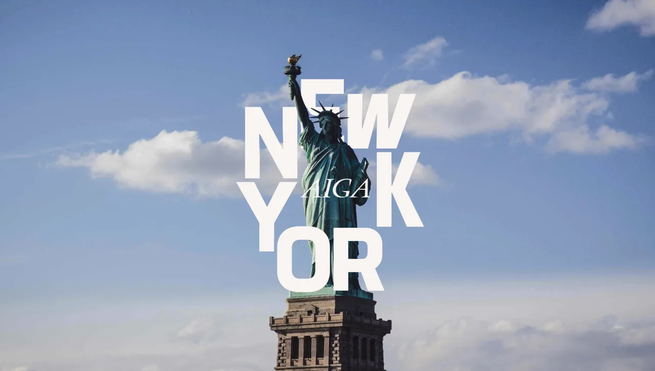
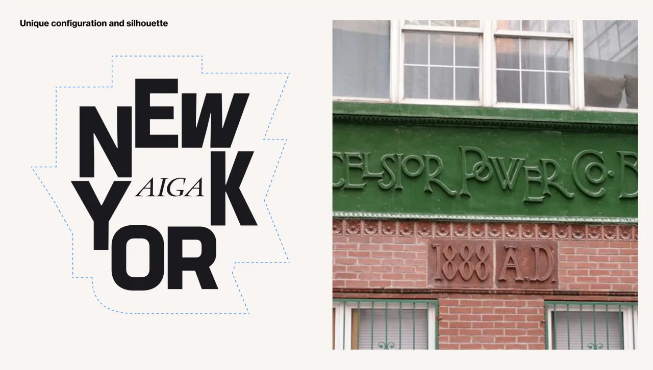
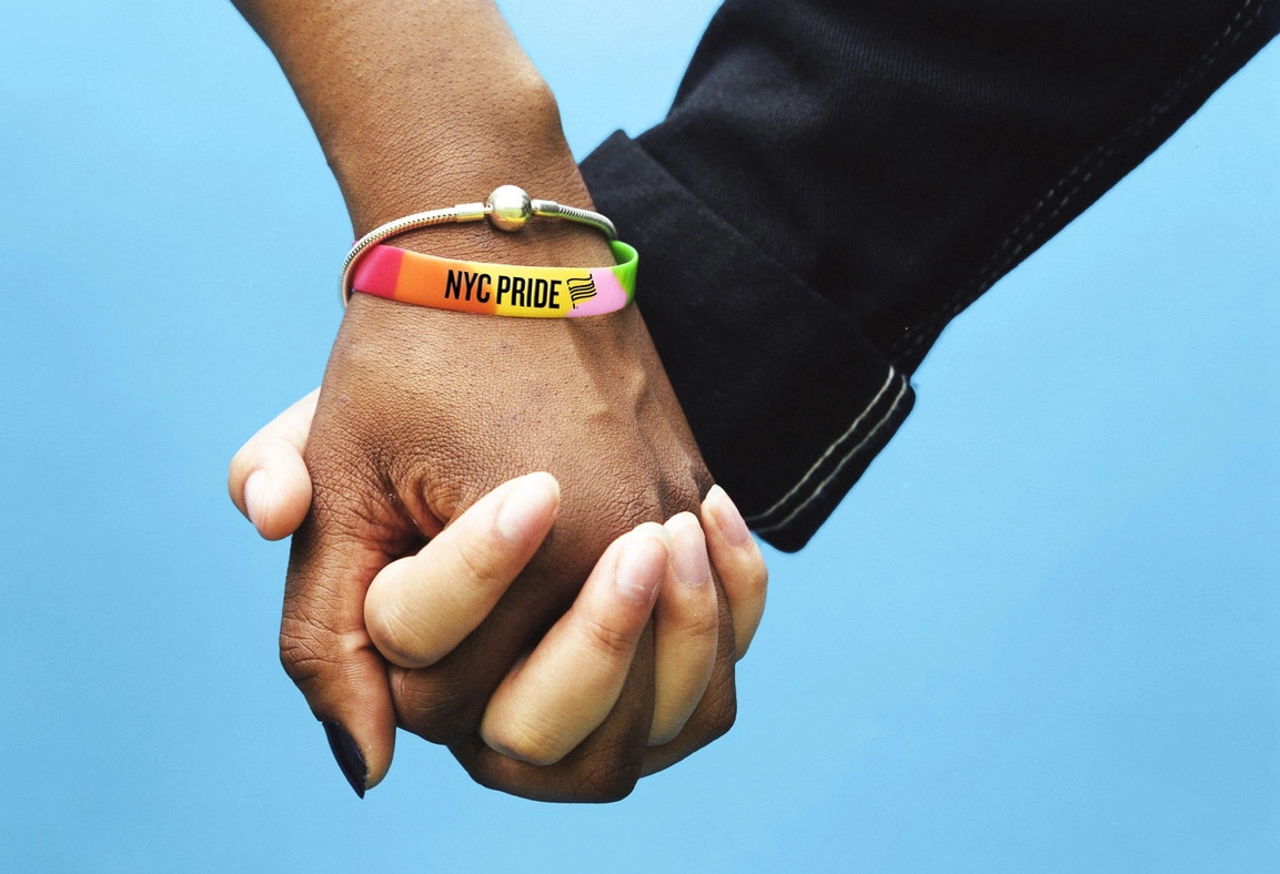
Colour plays its own role in that story. Instead of predictable flag references, the palette draws from the streets with scaffolding greens, pavement blacks, soft sidewalk whites and a light green that nods – subtly – to the Statue of Liberty. Locals would immediately recognise the visual language without it feeling heavy-handed.
Stacey adds that the result reflects the chapter's DNA, saying: "This new identity is more than just a logo, it's a reflection of who we are as a chapter and as a community.
"We've always been about creating spaces where designers can come together, share ideas and feel represented. This logo is a conversation starter, a symbol of our legacy and town square."
Over its 43-year history, AIGA NY has welcomed more than 90,000 attendees to events, exhibitions and programmes, often collaborating with groups such as the Queer Design Club. The chapter's Board of Directors has now formalised three guiding pillars – elevating diverse voices, celebrating design excellence and advocating for stronger industry standards – which anchor the new strategy.
As the birthplace of AIGA, New York continues to shape the organisation's wider direction. Stacey believes the new identity sets an important precedent: "The DNA of AIGA is New York. We take that DNA, make it shine – and want to encourage other chapters to do the same, to activate and celebrate what makes them unique."
The rollout begins this month and will gradually appear across AIGA NY's website, event materials and digital platforms. It marks only the second time the chapter has adopted a unique logo, the last being its influential 2007 redesign led by Carin Goldberg.
Editor's Picks





Trending





Latest Jobs
Senior Designer at BKC
Full-time·£50k-£60k
Graphic & Motion Designer at The SHARP Agency
Full-time·Leeds·£26k–£33k
Midweight Editor at Earworm
Full-time·Bristol·£28k-£32k
Midweight Designer at Catalyst Creative
Full-time·London·£32k-£36k
Design Director at Human After All
Full-time·London·£66k–£88k
Account Manager at BUILDHOLLYWOOD
Full-time·London·£34k–£38k