Coffee with a twist: Robot Food creates hard hitting identity for Black Twist Hard Coffee
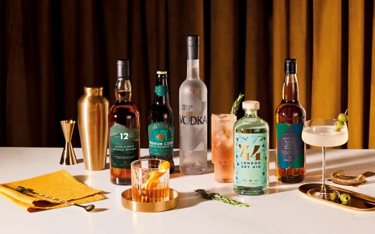
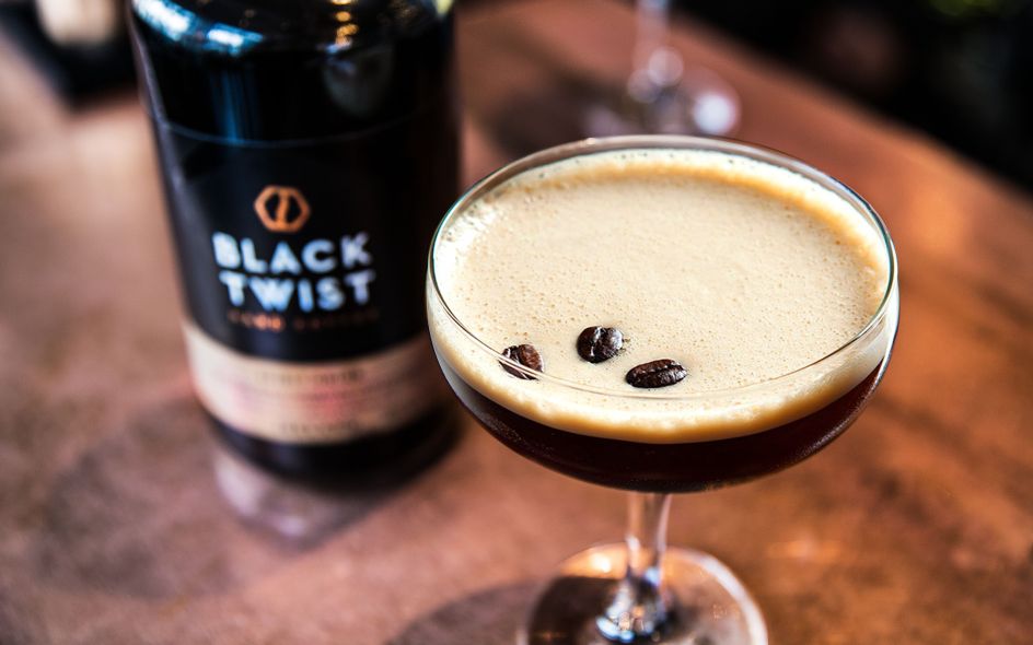
What do you get if you mix coffee with whiskey? Aside from bucket loads of energy, you get Black Twist – a new 'hard coffee' created for the cross-over bar and coffeehouse culture.
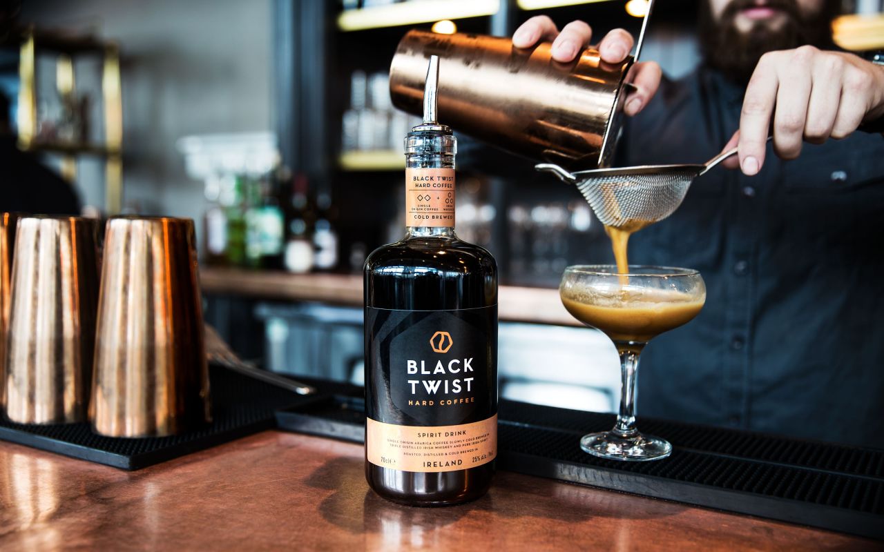
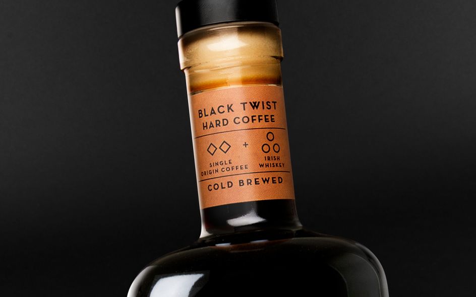
For something that packs so much punch, a unique brand identity was required. Tasked with creating that, was Robot Food, whose team came up with the memorable tagline, 'Hard coffee', to differentiate the product from more traditional coffee liqueurs.
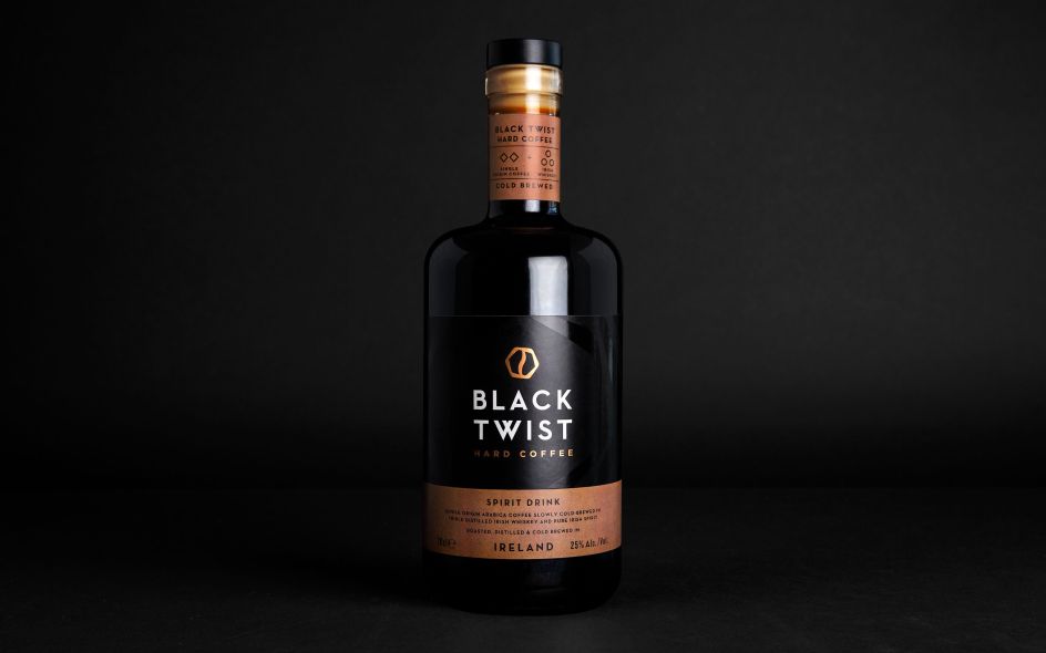
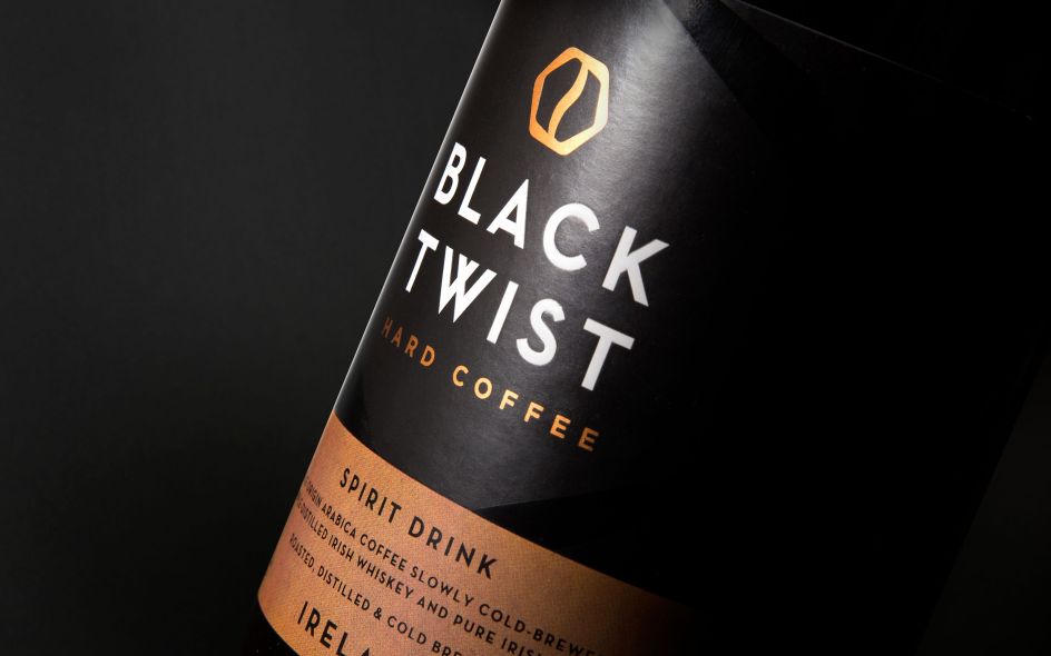
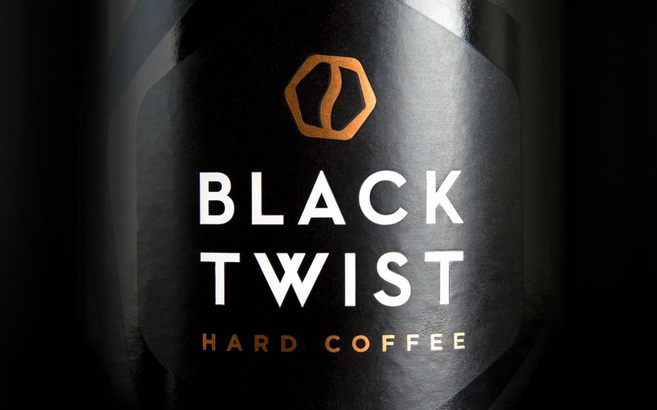
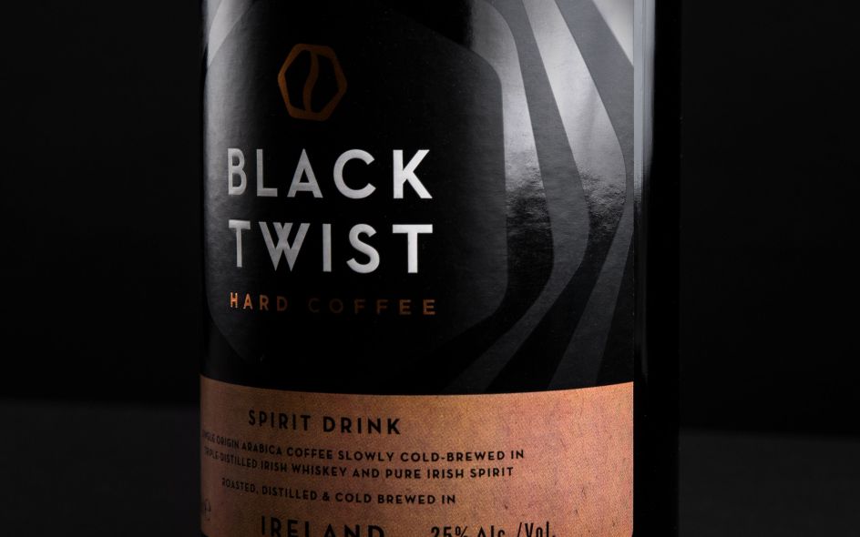
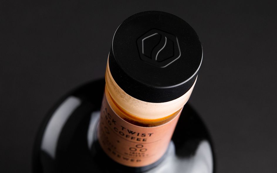
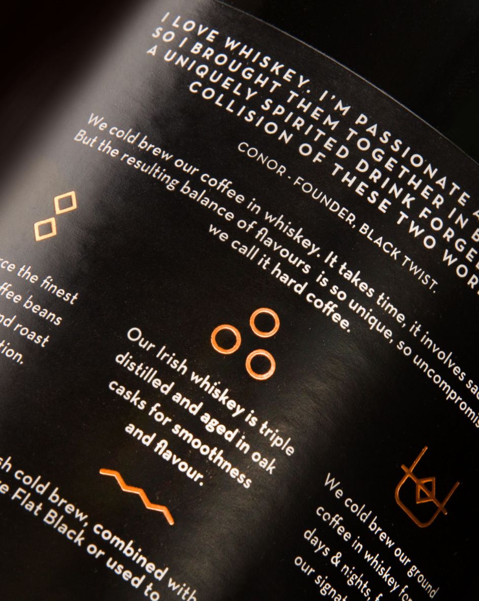
The team then created a distinctive white logo against a striking black and copper design with a slick, subtle 'twist' pattern. The 'crafted' texture in the cardboard-effect label evokes artisanal cues, and clear pack messages and icons capture the Irish provenance and tell the tale of the two key ingredients, echoed in the punchy brand story. The distinctive bottle shape with its hard lines and broad shoulders completes the look.
Martin Widdowfield, Robot Food's Creative Director, said, "Black Twist packs a punch in terms of flavour, versatility and with its innovative attitude. By using strong colourways and a bold visual language, we succeeded in communicating the product's craft and intensity, and made sure there was plenty of distance between Black Twist and the 'sweeter', less 'intense' products on the market."
If this sounds up your street, the premium crafted spirit drink with 25% ABV will soon be winging its way to bars, restaurants and gastropubs near you, so keep your eyes peeled. And check out more of Robot Food's work at robot-food.com.
All images courtesy of Robot Food
Editor's Picks


Trending


Podcasts


Editor's Picks
Further Reading