Bureau Mirko Borsche creates the branding for Venice's Art Biennale Pavillion
At the Venice Biennale, every pavilion has to work hard to be noticed; and while that comes down to the art it houses, it also means the branding and graphic design has to be pretty special.
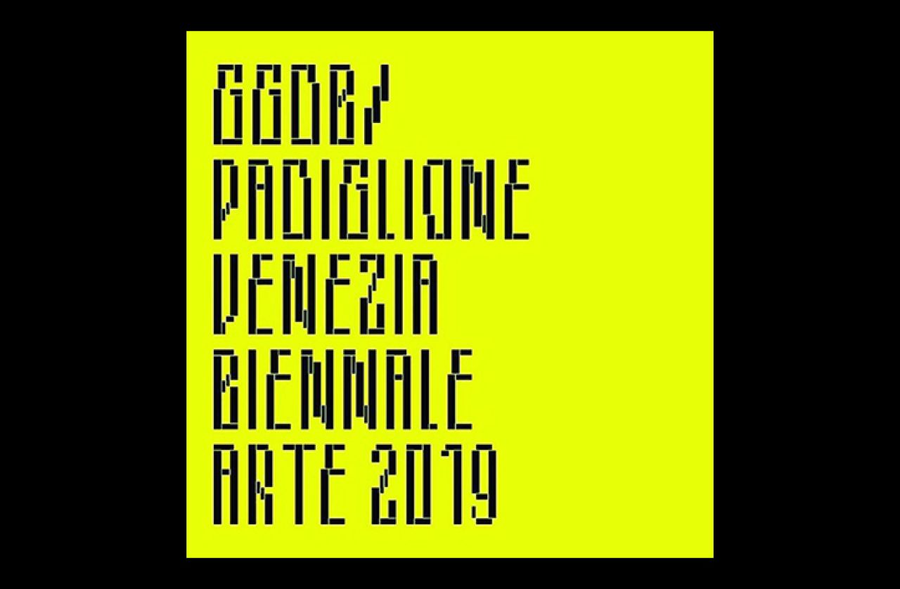
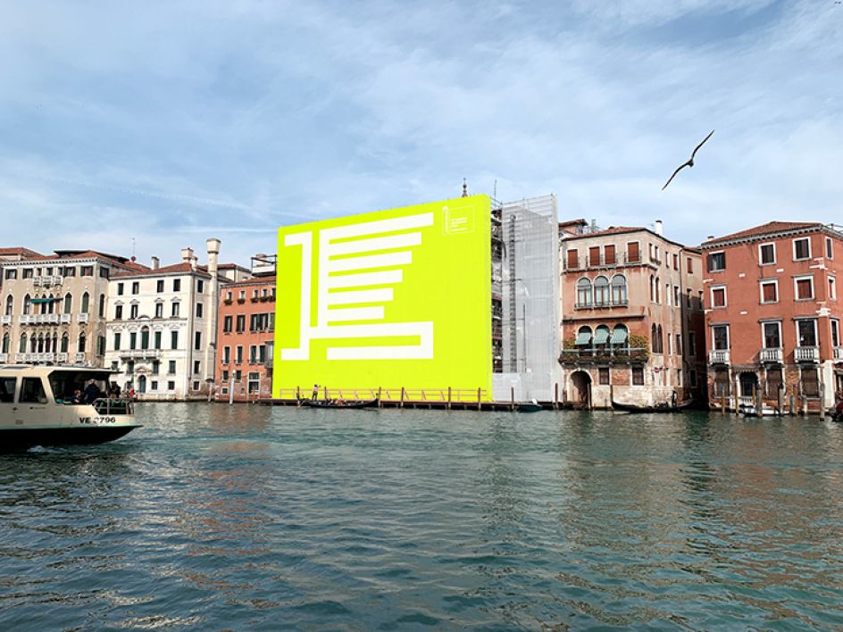
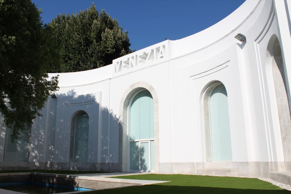
German graphic designer Mirko Borsche was commissioned to create the branding for the Venezia Pavilion in the main Giardini – a big deal, since this represents the city of Venice itself and is the only city to have its own pavilion.
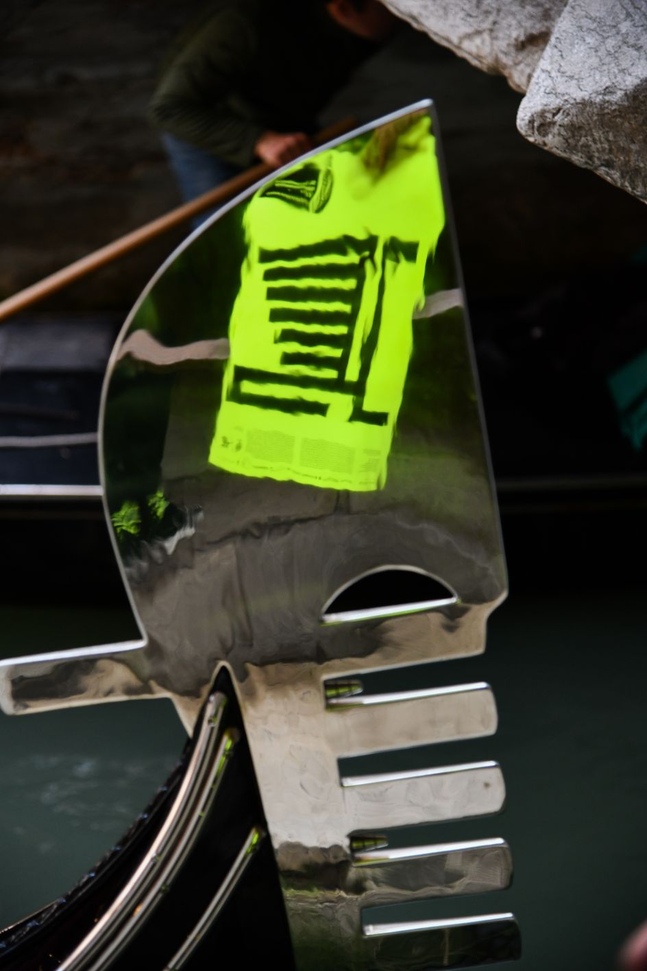
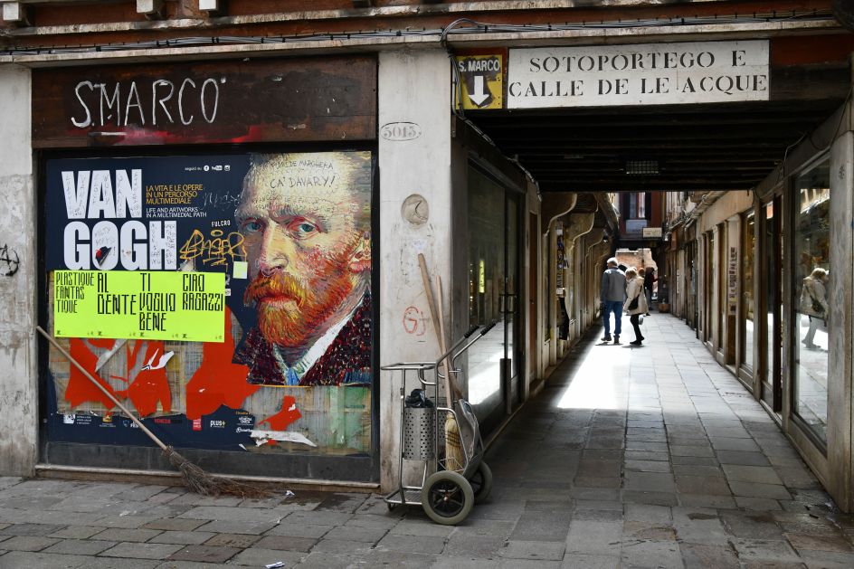
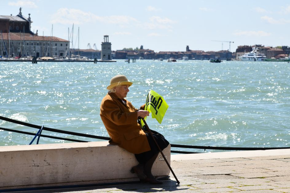
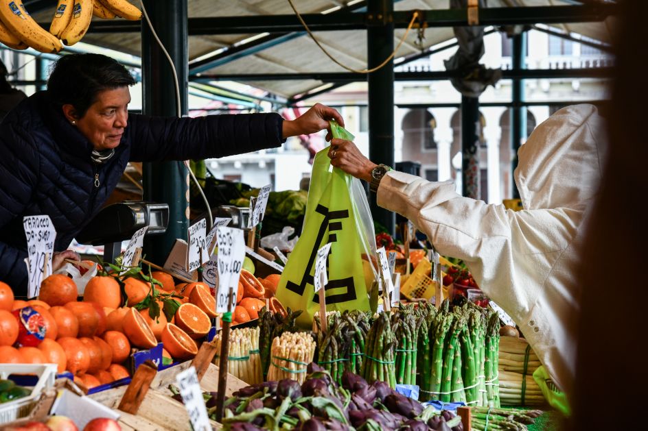
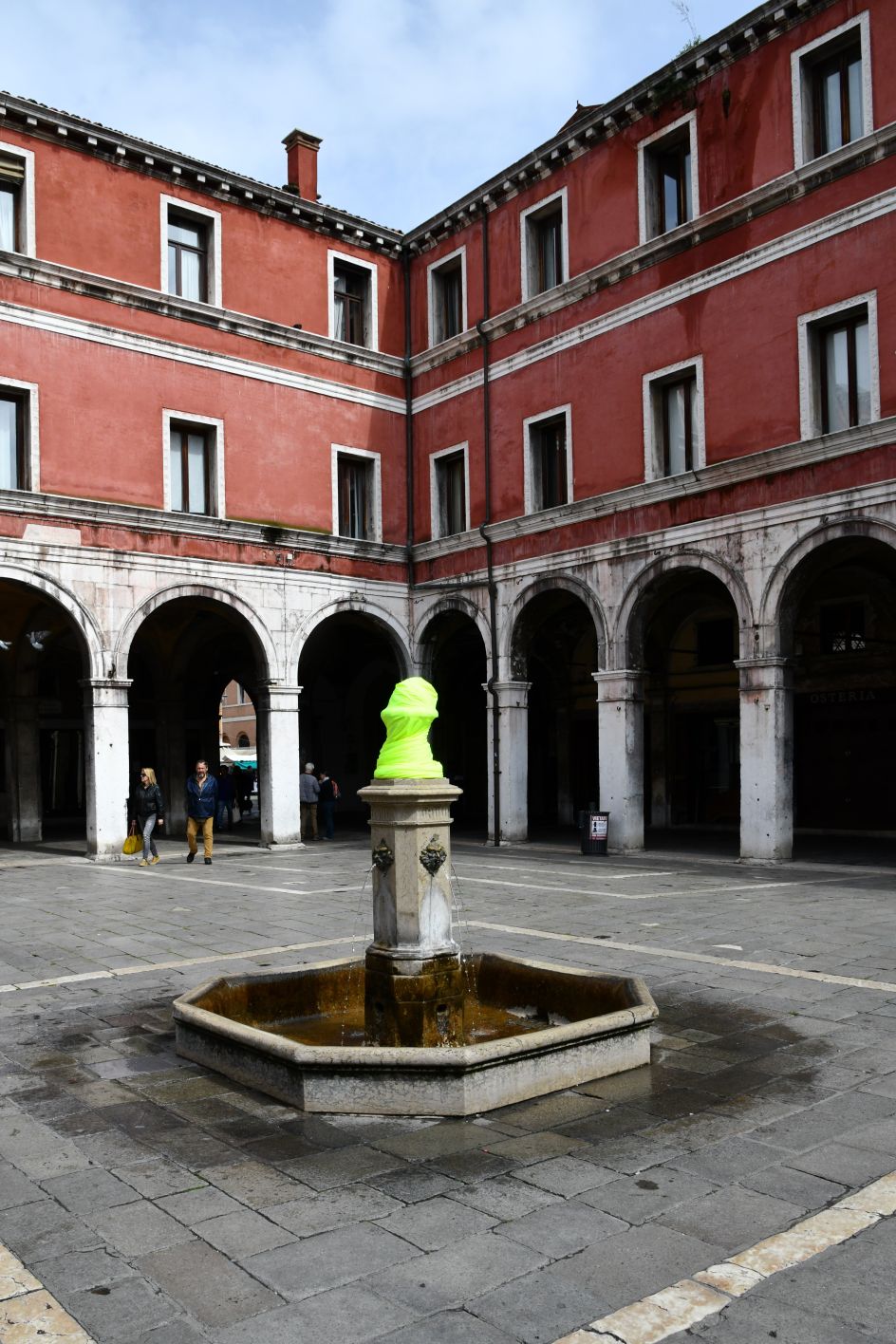
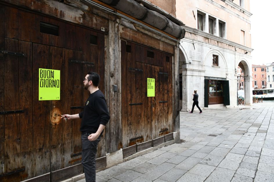
Borsche created a new abstract neon yellow motif inspired by the symbol of Venice – the lion of San Marco, which appears across the city on everyday objects and buildings, including signs, posters, flags and public transport and on the façade of one of the first and oldest hotels in Europe, Palazzo Ca da Mosto. As such, it’s been posited that the symbol could become not just a symbol for the pavilion, but for Venice itself, and was created to physically "go viral".
Borsche was brought in to work on the project by Stelios Kois, a Greek architect who co-curated the space, who he had worked with on a previous project.
The lion motif is deliberately reduced and abstracted, and the branding also uses simple geometrical graphic elements that work to represent the six boroughs of Venice in the lines of its wings.
“By making this symbol big and the information about the Pavilion small, we knew that most people would misinterpret it as the corporate identity of the Biennale, which strongly relates to the concept of fake news,” Borsche told It’s Nice That.
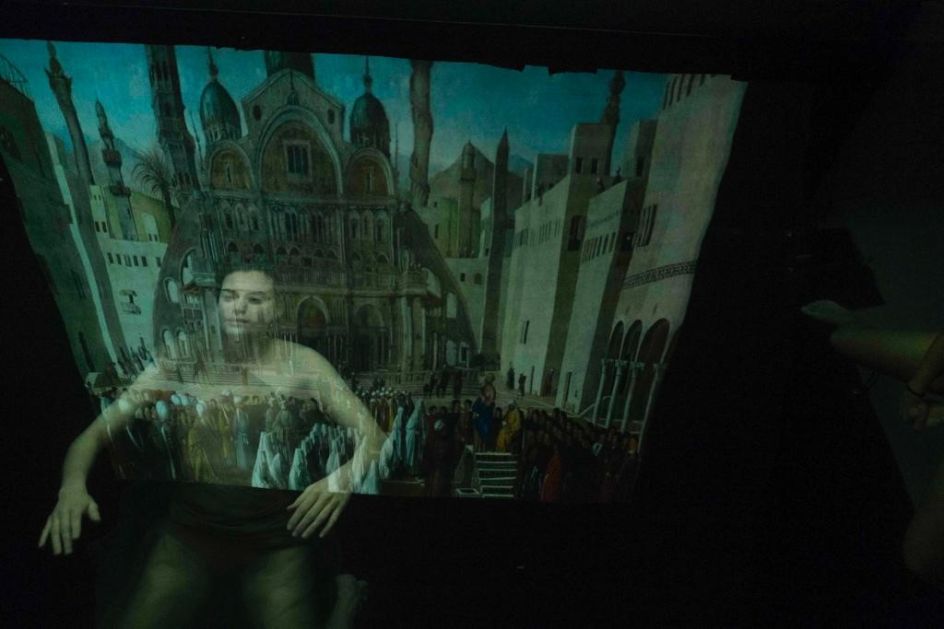
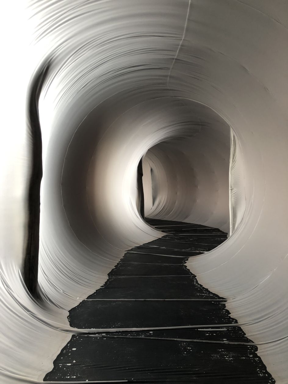
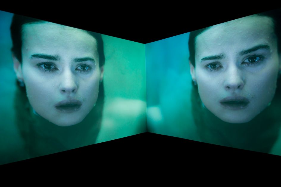
The Venezia Pavilion exhibition tells the story of the city through an immersive installation engaging all the senses by seven artists including Plastique Fantastique, Mirko Borsche himself and Fabio Viale, as well as a city-wide arts initiative.

Editor's Picks


Trending


](https://www.creativeboom.com/upload/articles/90/908fdb6378db1e95d12595416f54e6336d5e80b8_732.jpg)
Podcasts


Editor's Picks
Further Reading