Brand Brothers' modular identity makes all the right connections
2020 has been a harsh year for anyone involved in the restaurant trade. So here's hoping this beautiful identity by Brand Brothers will give Locacuisines, the French leader in ephemeral restaurants and modular kitchens, a bit of a lift.
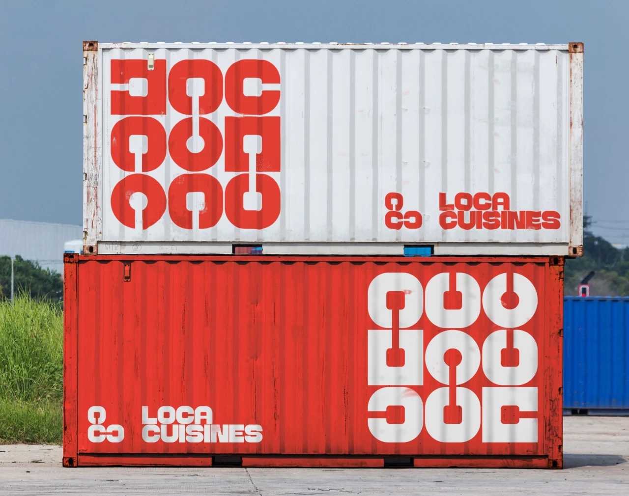
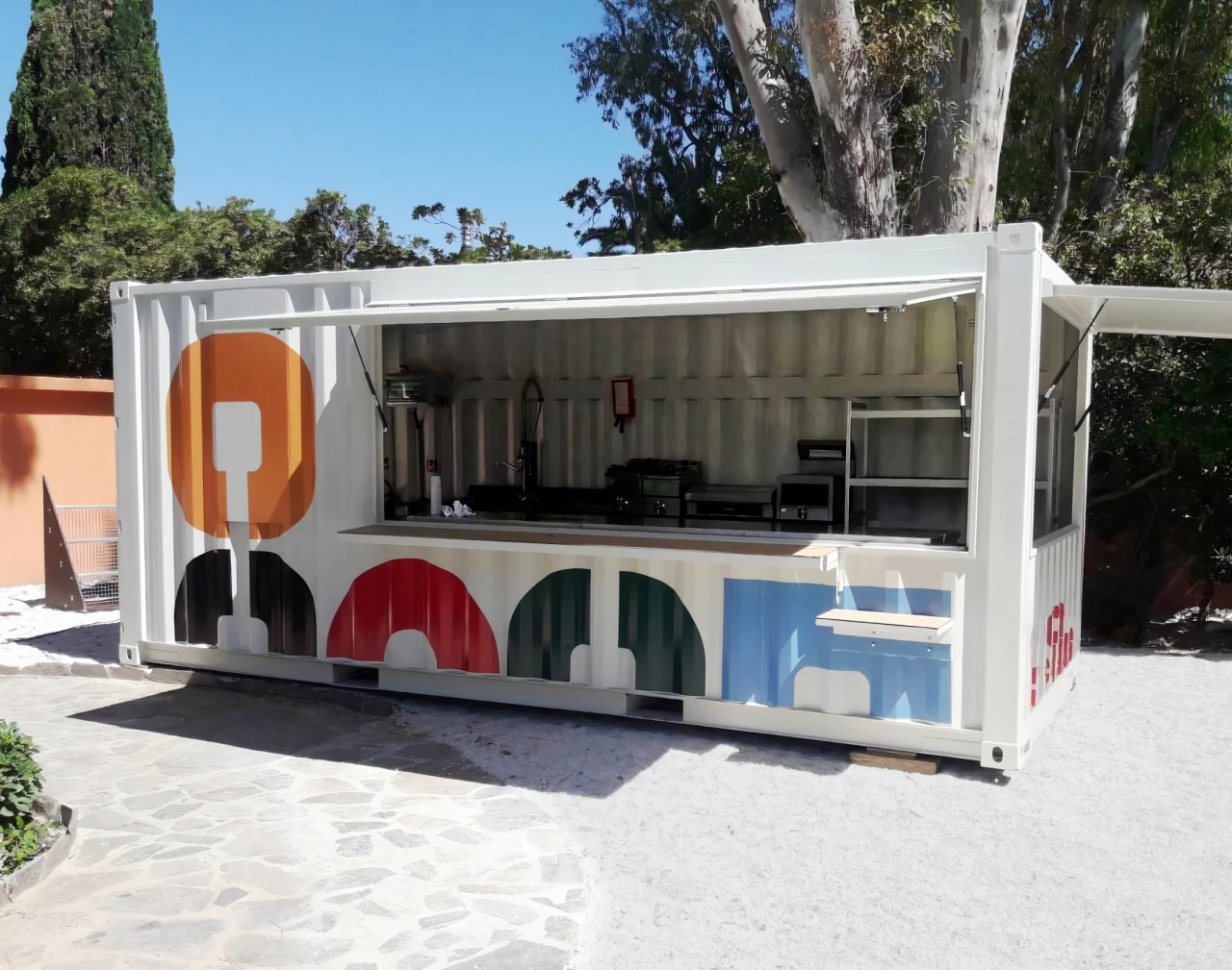
Based in Toulouse, Locacuisines is an unusual business: basically, they assemble mobile units to form temporary food courts, for anywhere between 10 and 10,000 people. Locacuisines has equipped office areas, sites under construction, schools, hospital groups, Disneyland Paris and a ski resort in the French Alps, amongst others.
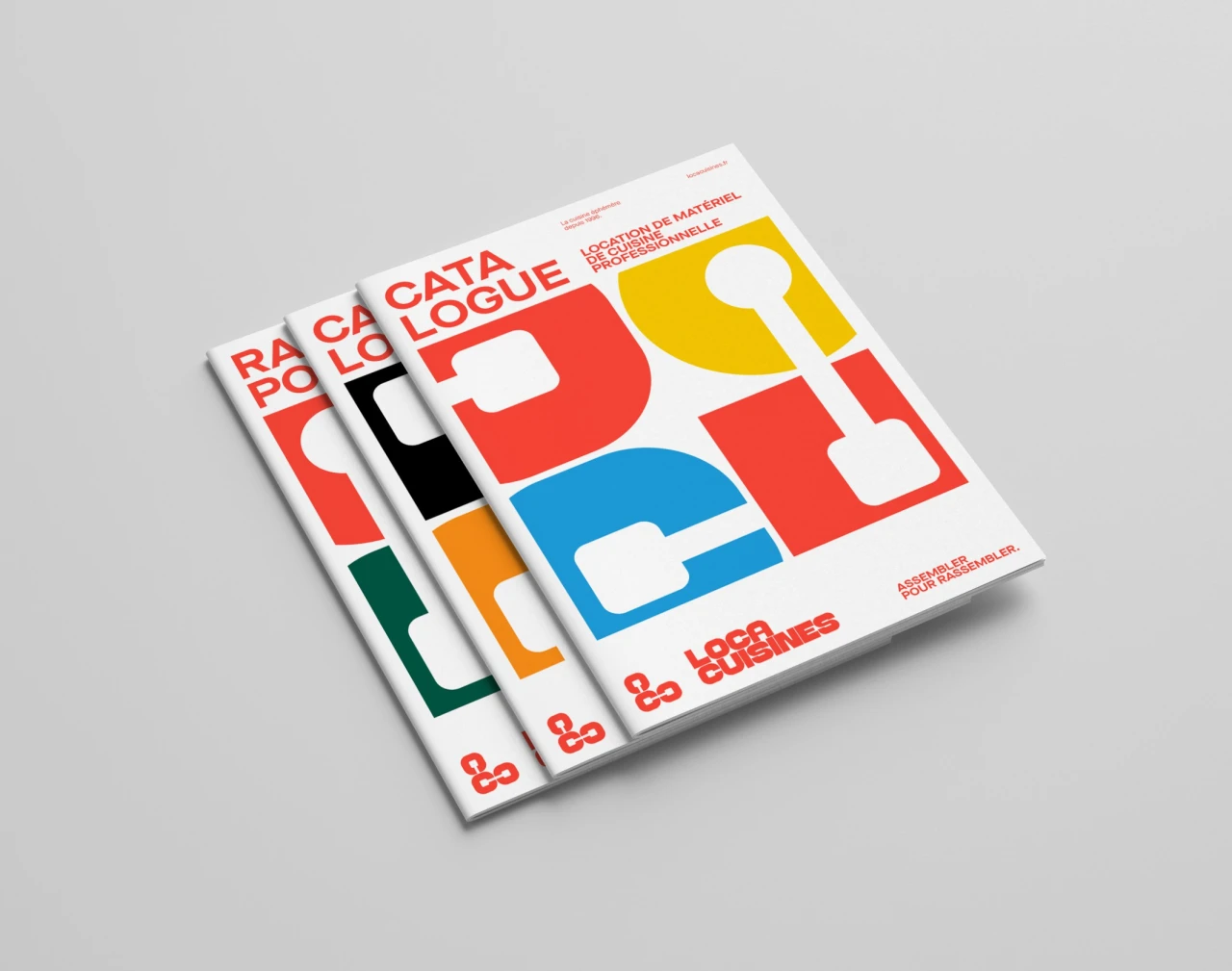
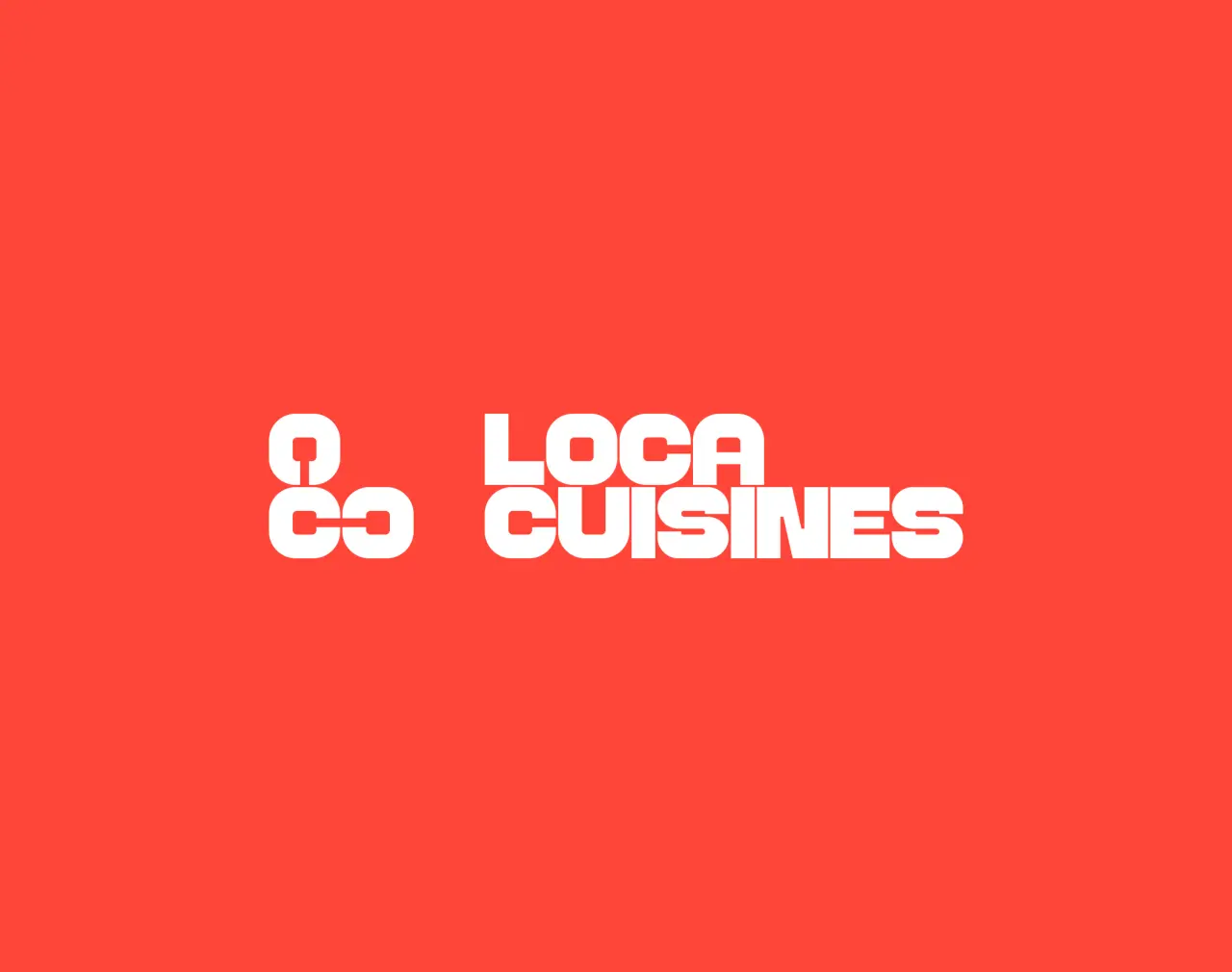
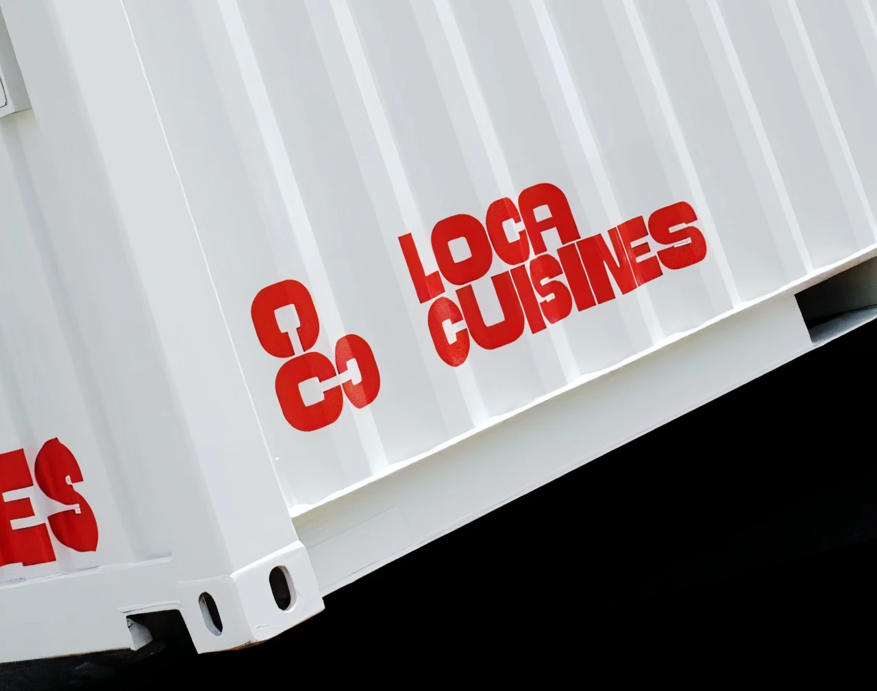
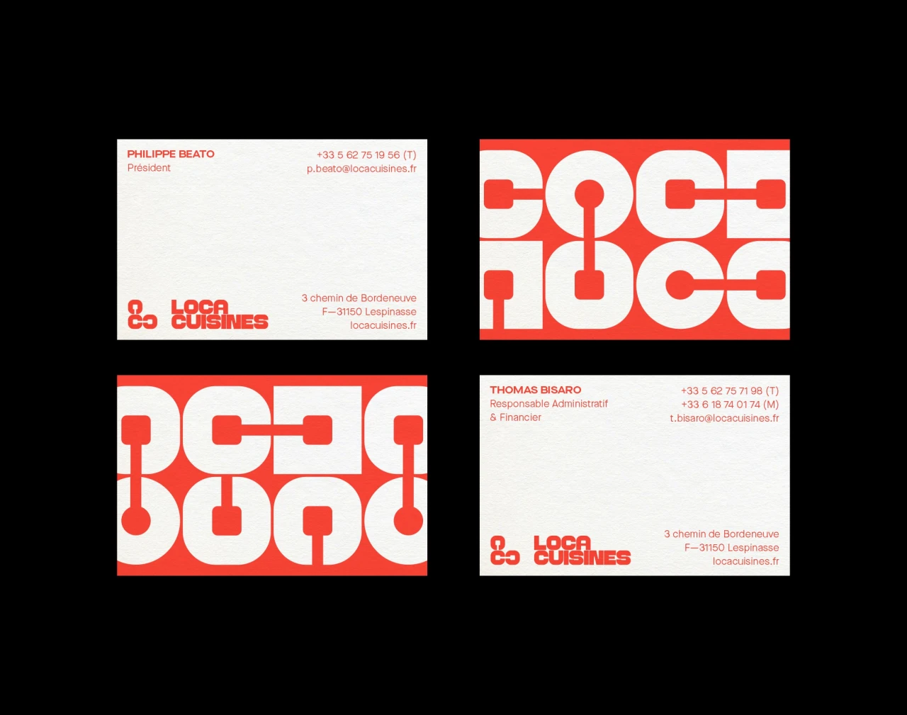
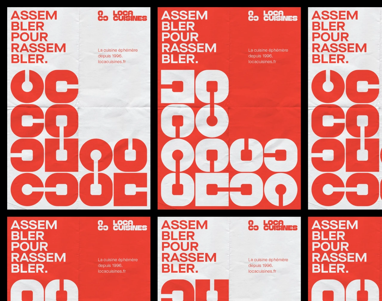
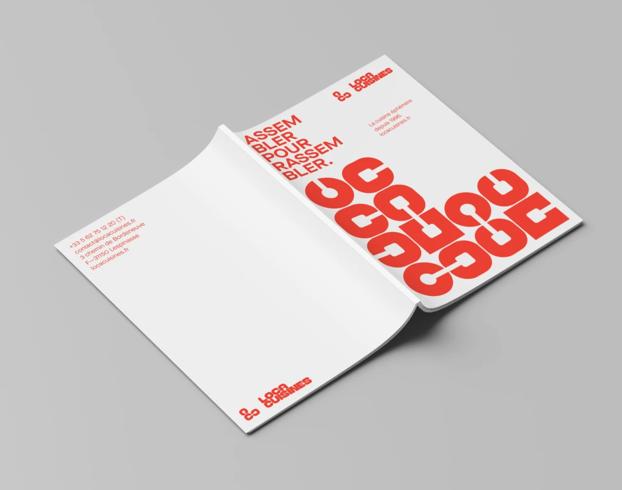
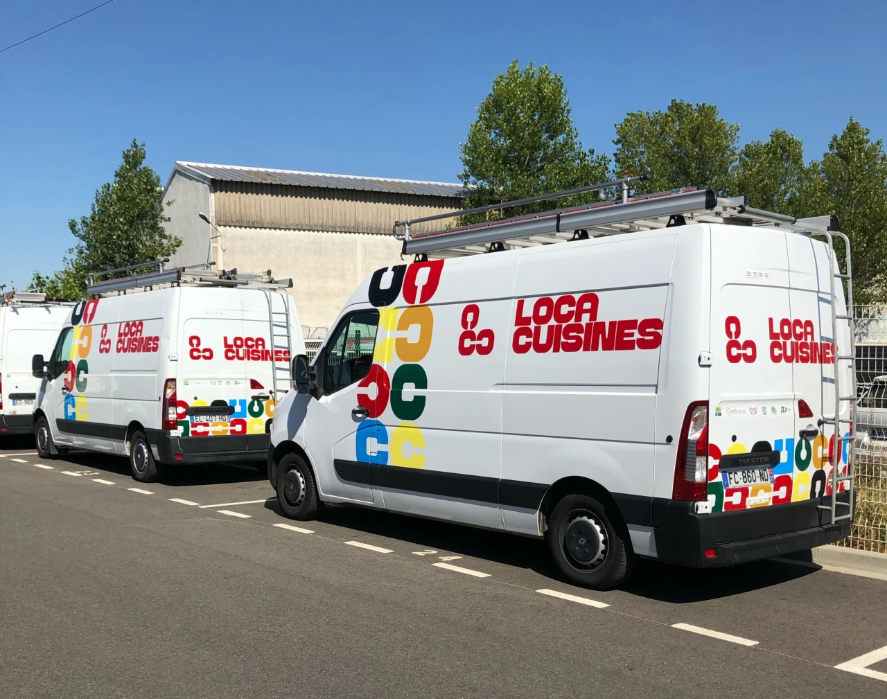
Brand Brothers crafted a custom wordmark and a modular system that offers the company a wide variety of visual expressions. And we think it works brilliantly.
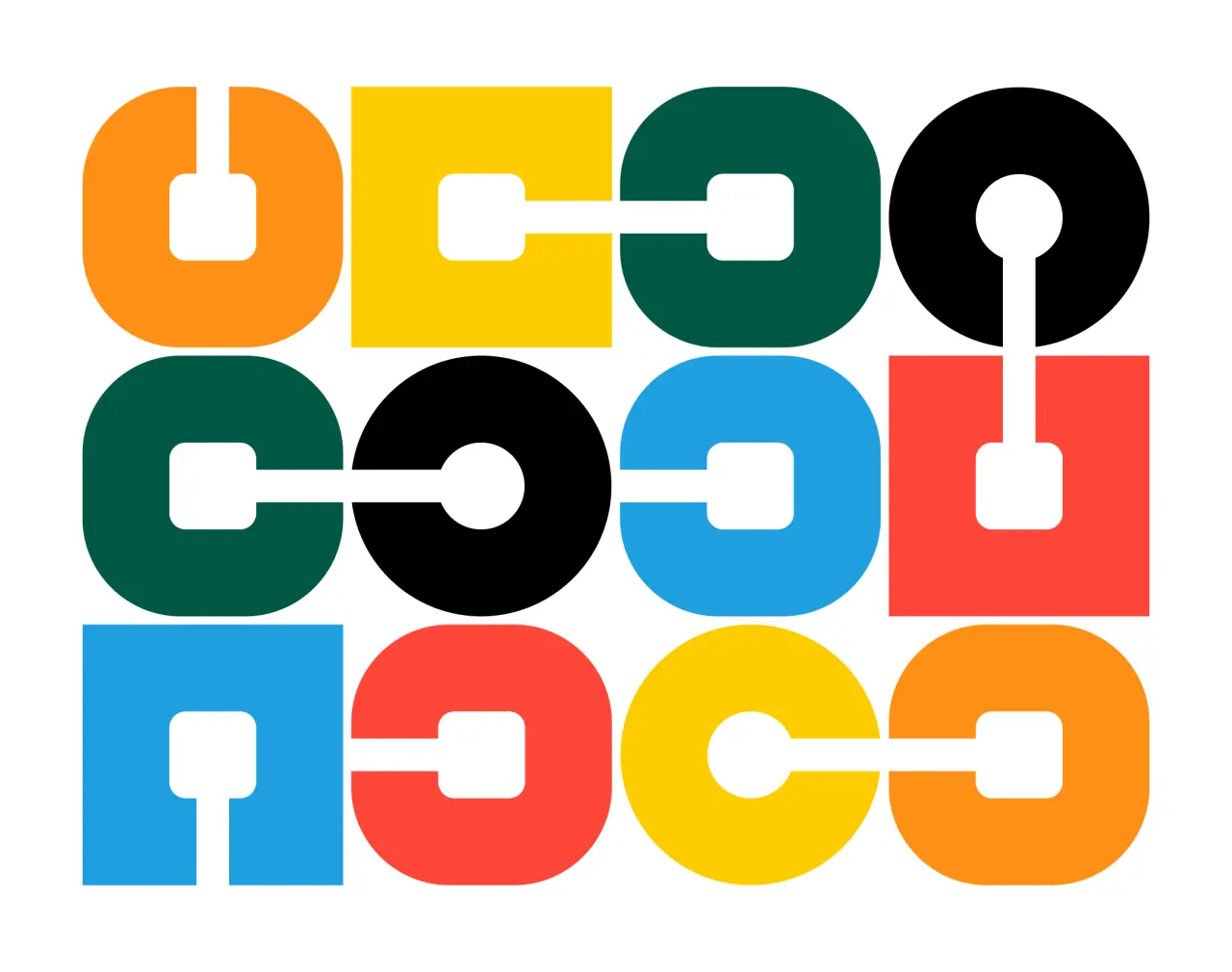
The new tagline (Assembler pour rassembler) was the starting point for the graphic language Brand Brothers developed. Based on the in-house typographic design, the symbol, an L made up of 3 Cs, expands to form a set of modules that connect over and over.
It's an innovative, metaphorical representation of the assembly of modules. And there's a fresh, friendly and eye-catching feel to the execution that really makes it stand out in a sea of bland visual identities.
Editor's Picks





Trending






Latest Jobs
Senior Brand Designer at Analogue
Full-time·Leeds·£38k-£45k
Senior Designer at Definition
Contract·London·£45k–£50k
Graphic & Motion Designer at The SHARP Agency
Full-time·Leeds·£26k–£33k
Brand Designer at Adfin
Full-time·London·£30k–£50k
Paid Media Executive at Munro Agency
Full-time·Glasgow·From £27,000
Art Director at SPOKE
Full-time·London·£55k-65k