Brand Brothers gives M Capital a fresh new look that reaffirms its reputation as 'chic' and 'benevolent'
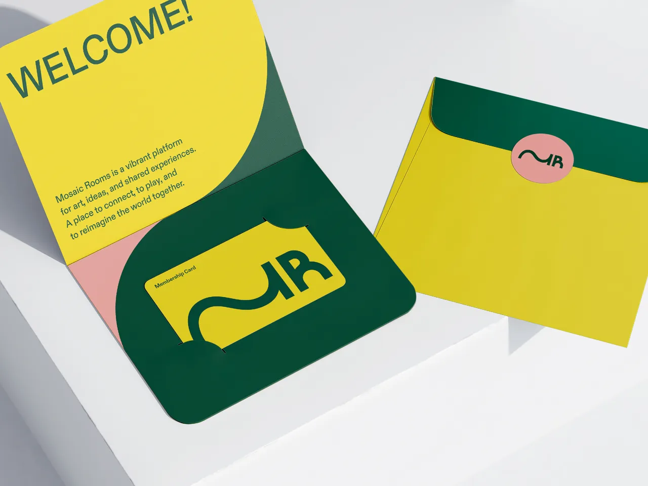
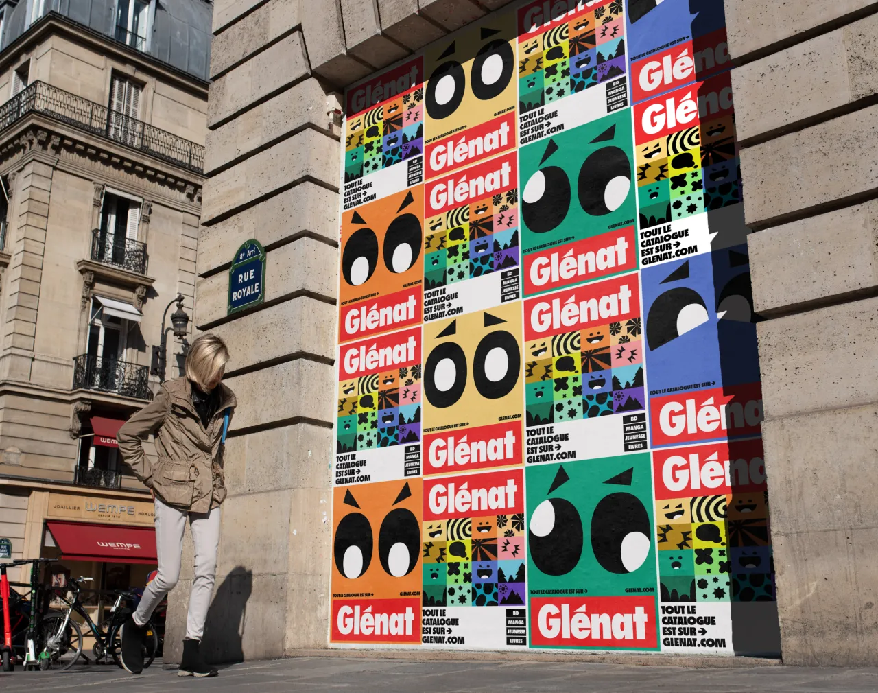
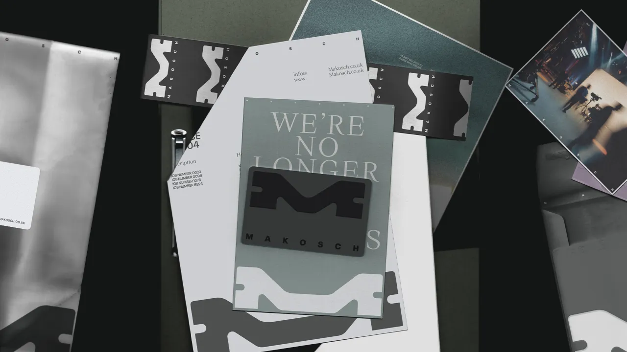
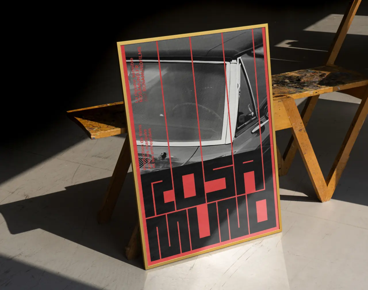
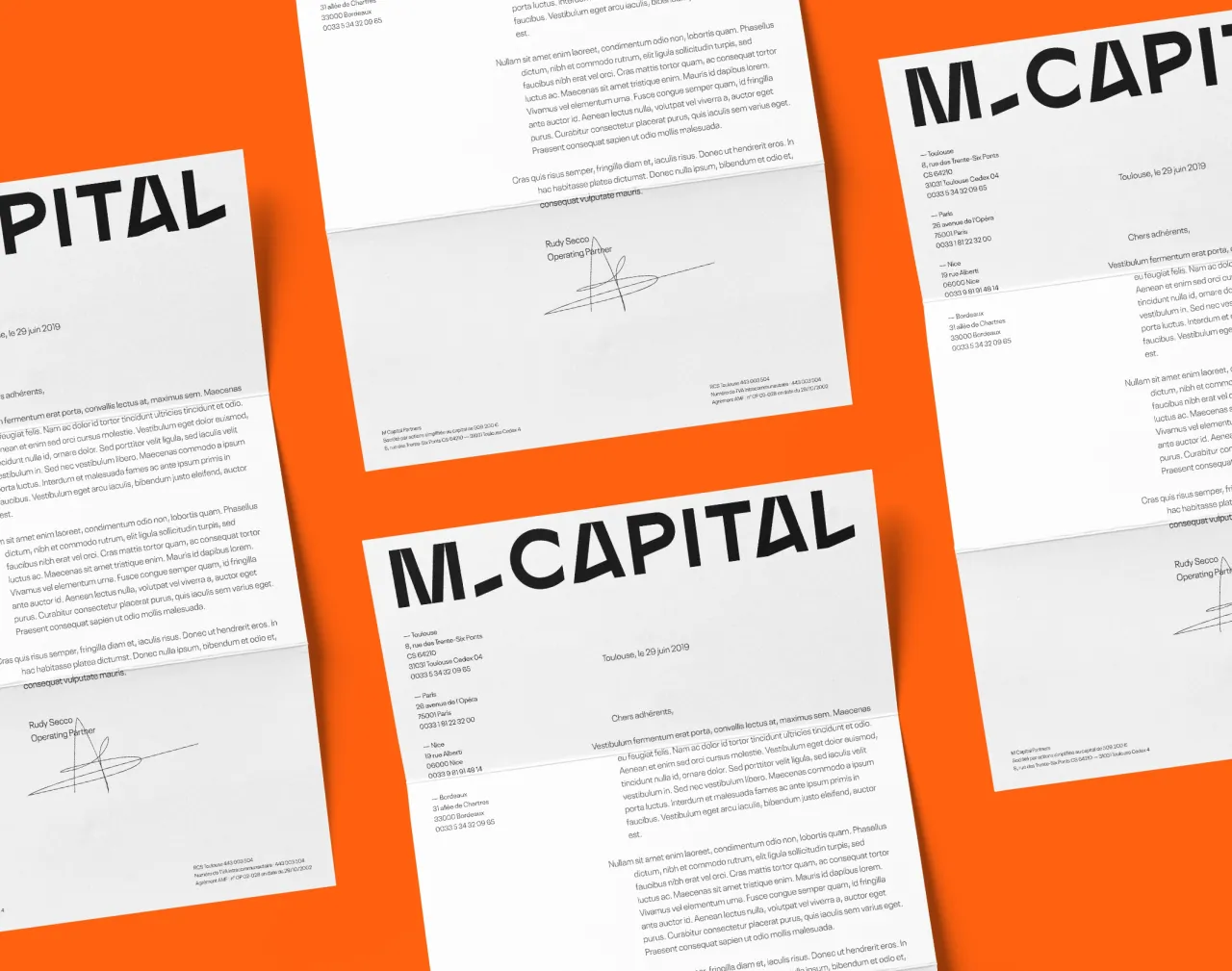
French design studio Brand Brothers is behind this colourful refresh for M Capital, one of France's leading private investors and one of Europe's top 300 growth companies, (according to the Financial Times).
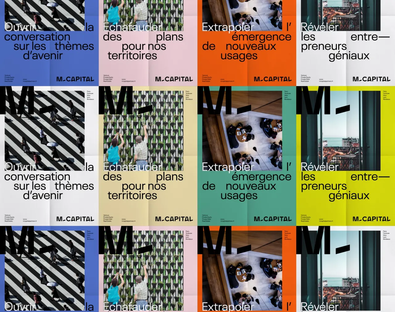
Based mainly in Toulouse and Paris, M Capital is also a brand that defines itself as "chic and accessible" as well as "rock and benevolent", cultivating a reputation as both serious and respected but free and even impertinent. Keen to maintain this stance while remaining relevant, it approached Brand Brothers to completely rethink its visual identity.
"From the outset, we wanted to avoid conforming to the classic aesthetics of financial companies, while developing a solid and serious visual base," says Johan Debit, one of the co-founders of Brand Brothers.
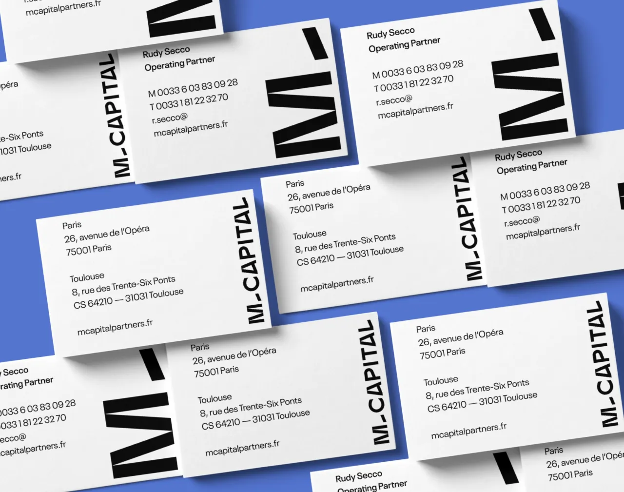
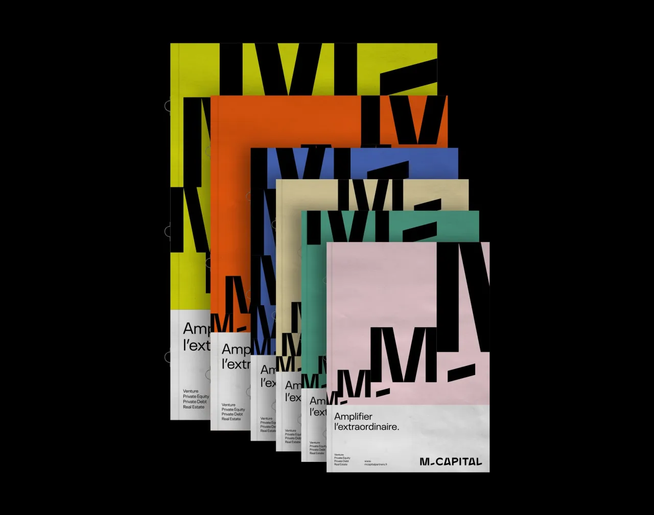
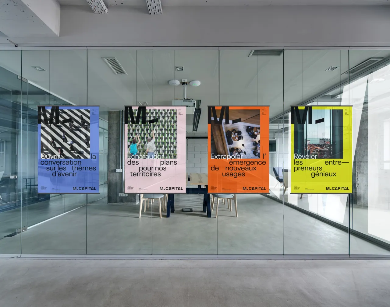
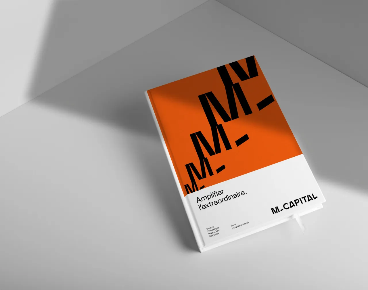
"Our focus is on the mantra, 'Amplifying the extraordinary', an emphatic and deliberately oversized promise, we have built a typographic identity imbued with clarity and radicality. The logo, a stable and structured typographical design, reveals some oddities that bring the right dose of singularity. A palette of bright colours makes it possible to offer strong contrasts on the different variations."
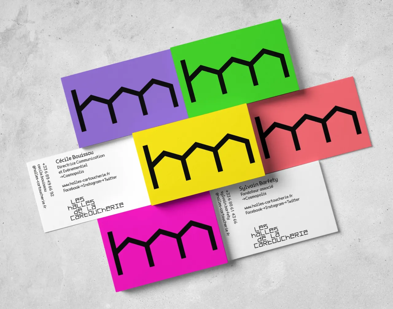
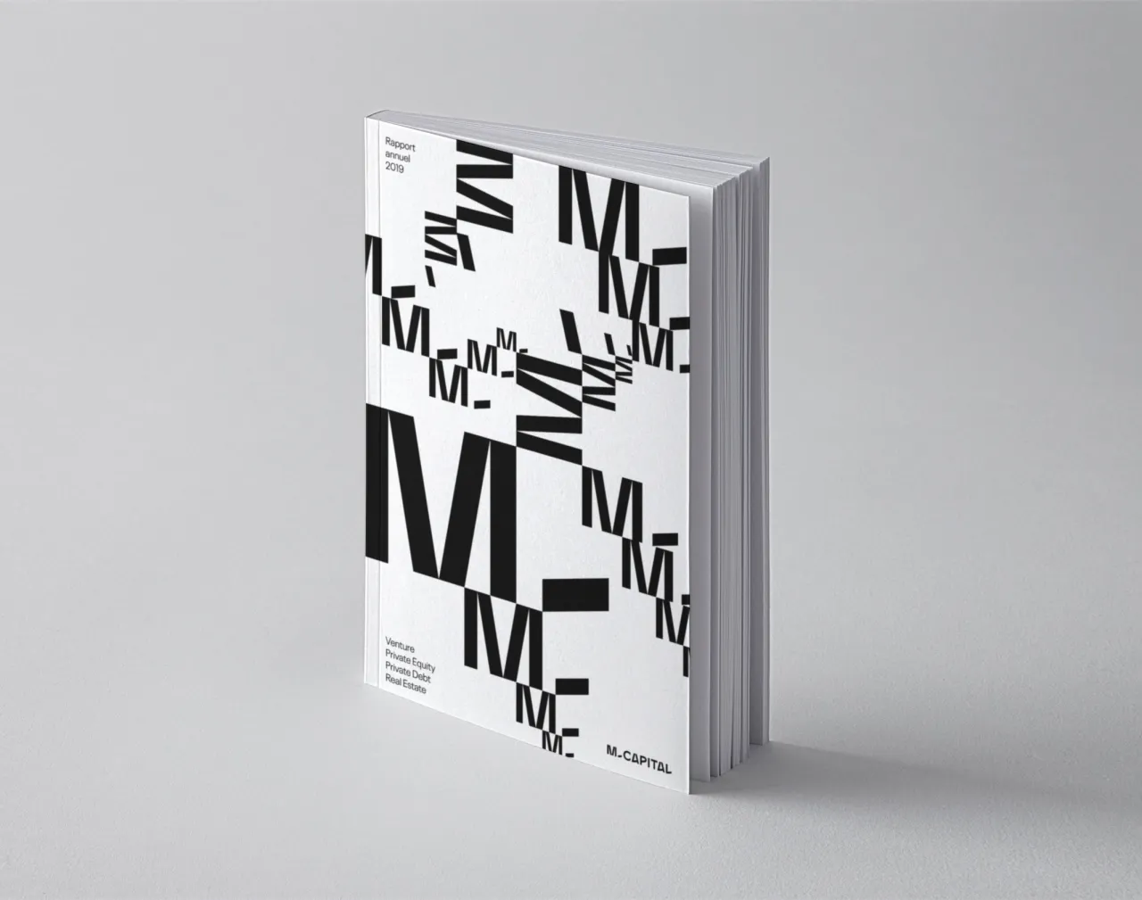
The visual imprint is built around the monogram "M-", which, through a play of scales, illustrates the promise of growth and progress. A construction game that allows you to create infinite graphic patterns and unify the various materials.
Editor's Picks





Trending






Latest Jobs
Senior Creative Lead at Random Studio
Full-time·Amsterdam / Paris·€90k-€110k
Senior Operations Manager at BIG Partnership
Full-time·Glasgow·£45k–£50k
Senior Digital Designer at 3800
Full-time·Sheffield·£40k-60k
Client Director at Koto
Full-time·Berlin·€70k-€85k
Senior Designer at Definition
Contract·London·£45k–£50k
Midweight Graphic Designer at We Are Your Friends
Full-time·London·£36k–£44k