Alphabet's cheerful packaging for Play Brew Co's latest 'special release' beers is full of character
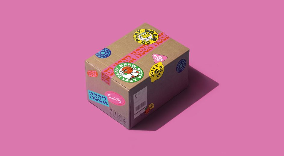
Play Brew Co is a Middlesbrough-based craft beer brand hell-bent on producing exhilarating beer with a nostalgic twist, born from the influential culture of the 1970s, '80s and '90s. For its first range of "special release beers", it called on Manchester studio Alphabet to help it make a splash in a saturated market.
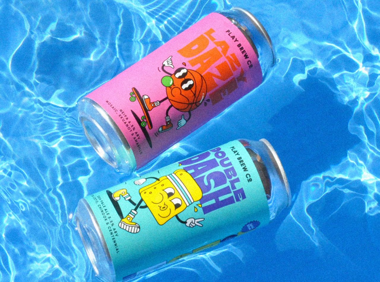
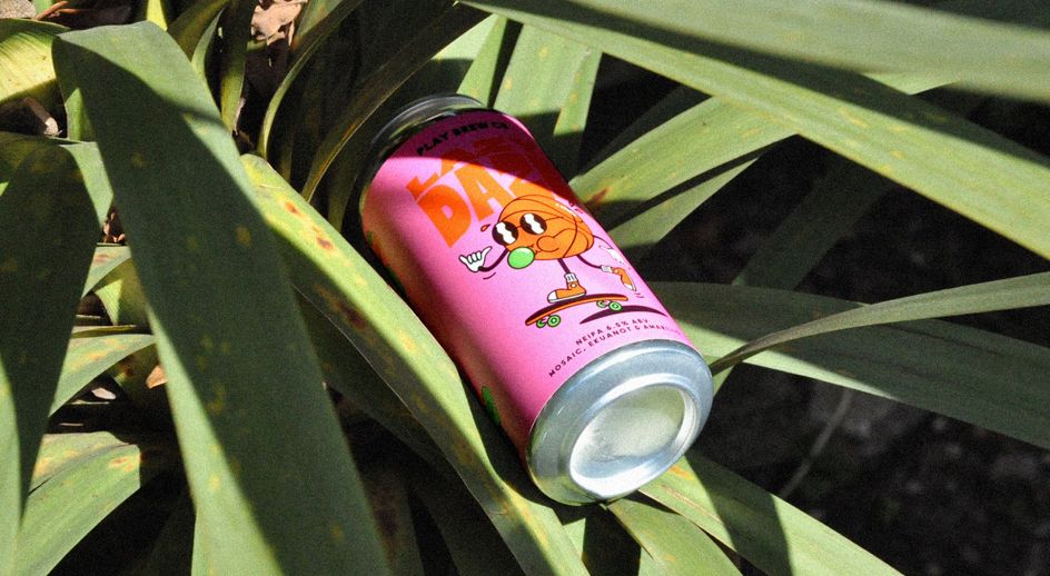
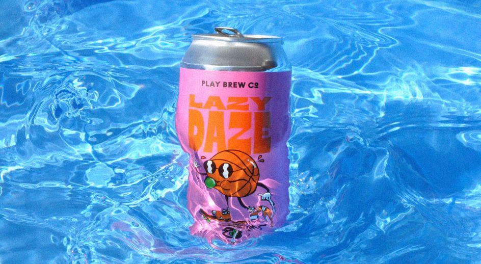
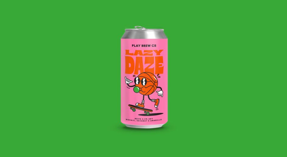
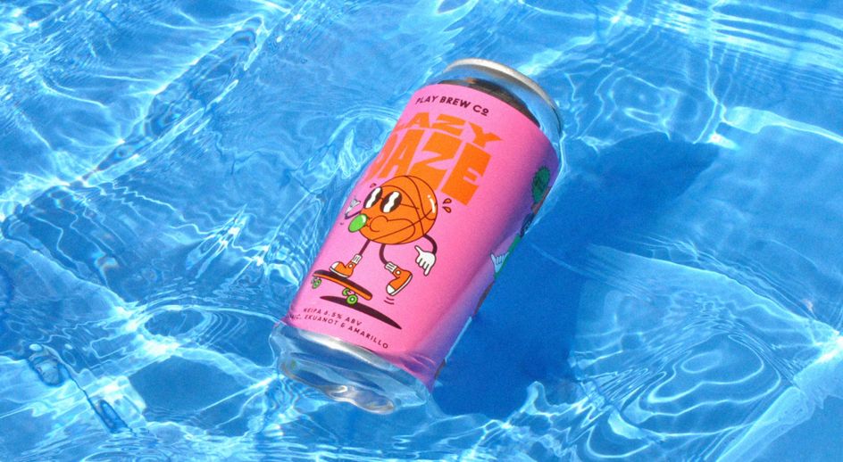
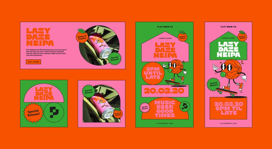
For this special release, Alphabet created illustrated characters, each taking part in a different activity directly inspired by the inspiration of the flavour-profile of the beer itself and the character of the hops specifically.
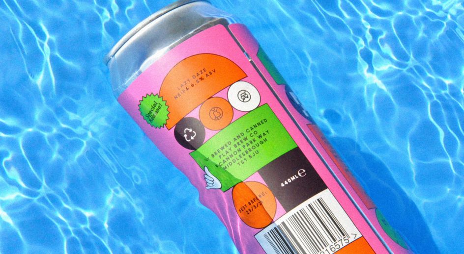
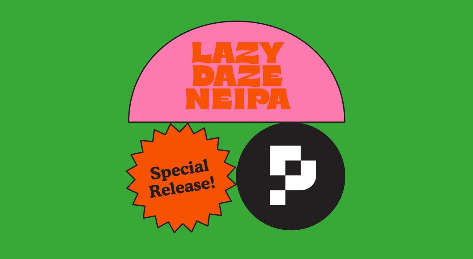
Lazy Daze is a New England-style IPA featuring huge citrus and tropical fruit hop character with a softer, smoother mouthfeel from the adjusted water chemistry, higher protein malts, and lower attenuation. "With its fruity bold character, we were inspired to create a colour scheme and illustrated character that represented the tropical vibes of summer sports for 'Lazy Daze'," says Sam Lane, co-founder and creative at Alphabet.
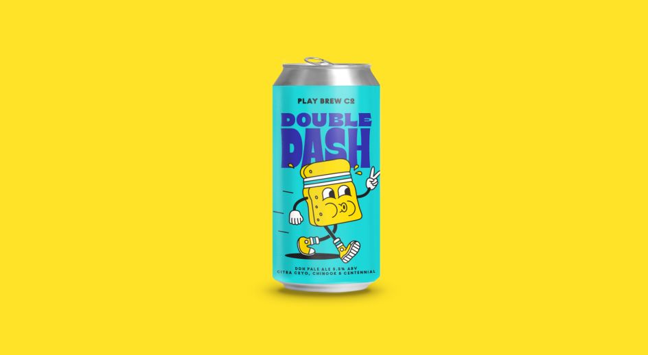
Double Dash, meanwhile, is a double dry-hopped pale ale – brewed to give the flavour intensity of a DIPA at a more session-able ABV of 5.5%. "With its easy-drinkability and mouthfeel, we were inspired to create a colour scheme and illustrated character that represented the marathon-based session beer of 'Double-Dash'," adds Sam.
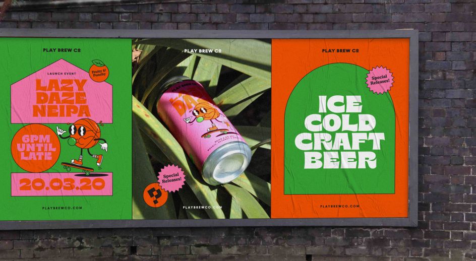
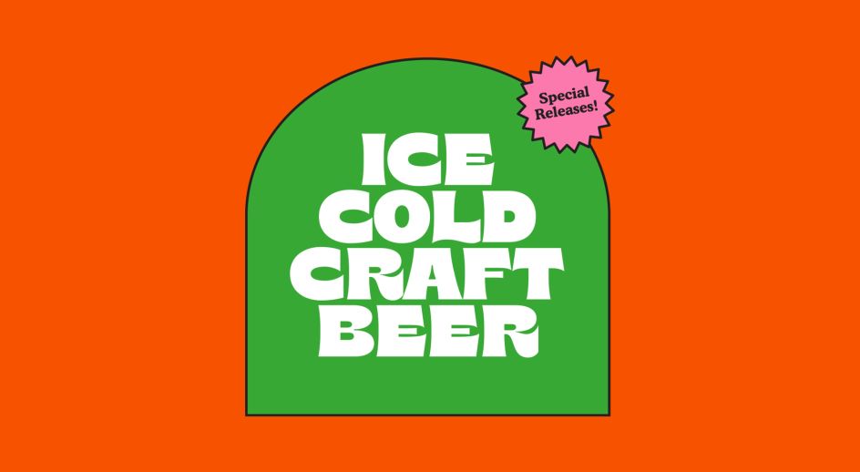
Alphabet worked on a limited but bold colour scheme for each release with a strong black keyline as a key recognisable brand feature to help the identity stand out across print and digital touchpoints. Discover more of Alphabet's work at madebyalphabet.com.
Editor's Picks


Trending


Podcasts


Editor's Picks
Further Reading