Without creates a cross-cultural brand identity for new Asian food line Kelly Loves
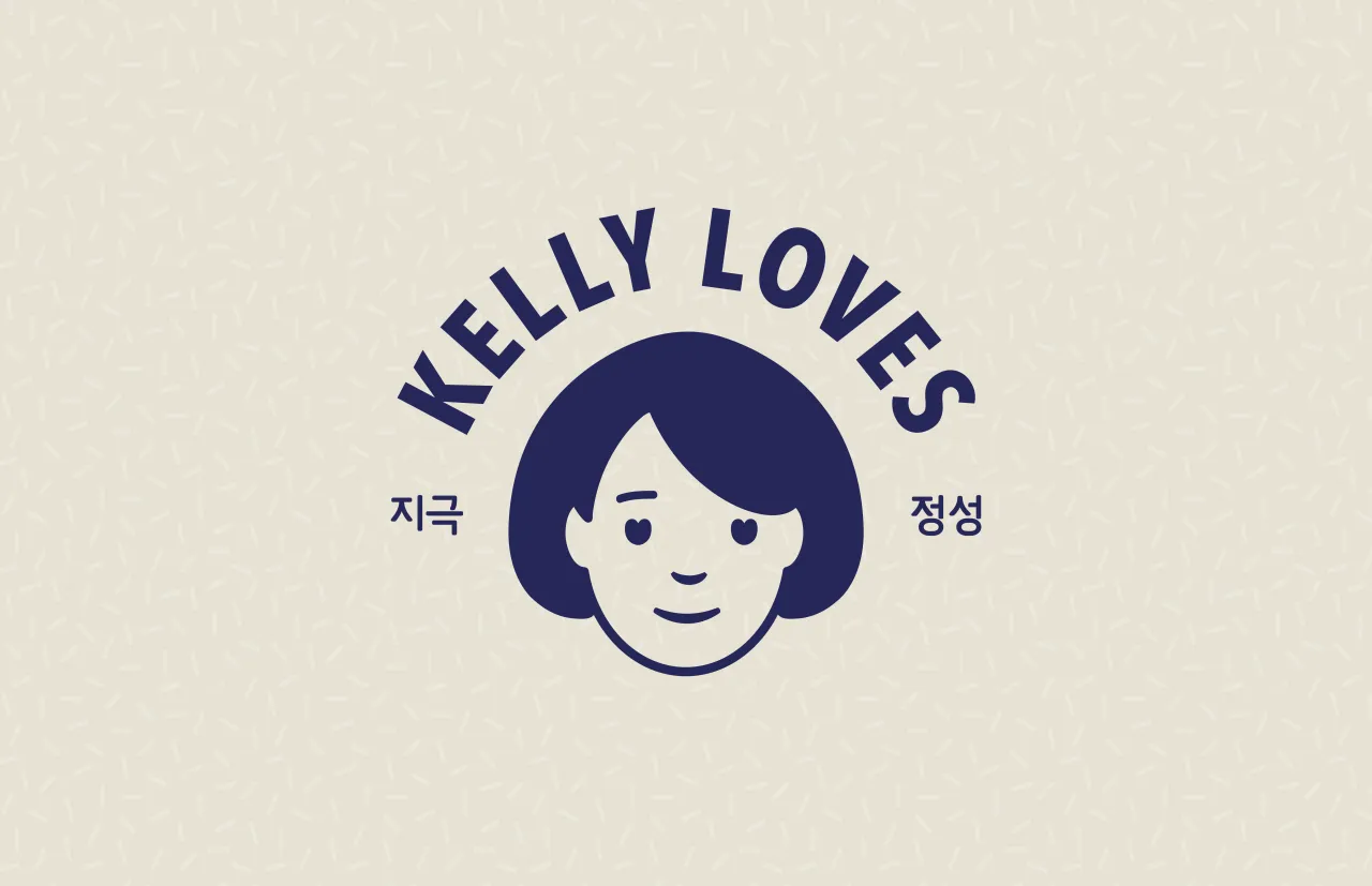
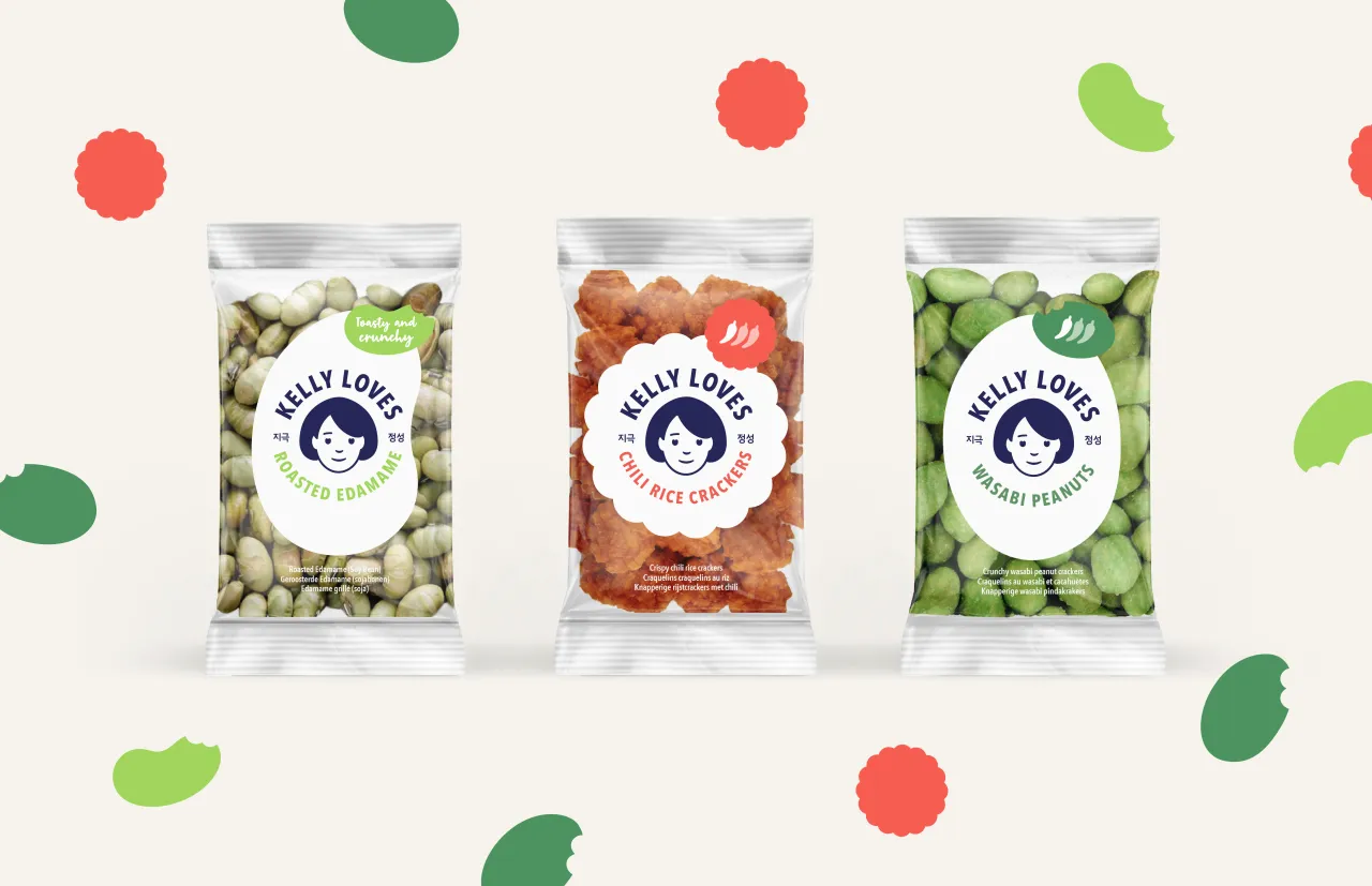
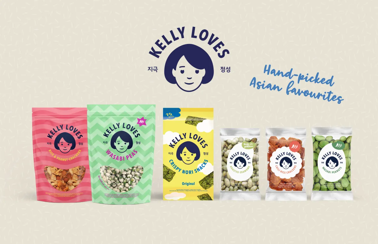
New Asian food brand Kelly Loves has launched in the UK and Europe with an "authentic" brand and packaging identity courtesy of London studio Without.
Created by well-known Korean food entrepreneur Kelly Choi, founder of Kelly Deli and Sushi Daily, it's a bid to bring wholesome Asian food to Western supermarket shelves and tap into the booming "grab-and-go" sector.
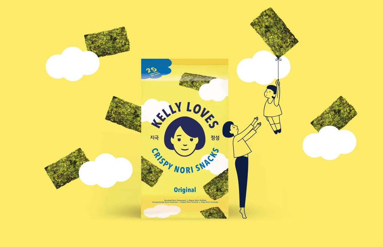
Research shows that authenticity is the key ingredient for consumers buying and eating Asian food in this part of the world, so Without's design team looked to the traditional line drawings and cartoon styles of the East to create a fresh, authentic design language and tone of voice, with Kelly at the heart of the brand story.
Kelly Choi says: "We source the highest-quality ingredients, and what we produce is 100% authentic. It was very important that our new off-the-shelf range was brought to market in a way that would be attractive to the modern Western palate while staying true to its roots. We’d seen Without’s considerable body of work in the food and beverage sector and felt they were the perfect fit for us."
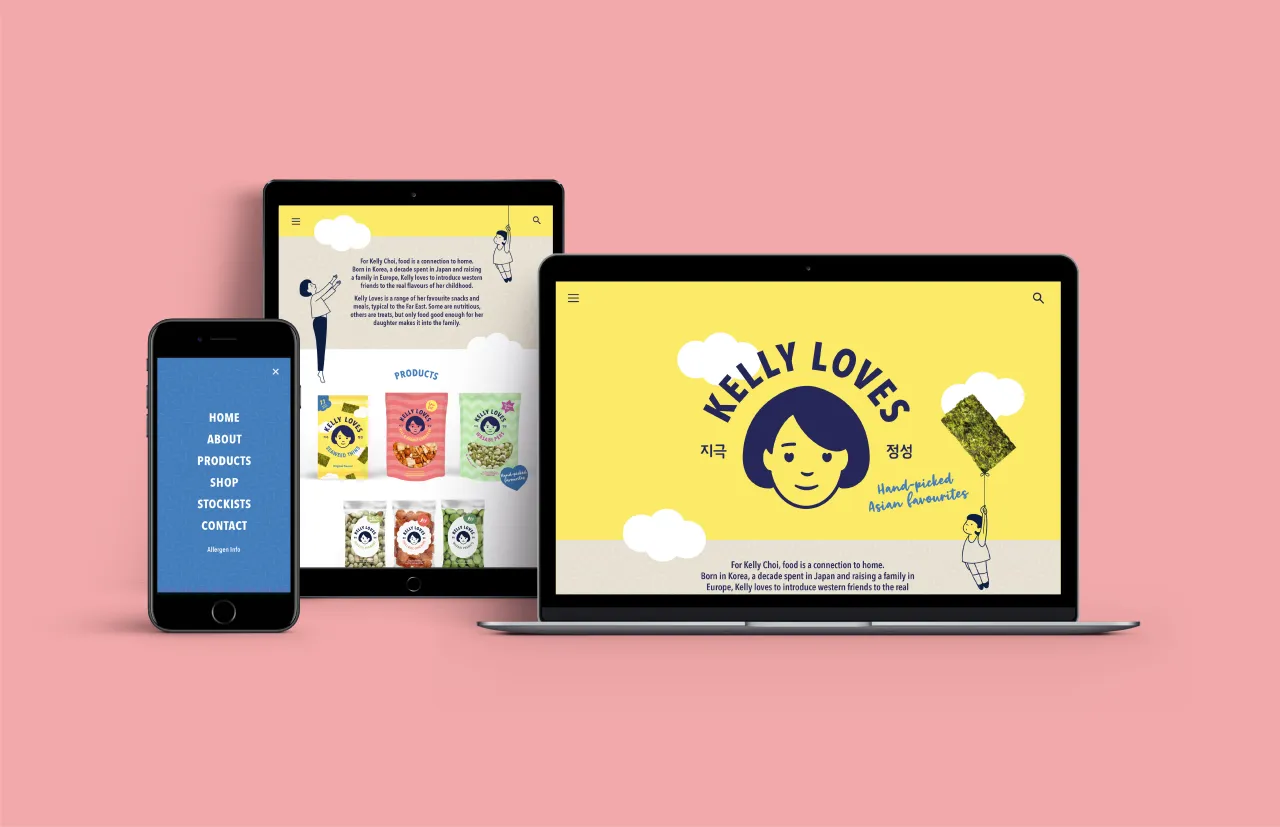
Without's Creative Director Roly Grant says: “Kelly Choi has such integrity and passion, and we wanted to get that across. We decided upon the ‘Kelly Loves’ name as it is completely adaptable and celebrates the fact that founder Kelly is a chef, mum and provider who wants to look after her customers.
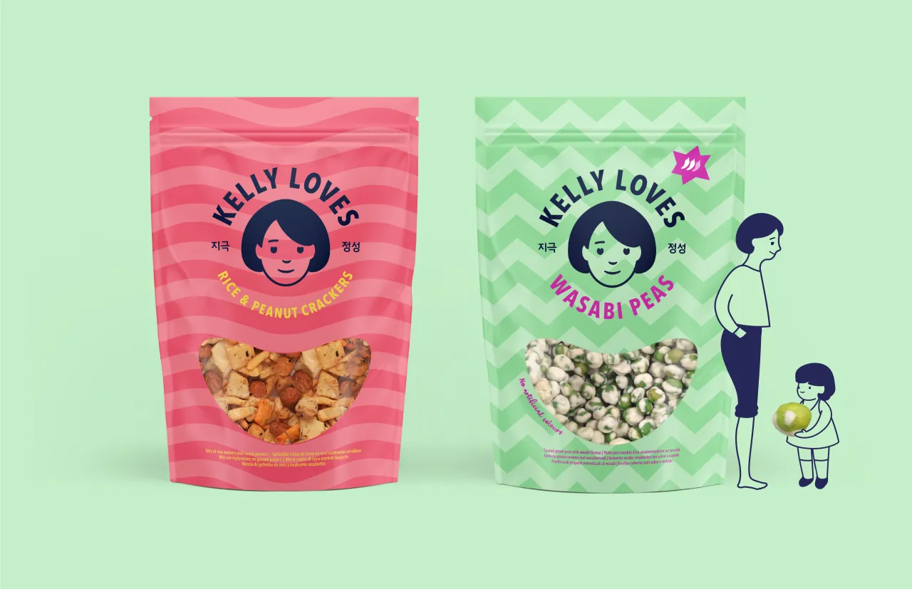
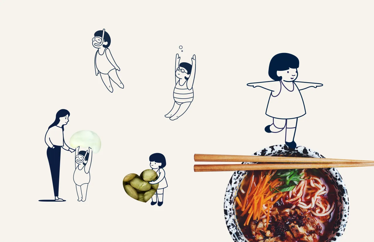
“During the collaboration process, Kelly frequently mentioned that she would only sell what she was happy to feed her young daughter, so this became a central tenet of our approach. We developed Asian-inspired line drawings of a mother and daughter interacting to bring the brand to life and provide cohesion across the range. The two characters allow us to demonstrate different product attributes – light, healthy, balanced, for example – in an engaging, friendly way.”
So a cute drawing of a little girl being lifted into the air on a seaweed-snack ‘balloon’ points to the lightness of the product, for example. Likewise, when we see her walking along a chopstick ‘beam’, we understand that the product is perfectly balanced.
Kelly Choi adds: “Without’s approach is completely consumer-centric; they’ve created a universal yet original brand identity and language that will appeal to everyone, from true foodies to those experimenting with Eastern flavours for the first time. Without pushed boundaries and made me think about my brand positioning, giving me the confidence to put my name to the range.”
Editor's Picks





Trending






Latest Jobs
Midweight Graphic Designer at We Are Your Friends
Full-time·London·£36k–£44k
Senior Graphic Designer at MoMA Retail
Full-time·New York·$72k-$80k
Digital Marketing Executive at Arise
Full-time·Sheffield·From £23,750
Design Director at Koto
Full-time·London·£72k-£90k
Senior 2D Motion Designer at Art&Graft
Full-time·London·£50k-£65k
Senior Creative Lead at Random Studio
Full-time·Amsterdam / Paris·€90k-€110k